2023 Open House Hobart posts
- Architectural Drawing
- Signs of Hobart
- Crisp & Gunn (The Forestry Dome)
- The Railway Roundabout Fountain
- The ABC Building
The New Spirit of Modernism (Part 1)
Featured buildings – State Library of Tasmania and The Stack.
If you can’t already tell from the majority of my photos, I’m rather fond of modernist buildings. So I was very excited when I saw there was a modernism walking tour on Open House weekend.
I’d told Lil Sis when we were negotiating the booking system that I didn’t care about anything else as long as I got onto this tour. We had booked onto a modernism tour a couple of years ago and it had been cancelled at the last minute because the architect had broken their toe and couldn’t manage the walk.
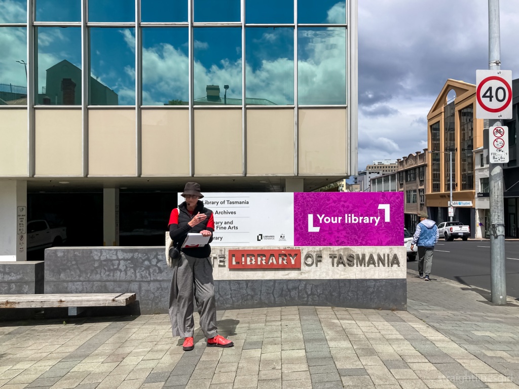
But no such disaster this time, and we met architect Bronwen Jones outside the State Library on Sunday afternoon.
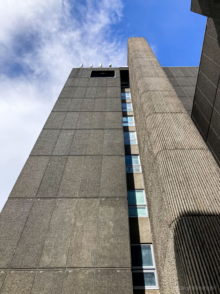
Bronwen describes herself as a flâneuse, a female flâneur, the person who walks around the streets, observing urban life. I’ve often felt connected to this term but the one I use more often to describe myself is ‘urban bushwalker’. To my mind, it’s the same thing. Though maybe the original flâneurs walked with a sketchbook and I walk with my camera.
Bronwen is passionate about modernism and observed that, unlike the old sandstone buildings that dominate Tasmania’s landscape, there has been very little research done into these mid-20th century structures. As a result we don’t know a lot about them and there’s a real risk of them being demolished with their stories untold. It’s happened to far too many of these buildings already.
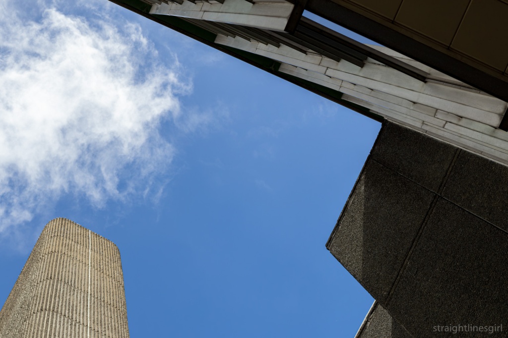
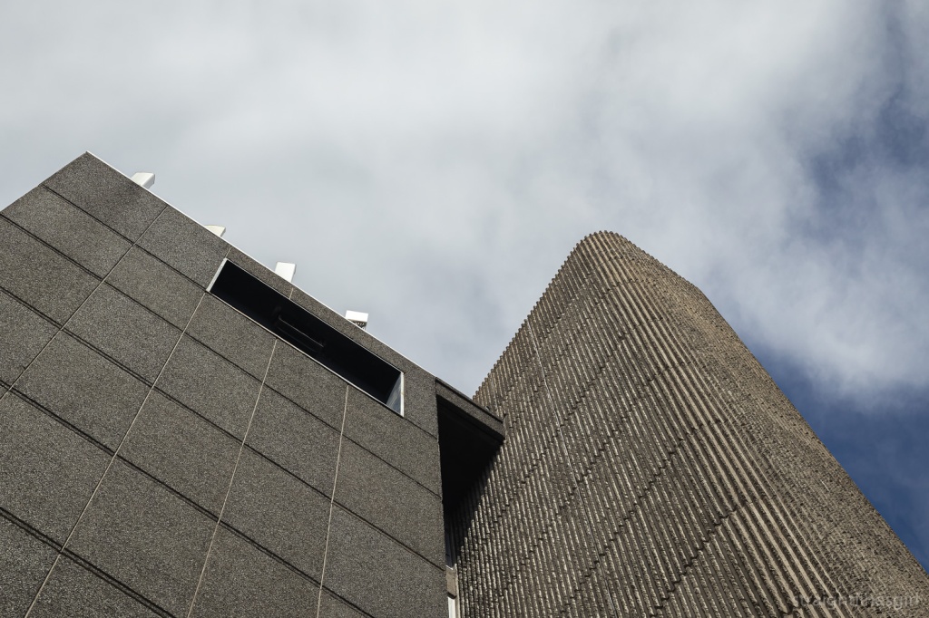
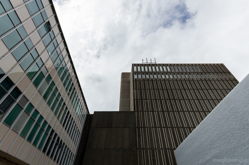
We began our tour at the Stack, the wonderful 1970s brutalist addition to the State Library (which you might recall was originally housed in the Carnegie Building we saw on the Signs of Hobart tour). It’s a most distinctive building, and there’s a video floating round in the archives that shows it being built.
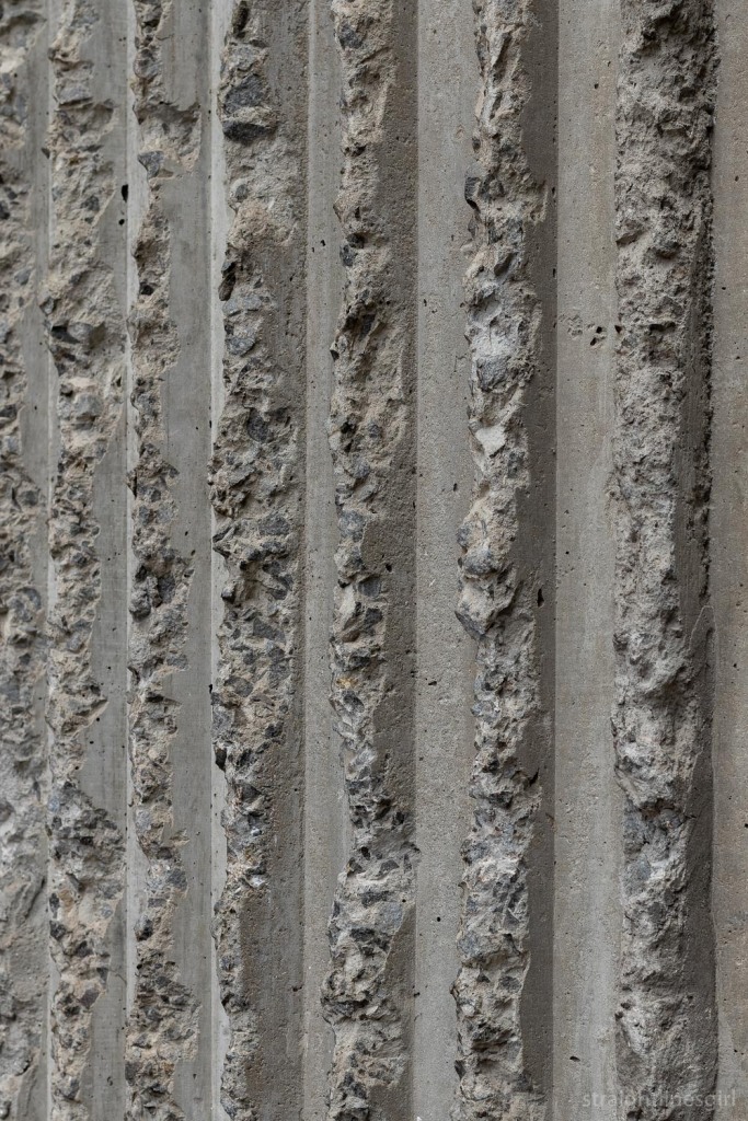
It took me many years to work out that when an item’s location in the library catalogue said “Stack” it actually meant the item was in this building not, as I’d imagined, that it was sitting in a stack of other books on the floor . . . That only happens in my house. The library would not do this.
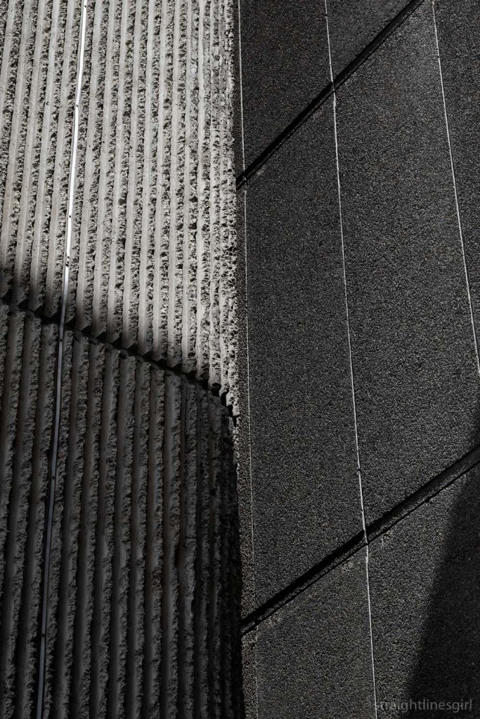
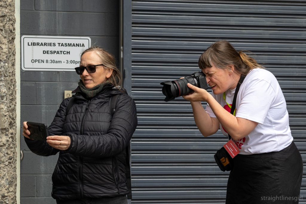
Now that we have that cleared up, we were accompanied on the first part of the tour by Nina, one of Open House’s official photographers, who I’d met at the drawing workshop on Friday.
And at last, finally, several years after she had photographed me photographing a building completely unaware, I got my chance to return the favour. You have to be quick to do this though. She knows exactly what you’re doing most of the time!
So, back to the Stack.
This building is raw, honest and, as Bronwen pointed out, designed with minimal windows to keep all the precious archival records away from the sunlight. She said it was always the intention for this section to be added when the library building was designed in the late 1950s, but it wasn’t completed until around 1971.
The State Library building itself was designed by the Melbourne architect John Scarborough, who also designed the Morris Miller Library at the University. It was opened in 1962.
As we admired this fabulous building, Bronwen spoke about the context within which the modernist buildings came to be. There is much written on this. It was a time following post-war austerity, when architects (and everyone else) were able to travel internationally and bring back new ideas, and new immigration waves of people bringing ideas from their homelands with them. This included new design concepts, new materials like glass, steel and concrete, and new technology, including pre-fabrication.
And standardisation. There’s a lot of that. Fin. Glaze. Panel Repeat.
Bronwen said there is a lot of horizontal lines and regularity in these designs, but not necessarily with the axial symmetry you’d see in a Georgian design. The idea is that these buildings are stripped back to the essentials so the form comes through without any ridiculous (my word, not hers) fancy ephemera to distract you.
It fits the concept of “tabular rasa”: sweeping everything clean and starting over (I had to google that because I spelled it wrong). And it’s a very minimalist aesthetic: To achieve the most practically and aesthetically with the least possible means.
The other concept big in modernism was “form follows function” which in its simplest sense means the building should be designed so it can do what it’s meant to do. The Stack is an obvious example of this, I suppose, with its design that excludes the light so the archival artefacts aren’t damaged.
I tried to take notes but it’s impossible to do that and make photos at the same time AND listen to the person talking. (Can anyone tell me what “Groused Harvey” is supposed to mean? I wrote that in my notes and I have no idea!)
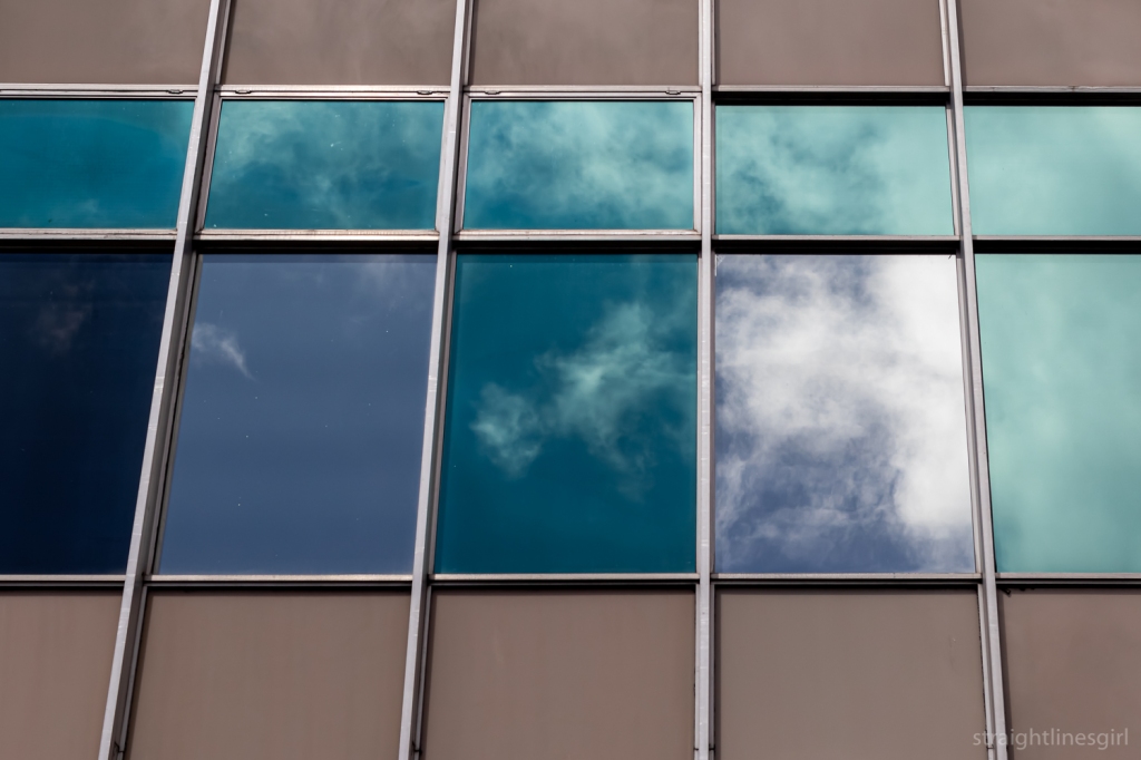
Bronwen spoke about glass curtain walls, of which this is Tasmania’s first example. She noted that this type of wall is non-structural; it is ‘pinned’ to the slabs, which themselves are built on columns which give the structural support. This is unlike older architecture, which is built brick-on-brick, put in a window and keep building. (Reminds me of my Lego days.)
A problem with these structures today is that this is very thin, light glass that was intended to deliver natural light and warmth into the building, accompanied by flexible “shape-shifting interiors” that could easily be altered to the required layouts.
But open plan offices suck (again, my words), and the glass isn’t exactly thermal glass, so it’s not super efficient.
The building, like many others of this era, is elevated, and with so much glass it appears light and weightless, almost like it’s floating, in direct contrast to its grounded heavy neighbour, the Stack. I can’t say I’d ever paid attention but Bronwen pointed out how the building is set back from the street front and it sits at a slightly different angle to the street.
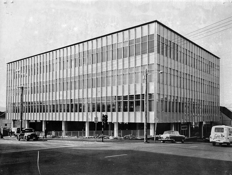
With the building sitting above the ground there is potentially a great public space at street level. It’s a car park, which is not great use of the space, but, as Bronwen said, in this era everything was being designed around the “car is king” principle. (I don’t think much has progressed there . . . though there are shifts that are upsetting car drivers, so there is hope for us urban walkers.)

After stopping to admire the buildings from Murray Street, we headed down the road for the next stop on the tour.
To be continued . . .

Pingback: open house hobart 2023— the new spirit of modernism (part 2) | straightlinesgirl images
Pingback: Week 50/2023: Modernism and macros - stepping on the cracks
Pingback: open house hobart 2023—some houses | straightlinesgirl images