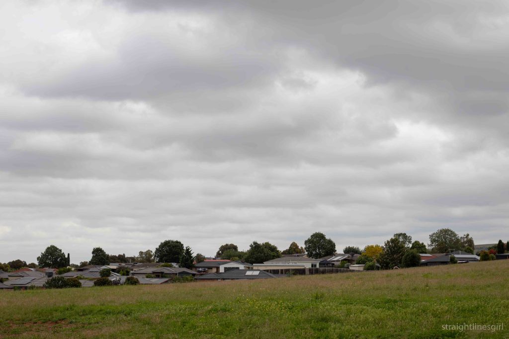
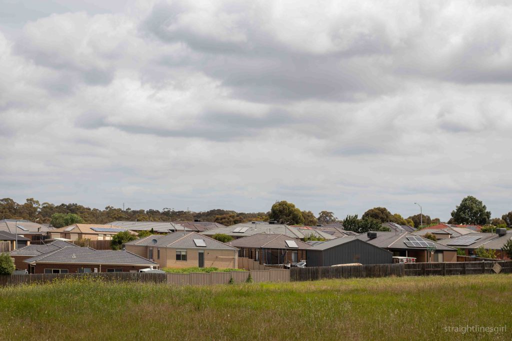
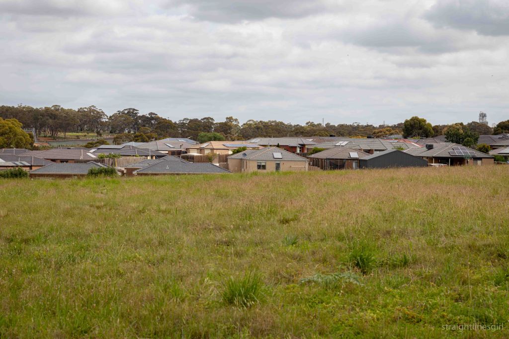
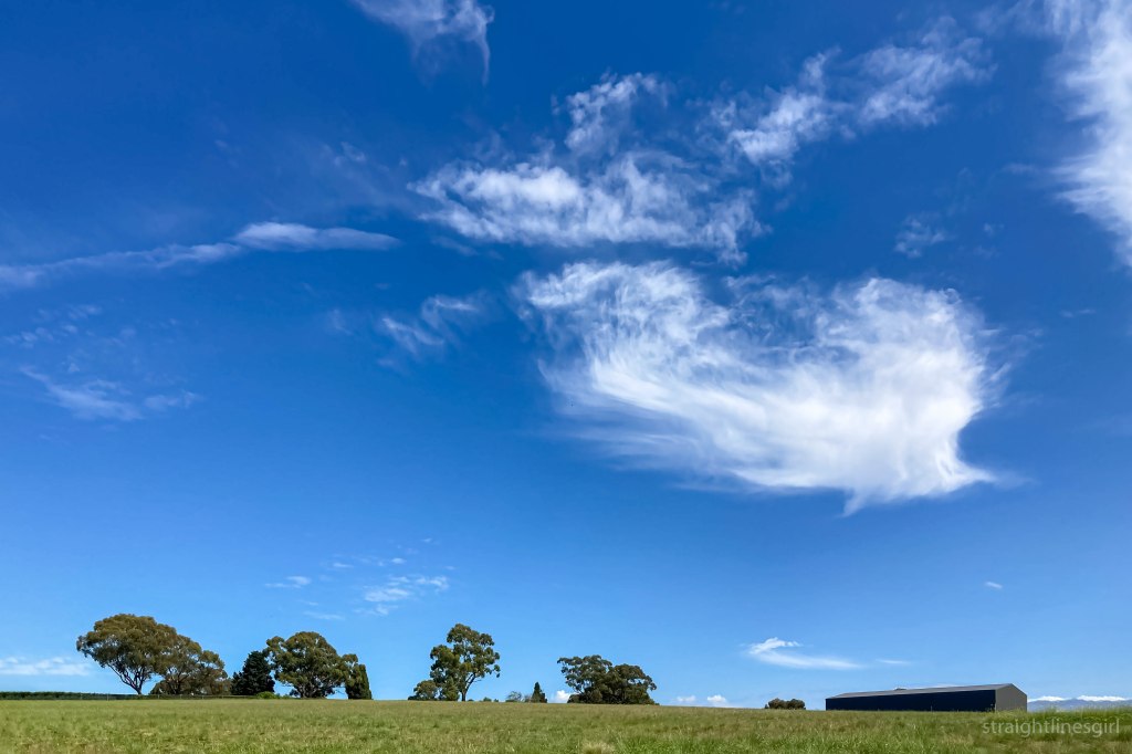
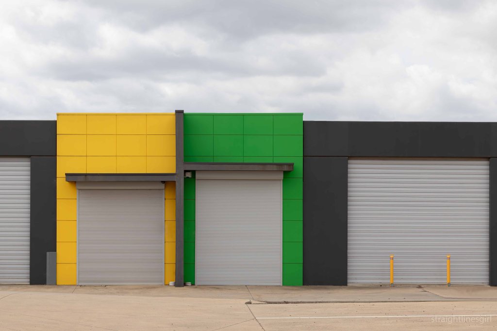
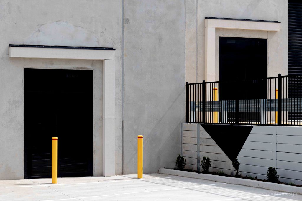
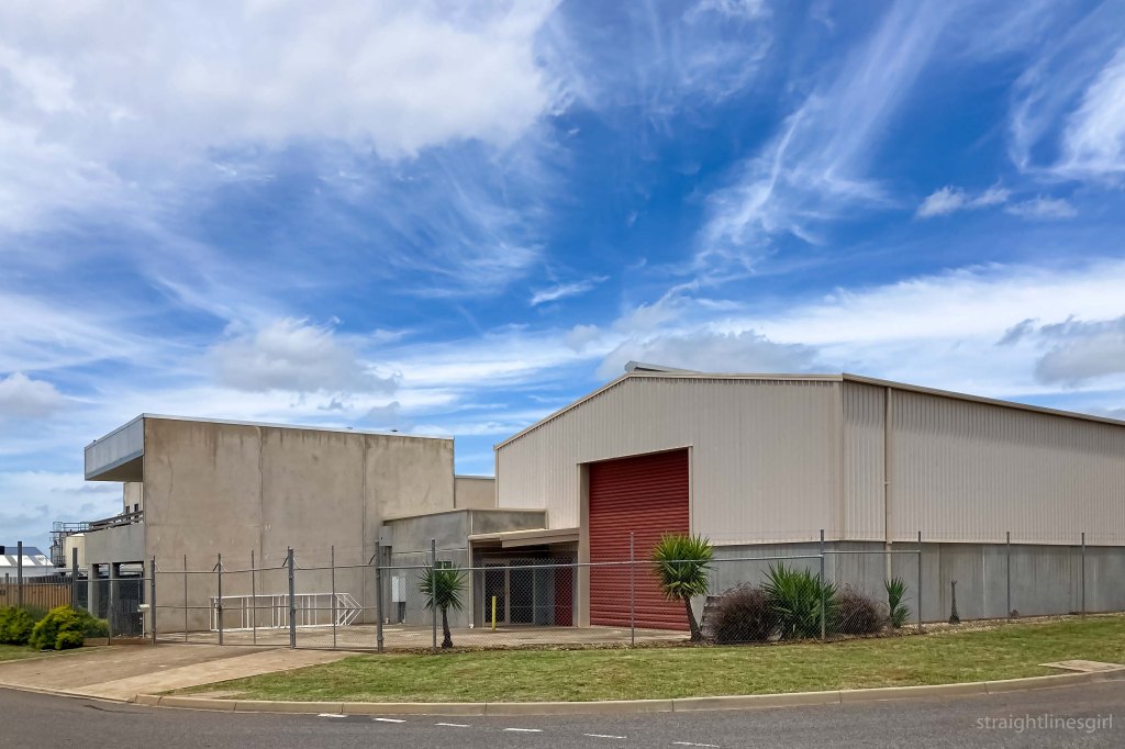
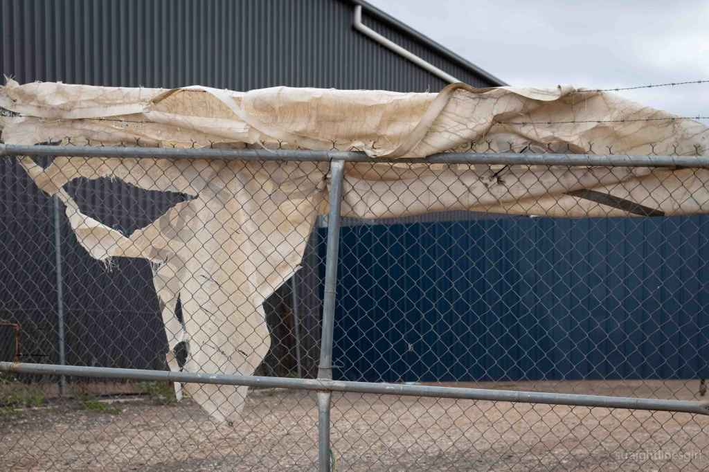
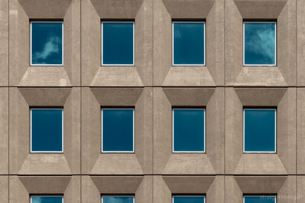
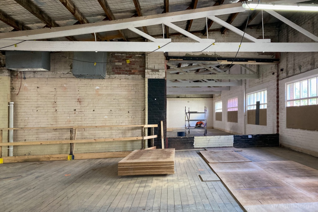
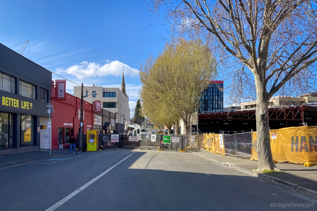
the suburb and the sky
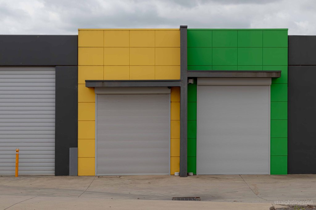
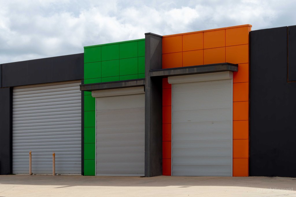
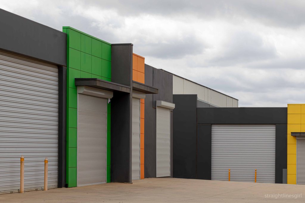
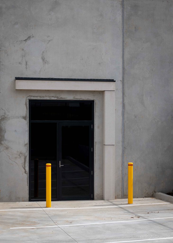
industrial colours
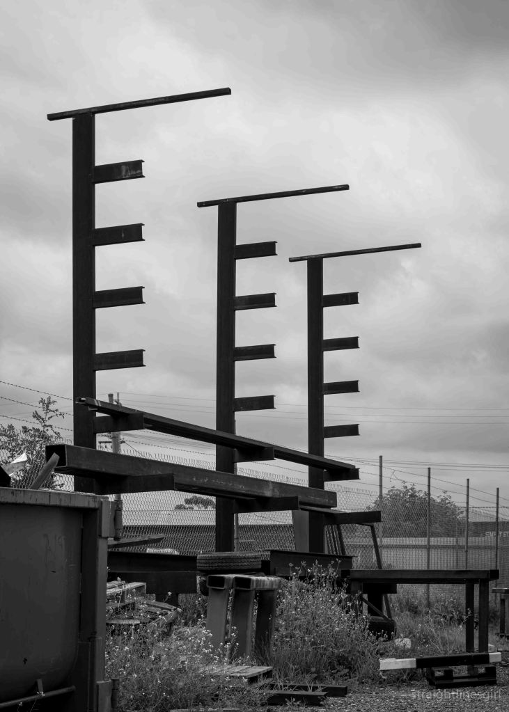
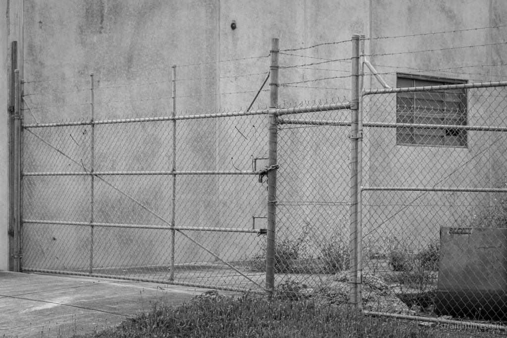
black and white
scenes from the street

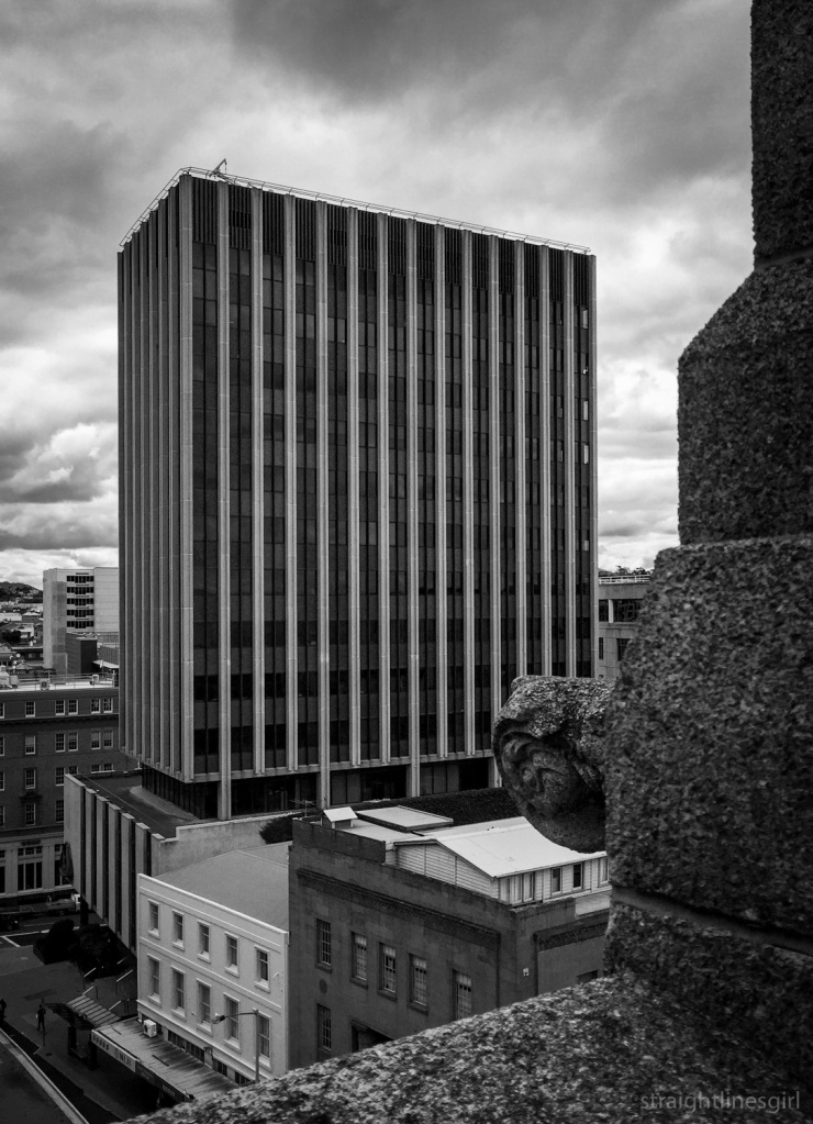
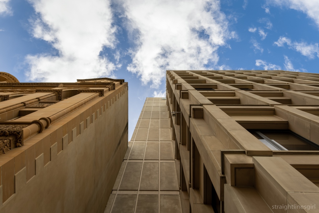
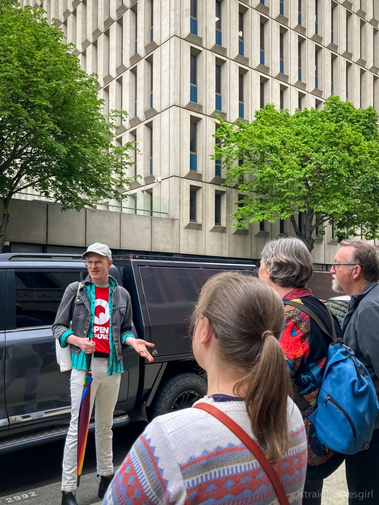
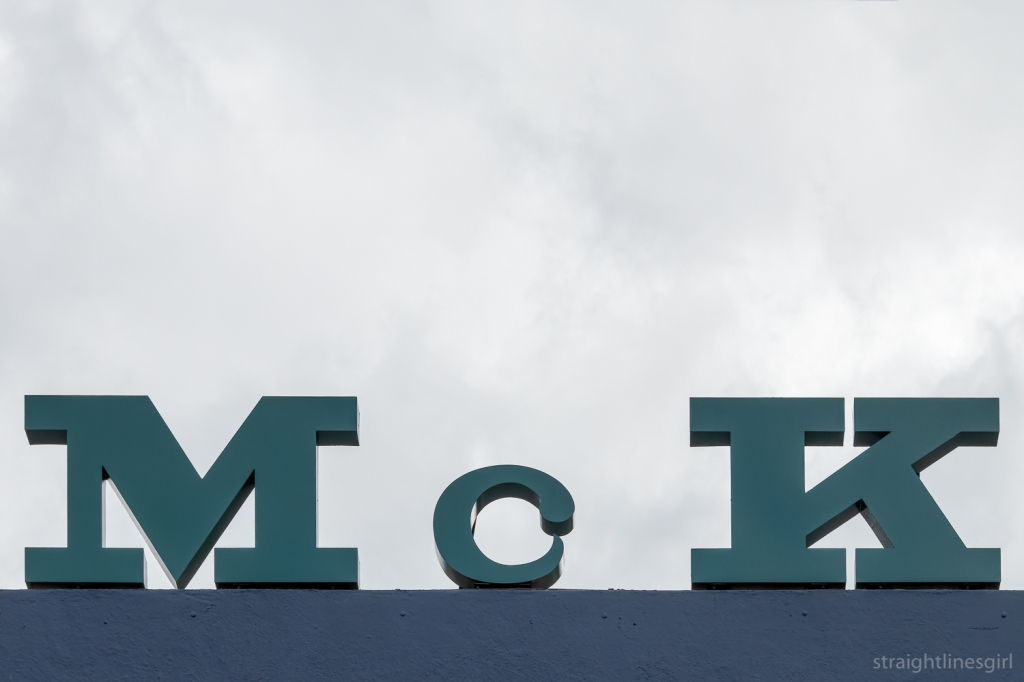
Leaving the State Library behind, our wonderful guide, Bronwen, led us down Murray Street past “Murray House”, to the corner of Liverpool Street, where we found the former MLC Building.
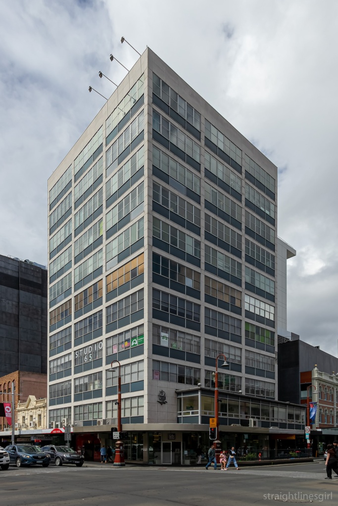
It was designed by Philp Lighton Floyd and Beattie for MLC. I had to google ‘MLC’ as I’m not sure what it stands for (other than knowing it’s easily confused with CLM, whose building on the corner of Macquarie and Elizabeth Street was where we saw a ghost sign on Saturday). I suspected the words “mutual” and “life” might make an appearance and, indeed, MLC was once known as Mutual Life & Citizens Assurance Company Limited.
The building was constructed in two stages, with the first five storeys built (according to my records) in 1958, which means it pre-dates the library. The remaining floors were added in about 1977.
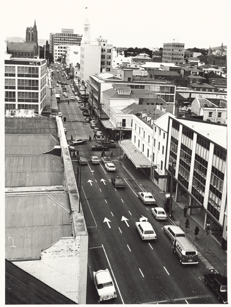
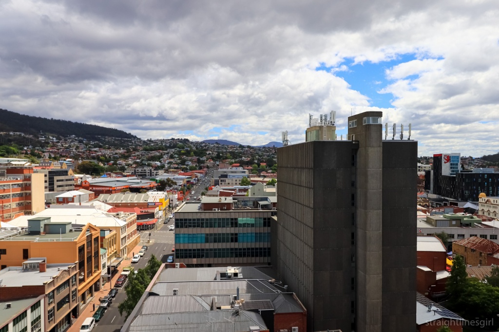
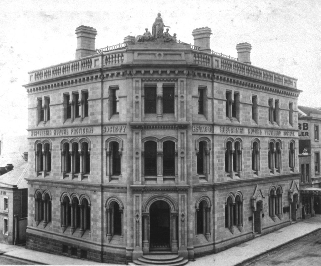
I found the above photo in the library, which shows what the MLC building looked like before the top floors were added. (It looks like it might have been taken from the library.) There are a few other buildings in Hobart where this approach was taken. What is now Construction House in Bathurst Street and former 34 Davey Street are two that come to mind.
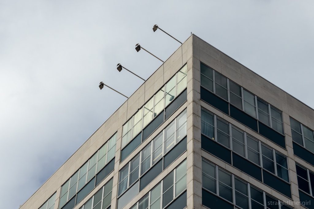
I was lucky to have had a tour of this building through Open House in 2018, which took in the view of the city from the roof.
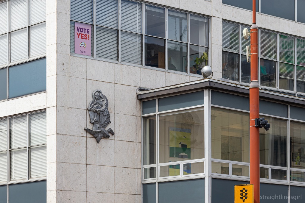
The building also has this interesting extension on the first floor, which I think Bronwen said was part of the original design. And of course, the obligatory relief sculpture to show MLC’s care for their customers.
Further along Murray Street is Jaffa House, which wasn’t on our official list of stops but we stopped there anyway.
It was designed by Jim Moon of Bush Parkes Shugg and Moon, and built in 1971-72. It was originally the Savings Bank of Tasmania headquarters, and is known as Jaffa because of its colour.
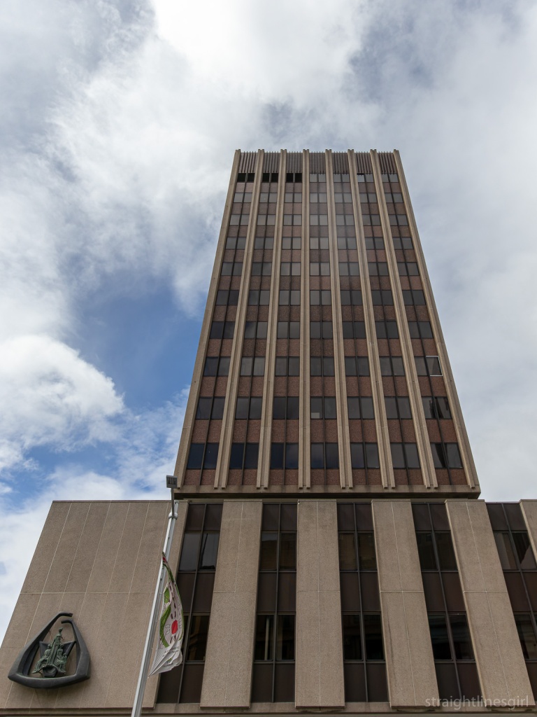
Our next stop was AMP House on the corner of Collins and Elizabeth Street. It will always be AMP to me, never NAB, despite what the sign on the side says.
It was designed by Richard Crawford of Crawford Shurman Wegman Architects and competed in 1968.
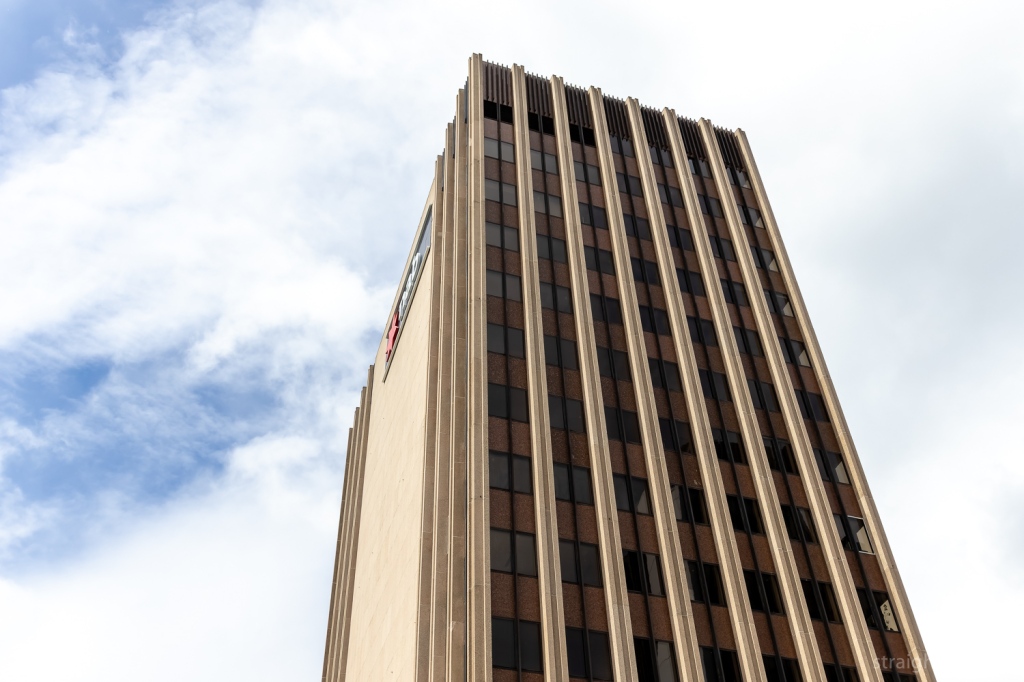
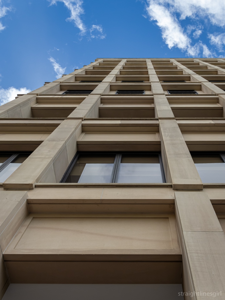
This is a delightful building that can almost be seen in two parts: the tower and the podium on which it sits. I’ve often thought that the podium by itself would make a lovely small brutalist building.
You can see the relationships between the tower and the podium more clearly from higher up, like in this photo I made from the roof on the neighbouring CML Building during Open House 2018. (I did a lot of rooftops that year!)
AMP is the Australian Mutual Provident Society, and it had a small office building on this site prior to 1881, when its new building was constructed.
This building was extended and had another floor added in 1913. Bronwen said that in the 1960s, AMP decided it wanted to own the tallest building in Hobart, so it had the 1881 building demolished and replaced with the current one. One of the archways from the old building is now located in the Botanical Gardens.
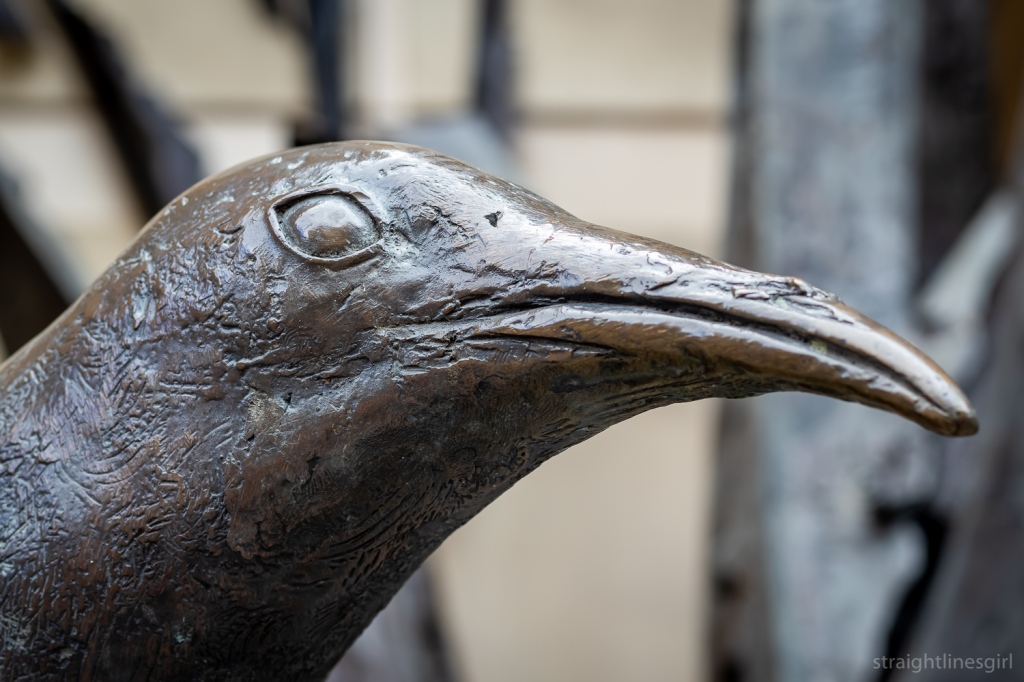
The facade features the Tom Bass relief sculpture “Amicus certus in re incerta – A sure friend in an uncertain event”, which is similar to the one on the side of Sydney’s AMP building. This one has a stylised map of Tasmania in the centre of arms encircling the Goddess of Plenty watching over the father, mother and child.
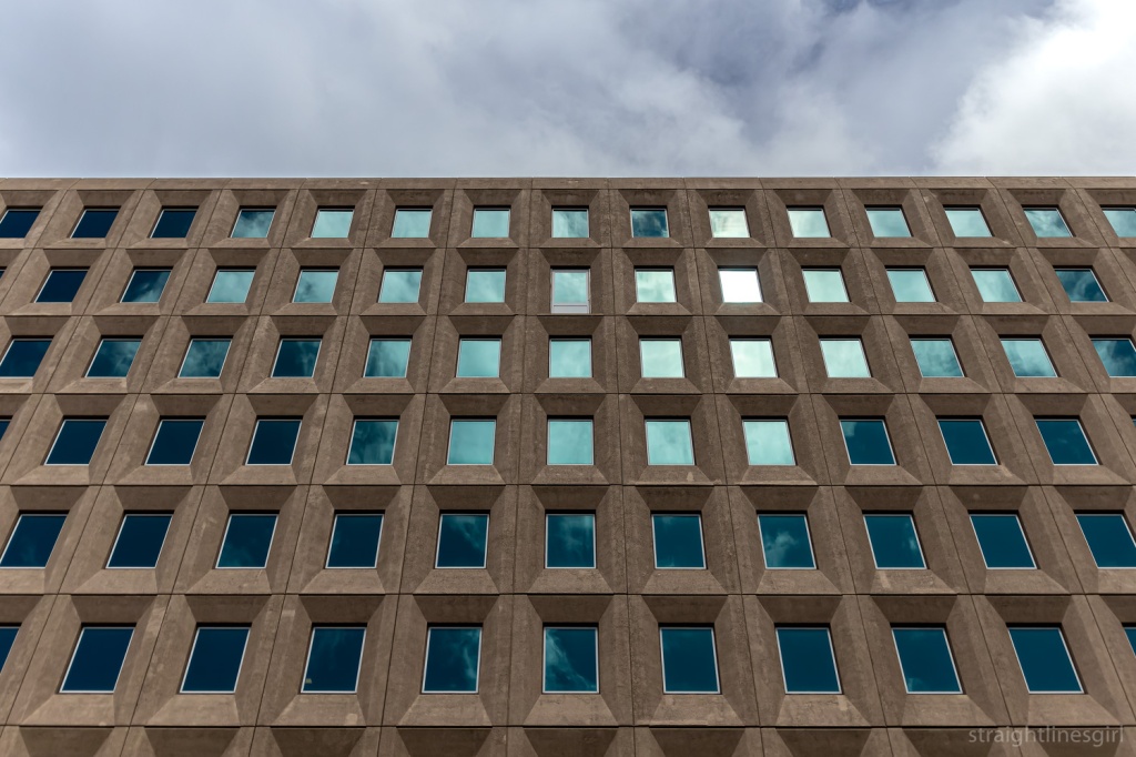
Just around the corner on Macquarie Street, is the Reserve Bank Building, which we learned about on a 2020 Open House walking tour.
This building was completed in 1978, and Bronwen noted its recessed corners. (She loves recessed corners and pointed them out everywhere we went). What I remember about this building is that they wanted to keep it simple and inexpensive because money was tight at the time, and it wouldn’t have been a good look for the government to go splashing cash around for a fancy new bank building.
It was awarded the ‘Enduring Architecture Award’ at the 2012 Tasmanian Architecture Awards.
Bronwen pointed out the recessed area to the left of the building that was kept aside for the public artwork, which in this case is Stephen Walker’s wonderful Antarctic Tableau.
Our final stop was the fabulous Lands Building in the next block.
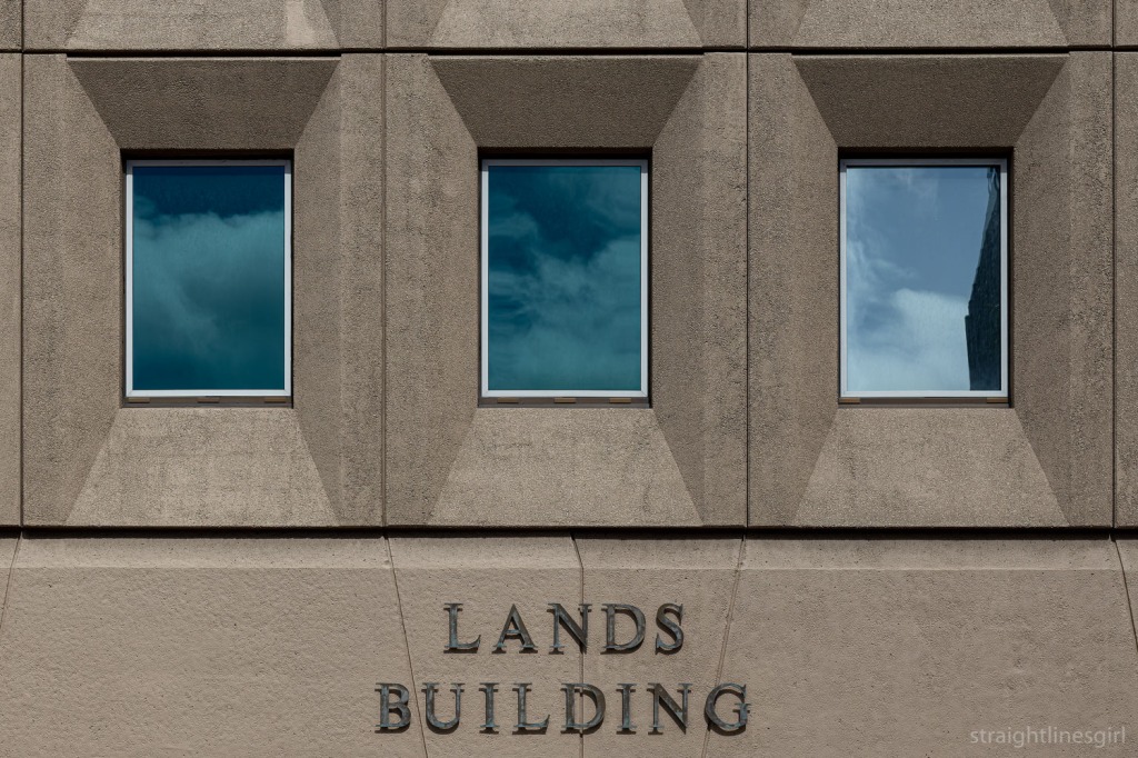
It’s a very neat symmetrical design with some kind of escape hatch on the second to top floor that no one has ever been able to explain. (Look closely!)
Another example from the 1970s (1976, I believe), it is, like other brutalist structures, grounded and earthy, which, Bronwen observed, seems appropriate for something called the Lands Building.
I think it could be taller.
And that was the end of the tour.
It was great to meet someone who loves these buildings so much, and I agree with Bronwen that we need to find out more about them. I’m certainly enjoying uncovering their history from random places, but often all I can find is little snippets, as there isn’t a lot of readily available information about many of these buildings. It’s fun to search though! There are many rabbit holes . . .
Before we left, Bronwen asked if there was any interest in more tours of other modernist buildings and the answer was a very enthusiastic ‘yes’, so hopefully next year we’ll see her again.
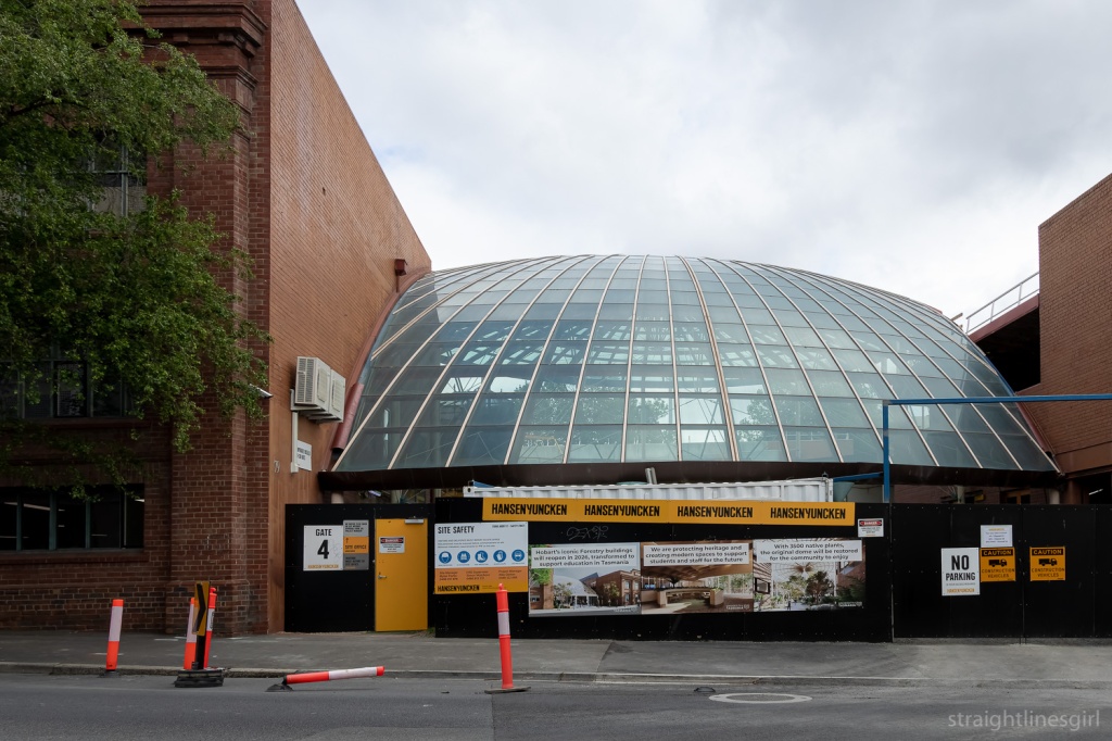
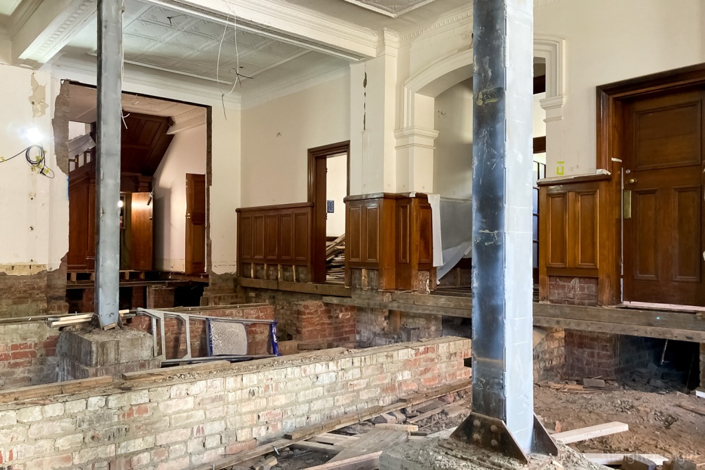
Our second major tour of Open House Hobart weekend was the former Forestry Tasmania headquarters in Melville Street. The site is now owned by the University of Tasmania and is currently being redeveloped as a university building. This development spans from Melville Street to what was Freedom furniture in Brisbane Street.
It’s the focus of much controversy at the moment, due to the university’s proposed move from its Sandy Bay campus into the city.
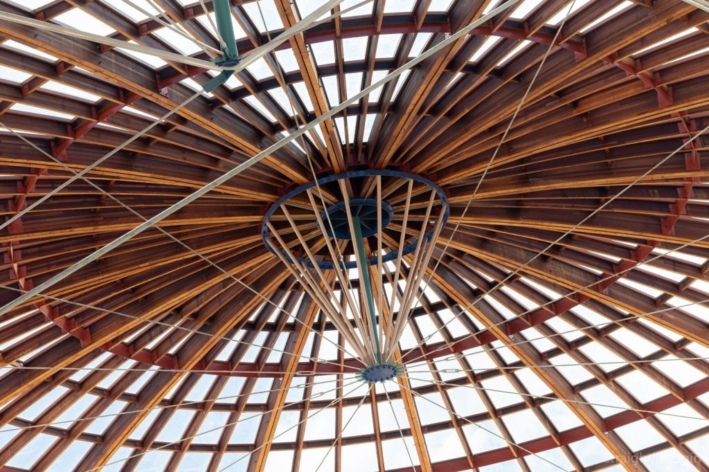
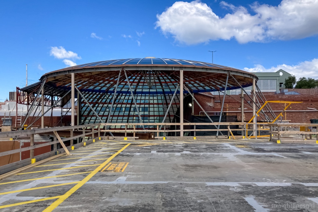
The Melville Street frontage includes two older buildings connected by what is known as the “Forestry Dome”, designed by Robert Morris-Nunn in 1997, to enclose a courtyard on the site. The two buildings it linked were heritage listed but the dome itself, which housed an internal forest, was not.
It received a RAIA Tasmania award for recycled buildings, and the Colourbond Steel in Architecture Award in 1998, and was a finalist in the National Architecture Awards.
Hobart Council approved an application from Tasmania Police in 2018 to demolish the dome for their new headquarters. It was reported that many councillors didn’t support that development and only approved it because there were no grounds in the planning scheme to reject it. Fortunately for the dome, the work didn’t proceed and somewhere along the line, Utas ended up buying the site.
It’s also now listed on the Heritage Register along with the Crisp and Gunn offices and workshop at 79-83 Melville Street.
So the Dome is secure.
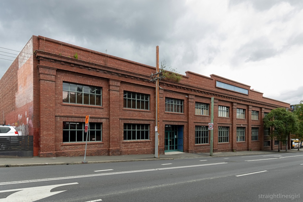
The site was constructed in the 1920s, replacing an older Crisp and Gunn facility from the early 1900s that burned down in 1922.
Ernest and Frederick Crisp went into partnership with John and Thomas Gunn’s southern interests in 1908. This was just one of their sites, the partnership having many building interests around Hobart, including seven timber stores, a timber yard in Derwent Park, and brickworks at Knocklofty (the Gunns originally having been bricklayers by trade).
Over this site, which extended through to Brisbane Street, there was an office building, joinery factory, ironmongery, paint and glass stores and a timber mill. The complex was built by William Cooper and Sons, one of Hobart’s best-known building and architecture families. (See here for more information, and also THR12028 Provisional entry – Datasheet and CPR – Crisp & Gunn offices and workshop, and Forestry Tasmania dome at Heritage Tasmania.
The mill and store on Brisbane Street were demolished in the 1990s. Most recently, that side of the site had been occupied by Freedom Furniture.
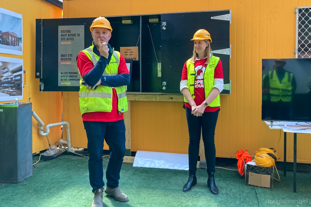
We were shown around the site by Pheobe from Woods Bagot, designers of the redevelopment, and Alex, Hunsen Yuncken’s project manager.
Alex observed that one of the main challenges of the site is the eight level difference between the Brisbane Street side, where there was a two-storey underground car park connected to Freedom Furniture, and the structures on Melville Street. So there is a lot of earth moving to do, and this has to take place without removing the structures that they’re retaining.
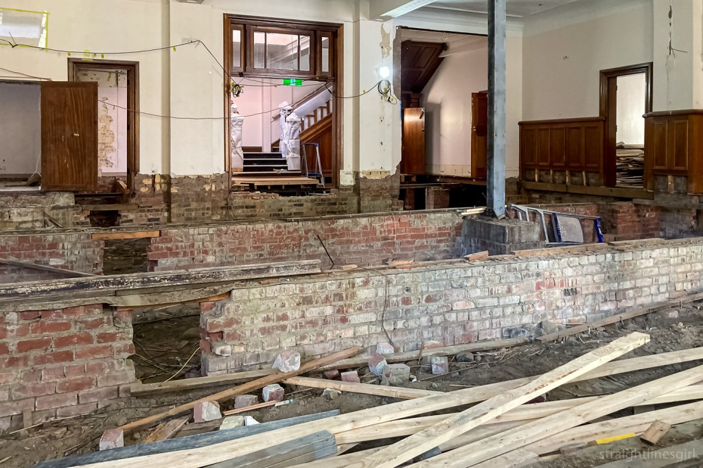
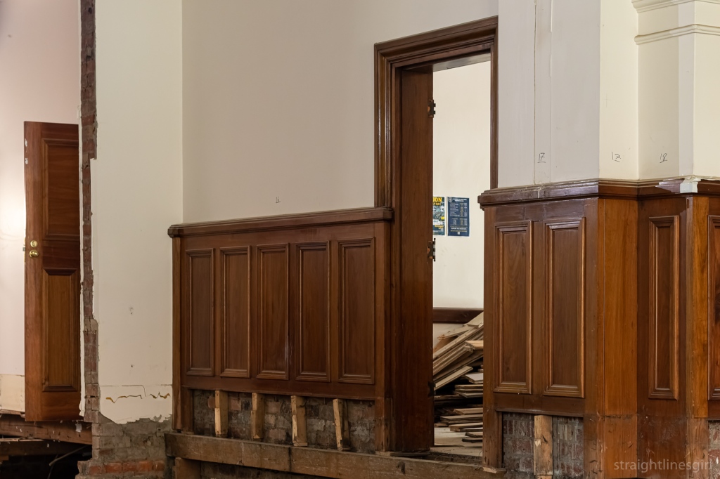
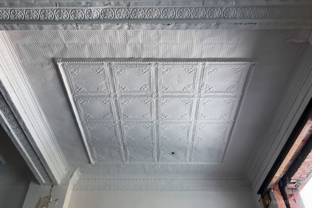
We looked through the deconstruction of the office building first. This is the smaller of the two Melville Street buildings, on the Elizabeth Street end.
We heard about the work they’re doing to retain a lot of the lovely timber in there, including a beautiful blackwood staircase. I think they said this will be the main office area for academic staff and others.
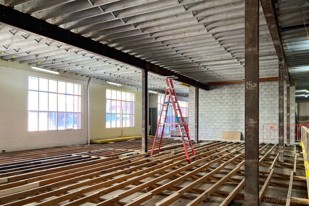
The warehouse side of the site, closest to Murray Street, will be the main teaching and learning space, and at this stage it’s hard to envisage what it will look like after it’s all completed. Phoebe said the focus will be away from lecture theatres and more on smaller learning spaces for collaborative group work and face to face learning.
Making our way to the Brisbane Street side of the site, we got a different perspective on the dome.

The work on the Brisbane Street side of the site is also incorporating stormwater upgrades. Alex explained the existing convict-built infrastructure can’t cope with more frequent storms of increased intensity so a lot of the disruption to this street has been because they’ve had to do this work at the same time as the redevelopment.
It was an interesting visit and an opportunity to see a site that won’t be fully open for another two years. And no matter what else happens, it’s a big win that the dome is going to be restored and re-forested.
Thank you Alex, Phoebe and Open House for giving us the opportunity to see this work up close. I’ve often passed by and wondered what it all looked like inside so it’s great to finally know.
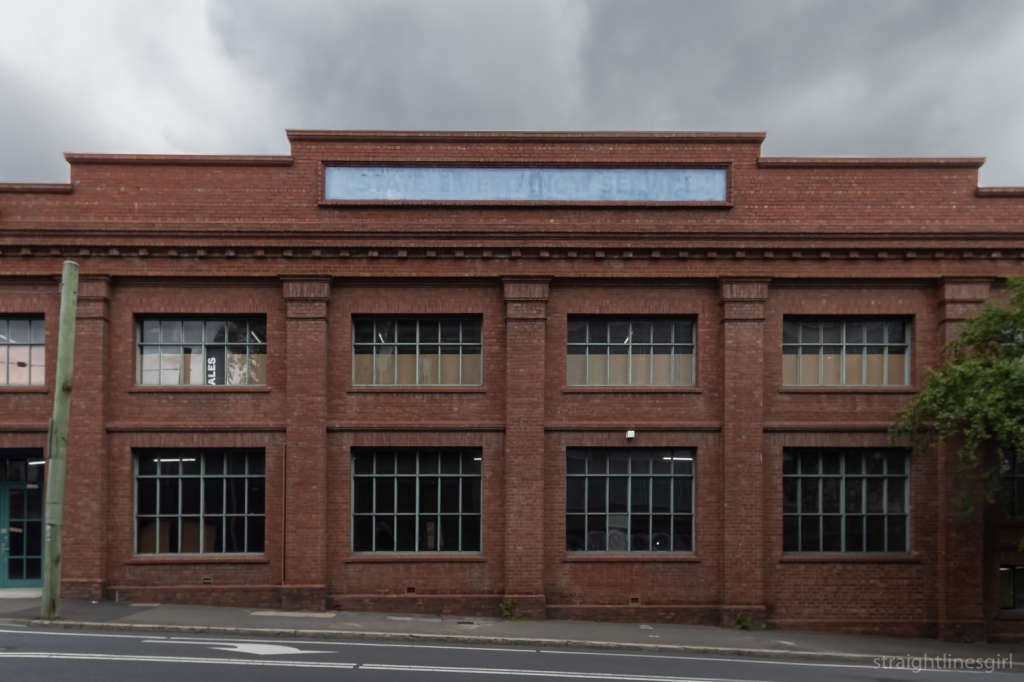
And I can’t be the only one who’s noticed this ghost sign on the site, hinting at the building’s former use as an SES headquarters between 1971 and 1994, before Forestry Tasmania took it over in 1995.

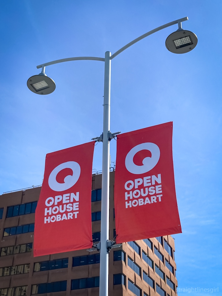
I love November because it’s Open House Hobart time!
This year, Lil Sis and I had a whole weekend of events planned. And to kick things off, on Friday I went to the architectural drawing class, which I wrote about on my other blog.
Our first tour was the Signs of Hobart tour, hosted by Brady Michaels. Brady has undertaken a massive trip around Australia to document signs, both well-known and obscure, before they disappear.
His book Signs of Australia was included in our tour registration.
The tour promised to “reveal the hidden and not-so-hidden secrets of Hobart’s built environment, viewed through the lens of vintage signage, advertising and design”.
It was a one-hour (and a bit because these tours always run over time) walk around Hobart looking at some of the well known and lesser-known signs that adorn our streets, starting with the Gibson Flour Mill in Morrison Street.

Continuing around to Argyle Street, we stopped to look at the Bushells Tea ghost sign, near the replica Mawson Huts. I think this is a fairly well-known ghost sign in Hobart but I didn’t know that these signs dated back to the 1950s, when tea’s mantle as the most popular drink in Australia was being challenged by coffee. Brady said where you find a Bushells sign like this, you are (or would have been) quite likely to find a Robur sign nearby, as it was the other popular brand of tea at the time.
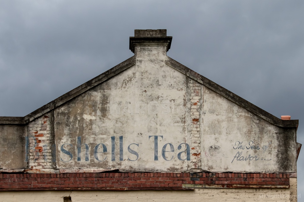
If you look very closely at this sign, there’s another sign underneath the white background, which looks like it might say something like “Wards Customs Ale” but it’s very hard to make out.
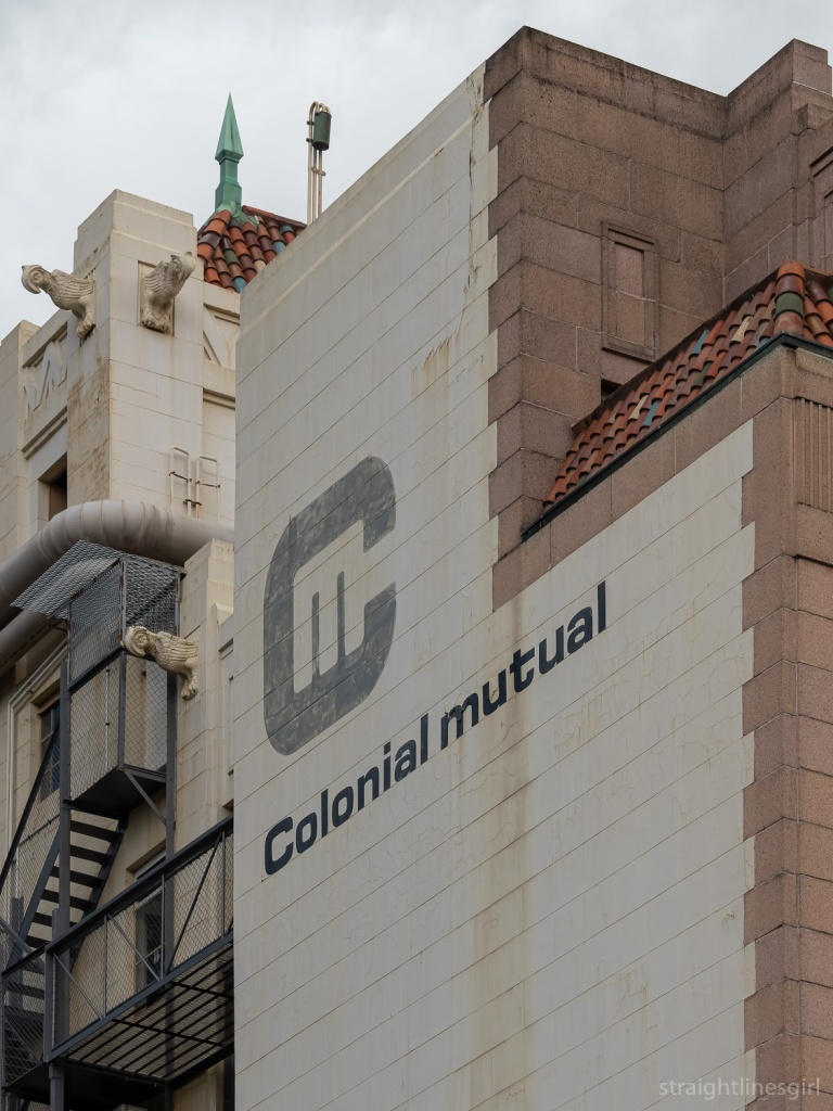
It was a treat to learn that one of our fellow walkers was the son of the sign writer who had made the Bushells sign! So we got an extra tour guide who had personal connections to many of the signs we stopped to look at, including the Colonial Mutual sign in Macquarie Street, which he had done himself.
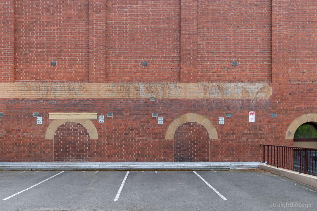
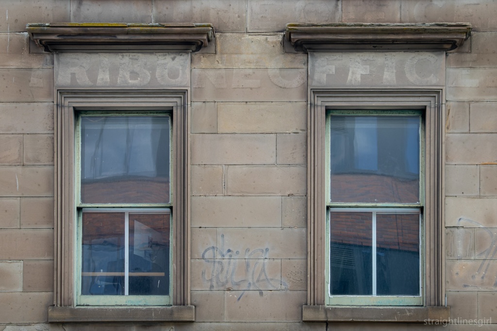
One of the cool signs we stopped by was a ghost sign I discovered a couple of years ago that marks the site of Hobart’s first public library in the Carnegie Building on the corner of Argyle and Davey Street. (This links nicely to one of Sunday’s tours.)
We made our way through the Elizabeth Street Mall stopping to look at some more signs along the way.
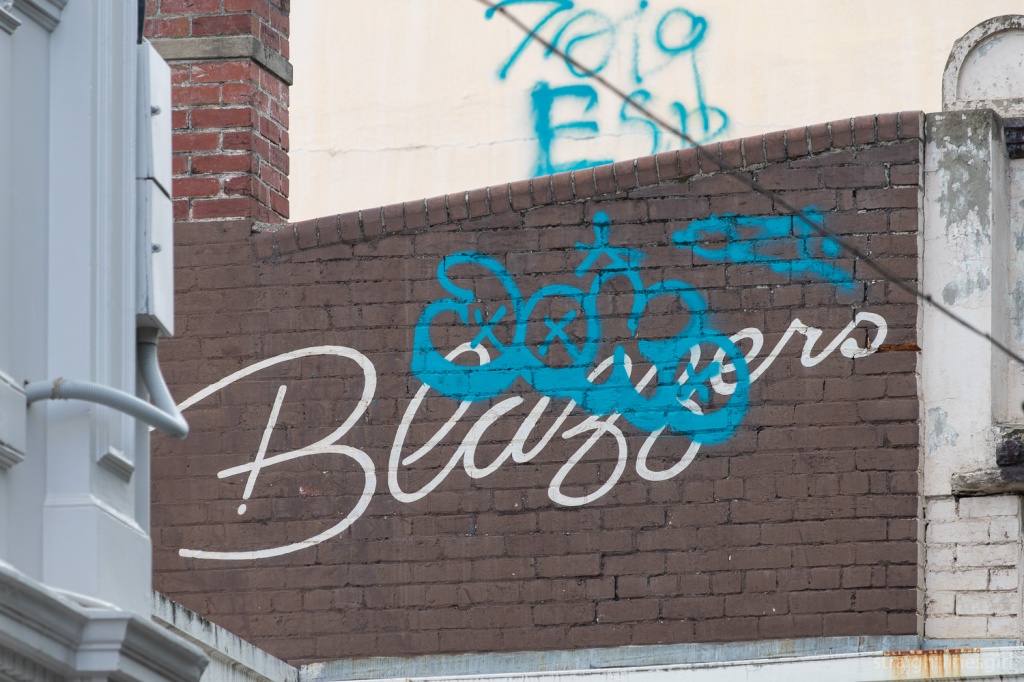
The beauty of tours like this is gaining a new appreciation of signs I already knew about, as well as seeing ones I must have passed by hundreds of times and never noticed, like this “Blazzers” sign. Brady thinks it was a coffee shop but no one remembers it.
Brady noted that a some of the signs have been tagged, which is unfortunate. He said in other places, graffiti artists will leave old signs alone, but that doesn’t seem to be the case in Hobart.
I guess it adds another layer of history to them.
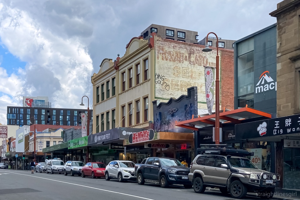
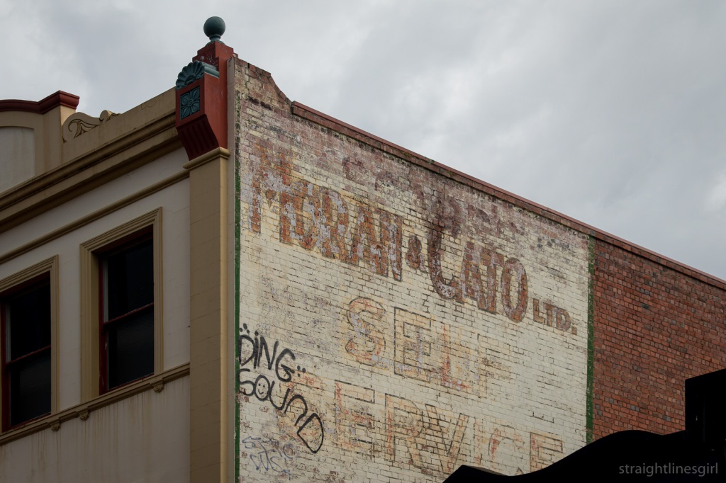
I’d always wondered about “Moran & Cato” from this sign further up Elizabeth Street
It turns out Moran and Cato was a chain of grocery stores established in the late 19th century, with stores across Tasmania in the 20th century competing with Colesworths. It converted most of its stores to self-service in the late 1950s and early 1960s, which gives a clue to the vintage of this sign.
Just down the street from this building is this older ghost sign most likely from the Tasmanian Tribune, which appears to have been the local newspaper from 1872 to 1879.
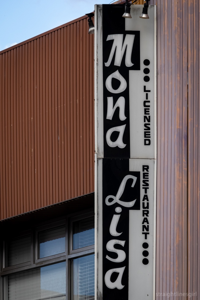
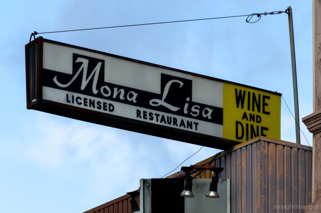
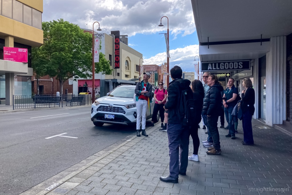
There’s some very cool signs along Liverpool Street, including the old Mona Lisa restaurant, which I’ve heard a lot of people in history groups reminisce about.
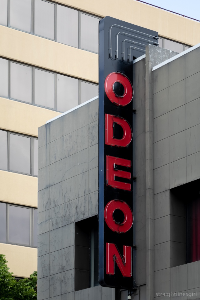
Liverpool Street is also home to the Odeon Theatre, formerly the Strand Picture Theatre, built in 1916.
There are some other interesting signs on Liverpool Street and we stopped here to talk about some of them.
Our signwriter companion knew about this one, which I think he said was for a restaurant.
In the next block is the Zebra Stove Polish sign on sandstone, which isn’t a common surface for painted signs like this one. Brady said it was one of his early discoveries. He said he’d been having a meal in the Shamrock Hotel over the road, looked out the window and there it was.
Apparently, it looks better when it’s raining as the water brings more contrast out.
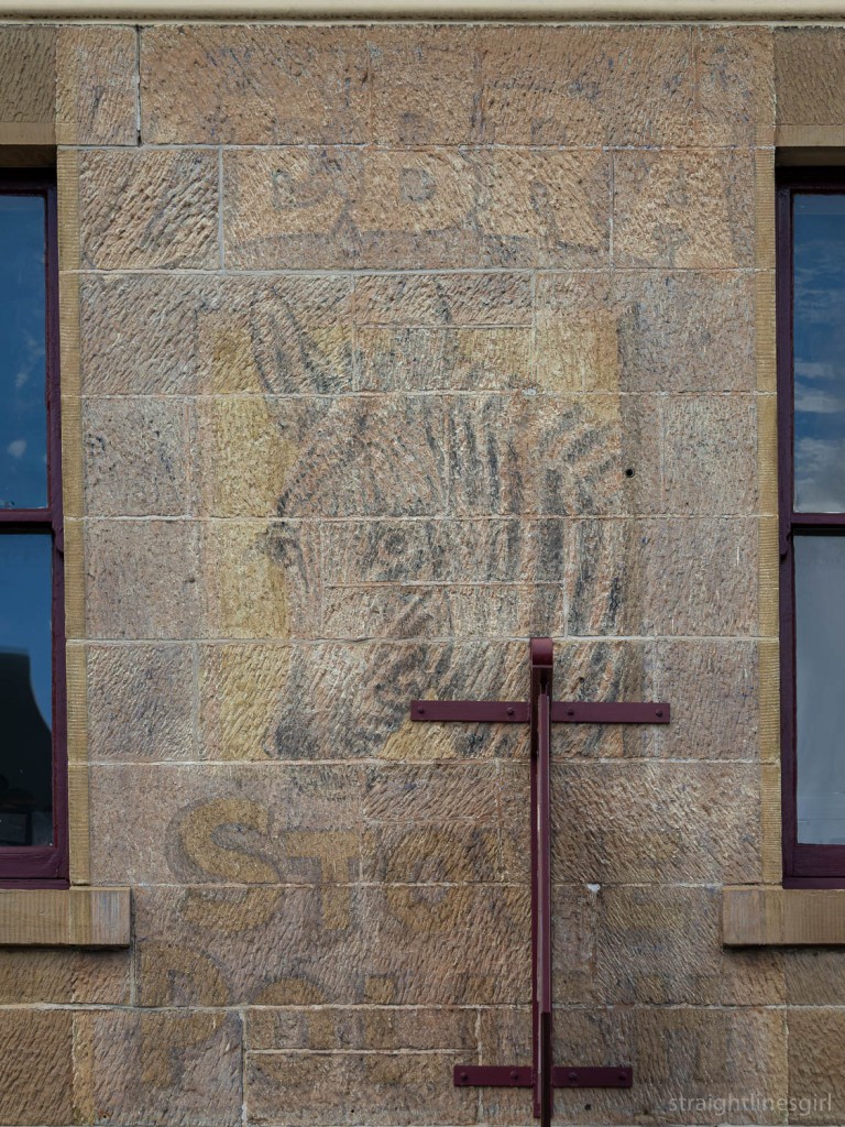
Zebra Stove Polish is, as you might imagine, polish for cast iron stoves
We need to start a campaign to get rid of the metal sign the current business has stuck right in the middle of it!
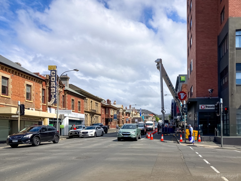
Our final stop was back on Macquarie Street, walking past the former public toilet block near the former Redline Coaches depot in Harrington Street, which someone accurately described as having been “a dump”.
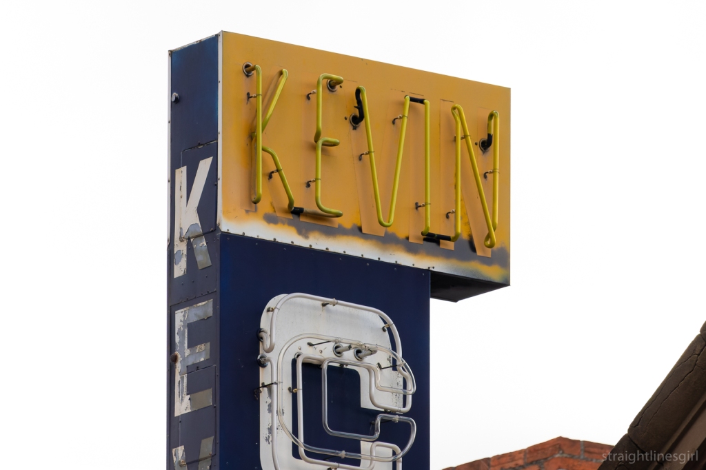
In this area of Macquarie Street, just up from Harrington Street, we had a minor medical precinct. Near the intersection is the Kevin Corby Pharmacy and its fancy neon light, and further up the street is another former pharmacy that used to (from memory) have a huge green and red neon sign that alternated NOW OPEN/24 HOUR or some such. It’s now the Australian Nursing and Midwifery Foundation office.
This one alternated between ‘Corby’ and ‘Chemist’.
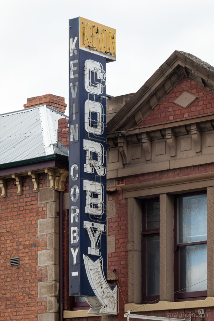
Brady recalled that the Kevin Corby sign was the first neon sign he’d ever seen, coming in to Hobart on evening from the Huon Valley as a kid.
I can remember staying in the Travelodge across the road on a school trip once, so it’s most likely I saw this sign as a young person too, but I don’t have any memories of it from that far back!.
This was the end of the tour but we didn’t quite end there because some of us had to go back with Brady to OHH Central, to pick up our copies of the book.
So we had a chance to take in a couple more signs on the way, including more sandstone on the side of the Royal Tennis Courts, and the former Federal Coffee Palace in Murray Street, which is now Daci and Daci.
It was fitting to end the tour here, since we’d started the morning talking about the competition between tea and coffee in the 1950s.
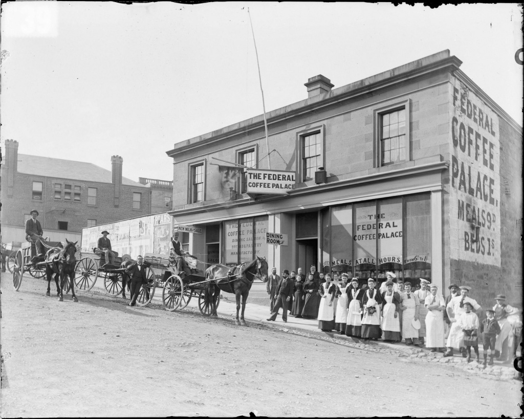
Coffee palaces were introduced by the Temperance movement, as a no-alcohol alternative to pubs, in the late 19th century. But from what I can tell, in Australia, no one drank coffee at that time; they all drank tea, so these establishments actually served tea. It doesn’t sound like they were wildly popular venues, so they didn’t last long and some of them actually ended up becoming hotels.
It was an interesting tour. I hadn’t really thought about it before, but these signs really do tell stories of our past. As the Signs of Australia website says, “They tell us who we are and how we got here, and they preserve a history of commercial sign writing and typography too.”
Thank you, Brady, for sharing your passion for this fascinating part of our history.


Coles Old WorldJohn Vella2004Acrylic paint on board and stainless steel


As a supermarket situated on the edge of a commercial and domestic precinct, this site embodies ideas and experiences related to shopping and home.The abstracted designs of shopping trolleys reference the diverse actual, natural and virtual networks that define our lives. Divided by the stainless steel columns and distorted by the weather, light and your point of view, the painted lines become immersive, organic and elusive entities.


As you might imagine, the work also attracted vandals over the years, and people would sometimes park a shopping trolley in each bay. John says while the vandalism had started to break the work down, it was also “recreating the streetscape in an intuitive way that [he] came to enjoy”.


It reminds me of photos I’ve made of temporary spaces, temporary views, and the fact that the urban environment is in constant change. That’s one of the reasons I love photography: to capture those moments frozen in time because tomorrow the space might be different.

(Additional commentary from an article by John Vella, “Remote Control: Frangibility and the art of bloodletting the permanent“, Copyright John Vella and Litmus Research Initiative, Massey University, New Zealand, 2009.)
I didn’t realise until after I’d got back home from the Sydney trip that there was a companion to the Randwick Art Deco walk for the neighbouring suburb of Coogee.
That’s cool. I have somewhere new to explore next time I’m in the area.
I spent only a couple of hours in Coogee this time. It involved a walk down Coogee Bay Road, fish and chips on the beach, and the return walk up a back road that ended up in St Pauls Street in Randwick.
I was going to explore more the next day but the rain put an end to that idea.


After I’d spent more than an hour with Town Hall House, I wandered around briefly before deciding to call it a day.
First was the entrance to this building in Druitt Street, which was once, according to the real estate website, Australia Post’s central agency warehouse and also a gym operated by Madonna.

And I couldn’t help this photo of the Western Distributor coming off the Sydney Harbour Bridge.

I did come back into the city later in the week, to visit the Art Gallery of NSW.

I wrote about what I saw there on my travel blog.
While I was making my way back to the city, I saw this building from Hyde Park, which I later found out was 201 Elizabeth Street, a 38-storey building that is about to be redeveloped.

In the 1880s, this site was occupied by a five-story tobacco factory, which was demolished in the 1928 for a T&G Building designed by A&K Henderson. At 68 metres, it was the tallest building in Sydney at the time. That building was in turn demolished in 1975, with the current building completed in 1979. (Urbis, 2016)

Walking though the city I was surprised at how many of the older buildings were scaffolded and being redeveloped. I wondered how many of them were featured in the Sydney Modern and Sydney Inter-War walking tours and how many I wouldn’t have been able to see if I had gone looking for them.
One that wasn’t was the Commonwealth Bank building in Pitt Street and Martin Place. This is the building that the Commonwealth Bank used on its money boxes.
It was built in 1916 and was the first fully steel-framed structure in Sydney.

According to Sydney Inter-War, the building had a major addition from 1929-1933 along Pitt Street (not pictured) and again in 1965 along Martin Place, which can be seen at the back of the photo.
That was the end of my Sydney city adventures. I’m happy with what I saw on my two trips into the city, even if some of it was shrouded.
I’m never sure if Sydney actually is a more complicated city than Melbourne, but it seemed to be a lot harder to find buildings in the Sydney books than it had been in Melbourne. It might be that I’m geographically challenged. It’s been more than once I’ve headed off in the opposite direction to where I’m supposed to be going in Sydney, and I would have ended up on the tram back to Circular Quay if I hadn’t looked at the signs on the platform as the tram was arriving.
Sydney racetracks run backwards so maybe everything else there does too!
I suspect it’s more likely to be me though.

When I left off last time, I was walking off the Sydney Harbour Bridge, hoping the scaffolded building I could see (far left of the photo) wasn’t the AMP Building.

The little sandstone-looking building is the Fours Seasons Hotel, which I thought might have appeared in the Sydney Modern book. It doesn’t.

I couldn’t find out much about this building other than it was built in 1982.
Once you get off the bridge, there are a zillion lanes of traffic, and you can take the Cahill Walk back to Circular Quay through The Rocks.

Signs along the way tell about how the expressway was built and how much the area has changed.
Construction on the Cahill Expressway started in 1954, and it was built to divert through traffic away from the CBD. This road doesn’t sound like it has many fans. This article says it’s been described as “doggedly symmetrical, profoundly deadpan, severing the city from the water on a permanent basis, as well as “an eyesore, an unnecessary barrier between the city centre and the harbour foreshore and an inappropriate structure to have at the city’s point of entry”.
It says it is “extremely functional though rather ugly, and in a more environmentally and aesthetically conscious era would never have been allowed to be built”.
Ouch!
According to the signs, the construction took place across much of the “historic heart” of the city and resulted in many houses in The Rocks being demolished.
As you come off the walk, you can stand in the spot that was once Little Essex Street (and before that, Brown Bear Lane), which was demolished in 1954, and see what it would have looked like in 1902.

I made it back to Circular Quay and commenced my search for the AMP Building.
It was built in 1962, designed by Peddle Thorp and Walker. When it was completed, at 115 metres, it because Australia’s tallest building, breaking the height limit restrictions set in 1912. Sydney Modern says it used the precedent of Melbourne’s ICI House to do this. I’m not sure how that went down. Maybe it was “Melbourne broke their height limits so why can’t we, and we can make ours taller so we’ll win at tall buildings”.
I believe (at least in Melbourne’s case) it had something to do with the percentage of the area of the site the building was actually going to cover. So maybe that’s the precedent. For this building, a significant proportion of the site was to be public open space. It’s now a public transport space, which makes it congested and tricky to get around, but open space was the original intention.
I like my answer better.
According to the Cahill Expressway signs, the expressway “modernised the Circular Quay skyline, encouraging the construction of new skyscrapers”, and AMP house was obviously one of them.
As I had reluctantly suspected, it was indeed the scaffolded building.
This is what I saw when I got to 33 Alfred Street.


There’s boards underneath that provide some history of the building and explain what’s happening in the redevelopment (or, as they call it, re-sculpting).

Fortunately, the Tom Bass sculpture is still visible.

This sculpture depicts the goddess of Peace and Plenty, the male figure of Labour and a woman with a child. The AMP’s motto Amicus certus in re uncerta means “a certain friend in uncertain times”. This basic idea is a feature of other AMP buildings, including the one in Hobart.
According to Sydney Modern, the AMP Building is distinct because of its curved facade, “a feature which, along with its height, caused a surprising amount of controversy”.
It also had a roof-top observation deck that was closed when taller buildings came along.
Here’s what it used to look like, and what I’d been hoping to see.

Two out of two misses wasn’t a good start to the day!
I wandered around Circular Quay a bit longer and made the obligatory bridge photo.

I noticed markers on the ground denoting the line of the foreshore prior to settlement and development of the area, reminding me that in the context of this place and its original inhabitants, the Gadigal people of the Eora Nation, what I was looking at was a minuscule faction of its history.

I could try and visualise what the AMP building might have looked like. It seems so small now. It’s hard to imagine it was once the tallest building here.

As I was deciding what to do next, I came across another Tom Bass sculpture on the side of a building, best seen from the adjacent set of steps.

Sydney Modern tells me this was originally on the side of the ICI building that was previously on the site.
Smaller than Melbourne’s ICI building, this was a glass curtain wall building designed by Bates Smart & McCutcheon (who also designed the one in Melbourne), constructed in 1957 and demolished in 1996.
Here’s a picture of the statue in situ. Information on Sydney’s ICI house seems to be a bit lacking because almost every search comes up with the Melbourne building. But here’s an archive photo of it being built.
By now I’d seen enough of Circular Quay and wondered if I wanted to find some more of the buildings in Sydney Modern and its partner, Sydney Inter-War 1915-1940. While I’d covered the Melbourne Mid-Century Modern tour in two days, these two tours were more logistically difficult.
For a start, I don’t know Sydney as well as I know Melbourne and have been known more than once to head off in the opposite direction to where I’m supposed to be. I’m not sure why, but Sydney has this disorienting affect on me. It’s probably something to do with how their horse races run the wrong way.
And there are two tours that overlap in a lot of places and Sydney’s big and I can never find anything . . . and I only went into the CBD for one thing, and I hadn’t seen it yet.
It was time to find what I’d come to see!
Continuing on the Randwick Art Deco Walk, today’s photos are from around Belmore Road, which is the main business area of Randwick.


I’m taking part in Susannah Conway’s August Break photo challenge on Instagram in August. Day 14’s prompt was “Love is . . . “
I wasn’t sure what would most represent this for me, but I spent most of the day sorting out my archive and backlog of photos in my Hobart Street Corners photo project from the past four years, and starting to put them on my website so they have a life beyond Instagram.

I guess spending over four years on a project must mean I love it, right?
I mean, I do. I love the idea of documenting these places and how they change over time, and keeping a long-term record of this.
I can’t say I loved looking at some of the terrible editing I did back in 2018 and 2019 though, and I like to think I’ve improved a bit there. And I do sometimes feel I’ve set myself up to fail with an unnecessarily excessive volume of photos that maybe I don’t love as much as I want to.

I’ve been thinking about this for a while. Where to with the project? What do I want it to be? How can I maintain the love?
I’ve recently looked at collections of photos by Stephen Shore and read his reflections on structuring his images, some of which are street corners. Not that I’m comparing my work to Stephen Shore’s, but his comments rang true for me.
In the 1970s and 1980s Stephen photographed, among other things, city intersections. He talks about how content and structure would guide him to where he would photograph and exactly where to place the camera, but that there was a bigger question: Why this particular intersection on this day, in this light, at this moment? He says thinking about this gave him the experience of deep connection with the content of the picture. (Modern Instances, page 61.)
It would be easy for me to say that the answer to that question is that I simply wanted to record the street corner that I happened to be walking past at this moment in time. It’s the reason for the very first photo from the project in February 2018. I don’t think this is a bad thing. And it’s very easy to do when you’re using an iPhone rather than a view camera like Stephen Shore ended up using for many of photographs. (Have you seen the size of those things?)
(Random aside, I think I read somewhere that Stephen uses an iPhone for some of his images now.)

But even with this reason, I feel like I can only sustain this for so long, before it starts to get same-y and uninspiring. It starts to feel like a chore and I start to seek more from the pictures.
I’m not sure what this might be. I’m not about to run out and get an 8×10 camera to force myself to slow down. This is an iPhone project, and it comes with the many limitations of using that as a camera.
But even just becoming aware, as Stephen started to be when he started shooting with the view camera, of the “continual shifting” of the visual relationships between the elements while walking down a street. “The telephone pole bears an ever changing relationship to a building next to it or behind it, this mailbox changes its relationship to the telephone pole.” These changes we can pay conscious attention to as we walk. (Uncommon Places, page 201.)
As he worked, Stephen would ask, “Where do I stand so that the camera makes sense of the space I can see?” (Modern Instances, page 59.)
The intersection he saw as a three-dimensional problem. Where am I going to stand? Where am I going to cut it off? How much am I going to show? Am I going to wait for a person to stand in or a car to stop? (Uncommon Places, page 201.)
These are things I can pay closer attention to when I’m at an intersection, even if my phone can’t capture all of the detail that a large format camera would.

Bringing more awareness to what I’m including in the image, and why I’m making it at that time (apart from it being on the way to work) might make me slow down and think a bit more. I might make fewer photos but perhaps they’ll be more interesting or insightful.
By slowing down it will take longer for me to make a photograph, which I’ll then post on Instagram to be viewed briefly in someone’s feed. It’s a curious mix. The image maker and the image viewer experience very different things.
As Stephen says of his prints, “I can pay attention to small details, I can see relationships in space that may not reveal themselves immediately, and have all of this inform a picture which is then taken in very quickly by the viewer. So there is a compression of time in the picture: to be there and see everything could take minutes, but it all can be grasped at once on this piece of paper.” (Uncommon Places, page 201.)
But I don’t think this means I shouldn’t slow down, observe elements in place and be more deliberate in my framing. That creates the meaning for me, and that’s what I want to play around with for a while, and see where it takes the project.

