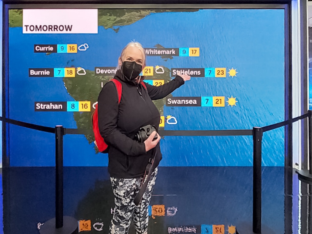
2023 Open House Hobart posts
- Architectural Drawing
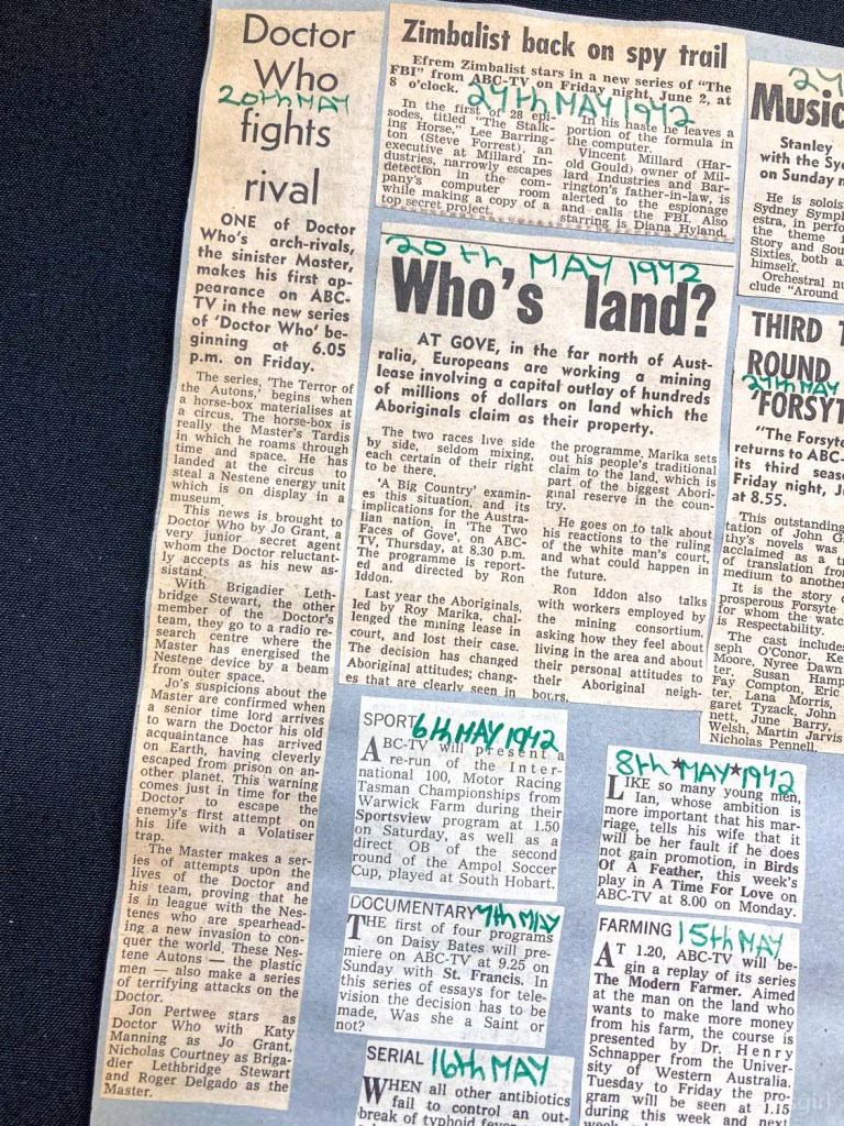
- Signs of Hobart
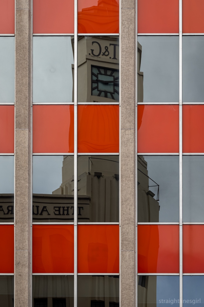
- Crisp & Gunn (The Forestry Dome)
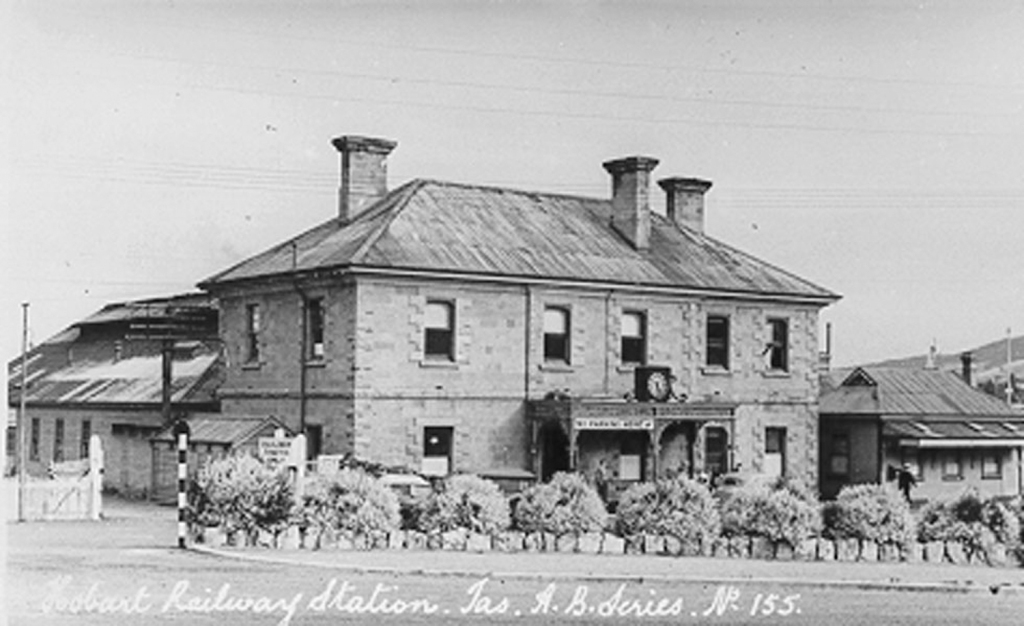
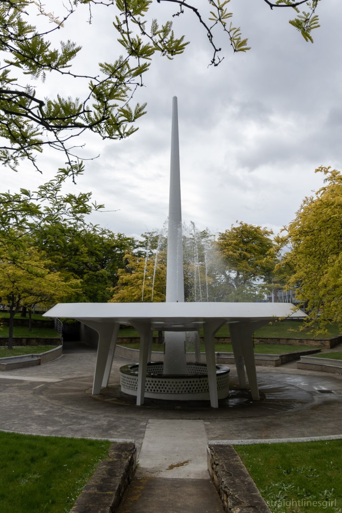
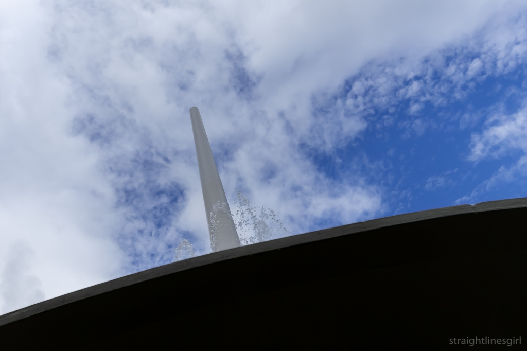
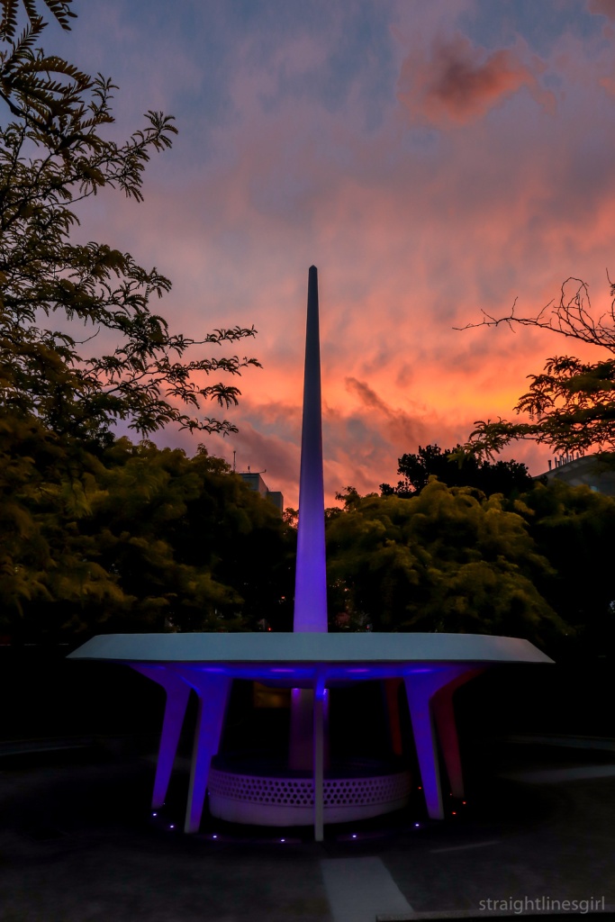
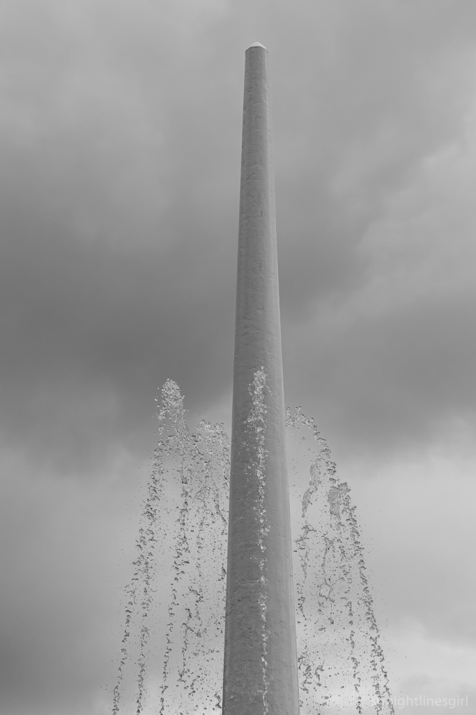
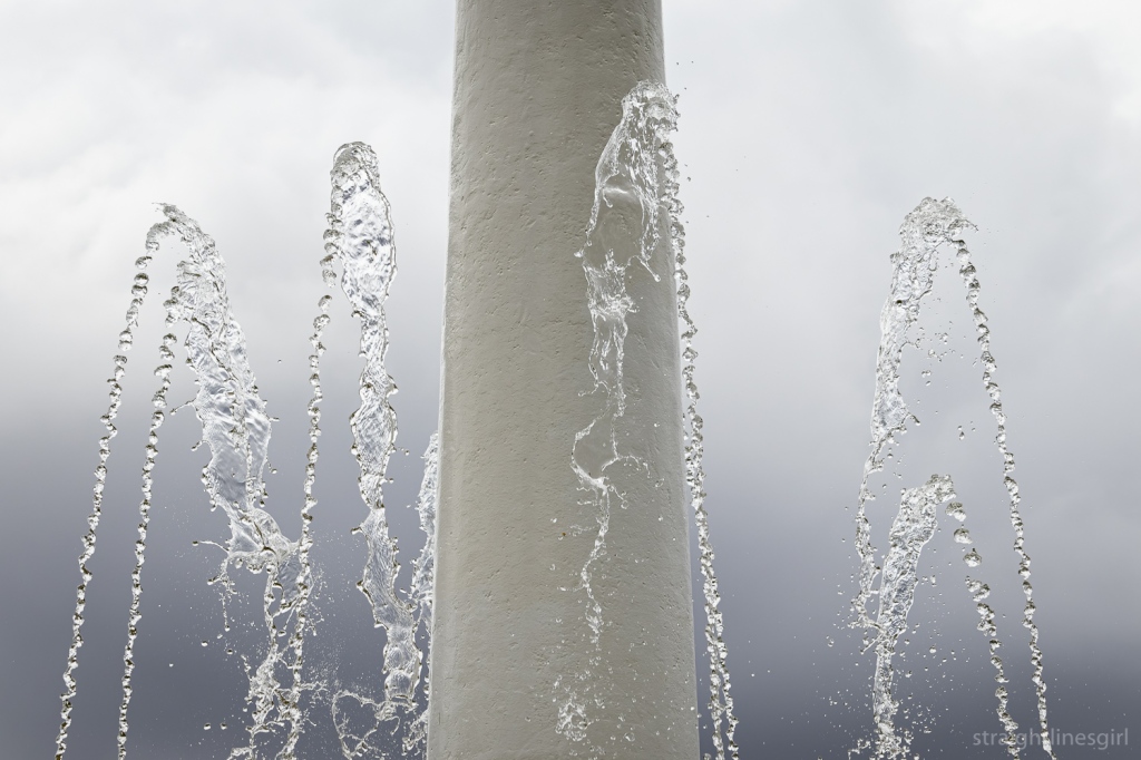
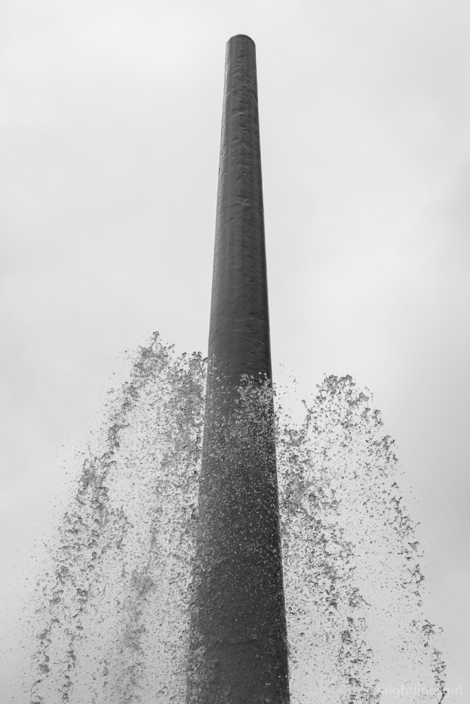
- The Railway Roundabout Fountain
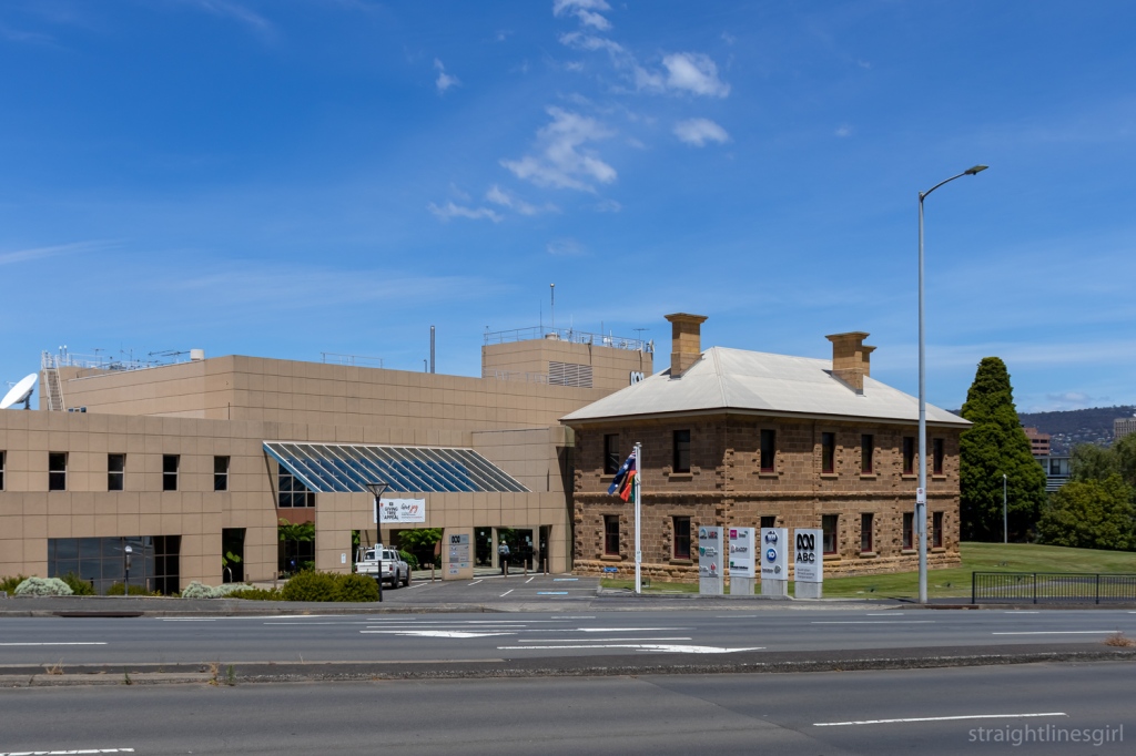
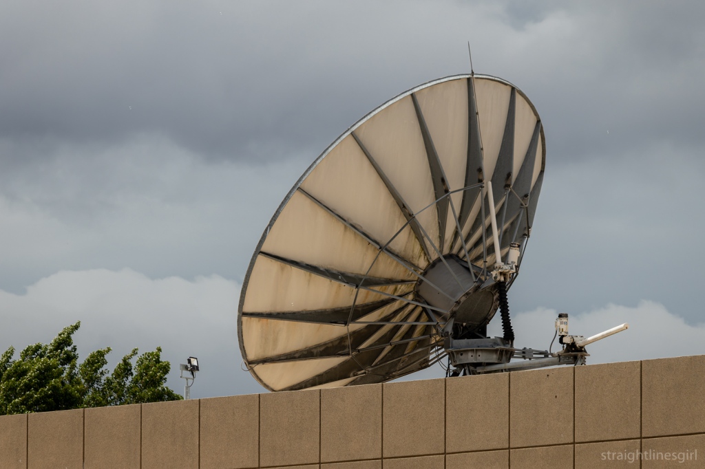
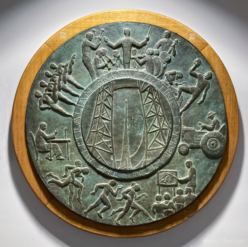
- The ABC Building
- The New Spirit of Modernism (Part 1)
The New Spirit of Modernism (Part 2)
Featured buildings – Former M.L.C Building, Lands Building, and former AMP Building.
Former MLC Building
Leaving the State Library behind, our wonderful guide, Bronwen, led us down Murray Street past “Murray House”, to the corner of Liverpool Street, where we found the former MLC Building.
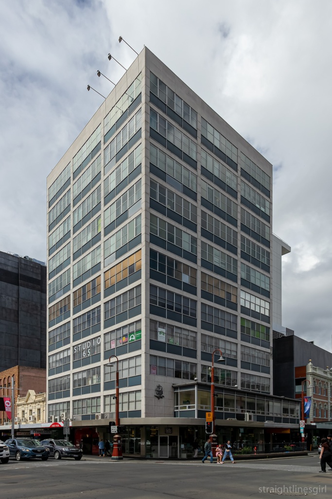
It was designed by Philp Lighton Floyd and Beattie for MLC. I had to google ‘MLC’ as I’m not sure what it stands for (other than knowing it’s easily confused with CLM, whose building on the corner of Macquarie and Elizabeth Street was where we saw a ghost sign on Saturday). I suspected the words “mutual” and “life” might make an appearance and, indeed, MLC was once known as Mutual Life & Citizens Assurance Company Limited.
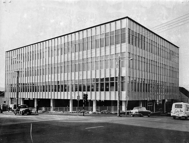
The building was constructed in two stages, with the first five storeys built (according to my records) in 1958, which means it pre-dates the library. The remaining floors were added in about 1977.
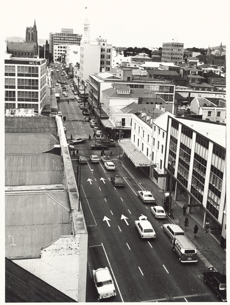
I found the above photo in the library, which shows what the MLC building looked like before the top floors were added. (It looks like it might have been taken from the library.) There are a few other buildings in Hobart where this approach was taken. What is now Construction House in Bathurst Street and former 34 Davey Street are two that come to mind.
I was lucky to have had a tour of this building through Open House in 2018, which took in the view of the city from the roof.
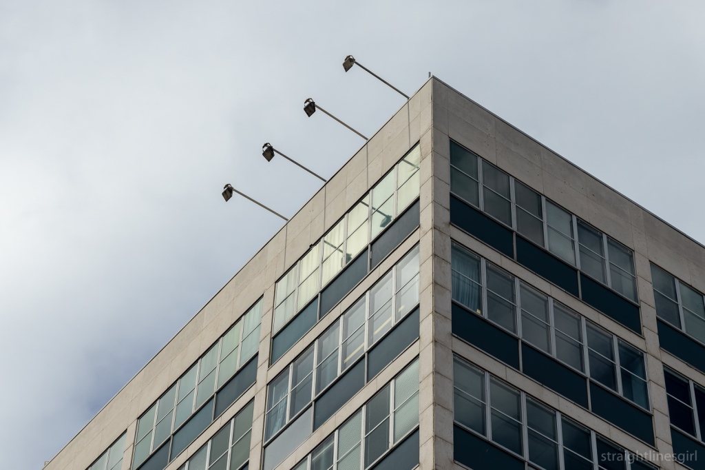
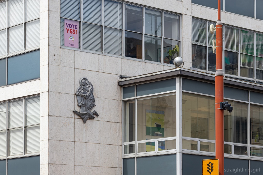
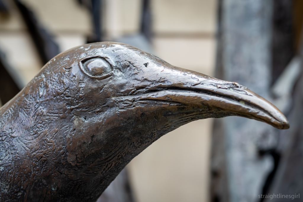
The building also has this interesting extension on the first floor, which I think Bronwen said was part of the original design. And of course, the obligatory relief sculpture to show MLC’s care for their customers.
Jaffa House
Further along Murray Street is Jaffa House, which wasn’t on our official list of stops but we stopped there anyway.
It was designed by Jim Moon of Bush Parkes Shugg and Moon, and built in 1971-72. It was originally the Savings Bank of Tasmania headquarters, and is known as Jaffa because of its colour.
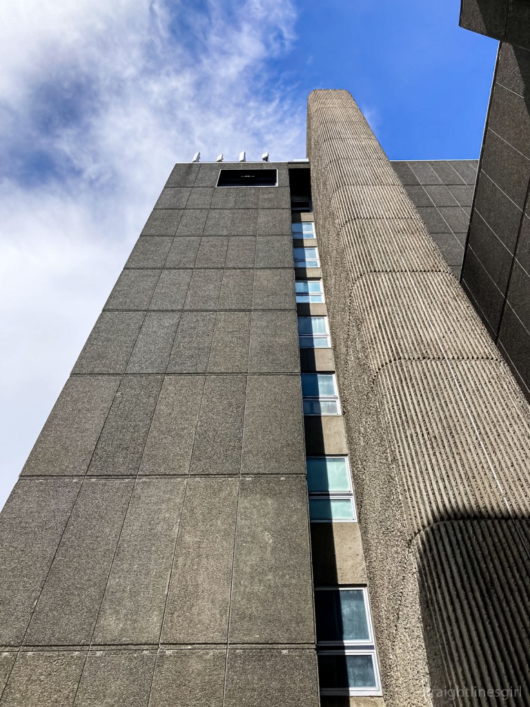
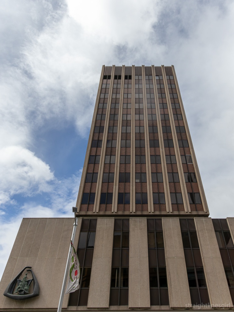
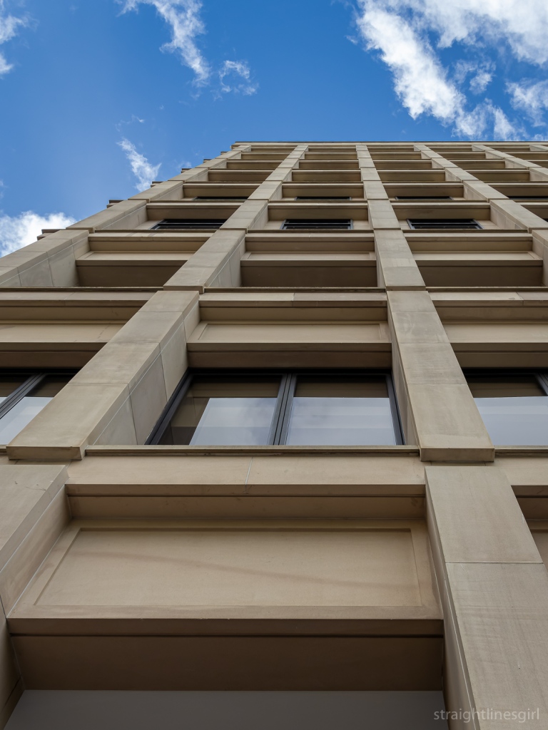
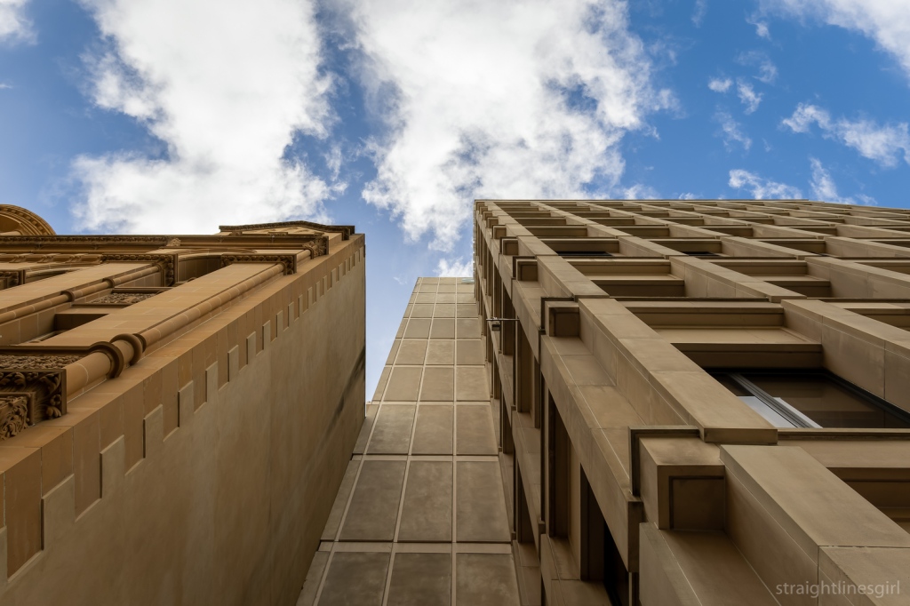
AMP Building
Our next stop was AMP House on the corner of Collins and Elizabeth Street. It will always be AMP to me, never NAB, despite what the sign on the side says.
It was designed by Richard Crawford of Crawford Shurman Wegman Architects and competed in 1968.
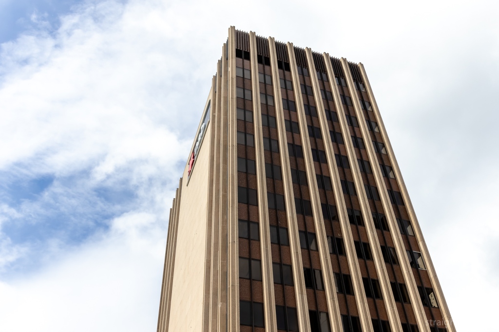
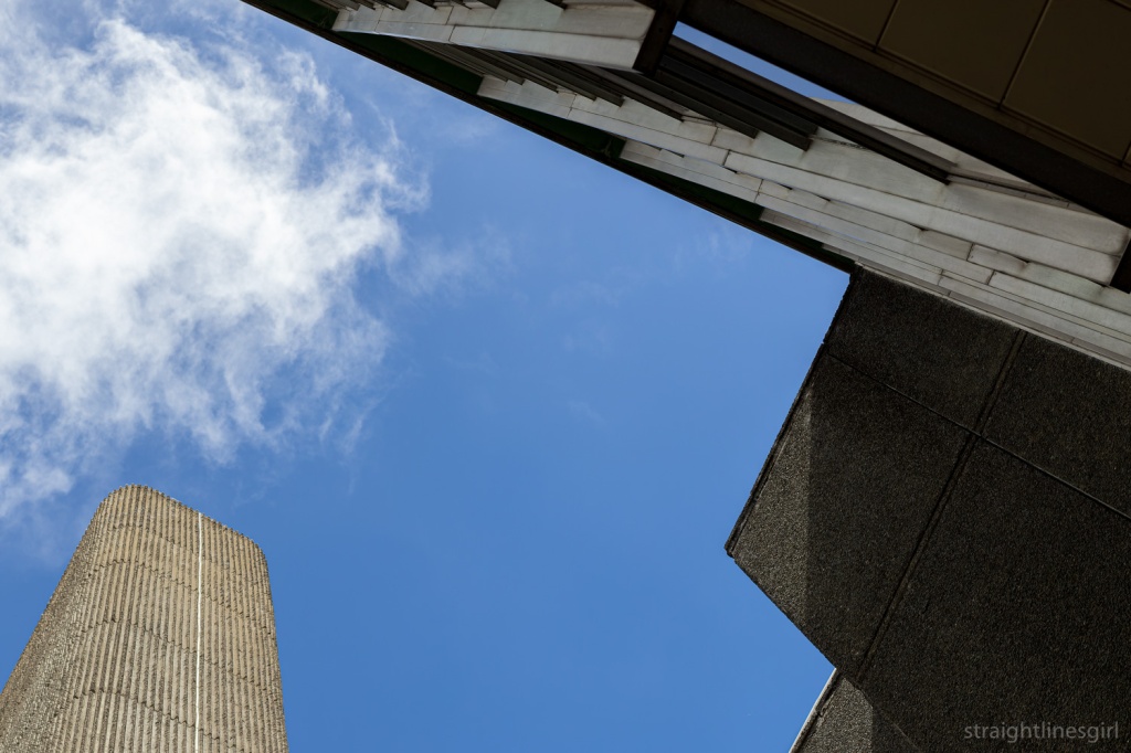
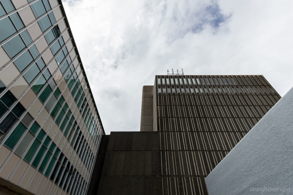
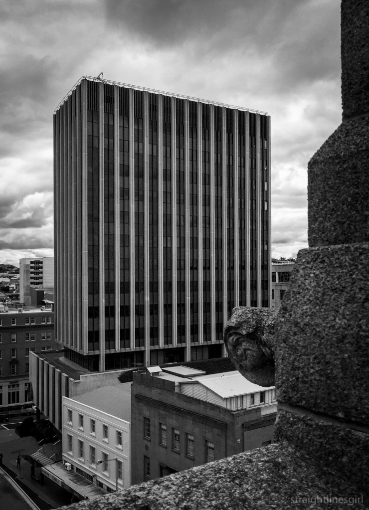
This is a delightful building that can almost be seen in two parts: the tower and the podium on which it sits. I’ve often thought that the podium by itself would make a lovely small brutalist building.
You can see the relationships between the tower and the podium more clearly from higher up, like in this photo I made from the roof on the neighbouring CML Building during Open House 2018. (I did a lot of rooftops that year!)
AMP is the Australian Mutual Provident Society, and it had a small office building on this site prior to 1881, when its new building was constructed.
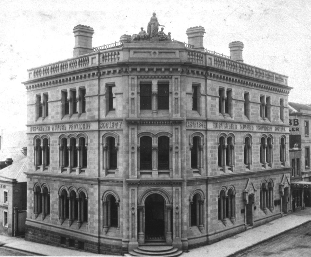
This building was extended and had another floor added in 1913. Bronwen said that in the 1960s, AMP decided it wanted to own the tallest building in Hobart, so it had the 1881 building demolished and replaced with the current one. One of the archways from the old building is now located in the Botanical Gardens.
The facade features the Tom Bass relief sculpture “Amicus certus in re incerta – A sure friend in an uncertain event”, which is similar to the one on the side of Sydney’s AMP building. This one has a stylised map of Tasmania in the centre of arms encircling the Goddess of Plenty watching over the father, mother and child.
Reserve Bank
Just around the corner on Macquarie Street, is the Reserve Bank Building, which we learned about on a 2020 Open House walking tour.
This building was completed in 1978, and Bronwen noted its recessed corners. (She loves recessed corners and pointed them out everywhere we went). What I remember about this building is that they wanted to keep it simple and inexpensive because money was tight at the time, and it wouldn’t have been a good look for the government to go splashing cash around for a fancy new bank building.
It was awarded the ‘Enduring Architecture Award’ at the 2012 Tasmanian Architecture Awards.
Bronwen pointed out the recessed area to the left of the building that was kept aside for the public artwork, which in this case is Stephen Walker’s wonderful Antarctic Tableau.
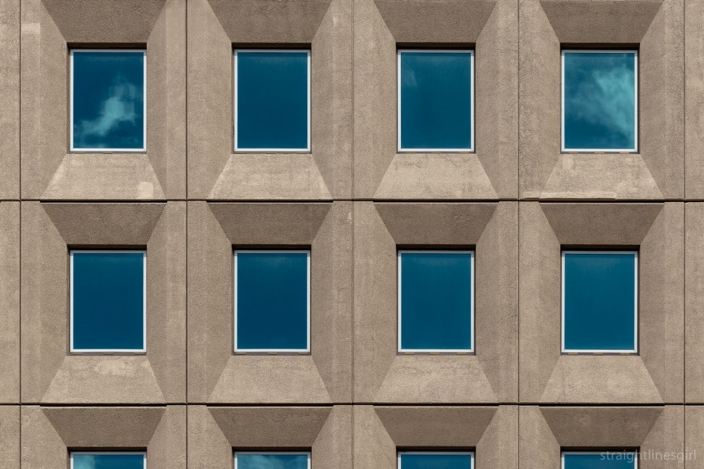
Lands Building
Our final stop was the fabulous Lands Building in the next block.
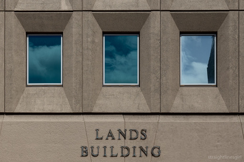
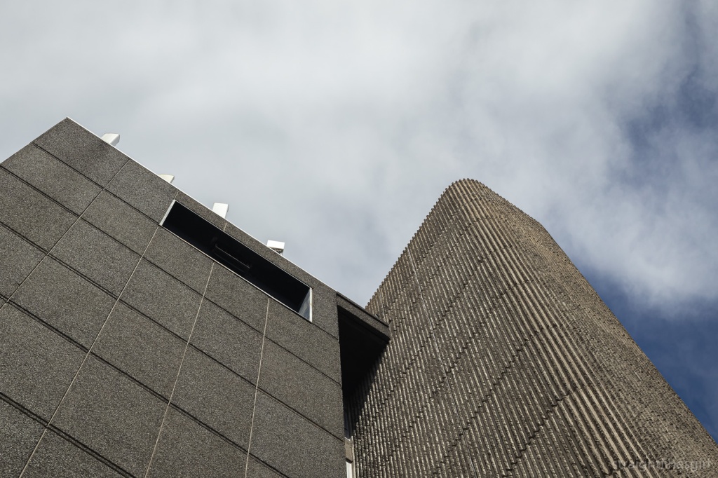
It’s a very neat symmetrical design with some kind of escape hatch on the second to top floor that no one has ever been able to explain. (Look closely!)
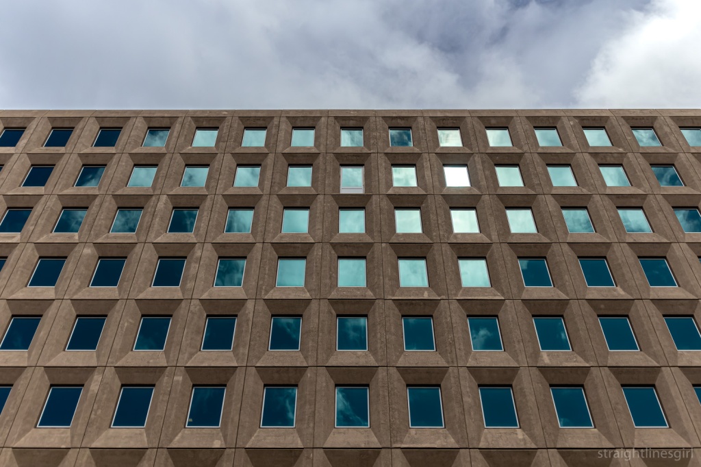
Another example from the 1970s (1976, I believe), it is, like other brutalist structures, grounded and earthy, which, Bronwen observed, seems appropriate for something called the Lands Building.
I think it could be taller.
And that was the end of the tour.
It was great to meet someone who loves these buildings so much, and I agree with Bronwen that we need to find out more about them. I’m certainly enjoying uncovering their history from random places, but often all I can find is little snippets, as there isn’t a lot of readily available information about many of these buildings. It’s fun to search though! There are many rabbit holes . . .
Before we left, Bronwen asked if there was any interest in more tours of other modernist buildings and the answer was a very enthusiastic ‘yes’, so hopefully next year we’ll see her again.