Category Archives: government

open house hobart 2023— the new spirit of modernism (part 1)

2023 Open House Hobart posts

The New Spirit of Modernism (Part 1)

Featured buildings – State Library of Tasmania and The Stack.

If you can’t already tell from the majority of my photos, I’m rather fond of modernist buildings. So I was very excited when I saw there was a modernism walking tour on Open House weekend.

I’d told Lil Sis when we were negotiating the booking system that I didn’t care about anything else as long as I got onto this tour. We had booked onto a modernism tour a couple of years ago and it had been cancelled at the last minute because the architect had broken their toe and couldn’t manage the walk.

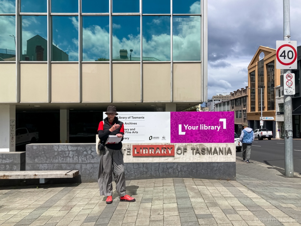
But no such disaster this time, and we met architect Bronwen Jones outside the State Library on Sunday afternoon.

A tall, brutalist building. View is looking up to the sky.
The State Library Stack

Bronwen describes herself as a flâneuse, a female flâneur, the person who walks around the streets, observing urban life. I’ve often felt connected to this term but the one I use more often to describe myself is ‘urban bushwalker’. To my mind, it’s the same thing. Though maybe the original flâneurs walked with a sketchbook and I walk with my camera.

Bronwen is passionate about modernism and observed that, unlike the old sandstone buildings that dominate Tasmania’s landscape, there has been very little research done into these mid-20th century structures. As a result we don’t know a lot about them and there’s a real risk of them being demolished with their stories untold. It’s happened to far too many of these buildings already.

A view looking up at some modernist buildings
Behind the State Library

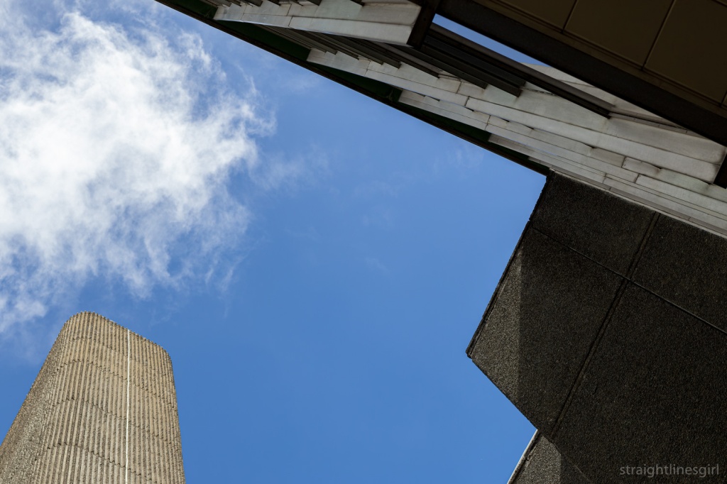
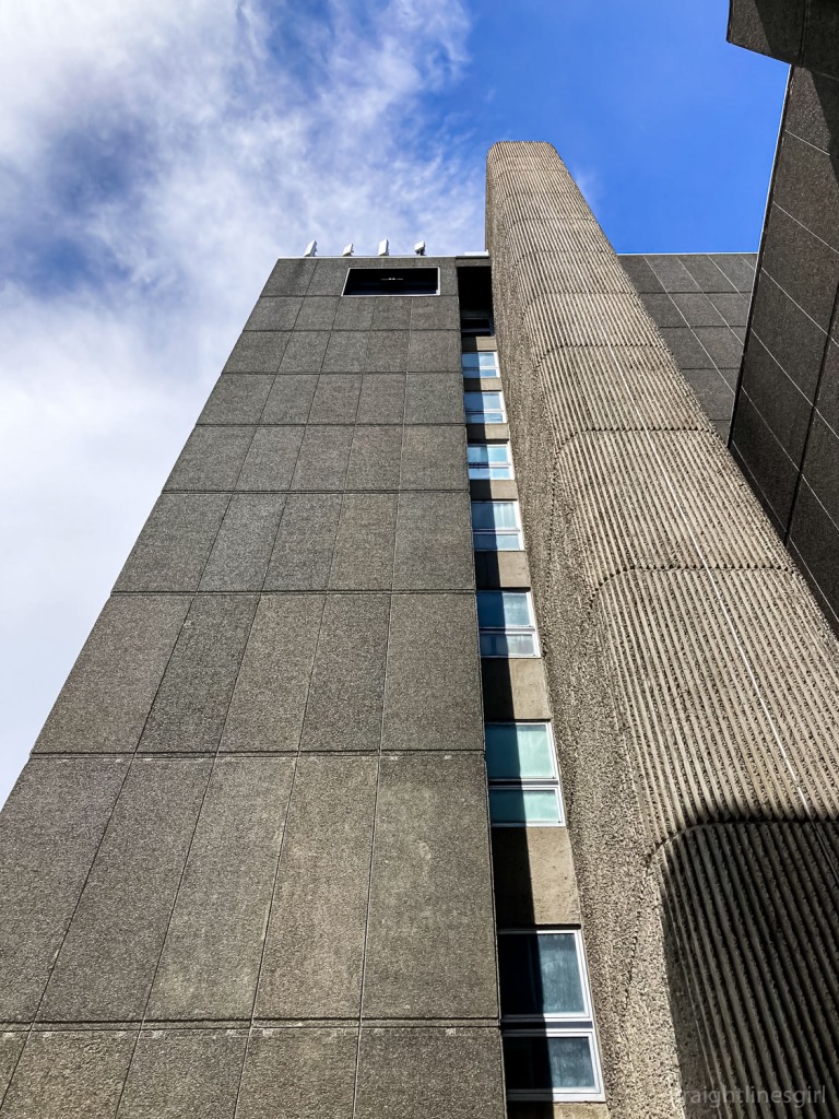
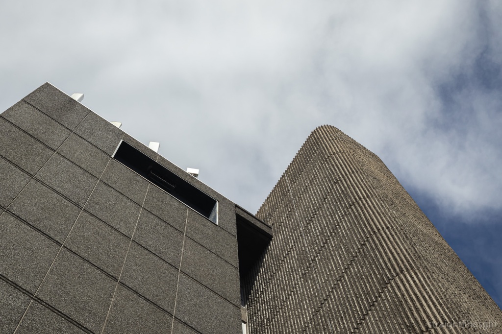
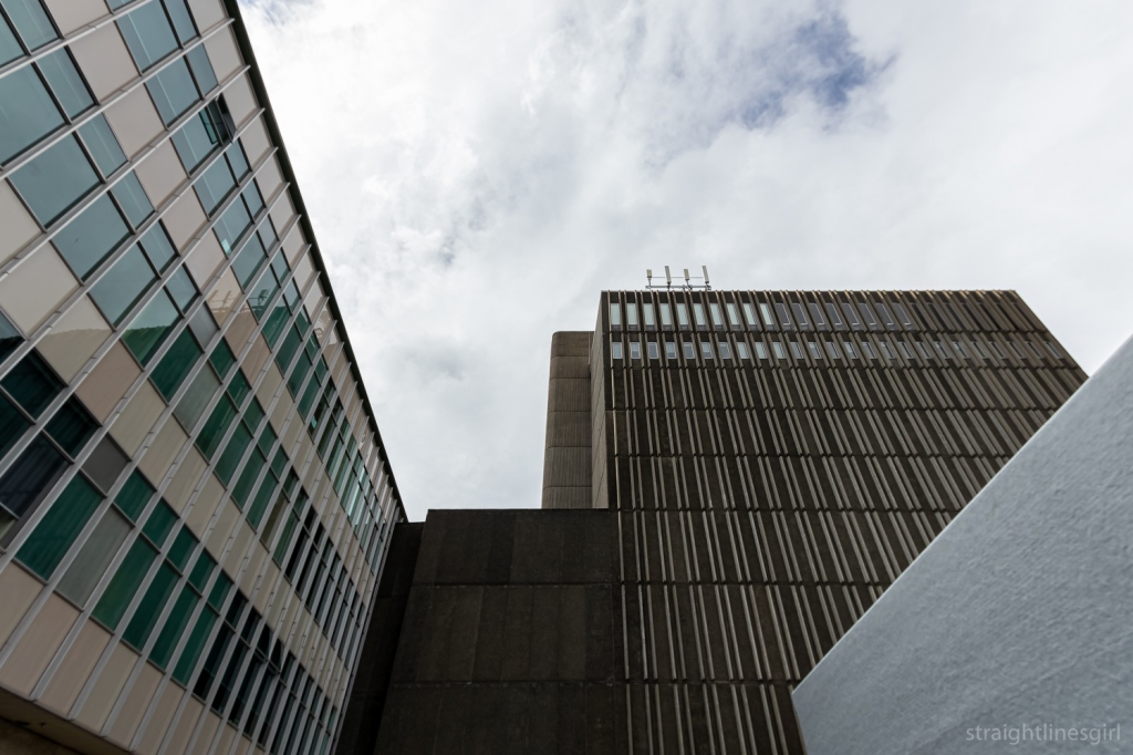
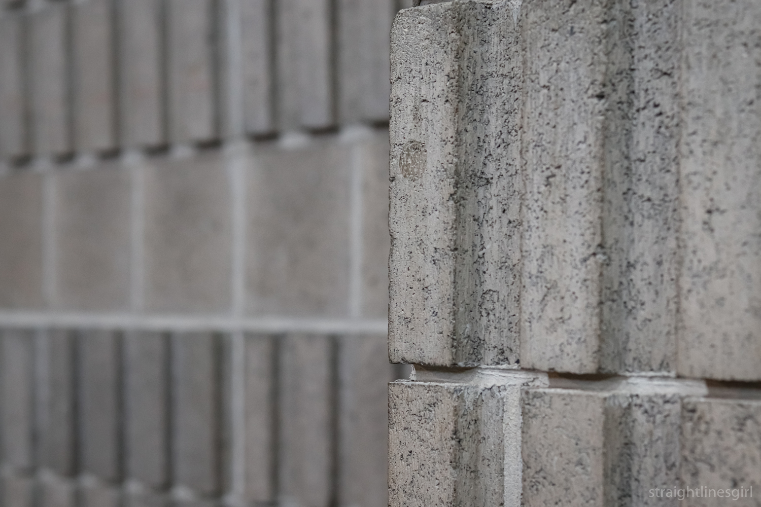
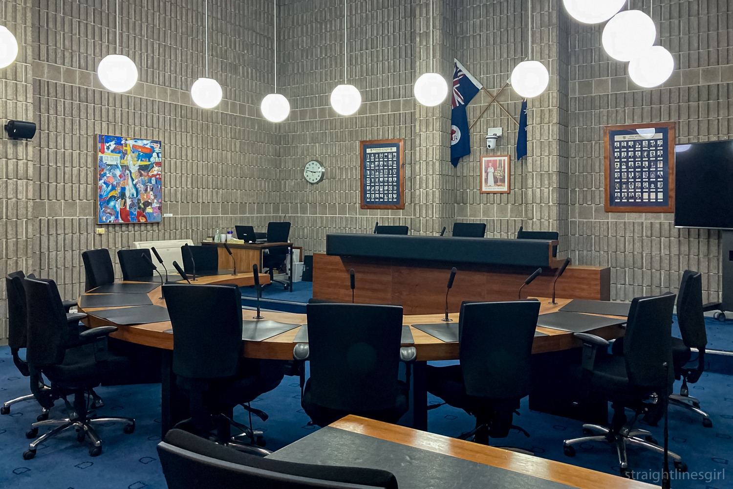
We began our tour at the Stack, the wonderful 1970s brutalist addition to the State Library (which you might recall was originally housed in the Carnegie Building we saw on the Signs of Hobart tour). It’s a most distinctive building, and there’s a video floating round in the archives that shows it being built.

Close up of ragged concrete lines on the side of a building
Stack detail

It took me many years to work out that when an item’s location in the library catalogue said “Stack” it actually meant the item was in this building not, as I’d imagined, that it was sitting in a stack of other books on the floor . . . That only happens in my house. The library would not do this.

Light and shadow on different textured concrete
Textures and shadows of the Stack

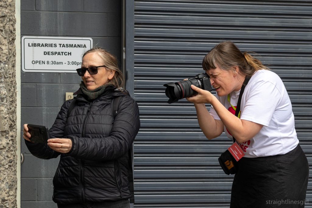
Now that we have that cleared up, we were accompanied on the first part of the tour by Nina, one of Open House’s official photographers, who I’d met at the drawing workshop on Friday.

And at last, finally, several years after she had photographed me photographing a building completely unaware, I got my chance to return the favour. You have to be quick to do this though. She knows exactly what you’re doing most of the time!

A woman in a white t-shirt is photographing a woman in a black jacket who is photographing the side of a building
Nina in action. Lil Sis is possibly aware this is happening

So, back to the Stack.

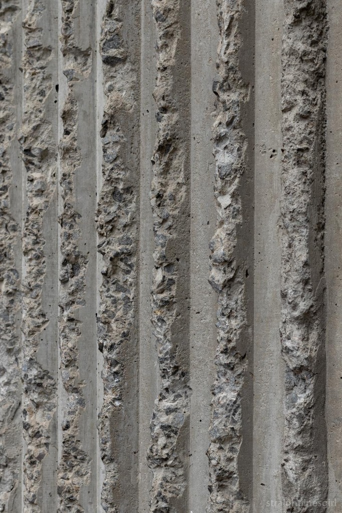
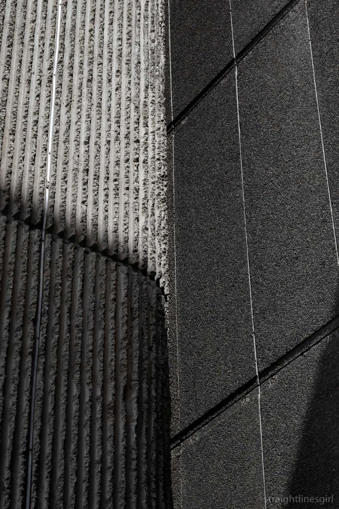
This building is raw, honest and, as Bronwen pointed out, designed with minimal windows to keep all the precious archival records away from the sunlight. She said it was always the intention for this section to be added when the library building was designed in the late 1950s, but it wasn’t completed until around 1971.

Looking up at a concrete building
Minimal windows

The State Library building itself was designed by the Melbourne architect John Scarborough, who also designed the Morris Miller Library at the University. It was opened in 1962.

As we admired this fabulous building, Bronwen spoke about the context within which the modernist buildings came to be. There is much written on this. It was a time following post-war austerity, when architects (and everyone else) were able to travel internationally and bring back new ideas, and new immigration waves of people bringing ideas from their homelands with them. This included new design concepts, new materials like glass, steel and concrete, and new technology, including pre-fabrication.

A woman wearing a red top standing in front of the State Library building, a glass curtain wall with blue panels
Bronwen talking about the design of the State Library

And standardisation. There’s a lot of that. Fin. Glaze. Panel Repeat.

Bronwen said there is a lot of horizontal lines and regularity in these designs, but not necessarily with the axial symmetry you’d see in a Georgian design. The idea is that these buildings are stripped back to the essentials so the form comes through without any ridiculous (my word, not hers) fancy ephemera to distract you.

It fits the concept of “tabular rasa”: sweeping everything clean and starting over (I had to google that because I spelled it wrong). And it’s a very minimalist aesthetic: To achieve the most practically and aesthetically with the least possible means.

The other concept big in modernism was “form follows function” which in its simplest sense means the building should be designed so it can do what it’s meant to do. The Stack is an obvious example of this, I suppose, with its design that excludes the light so the archival artefacts aren’t damaged.

I tried to take notes but it’s impossible to do that and make photos at the same time AND listen to the person talking. (Can anyone tell me what “Groused Harvey” is supposed to mean? I wrote that in my notes and I have no idea!)

Closeup of blue glass curtain wall panels
State Library glass curtain wall

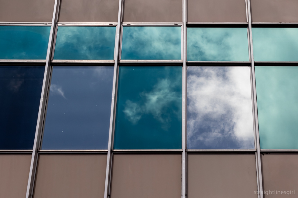
Bronwen spoke about glass curtain walls, of which this is Tasmania’s first example. She noted that this type of wall is non-structural; it is ‘pinned’ to the slabs, which themselves are built on columns which give the structural support. This is unlike older architecture, which is built brick-on-brick, put in a window and keep building. (Reminds me of my Lego days.)

A problem with these structures today is that this is very thin, light glass that was intended to deliver natural light and warmth into the building, accompanied by flexible “shape-shifting interiors” that could easily be altered to the required layouts.

But open plan offices suck (again, my words), and the glass isn’t exactly thermal glass, so it’s not super efficient.

The building, like many others of this era, is elevated, and with so much glass it appears light and weightless, almost like it’s floating, in direct contrast to its grounded heavy neighbour, the Stack. I can’t say I’d ever paid attention but Bronwen pointed out how the building is set back from the street front and it sits at a slightly different angle to the street.

An ols black & white street view of the state library of Tasmania building, a four-story glass curtain facaed
View of the library from the 1960s (Tasmanian Archives PH30-1-2205)

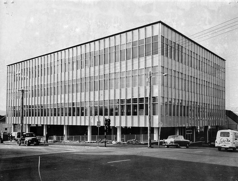
With the building sitting above the ground there is potentially a great public space at street level. It’s a car park, which is not great use of the space, but, as Bronwen said, in this era everything was being designed around the “car is king” principle. (I don’t think much has progressed there . . . though there are shifts that are upsetting car drivers, so there is hope for us urban walkers.)

State Library Bathurst Street facade

After stopping to admire the buildings from Murray Street, we headed down the road for the next stop on the tour.

Looking up at a complex of concrete and glass curtain wall builsings
State Library and the Stack from Murray Street

To be continued . . .

sydney city – the wrap up

After I’d spent more than an hour with Town Hall House, I wandered around briefly before deciding to call it a day.

First was the entrance to this building in Druitt Street, which was once, according to the real estate website, Australia Post’s central agency warehouse and also a gym operated by Madonna.

48-58 Druitt Street

And I couldn’t help this photo of the Western Distributor coming off the Sydney Harbour Bridge.

I did come back into the city later in the week, to visit the Art Gallery of NSW.

Art Gallery of NSW

I wrote about what I saw there on my travel blog.

While I was making my way back to the city, I saw this building from Hyde Park, which I later found out was 201 Elizabeth Street, a 38-storey building that is about to be redeveloped.

201 Elizabeth Street (Kann Finch & Partners, 1979)

In the 1880s, this site was occupied by a five-story tobacco factory, which was demolished in the 1928 for a T&G Building designed by A&K Henderson. At 68 metres, it was the tallest building in Sydney at the time. That building was in turn demolished in 1975, with the current building completed in 1979. (Urbis, 2016)

201 Elizabeth Street

Walking though the city I was surprised at how many of the older buildings were scaffolded and being redeveloped. I wondered how many of them were featured in the Sydney Modern and Sydney Inter-War walking tours and how many I wouldn’t have been able to see if I had gone looking for them.

One that wasn’t was the Commonwealth Bank building in Pitt Street and Martin Place. This is the building that the Commonwealth Bank used on its money boxes.

It was built in 1916 and was the first fully steel-framed structure in Sydney.

Commonwealth Bank Building (John Kirkpatrick, 1916)

According to Sydney Inter-War, the building had a major addition from 1929-1933 along Pitt Street (not pictured) and again in 1965 along Martin Place, which can be seen at the back of the photo.

That was the end of my Sydney city adventures. I’m happy with what I saw on my two trips into the city, even if some of it was shrouded. 

I’m never sure if Sydney actually is a more complicated city than Melbourne, but it seemed to be a lot harder to find buildings in the Sydney books than it had been in Melbourne. It might be that I’m geographically challenged. It’s been more than once I’ve headed off in the opposite direction to where I’m supposed to be going in Sydney, and I would have ended up on the tram back to Circular Quay if I hadn’t looked at the signs on the platform as the tram was arriving.

Sydney racetracks run backwards so maybe everything else there does too!

I suspect it’s more likely to be me though.

Surry Hills art from a passing tram

town hall house

After my visit to Circular Quay and The Rocks, where I found some interesting places, but not what I’d set out to see, it was time to look for the one building that was on my if-I-don’t-see-this-the-whole-trip-will-be ruined list.

This was Town Hall House, which was designed in the 1970s to accommodate City of Sydney council staff that had outgrown the Town Hall and were spread around the CBD.

Town Hall House (Ancher Mortock annd Wooley, 1977)

The first time I saw a photo of this building, it reminded me of another building that was very close to my heart.

In fact, an information sheet from the Australian Institute of Architects states of 10 Murray Street that Dirk Bolt’s “architectural language of cantilevered deep beams to support levels above was to be adopted for  . . .Sydney Town Hall House”.

So it’s like 10 Murray Street’s cousin.

Town Hall House (Ancher Mortock annd Wooley, 1977)

I was excited to finally see this place in person!

Town Hall House and a weird ghost of a jetstream

In hindsight, maybe the middle of a hot weekday wasn’t the best time to try and make photographs of a CBD building. But I did what I could and managed not to bump into anyone or get run over in traffic. So all up, it was a successful trip. 

Town Hall House, Druitt Street
Town Hall House
Town Hall House
Town Hall House, Kent Street
Details
Part of the public space behind the street front
Stairs off Kent Street to the plaza
Kent Street side
Druitt Street side
Druitt Street side
Druitt Street side
Druitt Street entrance
Druitt Street facade

sydney: circular quay meandering

On my recent Sydney trip, along with the Randwick Art Deco Walk brochure and the Brutalist Sydney Map, I had with me the Footpath Guides Sydney Architectural Walking Guides. I have their Melbourne Mid Century 1950-1970 book and on one of my Melbourne trips I followed the route suggested in that book and photographed all 25 buildings. This had involved a couple of early morning starts staying in Melbourne CBD.

I decided I wasn’t going to do the full walks set out in either the Sydney Inter-war (1915-1940) or Sydney Modern (1950-1990) books but would pick out places that interested me. There was only one building that was on my “I must see this or the whole trip is ruined” list. I was going to find the others if I got the chance because I’d planned to spend most of the week in and around Randwick rather than in the CBD.

The Sydney Modern book mentioned the Sirius apartment building and the AMP building, both of which were around the Circular Quay area. I’d heard of both of them, so I made that my first stop on my CBD day. Circular Quay is a convenient light rail ride from either Randwick or Kensington so I had no trouble getting there.

The first structure that caught my eye (apart from the gargantuan cruise ship) was the Museum of Contemporary Art.

Museum of Contemporary Art, Circular Quay (W.H. Withers & W.D.H. Baxter, 1952)

It was previously the Maritime Services Board building and replaced a much older building. It was planned in 1939 but was delayed because of shortages of labour and materials during the war. Work restarted in 1946 but further delays meant it wasn’t completed until 1952, by which time its design as considered somewhat dated.

Museum of Contemporary Art

The entrances are framed with pink Rob Roy granite, which came from quarries in Sodwalls, near Lithgow. The carved sandstone decorations under the clock tower (you can’t see them here) include a ship’s propeller, wheel and anchor signifying respectively the “driving force, guiding force and stability” of the Maritime Services Board.

Also, what visit to Circular Quay would be complete without a photo of the Sydney Opera House?

Sydney Opera House (Jorn Utzon, 1973)

I wasn’t there to see either of those structures! Circular Quay was packed with unmasked people and I didn’t want to stay there, so my search for Sirius began. It’s on Cumberland Street, which would be easy for anyone who isn’t as geographically challenged as I am to get to from Circular Quay.

According to Sydney Modern, the NSW Housing Commission built the Sirius apartment complex over the period 1975-1980 to re-house public tenants who were displaced during redevelopment of The Rocks. It included a total of 79 apartments of various sizes, and catered for 250 aged and family residents.

Its architect was Tao Gofers, who was a Housing Commission architect at the time. He originally wanted to paint it white, but they ran out of money so (I think, thankfully) that never happened.

A “rare and fine example” of Brutalist architecture (according to the NSW Heritage Council), Sirius looked like this:

Sirius (image by Katherine Lu. Licensed under the Creative Commons Attribution-Share Alike 4.0 International license.)

I knew it was in danger.

If I hadn’t already known, the bomb symbol next to the words “UNDER THREAT Demolition is imminent” in Sydney Modern (published in 2017) was difficult to miss.

The NSW government had announced in 2014 it would be selling the site to be redeveloped into luxury apartments. I hadn’t followed the story very closely but this was obviously very distressing for the residents of the complex, along with the broader community. They formed the Save Our Sirius Foundation to fight to save the complex.

In 2016 the NSW Heritage Minister refused to have Sirius listed as a heritage site, apparently because its heritage value was outweighed by its financial value to the government. The NSW Land & Environment Court didn’t agree.

By the end of 2017, however, Myra Demetriou was the only resident left at Sirius, and she moved out in February 2018 after the government finally put the complex up for sale. Myra passed away in 2021.

I’d heard there were plans to redevelop it into fancy boutique apartments rather than demolishing it but I hadn’t realised the work was actually underway until I (eventually) got there.

Sirius reimagined

That was disappointing, and I’m sad I never got to see it as it was.

Because I’d taken the long way round, by the time I found Sirius, I’d walked under the Sydney Harbour Bridge. Continuing along Cumberland Street, past the bridge climb office, I found a random lift that went up to the bridge itself. I didn’t know you could walk on the bridge, so I went up to have a look.

Sydney Harbour Bridge (1932)

The bridge construction started in 1924 and was completed in 1932. I found the bridge plaque, which mentions the firm Dorman Long and Company, who were the contractors for design and construction. My great grandfather worked for that company in the 1920s and my mother says he was involved in the bridge design. I have no reason to disbelieve this. He was a structural engineer who specialised in bridges. He moved to Tasmania in 1925, so his involvement must have been only at the very early stages. (Or he wasn’t involved at all and it’s just a family urban legend!)

Sydney Harbour Bridge plaque

I decided not to take the lift to the top of the pylon. The view was pretty good from where I was.

Sydney Opera House from the Harbour Bridge

I didn’t want to go all the way across the bridge because I had other things to see. I’d been able to see a scaffold-clad building from the bridge and desperately hoped it wasn’t the AMP building which was also on my list to see . . .

I found this cool building on the way back. I have no idea what it is.

Sydney Harbour Bridge

Coming off the bridge back down to The Rocks is the Cahill Walk, which accompanies the Cahill Expressway. I wondered if I was going to find myself in this Jeffrey Smart painting, but that’s further around the expressway.

I could see just one part of Siruis that hadn’t been covered over by the redevelopment work.

Sirius reimagined

The lone block made me think of Myra’s story, and what it might have been like for her to be the last person living in the complex.

There was a cool view of the skyline.

Sydney from the Harbour Bridge

Postscript for Sirius: I was at the Art Gallery of NSW later in the week and found a book about the struggle to save Sirius in the bookshop. It tells the history of the complex, from the Green Bans placed on The Rocks in the 1970s until the 2017 court ruling.

Sirius by John Dunn, Ben Peake & Amiera Piscopo

open house hobart 2022—clarence council

Plaque commemorating the opening of the building by the Premier of Tasmania the Hon E E Reece MHA on 16 April 1973.
Clarence City Council

This weekend was the 10th anniversary of Open House Hobart and they had a great program. But I had already made arrangements for Saturday before the dates were announced and wasn’t able to attend anything that day. The only building we were able to arrange was a tour of Clarence City Council Chambers on Sunday.

It was amazing!

Unfortunately, it was raining so I don’t have any photographs of the outside (yet) but the Open House site has some good exterior images.

The building was built in 1972 to replace the older council building in Bellerive, when they decided to move the administrative centre to Rosny. It’s located near other government services such as the police station and the library, and is a short walk from Eastlands shopping mall.

It’s a most impressive building that won the Triennial Award for Public, Educational, Religions and Sporting Buildings in the 1975 Tasmanian Architecture Awards. This year, it won the Enduring Architecture Award in the Tasmanian Architecture Awards, and was shortlisted for the national award.

An architectural drawing titled New Clarence Municipal Chambers
The original drawing from Bush Parkes Shugg Moon architects

It was designed by partners Lew Parkes and Pat Bush of Bush Parks Shugg & Moon in conjunction with Ray Heffernan, Bevan Rees and Charlie Voss, and we were lucky to have Bevan Rees show us around the building.

Bevan said it was built by the firm EA Watts (who also constructed 10 Murray Street). It has two “wings”.

The council administration wing was built with the concept of a shopping mall in mind, with the potential for future extension. The Tasmanian Architecture Awards jury citation says that this wing,

extending above ground over two levels and basement as the site falls away, is of an open rectangular plan surmounted by an expressed steel structure, with a glazed wall surround set back from the perimeter steel supporting columns. Beneath a central lantern light, the ground-level public foyer gives open access to council services, echoing the neighbouring shopping mall. 

The other wing is the area occupied by the council and is used for council functions and activities. We saw the main council meeting room and another large space outside of that, where we could see some of the original drawings of the building and other designs from the architects. It had some very cool carpet too. (Just visible in the photo above.)

This wing is described as “a vertically ribbed concrete masonry structure set into the ground, providing an expression of solidarity and contrasting texture”.

Close up of ribbed grey Besser blocks
Besser block detail

We weren’t able to visit the administration section but were free to have a look around the council wing, which is notable for its use of Besser blocks. The vertically ribbed concrete blocks were made especially for this building and Bevan said he can only think of one other example in Hobart where the same style of blocks is used. (Hint: It isn’t grey.)

Detail of grey ribbed Besser blocks
More Besser block detail

He said concrete blocks were relatively new to the markets in the 1960s, and one way Besser used to promote them was to hold functions for architecture students. Apparently, this was successful in encouraging young designers to use Besser blocks and they became very popular in Tasmanian design in this period.

The bricks are beautiful, and I do apologise for not taking in everything Bevan said because I kept going back to admire them.

A room of grey Besser blocks with a half-round table and large blue chairs. There are round white lights suspended from the celiing and a portrait of the queen on the back wall
The council meeting room

Bevan explained how the texture of these blocks gave them good acoustic properties, which meant that the designers didn’t have to do any further work to improve the acoustics of the council meeting room, and it wasn’t a “big boomy space”. He also talked about how the building was designed to not separate the public from the council so it made it a very “democratic” space. This feel of being close to the action reminded me a little of the design of the court rooms in the Supreme Court, which we visited back in 2019.

The planning officer from Clarence Council was also on the tour and he told us what a pleasure the building is to work in. He said that it’s a testament to the building and its design if it lets you in, and you don’t notice the building, then it grows on you and all of a sudden you’ve become a fan of the space. (*Googles jobs at Clarence Council*)

Blue carpets stairs against a white wall
Stairs leading down from the next room. We didn’t go down there.

Also testament to the design is the fact it has barely been modified in the 50 years since it was built. For example, in the council meeting room, all that’s really changed has been including TV screens and AV equipment to allow for council meetings to be streamed.

A row of four purple chairs agaibst the gret brick wall
Wonderful purple chairs

The purple seats in the public viewing area (how good are they) are thought to be original but no one’s really sure. The longest serving council staff member, who has been there since 1983, has said they were there at that time, so they’re at least 40 years old.

Three white spherical lights suspended against the brick wall
Cool lights

It was also a nice touch that one of the people on the tour had been on Clarence Council in the 1980s and was really happy to have the opportunity to see the space again.

A brick wall with white lights suspended in front, crossed glags, a portrait of the queen and a video camera
The back wall of the council meeting room

I definitely need to come back here to explore the outside of the building.

Swirly blue carptered stairs descending along a curved white wall
Those stairs again

Summing up the building’s enduring architecture award, the jury said

The Clarence Council Chambers is distinctively Tasmanian, while embracing universal modernist ideas. The design utilises local materials, and the careful articulation of building, space and landform to produce an architecture of civic identity—in a manner that would characterise Tasmanian architecture in the coming decades. It is an enduring building representative of an important phase in Tasmanian architecture evolution.

Six white spherical lights suspended agaibst a very dark background. Some ribbed bricks can faintly be seen

Thanks to Open House for making this possible. I’m glad that the one place I got to visit this year was as fabulous as this was!

open house hobart 2021: anglesea barracks

Open House Hobart 2021 Day 2: Anglesea Barracks

Our final tour of the Open House Hobart 2021 weekend was the Anglesea Barracks tour that we didn’t get to do last year because it rained. Last year we spent the entire tour in the military museum, which included a tour of the site via a model that had been constructed in the 1940s.

By the time we arrived, it was starting to look like this might happen again, with a light rainfall, but thankfully our guides decided to press on, with one group starting in the museum and the other walking round the barracks. We were in the second group so we got to walk around.

The site was chosen by Governor Lachlan Macquarie in 1811, with the first buildings on the site dating back to 1814.

The Army Museum tells us

Fraternisation between soldiers and convicts was understandable as many shared a common class background and also fought together in military campaigns throughout the Empire. With the establishment of the barracks, contact with the convict population was restricted and the feared threat of moral contamination and behaviour was minimised.

The site on top of Barrack Hill, the name Macquarie gave the site, gave clear and strategic views of the river, the settlement and the new Signal Station at Mount Nelson. Its influence over the town was more than military. The barracks became the social hub of the settlement and it was commonly said that ‘the best view in town could be had from the Officers Mess’ (now the Sergeants’ Mess).

The first building we looked at was the Guard House (1840), which is on your right as you enter the barracks. Merv, our guide pointed out the Spanish influence in the arches of this building.

Guard House. Designed by Roger Kelsall (Commander Royal Engineers). Built on the site of prior Guard-houses. It had 4 cells for soldiers that had committed misdemeanors or broken curfew.

The Soldiers Barracks (1847-48)

Designed by James Conway Victor (royal engineer). The third major barracks on the site the building was originally named “Anglesey Barracks” after the Earl of Anglesey. Later the name with its current spelling came into common usage for the whole precinct. In 1901 this building was extended to complete its original design necessitating the demolition of the first barracks building, the “Old Soldiers’ Barracks”. The original Soldiers Barracks, built in 1814, is thought to have been designed by Elizabeth Macquarie.

The Soldiers Barracks (1847-48)

The Field Officers’ Quarters 1814 (now used as the Navy HQ).

Designed by Lt John Watts, aid to Governor Macquarie, or possibly Mrs Elizabeth Macquarie. This is the oldest remaining building at Anglesea Barracks. It provided separate apartments for a field officer and four captains , with their wives, families and servants. It included private kitchens, toilets, kitchen gardens and harness rooms at the rear (now demolished.

Navy HQ

We also saw the parade ground, and the area set aside for memorials and tributes to people who died while on military service. Further round, opposite the Navy HQ is a row of buildings from 1827-1842.

The Subalterns/Officers Quarters (1827 – 1842)

Terrace

The Northern terrace was designed by David Lambe. The Southern and infill terraces were designed by John Lee Archer. This building was constructed in three stages over fifteen years and completed the enclosure of the Parade Ground. The first stage, the lowest of the three terraces, provided a Captain’s quarters and the Officers’ Mess – the social centre of Hobart Town. The later two stages provided accommodation for junior officers. Behind the terrace were kitchens servants’ quarters and a privy. These were demolished many years ago.

A side alley
More side alley

After exploring this part of the barracks, we met up with the group from the museum and they started splitting us up into three groups for the second part of the tour. Lil Sis and I were exhausted by this point, and having gone through the museum in fine detail last year, decided to skip this part of the tour, so we thanked Merv and departed.

It was another fabulous weekend, and we thank everyone from Open House Hobart for organising this event and the volunteers who ran things so smoothly at all of the venues. We especially thank the home and building owners who allowed us in to see these places, take photos and ask questions. We’re looking forward to seeing more in 2022.

open house hobart: princes park powder magazine

Concluding Saturday’s Open House Hobart journey, Lil Sis and I visited the Princes Park Magazine, underground from my favourite public toilets in Hobart.

One I prepared earlier: Princes Park toilet block and Empress Towers in the background

We met Sarah, the Senior Cultural Heritage Officer from the Hobart Council, who told us some of the history of the site, which was built to house gunpowder for the guns of the battery that was built above it. There were a number of batteries built around the River Derwent from 1804 to protect the port from potential invaders over the years, including French, Russian (in the mid to late 19th Century) and German (around the time of World War II) fleets. These include the Alexandra Battery in Sandy Bay, The Queens Domain Battery and the Kangaroo Bluff Battery on the Eastern Shore, which we visited a couple of years ago through Open House.

Underneath the popular Princes Park in Battery Point, a disused, fully intact subterranean magazine can be found. Built in 1840 to carry 144 barrels of powder, or 200 rounds, the Prince of Wales Battery became a public recreation ground in the 1880s. Explore the subterranean space, designed as a ‘room within a room’ to absorb the shock of accidental blast.

Open House Hobart
Thick walls!

In what sounds like a series of blunders of judgment by people who were a bit too worried about being invaded, there were three batteries built in this area. The first, the Mulgrave Battery (1818), was near the current CSIRO site and too close to sea level for anyone to be able to see any potential threats sailing up the river. The batteries on the southern tip of Sullivan’s Cove led to the promontory being called “the battery point”, which eventually became the name of the entire suburb.

According to the ABC, it’s been described as a “poor pitiful mud fort” that was likely to shatter if fired upon, and as noted, by the time anyone saw any threatening boats from there, it would already be too late.

The Prince of Wales Battery, further up the hill, replaced the Mulgrave Battery in 1840. It, along with the original Prince of Wales Hotel nearby, was named after Queen Victoria’s son Albert Edward, the Prince of Wales. The magazine we visited was built underneath this battery to store the gunpowder. Sarah noted that it was rather small, able to hold 144 barrels, which was much less than the Queen Victoria magazine on the Domain (which we saw a couple of years ago) could hold. The Albert Battery was subsequently built even further up the hill during the Crimean War in the 1850s.

The Royal Engineers designed the powder magazine, and Sarah explained how it was built on a “room within a room” principle. It actually looked like a little one-room house with a gabled roof and four-feet thick walls that would absorb the impact of any accidental blast. Neat hey. There were steps outside the room leading up to the battery.

The steps that used to lead to the battery above

It was all covered over in the 1860s and the batteries were decommissioned in 1882, when the land was handed over to the Hobart Council. The council redeveloped it into a park in 1934, when the magazine was “rediscovered” and the new entrance and the iron gates were constructed, together with the plaque that has a fairly major mistake on it. Most of the time these are kept locked and Sarah said it’s great to be able to open it up for tours like this. It was an interesting tour and built on some of the history we already knew about the battery system dotted around the city.

Sarah also talked about how this all linked in with the semaphore signalling system used in the 19th century, and mentioned the nearby Signalman’s Cottage, which featured in an episode of Restoration Australia. It would appear I am the only person in Hobart who hasn’t seen this.

A wall of the “room with in a room” is on the left (I think!)

50 in 50: the wrapup

When I got the idea for the 50 in 50 project, I thought it would be interesting to challenge myself to take a photo every day with the same lens, and to restrict myself to using only that lens for a whole month to see what new perspectives I could get by limiting my choices. I had initially thought I’d use my 24mm prime lens because, well, because I love it and I could see myself using just that lens forever and never using anything else.

Day 50: 50

But loving that lens so much, I didn’t think that it would be a huge challenge to not use it. The 50mm, on the other hand, well, that was something different. I wasn’t exactly sure why I’d bought it and I’d rarely used it. I think I’d heard it was a good lens for portraits but, as portraits aren’t a genre I’m very interested in at all, I’m not sure what I thought getting a portrait lens would achieve.

Nonetheless, I had it and it was sitting there in my lens bag unused. Everytime I went to use it, everything would be SO CLOSE and I’d hastily swap it for my 10-22 where I was a lot more comfortable.

I’d set myself the goal of completing a 30-day project with one lens in 2020 as part of my 20 in 2020 list that I write about on my other blog. I realised at the end of October that time was running out if I wanted to get this done. I was on a short break in the middle of a very frantic time at work when I decided, in that way you make crazy decisions when you’re relaxed and on holidays, that I was going to start the project the very next day with the 50mm lens and it was going to be a 50-day project, not a 30-day one. Because 50/50/50 was just so much tidier than 30/50/30.

The challenge was set and the rules were made. I locked all my other lenses away in my camera bag and began. The main rule was that I needed to make at least one photo every day and post it. I didn’t actually have to edit or post it the day I took the photo, as long as I’d actually captured a photo every day. I was a little bit flexible with the challenge and I did allow myself to continue to use my phone for thing I’d normally have used my phone for anyway like casual daily photos and Hobart Street Corners.

So what did I learn?

Not allowing myself to crop the images, other than what was needed to straighten them, meant that I had to be a lot more careful in my framing in-camera. In some photos that were very tight, I found it difficult to make the adjustments I needed to compensate for the viewfinder showing me a slightly different view than what appeared in the image. More than once, an image that I thought I’d framed perfectly ended up with something I thought I had excluded sneaking in on the right hand side, or the image wasn’t framed exactly the way I had thought it was.

Day 2: It’s not centred!

It was also difficult to step back as far as I needed to get what I wanted into the frame, so in a lot of photos I ended up getting closer and including less in the image than I had intended. This is why there are a lot of photos from the challenge of the tops of buildings or details, because the 50mm perspective just didn’t allow everything to be included. There are limits to how far you can step back sometimes, because there are things like brick walls or roads with heavy traffic that stop you. Getting run over in the pursuit of my art is not really the way I want to end my life!

Day 5: Just one more step back would have helped this one

Doing this challenge forced me to look at things in a different way to how I would have if I was using the 10-22 lens and trying to get everything in. It helped me to isolate details that I found interesting and to really think about what was interesting about a scene. It often felt like it was a lot more of a personal way to make photos, to find the element that spoke to me within what was usually quite a cluttered space, and to focus on that and to show it from my perspective.

I’d go out with one idea in mind and then, after being in the space for a while and taking the photos I thought I’d wanted, I’d look around some more and see something completely different. I’d then go and explore the things that had caught my eye and end up with a totally different image to what I’d imagined. Light playing on a surface, a creeping shadow, a small feature that I’d never have noticed if I’d been looking at the big picture. Something on the ground. Something sitting on a fence. I’d capture these things as I saw them, and I’m glad I did because, more often than not, I’d come back the next day and they’d be gone.

Day 29: Specs in time. I came back the next day to rephotograph this scene because I wasn’t happy with any of the images, and the dandelion had gone.

Of course, not everything worked out as I’d wanted it to, and some days I ended up just taking a photo of something, anything, just to complete the challenge for that day. These were not some of my best moments.

Day 35: Hmmmmmmm……

I found I really enjoyed getting up close to a feature and making it the focal point of the image, with a very shallow depth of field to blur the background.

Day 31: Some sandstone at some old building

Some of these types of photos worked well; others not so much. I had a couple of days where I’d get a photo I really liked only to find I hadn’t quite nailed the focus, whereas similar shots with less pleasing composition were tack sharp. What to do there?! My choice was to go with composition over sharpness and to remind myself it’s okay to take more than one photo of exactly the same thing if I think it’s going to be a good one. Maybe one day I’ll remember this.

Day 42: Composition trumps focus

16 December was the last day of the challenge and I’d already picked out my subject a couple of days earlier on my morning walk, when there was great light. I’d taken a few test shots and thought I could make it work on the last day. All I needed was the same light and the same lack of traffic on the highway. Sadly, the light didn’t come and I woke up feeling very unwell. Not unwell enough to not go for a walk but not exactly raring to go either. So I didn’t get the photo I wanted to round the project off. I took a couple of photos while I was out but nothing really worked and all I wanted to do was go back to bed. Which I did.

It was a disappointing end to what had been a fantastic project that, for the most part, I enjoyed doing. Overall, I’m pleased with the photos I made for the project, and there are a couple that are up there with my favourite images of the year.

Day 10: A re-edit of one of my favourite photos from the whole of 2020

I’m not in any great rush to stop using the lens and, now I know some of its possibilities, I’m keen to use it more often.

Day 38: I love this one and several of the others I made at the same location

It’s been a great experience for me. I would say if you feel like your photography is getting stuck or same-y or you want to mix it up a bit, set yourself a challenge like this where you restrict yourself to one element. Go out for a couple of weeks, a month, however long feels right to you, and make photographs every day within that restriction. Maybe you could restrict the lens, or the aperture you use (or even both!). You could restrict yourself to making a photo at a particular time of day or within a particular location. One challenge I have always been interested in is the “one block” challenge, where you can only make photographs of things that are within one block of your town for whatever period you choose. Maybe a back and white challenge is more your thing (I did that for a year in 2018), or you photograph only yellow things every day for a month. Or birds. Or cups of coffee. Or sandstone (nah, just kidding, don’t do that). Anything where you limit your options, I think, will help you to focus on one thing and to get more creative as you can’t get distracted by the many other variables that could distract you.

Now I have to plan myself a new challenge for 2021.

Have you thought about undertaking a photo challenge like this? Or done one? Let me know in the comments.