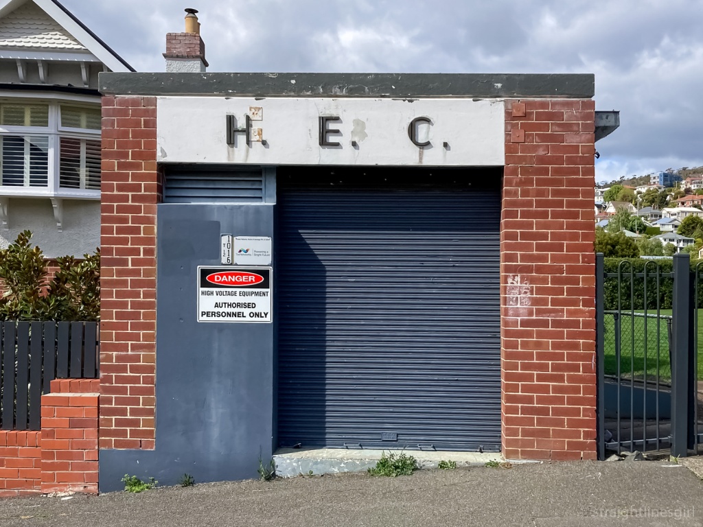
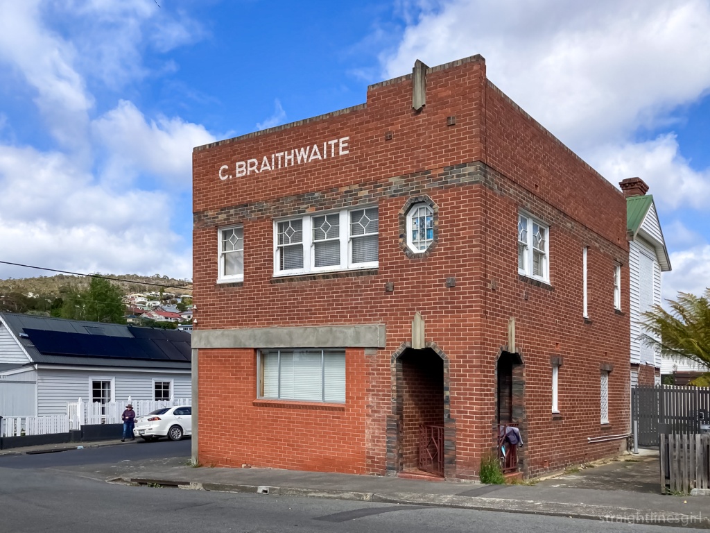
Category Archives: Tasmania

wandering at utas

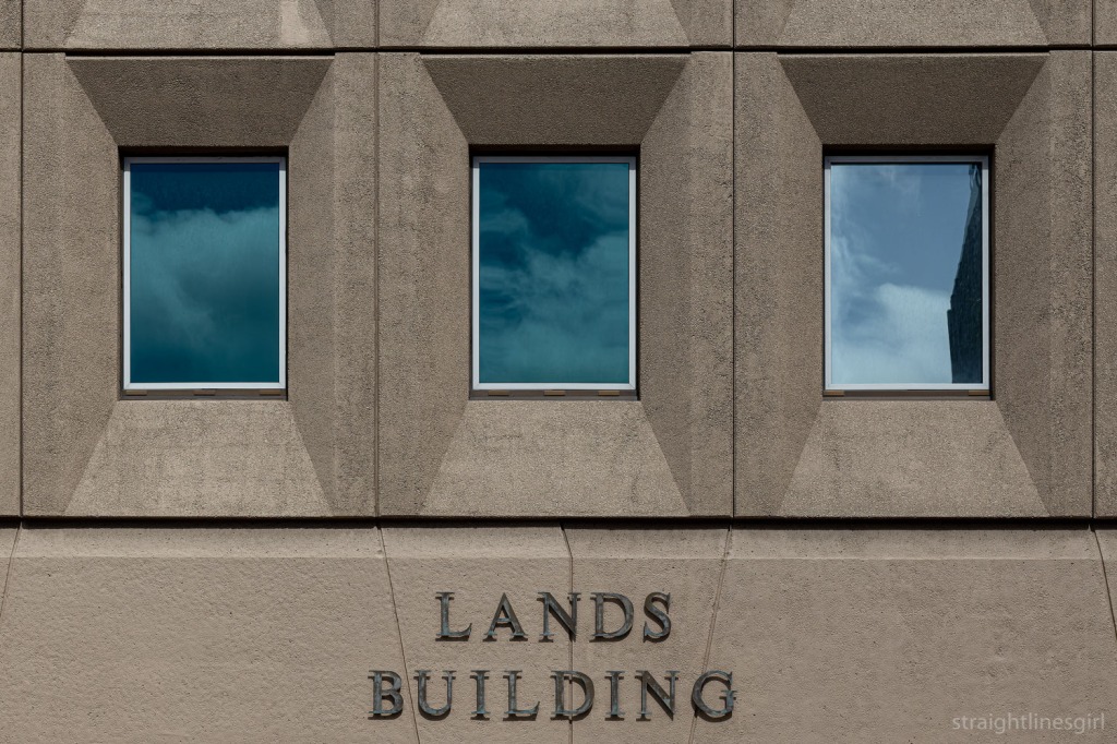
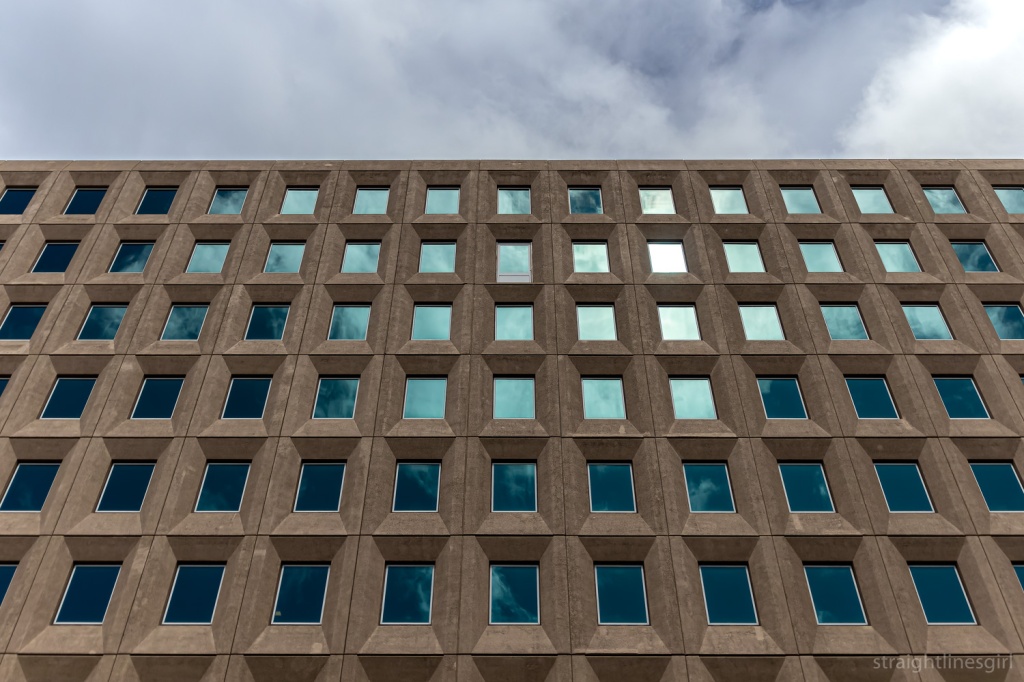
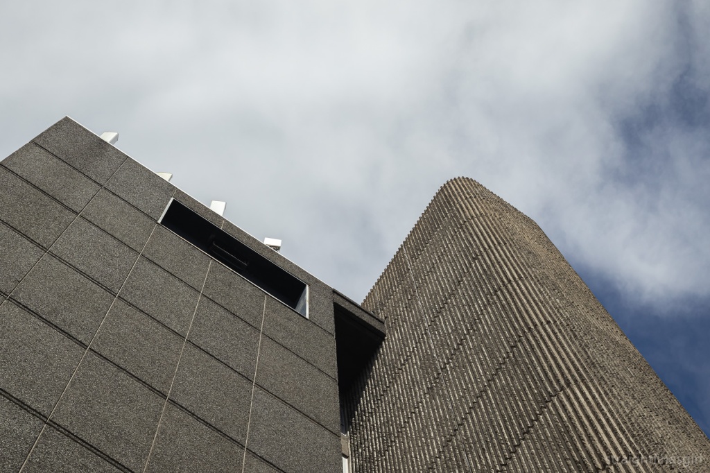
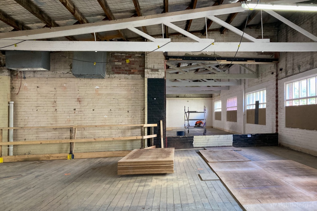
The University of Tasmania’s Sandy Bay campus has been the main base of the university since 1961, following moves that started in the 1940s to provide a larger campus for the rapidly growing university.

It now houses a wonderful collection of modernist buildings constructed during this period. It’s a beautiful campus, not far from the city, set between nearby Mt Nelson and the River Derwent, with views to kunanyi/Mt Wellington.

This site gives some of the history of the early buildings on the campus, and you can see some more early photos of some of the buildings I love photographing, including Chemistry, Humanities, and the Morris Miller Library here.

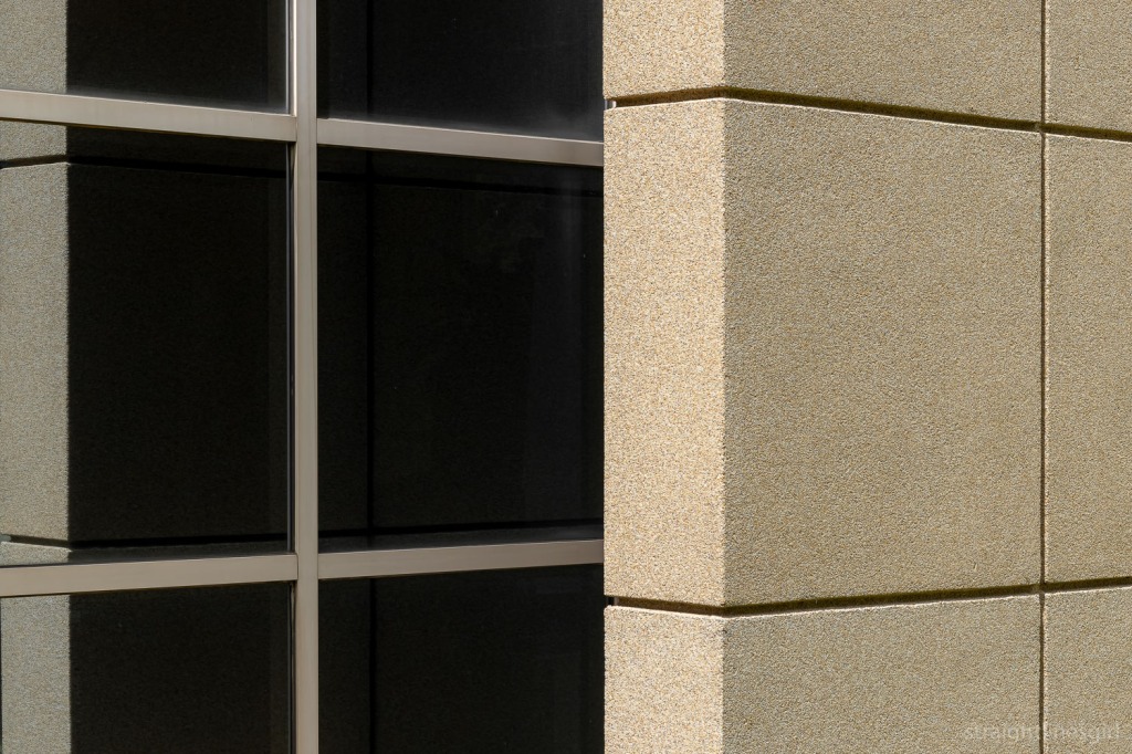
This post by Tasmanian Modernism photographer Thomas Ryan provides some background on the glass curtain walls that feature on many of the university buildings, as well as some more contemporary photos of these structures.

While the university sought to consolidate its presence in Sandy Bay in 1960s, it has now announced its intention to vacate this campus and move into the city, where some of its specialist faculties such as the medical school (near the hospital for obvious reasons) are already located.

This hasn’t been a popular decision, and there’s a strong community of opposition to the university’s move into the CBD and its plan to abandon the campus and turn it into housing, details of which I don’t have space to go into here.

I love the campus and I find an almost inexhaustible supply of photo opportunities every time I visit.

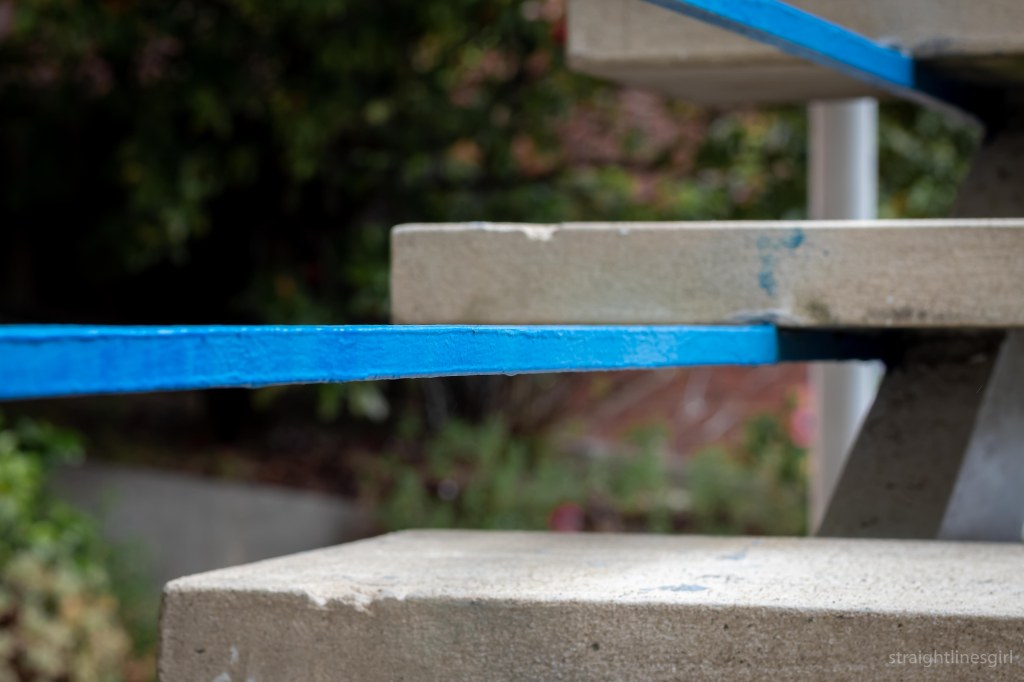
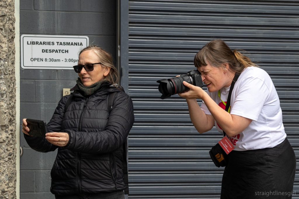
On my most recent trip, I took my 50mm lens and wandered round the campus looking for little details I don’t always see. What struck me as I walked was the overwhelming tranquility of this place, the green spaces, the trees and the birds. These are things that, working in a city, I don’t have easy access to. While there are green spaces in town, the constant traffic noise eats into the serenity they try to provide. It’s not the same thing at all, and being here in this space made me think of how much I would love to have an office in an environment like this. I think it would benefit my mental health as well as my capacity to think deeply and creatively.

But my mission was not to contemplate the potential loss of this beautiful environment, much as I disagree with the plan. I was here to walk and explore. To look at buildings from different angles and find things I’d not seen before.

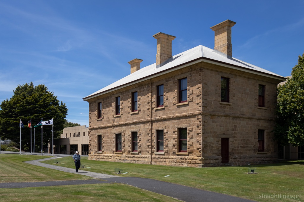
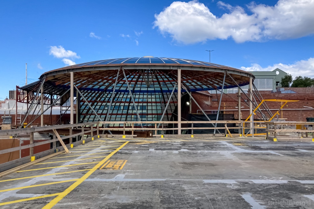
Here’s some of what I saw.

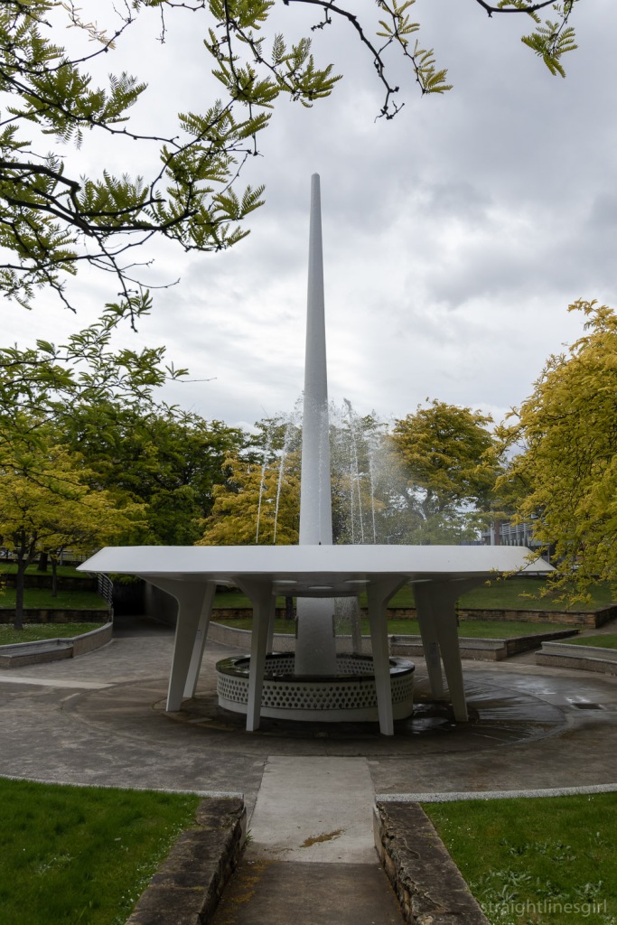
I also learned that the sculpture in the fish pond was by Stephen Walker.

I can forgive myself for not knowing this when I was actually attending the university because I didn’t know who he was or how much he had contributed to public art in Tasmania. But I’m not sure what my excuse is now . . .

Advertisement

love is . . . a street corner

I’m taking part in Susannah Conway’s August Break photo challenge on Instagram in August. Day 14’s prompt was “Love is . . . “

I wasn’t sure what would most represent this for me, but I spent most of the day sorting out my archive and backlog of photos in my Hobart Street Corners photo project from the past four years, and starting to put them on my website so they have a life beyond Instagram.

Hobart Street Corners photos from the early days of the project

I guess spending over four years on a project must mean I love it, right?

I mean, I do. I love the idea of documenting these places and how they change over time, and keeping a long-term record of this.

I can’t say I loved looking at some of the terrible editing I did back in 2018 and 2019 though, and I like to think I’ve improved a bit there. And I do sometimes feel I’ve set myself up to fail with an unnecessarily excessive volume of photos that maybe I don’t love as much as I want to.

Collins & Elizabeth Street, Thursday 18 January 2018, 7.19 am. Before I knew I was working on a project.

I’ve been thinking about this for a while. Where to with the project? What do I want it to be? How can I maintain the love?

I’ve recently looked at collections of photos by Stephen Shore and read his reflections on structuring his images, some of which are street corners. Not that I’m comparing my work to Stephen Shore’s, but his comments rang true for me.

In the 1970s and 1980s Stephen photographed, among other things, city intersections. He talks about how content and structure would guide him to where he would photograph and exactly where to place the camera, but that there was a bigger question: Why this particular intersection on this day, in this light, at this moment? He says thinking about this gave him the experience of deep connection with the content of the picture. (Modern Instances, page 61.)

It would be easy for me to say that the answer to that question is that I simply wanted to record the street corner that I happened to be walking past at this moment in time. It’s the reason for the very first photo from the project in February 2018. I don’t think this is a bad thing. And it’s very easy to do when you’re using an iPhone rather than a view camera like Stephen Shore ended up using for many of photographs. (Have you seen the size of those things?)

(Random aside, I think I read somewhere that Stephen uses an iPhone for some of his images now.)

Murray & Collins Street, Wednesday 21 February 2018, 8.48 am. The first official project photo.

But even with this reason, I feel like I can only sustain this for so long, before it starts to get same-y and uninspiring. It starts to feel like a chore and I start to seek more from the pictures.

I’m not sure what this might be. I’m not about to run out and get an 8×10 camera to force myself to slow down. This is an iPhone project, and it comes with the many limitations of using that as a camera.

But even just becoming aware, as Stephen started to be when he started shooting with the view camera, of the “continual shifting” of the visual relationships between the elements while walking down a street. “The telephone pole bears an ever changing relationship to a building next to it or behind it, this mailbox changes its relationship to the telephone pole.” These changes we can pay conscious attention to as we walk. (Uncommon Places, page 201.)

As he worked, Stephen would ask, “Where do I stand so that the camera makes sense of the space I can see?” (Modern Instances, page 59.)

The intersection he saw as a three-dimensional problem. Where am I going to stand? Where am I going to cut it off? How much am I going to show? Am I going to wait for a person to stand in or a car to stop? (Uncommon Places, page 201.)

These are things I can pay closer attention to when I’m at an intersection, even if my phone can’t capture all of the detail that a large format camera would.

Liverpool & Elizabeth Street, Monday 26 February 2018, 12.03 pm.

Bringing more awareness to what I’m including in the image, and why I’m making it at that time (apart from it being on the way to work) might make me slow down and think a bit more. I might make fewer photos but perhaps they’ll be more interesting or insightful.

By slowing down it will take longer for me to make a photograph, which I’ll then post on Instagram to be viewed briefly in someone’s feed. It’s a curious mix. The image maker and the image viewer experience very different things.

As Stephen says of his prints, “I can pay attention to small details, I can see relationships in space that may not reveal themselves immediately, and have all of this inform a picture which is then taken in very quickly by the viewer. So there is a compression of time in the picture: to be there and see everything could take minutes, but it all can be grasped at once on this piece of paper.” (Uncommon Places, page 201.)

But I don’t think this means I shouldn’t slow down, observe elements in place and be more deliberate in my framing. That creates the meaning for me, and that’s what I want to play around with for a while, and see where it takes the project.

Murray & Liverpool Street, Wednesday 28 February 2018, 8.42 am.

open house hobart 2021: aotea house

Open House Hobart 2021, Day 2: Aotea House

After our visit to Esmond Dorney’s 1958 Butterfly House, we ventured deeper into Sandy Bay to find a house that was a complete contrast, at least on the surface.

The view from the garden. It is possible that the official Open House photographer posted a photo of me taking this exact photo on Instagram. I wish I’d at least washed my hair . . . .

This was Aotea House, designed by Britten Pace in 2020. This house was only open for two tours so we were very fortunate to be able to see it. It’s a three level concrete building on a super steep site at the top end of Sandy Bay.

Open House Hobart tells us

A faceted monolithic concrete form punctuated by panel joints and openings, Aotea House faced challenging site conditions and the design muse of a commanding white gum.

Rather than provide a continuous panorama allied to a homogeneous kitchen/living/dining, the vertical program presented an opportunity to create smaller distinct spaces within a larger volume. These intimate spaces were designed as an escape for family members with foreground relief from the panoramic views of the living room.

The plan is an irregular pentagon stacked over three modest floor plates, with each narrowing and framing views of foliage and close bushland or opening to sweeping views of the Derwent and Southern Midlands. And there are only two right angles in the entire house!

The white gum creates a contiguous thread, cohabiting occupants with rosellas feeding in its leafy canopy, then descending past the striking white trunk of the understory to the forest floor below.

Open House Hobart Website

It’s a fascinating residence.

So many angles!

Although it’s more than 60 years older than the Dorney House, I think the concept of making the garden part of the house that Esmond described is a feature here too, with the huge white gum being incorporated into the views from every level of the house.

The white gum from outside

The owners told us that they didn’t want to live in a concrete box and went to great trouble to make sure the house didn’t become one. There are only two right angles in the house so, as you might imagine, finding furniture to fit has been challenging.

The main bedroom

It has huge windows that had to be commercial grade because of the size, and the logistics of installing them sounds incredibly complex. There’s a massive curved external wall that made me think of the Gordon Dam, but is actually based on a mould from an industrial water tank.

More angles

The owners explained that they wanted open plan areas where the whole family could be together, as well as little nooks where people could escape by themselves. The result is a very open space, where the vertical elements dominate, with cleverly placed hiding places that I’m sure the kids (and the adults!) would love.

It’s a beautiful structure, with the combination of concrete and timber working really well together.
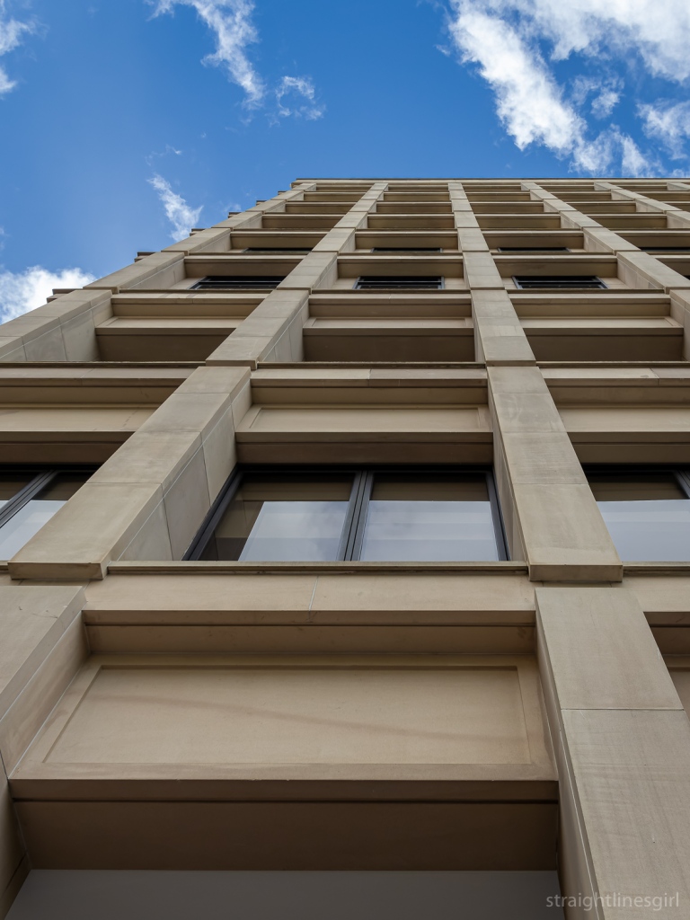
Lush wood and concrete

And the views are fabulous.

Part of the view from the living space

open house hobart 2021: butterfly house

Open House Hobart 2021, Day 2: Esmond Dorney’s 1958 Butterfly House

Butterfly House (originally known as Young House) at 536 Churchill Avenue is featured in Miranda Morris’ 100 Hobart Houses, which says “Although the 1950s brought a radical change to Hobart’s domestic architecture, nothing prepared the city for the arrival of the sputnik house.”

Butterfly House, Churchill Avenue

Yes, apparently it was originally called the Sputnik House, after the Russian satellite.

In the book, Miranda says that it was built for a Mrs Young, with Esmond noting that “All the warmth and sunshine, the flowers, the trees, the gardens should be as much part of the home as the kitchen and the living room”, in direct contrast to most traditional houses that he saw as cold and dreary, with the beauty shut out. (I can confirm that my house, built in the same era, which I love, is exactly like this.)

The main living area

According to the Open House website, this house has featured in design shows, dramas (The Gloaming comes to mind but I could be wrong because I haven’t seen it) and magazines but this was the first time it was open through this program.

20211114 OHH-230 Butterfly House 536 Churchill Avenue
The view from the main living area

Open House goes on to say

Widely admired for its innovative and authentic contribution to international design, the building’s powerful arching form is equally a response to its site and panoramic views. The walls are predominantly glass, lightly framed in tubular steel with integral diagonal bracing in plane with the glazing. Interior living spaces offer arresting views of mountain, sky and river, yet remain surprisingly private from the street thanks to the wide deck that extends over the carport and workshop below.

Originally built for a single woman, Young House was a relatively compact two-bedroom residence when purchased by its current owners. They commissioned Morris-Nunn and Associates to design an extension in 1999. Taking the form of a new pavillion in the back yard, the project won the RAIA Tasmanian Chapter Heritage award in 2001. The firm (now Circa Morris-Nunn Chua) added an extra bedroom and a lap-pool to the design in 2008.

Carefully restored and fitted out with an eye to mid-century modern style, Young House, like the Tate House in Taroona, showcases Esmond Dorney’s exceptional capacity to create buildings that expand and enhance the lives lived within them.

Open House Hobart 2021
The most recent addition to the back of the house and the pool

I’m not sure what else I can say. It’s a beautiful house and I can see why it is so widely admired. We were fortunate enough to have Paddy Dorney on the tour to talk about Esmond’s vision and Robert Morris-Nunn to explain more about the extensions.

Corridor from the original house to the extensions

One thing I learned was that Esmond had used Caneite in the original house. This is a form of soft, pliable fibreboard made from sugar cane, so it was really suited to the curves of this house. If you look closely at the walls and ceiling panels, you can see the texture of the caneite.

Caneite ceiling in one of the original bedrooms
How great are these colours!

They didn’t use this in the extension.

The other thing Robert noted was the way they had continued the form of the original structure as they’d extended out the back. It’s hard to see this from the ground, but it’s a lot more obvious from further back (see the third row of photos on Robert’s website to get an idea).

The bathroom window

What I loved about seeing this place and Tate House on the same weekend was how the additions to the original buildings had been done in very different manners but still retained the original feel of Esmond’s designs.

I also loved being able to see Esmond’s own home at Fort Nelson (1978) from the deck of this house.

The deck

I mentioned this to Paddy and he said yes, it was like little brother keeping an eye on big brother.
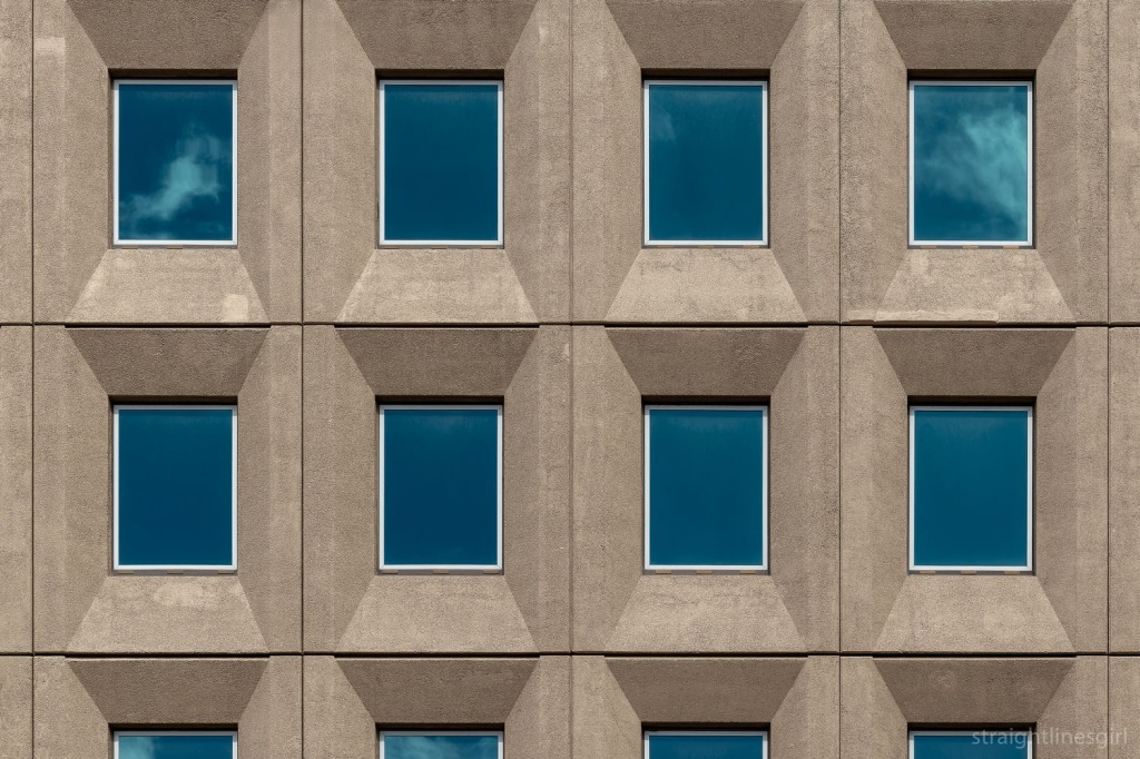
It was a wonderful space to spend some time and we greatly appreciate the generosity of the owners for opening up their home for us to see.

open house hobart 2021: wrest point

Open House Hobart day 2.

Our first stop was the Wrest Point Casino, which is a site than contains far more than the 74-metre (or 73 metres or 75 metres?) tower building that is, I believe, still Hobart’s tallest building.

Our tour guide was Graeme Tonks, who has written a book on the history of Wrest Point, which I’ve referred to to make sure I’ve got my facts correct in this post. He said that the tour was going to focus only on the architecture of the site, not any of the social and ethical issues that might come up around the casino, which I think was good to set out up front. The time for that discussion was not now.

Prior to the British arrival, the point was a camping ground for the muwinina people, who lived in the area we now call Hobart, but who did not survive British colonisation.

We started the tour near the front gates on Sandy Bay Road, where Graeme gave us a brief history of the site. In 1808 the site was granted to former Norfolk Island convict Thomas Chaffey, as part of a 62-acre parcel of land that extended up to the Mt Nelson track. He built a house on the promontory, which he named Chaffey’s Point.

Graeme mentioned that Chaffey’s Point became the place where people who had been executed were strung up. In part, this acted as a warning for people on any approaching boats of what would happen to them if they broke the law. The hanging place was moved from Hunter Island in Sullivans Cove because the locals found the smell and sight of decaying bodies around the wharf area offensive. I can’t imagine Mr Chaffey and his family would have particularly enjoyed the sight and smell from their home either. At around the same time, the authorities established a whaling station next to the point, so it must have been a barrel of olfactory unpleasantness for the people who lived there.
Thomas’ son, William Chaffey, built the Travellers Rest Inn on Sandy Bay Road in 1836. It’s still there but no longer used as a hotel. It houses the computers that run the gaming facilities in the casino. After his father’s death, William Chaffey sold part of the site, including the promontory, to David Dunkley, who built his own home, St Helena, there. Graeme said that Dunkley was also responsible for the Duke of Wellington Hotel on Macquarie Street, which explains the name “Dunkley” appearing on the side of the building. I’ve often wondered about that.

George Robertson acquired the property in 1898 and rebuilt St Helena. In 1928, Mrs Ina Lucas, who was originally from NSW and had lived in Cressy, deciding to move to Hobart with her alcoholic husband to try and keep him away from the booze (not entirely sure that was ever going to be successful), bought the property and built a new home called Wrest Point. This home was designed by the architect Lauriston Crisp, whose own home ‘Iluka’ (1926) is not very far away on Sandy Bay Road.

The gateposts were from Mrs Lucas’ time, and they are original, with the northern one having been moved further north later on to accommodate a larger gate.

After some digging around, Graeme discovered that the sandstone for these posts had come from Cressy. The clue to this, apart from it being where Mrs Lucas had lived, was that the sandstone hasn’t deteriorated in the way that much of the sandstone sourced from the south of Tasmania has done. Apparently northern sandstone can withstand the salt air better.
Mr Lucas died in 1929, and Mrs Lucas moved to England with their two sons in 1934. She sold the property to Arthur Drysdale in 1936. Drysdale was one of Tasmania’s most successful businessmen, who after running a string of farms, meatworks and butcher shops, would go on to run the Tasmanian lotteries.

Moving into hospitality, Drysdale had the Wrest Point Riviera Hotel built on the site in 1939. It was designed by the team of David Hartley Wilson and Colin Philp, who are responsible for several rather lovely art deco/moderne streamline buildings around Hobart. (Including, I was surprised to learn, the Shamrock Hotel on the corner of Liverpool and Harrington Streets.)

The entry of the former Wrest Point Riviera Hotel (April 2020)

What’s most interesting about this is that, rather than demolish the Lucas house, because it was only new, they built the hotel around the house, so there are elements of Mrs Lucas’s Wrest Point residence within the hotel itself. This includes some external windows (on the right of the above photo), the ladies’ powder room and rest room, and the study, which is untouched (and currently used for storage).

This has to be the best thing I heard all weekend!

Graeme showed us a plan of the house overlaid with the hotel so we could see how it had been done, as well as an early photo of the hotel. From the river, it would have looked absolutely stunning.

He also said there were seahorses on the entrance, which have long since disappeared. I wasn’t sure if these are original from 1939, but I found this photo on the Tasmanian Archives website and I thought they looked a bit too kitschy for 1939. According to Graeme’s book, however, they were part of the original design, in keeping with Drysdale’s P&O design for the hotel, which was intended to capture “the feel of an imposing luxury liner berthed off the sparkling waters of the Derwent River”. A grand building, lavishly fitted out, it provided a standard of hospitality and entertainment previously unknown in Tasmania.

Entry of the Wrest Point Riviera Hotel in the 1940s
(Photo from Libraries Tasmania online collection PH30/1/5524)

Graeme took us through the old hotel and pointed out where modifications had been made over the years. For instance, the reception area, which had been in the main entry hall, is now within the ground floor of the tower building, and some of the older accommodation is now used as offices. A lot of the older rooms had shared bathrooms so couldn’t be used for accommodation any more.

The beautiful staircase leading from the ground floor of the former Wrest Point Riviera to what is now executive offices

There’s also a couple of public phone booths built into one of the walls, where guests could take calls.

Wall detail in the former Wrest Point Riviera

We went into the Derwent Room, which used to have space where a full band would play, and a dance floor. This made the hotel a massively popular entertainment venue for the Hobart community and was the place to go for American servicemen posted here during World War Two.
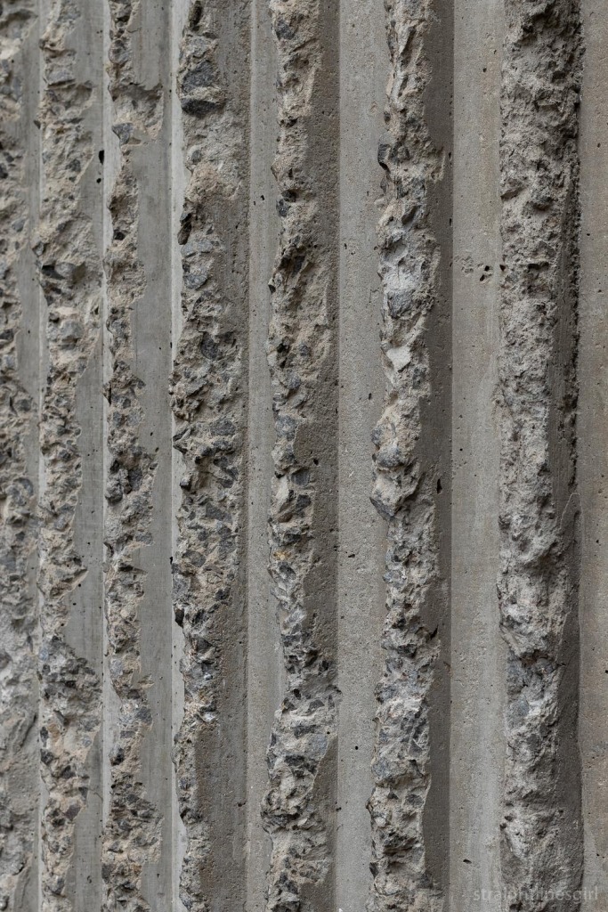
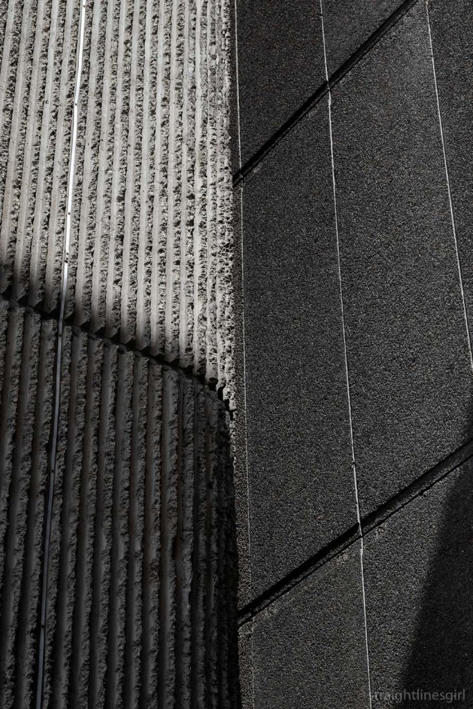
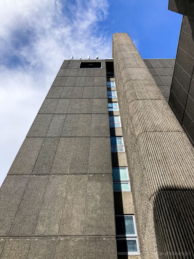
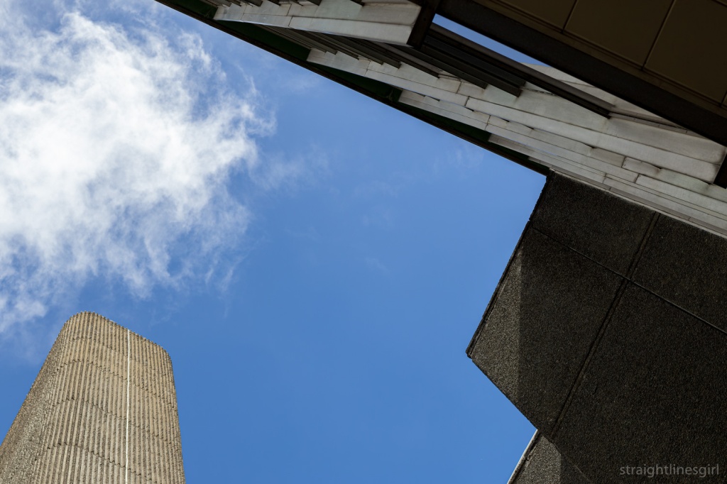
Light from the Derwent Room

As we walked into the tower building from the Riviera, Graeme showed us a photo of the architect’s model, which, sadly, no longer exists.

Crossing from the hotel to the tower via what used to be a balcony

The tower was designed by Sir Roy Grounds and completed in 1973, but not without its share of controversy. The issue of a gambling licence to the Federal Group, which bought the hotel in the 1950s, was the subject of much community concern and it ended up going to a state referendum. From what I can find out, Federal Group proposed that a casino would be a great way to attract more tourists to Tasmania, as there were no legal casinos anywhere else in the country. The “yes” vote narrowly won and the casino became a reality in 1973.

Wrest Point with the Casino Tower (1973), and the old art deco Wrest Point Riviera (1939) obscured by a more recent addition

Graeme pointed out the lift from the ground floor to the first level, which was installed so the Queen didn’t have to walk up the stairs. It’s exquisitely fitted out in blackwood, and is the slowest lift in the history of the world. (So I’m told. I was too impatient to wait for it and find this out.)

Our last stop was the Birdcage Bar, a cocktail bar that was installed a couple of years after the building had been completed. It’s best known for its frescos, painted by the surrealist artist Charles Billich. Most of the women are real people and many of them were dancers from the cabaret show. One of the women had a zebra stripe cape, and Graeme said that this, along with several other boxes of show paraphernalia was discovered in the attic of a Sandy Bay house by new owners, after several previous owners hadn’t even noticed them. This stuff is all now back with Wrest Point.

Billich frescos in the Birdcage Bar

Graeme told the story of one of the women, Honey Hogan, who later married former Premier Jim Bacon. Honey had been one of the original croupiers at the casino. Graeme said that because the casino was so new, they couldn’t use “experience” as a criterion for hiring croupiers because there was no one in Tasmania or even Australia who would have qualified, so other factors came into play, none of which, I imagine, would get through anti-discrimination legislation now!

One of the other painted women isn’t real, and her backside lines up with the head of the person who might happen to be playing the piano. Graeme explained that this was because of a disagreement between Billich and one of the pianists, and this picture was his response.

Over time, these images were deemed to be dated, and there were plans to paint over them, but what ended up happening was false walls were built over them and they were forgotten. It was only much later that someone remembered they were still there, and they were able to remove the flat walls and invite Billich back to restore his work.

The tour was fascinating and went for much longer than the allocated 50 minutes. Graeme said he was planning a return tour early in 2022 for anyone who was interested (me me me!) that would be longer and would cover a lot of the spaces we didn’t get to see today, like the spiral staircase leading to the high rollers’ room, and its amazing mural.

The casino is currently being redeveloped for its 50th anniversary, and this includes moving the original casino room to a space with windows. This is apparently unheard of for casinos: gaming rooms traditionally don’t have windows. Or clocks.

At the date of posting this, I’d just been on the longer tour with Graeme, so stay tuned for a follow up post of some of the other features (and lots of photos) of this property , which, love it or hate it, has played a massive part in Tasmania’s social and economic history. Thanks to Open House for organising the tour, to Wrest Point for making it possible, and to Graeme for taking the time to share his knowledge and insights of this Tasmanian icon.

Additional information and clarification of dates came from Our Tasmania: Sandy Bay, from Graeme Tonks & Mark Dibben’s book Wrest Point: The Life, The Times and the People of Tasmania’s Hotel, and from the follow-up tour of Wrest Point with Graeme in February 2022.

open house hobart: kaljuvee house

Continuing our Open House Hobart weekend quest to visit Esmond Dorney designs, Lil Sis and I stopped in at Kaljuvee House in Lenah Valley.

This is one in a series of “missing” Dorneys, apparently discovered derelict by the current owners and no one had known it was there.

Kaljuvee House, Lenah Valley

This house was built in 1952 so it’s one of his earlier works in Tasmania. It’s a beautiful space and very much original. The owner, Kate, said the only significant modification they had done was to extend the kitchen a little to be able to fit a dishwasher and more than one person.

The fire place hiding the study/office space

It’s distinctly a Dorney but has some features I’ve not seen on other houses, such as the slats over the front windows, which Kate says serve no purpose at all, and this curved ladder-like structure near the entry door, which she says makes it easy to get onto the roof and remove leaves from the gutter.
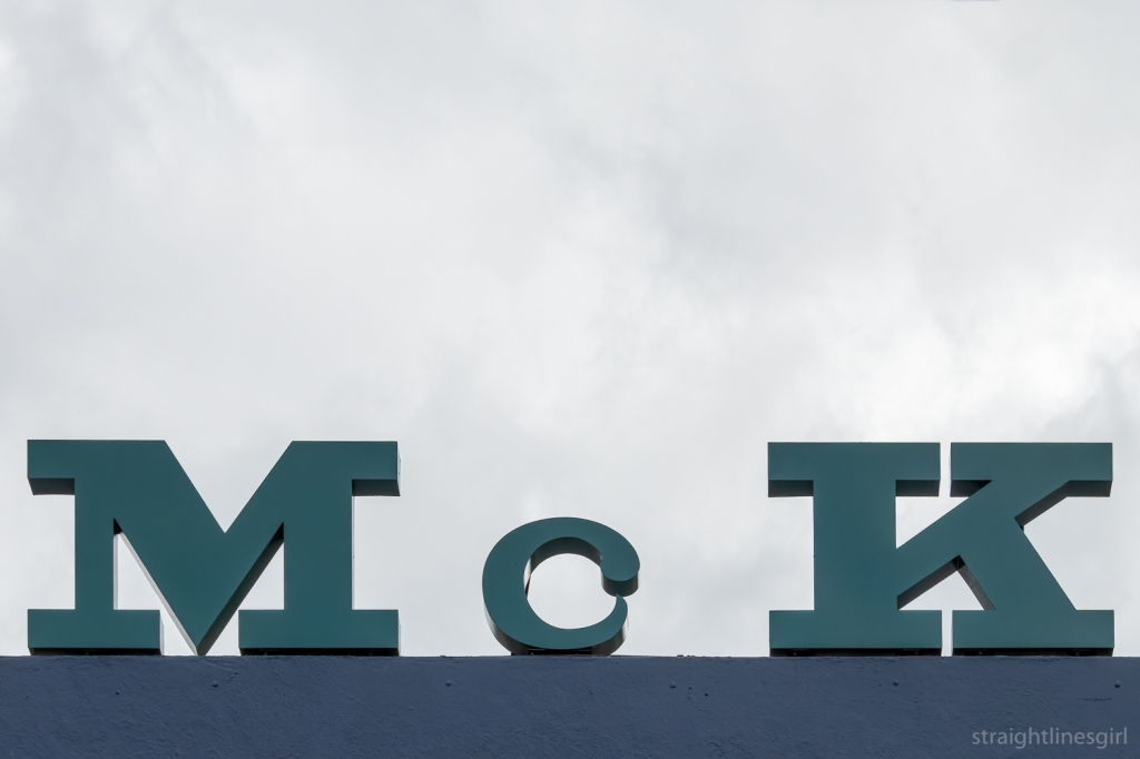
The entrance to the house

The Open House website says

This building may be one of Hobart’s great secrets: the house is perched above a quarry face far below the street level and is invisible from any public space. As dramatic proof of the legitimacy of this urban myth, it was discovered in poor condition by the current owners, as no one knew it was there! Now beautifully restored, this is its first public outing.


Approached by a stairway that winds from the street high above, two pavilions – one private and one social – are defined by a partial level change and a butterfly of two opposing skillion rooves. An expressed skeletal structure wraps the portico entrance and shades the fully glazed northern wall which opens to a stunning panorama of the River Derwent and the hills of the Midlands. The open living space (masked by a wall planter Scarpa would be proud of) soars over the garden and into the landscape.

Kaljuvee House from the street

It has a beautiful outlook and a lovely garden. I think I could live here but Kate says she’s not moving out any time soon.

open house hobart: macquarie street

Open House Hobart weekend was held on 13-14 November, with a fascinating range of buildings open for tours and drop-ins.

After our Taroona Esmond Dorney buildings, we were supposed to take part in the Modern Hobart City walking tour, which I was super excited about, but unforeseen circumstances meant it had been cancelled earlier in the week, so we had some free time before our next Dorney house. We decided to wander along Macquarie Street and see what we could find

The National Mutual Life Building at 119 Macquarie Street was open, we think for the first time

119 Macquarie Street. I didn’t get a chance to photograph it on the day, so here’s one I prepared earlier

Open House tells us this about it.

This six-storey neo-Gothic sandstone building in the centre of Hobart has been a prominent part of the Hobart city landscape since its construction in 1906. The National Mutual Life Association (founded in Melbourne in 1869) commissioned prominent Hobart-born architect, Alan Cameron Walker, to design their Hobart offices. Walker was born in 1865 and apprenticed under the well-known Tasmanian architect, Henry Hunter. The stone facade and carved bas-reliefs of the building are of particular note, and feature a lion and unicorn flanking the company logo above the entrance on Macquarie Street. The building now houses a number of commercial tenancies, with the third and fourth floors being occupied as a residence.
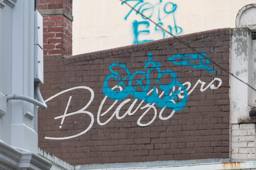
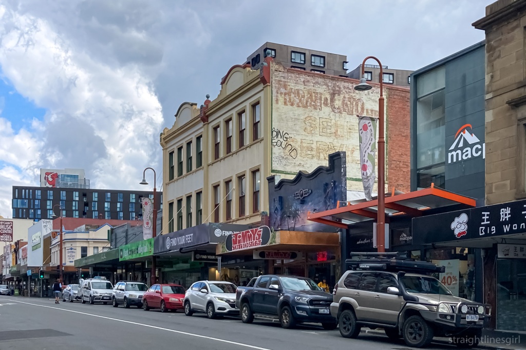
I’ve always been intrigued by this building, especially the turret on the roof, and it sits nicely next to one of my favourite buildings, the Reserve Bank.

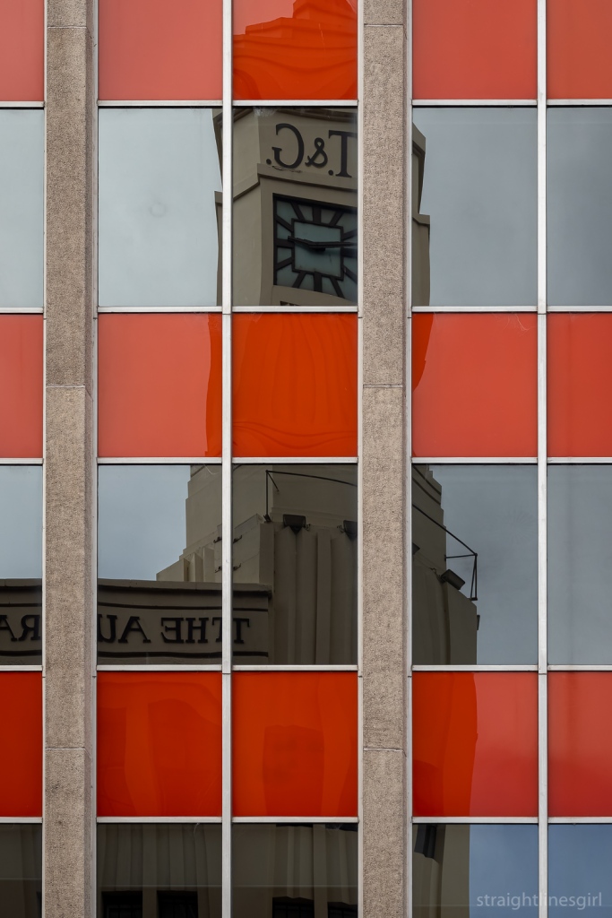
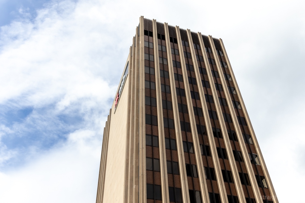
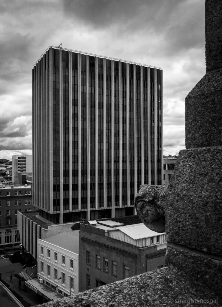
It was raining when we got to the roof top and my first impression was of the brilliant view it had of the two beautiful modernist buildings on the corner of Murray and Collins Street, Jaffa and the T&G Building. Who cares about the rain here?

Superb view from the roof

I was so excited by the view I almost forgot about the turret (I don’t know if that’s the actual term, I’m sure it’s not).

It also sits nicely against the Reserve Bank so you can reach out and touch it.

Should you wish to do so.

A different perspective of the Reserve Bank building

There was once a rooftop cafe up here, complete with deck chairs, which looks like it would have been a fabulous use of the space. We need more rooftop cafes!

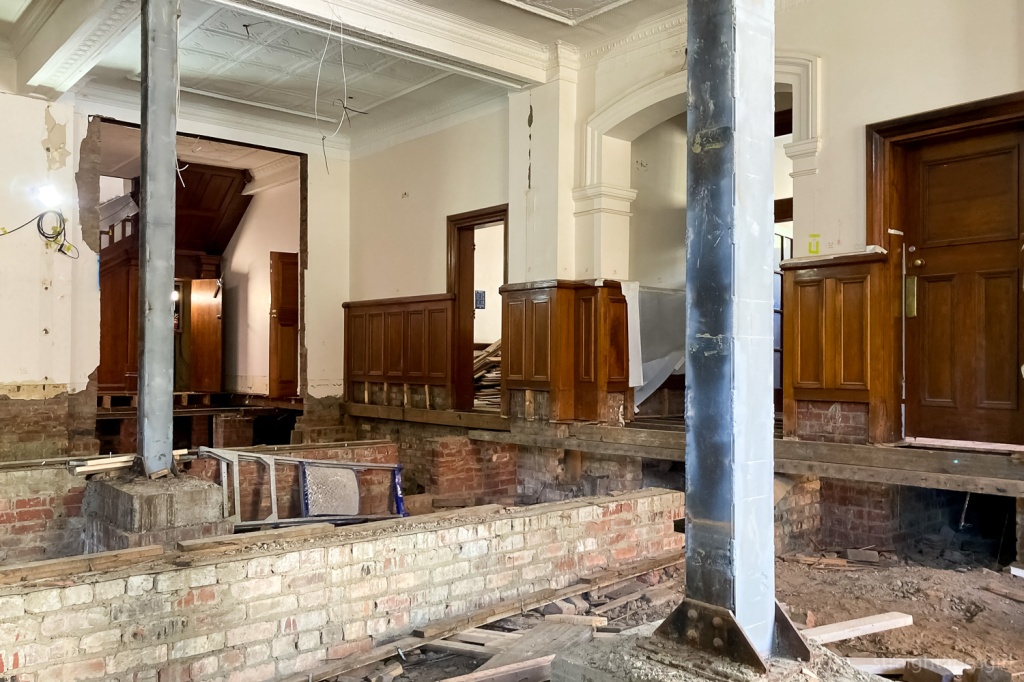
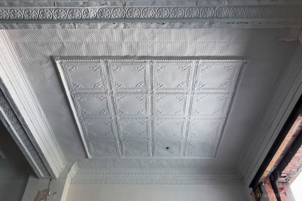
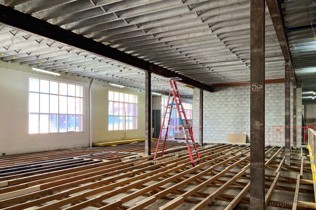
The top floor of the building had recently been vacated and was empty, ready for refurbishment.

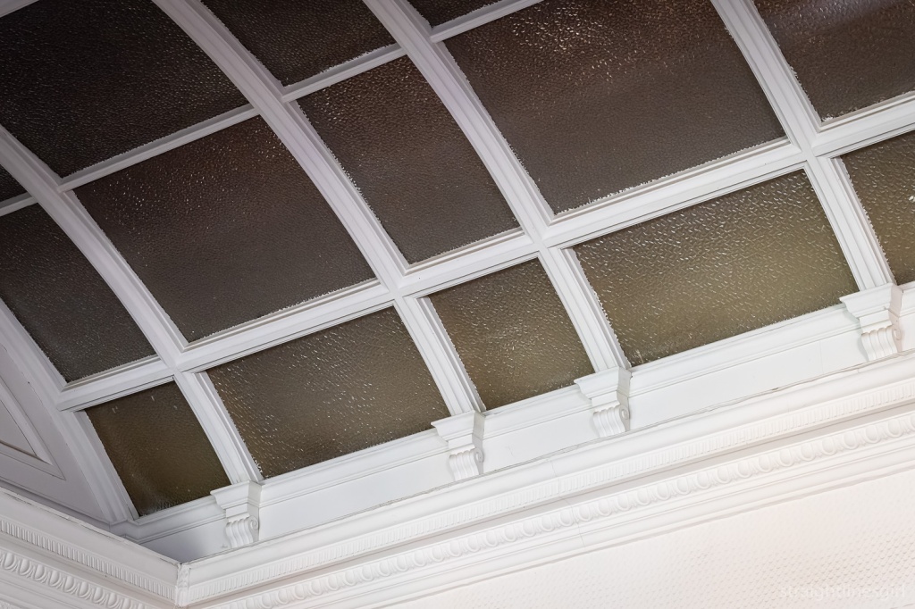
How good is this skylight?!

It was such a wonderful space and very hard not to notice all the lead lighting throughout, which is thought to have been an 1970s addition.

Every house needs a door with a ship on it

I wasn’t the only person expressing a wish to live here.

Wonderful colours
The door handles embossed with the National Mutual Life logo that also sits above the front door

On the other side of the Reserve Bank were two apartments at 105 Macquarie Street, “Polly” and “Henry”, which are recent transformations of former office spaces into short stay accommodation.

105 Macquarie Street. Another one from the archives.

They were both very different in look and feel, and Polly had super views of the other side of the Reserve Bank.

The other side of the Reserve Bank building

These spaces were designed by Preston Lane, who had done the Tate House restoration, and one of the things we noticed was how a huge artwork had been incorporated into one of Polly’s walls. Apparently this had inspired Erik at Tate House to do the same thing in his bedroom in Taroona. It looked really cool. And I wasn’t able to get any photos of it, but this post will give you the idea.

We didn’t get much time here as we had an appointment with another Dorney house further out of the city. Onward!

open house hobart: st pius x church

Open House Hobart weekend was held on 13-14 November, with a fascinating range of buildings open for tours and drop-ins.

After our visit to the Esmond Dorney-designed  Tate House in Taroona, Lil Sis and I called in to St Pius X Catholic Church, also designed by Dorney, consecrated in 1957.

Phone photo of St Pius X Church from 2018

According to the flyer they handed us when we arrived, the first Mass held in Taroona was at the old public hall in 1949. Before that, residents had to travel to Mass outside the area, which was difficult as not many owned cars and petrol was still rationed.

Pius X Church interior

The parish community made plans to build a church in 1949. They obtained the site from the Trustees of Sisters of Charity in 1955 and set out to raise funds. Eventually they obtained a £4000 loan, managed to raise another £1000, and looked for an architect who would taken the project. Esmond Dorney was the only one prepared to consider it.

View of both sides

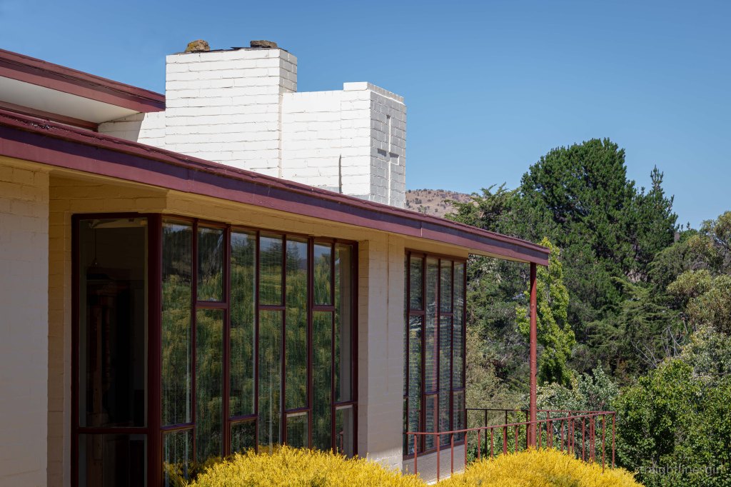
It has features that you might associate with Dorney, most notably the curved tubular steel framing. There’s a lot of varnished plywood panels and glass. You might notice that the windows on the bush-facing side are wide and clear to allow in the views of the bush, and on the other side it’s the wood panels that are wider and the frosted glass panels are narrower. It’s an interesting twist on an otherwise symmetrical design.

Pius X Church – the non-bush facing side

In the brochure, Parish Priest Father Nichols says, “It could be argued that it doesn’t have the traditional appearance of a church building, however its shape and form provide a very fine “skin” for the assembled church to carry out its worship”.

Detail of the carpet

Fittingly, in 2017 the Australian Institute of Architects awarded its award for Enduring Architecture to Esmond Dorney for his design of this church. It’s listed in the Register of the National Estate and is considered to be the first modernist church in Australia.

Looking back at the front wall

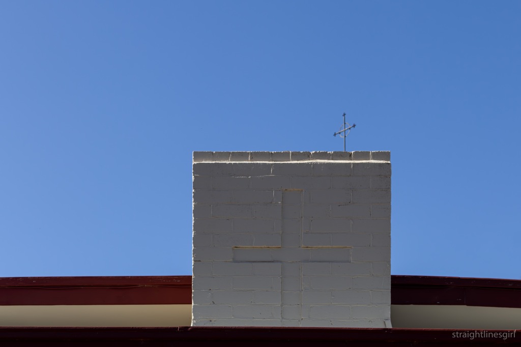
I’ve walked past it many times and tried to photograph it from the outside with limited success (the photo at the top!) but this is the first time I’d been inside. It’s certainly a stunning venue and I think our community is very lucky to have it.

The ceiling above the back wall

open house hobart: tate house

I had been anticipating the 2021 Open House Hobart weekend for weeks. As usual, my sister and I had booked in for several tours across Saturday and Sunday, and we had a lot to look forward to.

Our first tour on Saturday was Tate House in Taroona, which was built in 1958, designed by Esmond Dorney for the current owner, Erik’s, uncle, who lived there for many years.

Tate House in June 2020 before the restoration work

The Open House description of the house says

Tate House sits above the river’s edge with 180 degree views of the estuary, along with the hills and bays of the far shore. The immediate foreground, originally beach and boat sheds, is now slightly masked by later development. The house is a continuation of the form and structural technology of the Dorney Shack (1957) and the Young (Butterfly) House of 1958. With immediate street frontage, this design needed to find a different solution from those two projects to ensure privacy in a developing suburban context. Allied to some solid panels, a slightly deeper setback allows the garden to mask the glazing. The form itself responds directly to the hills on the eastern horizon, offering a relaxed logic to the street view.

In 2019, the current owners commissioned Preston Lane Architects to carefully restore the existing house and update the interiors, maintaining the essence of the original building while also accommodating the changing needs of the clients, allowing them to age in place.

Tate House, November 2021

Paddy Dorney spoke of how much planning went into the restoration project and of the passion of Erik, the architects, and the builders, who all worked to maintain the integrity of Esmond’s design while updating it to reflect the occupants’ needs. He noted the care and attention that James, the builder, who was also there for the tour, had put into the project.

The front of the house

The downstairs section wasn’t part of Esmond’s original design and it was deliberately designed to not look like his work.

The new, simple staircase

Part of the redesign was to include an internal staircase, so that people didn’t have to go outside to get upstairs. It’s a beautiful addition, sympathetic to the design but not trying to replicate it.

Use of glass to extend the partition walls on the upper level to the ceiling

I walk past this house often and never knew the downstairs area was there because you can’t see it from the street. I’d thought the house looked so small and wondered how it was possible to live in it.

Tate House entrance

Learning about the flow-on design from the shack and the way downstairs was incorporated later, it all made sense.

Back deck

I’d also been watching the renovations from the outside and, even though my first impression when seeing the house stripped back was to be horrified, I couldn’t imagine that anyone would do anything to a Dorney house that hadn’t been well considered and in keeping with its origins.

The refreshed kitchen windows from the back deck

It’s beautiful work and the house looks wonderful. It’s a simple but very clever design with lovely attention to detail. It seems to just fit the space perfectly as well as take advantage of the wonderful river views.

Back deck detail