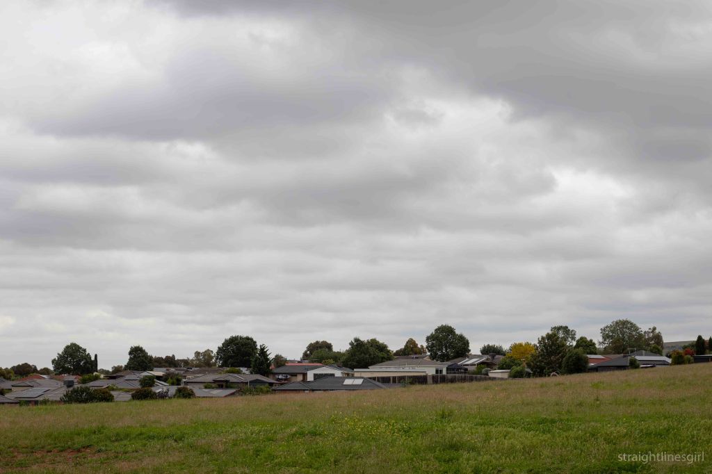
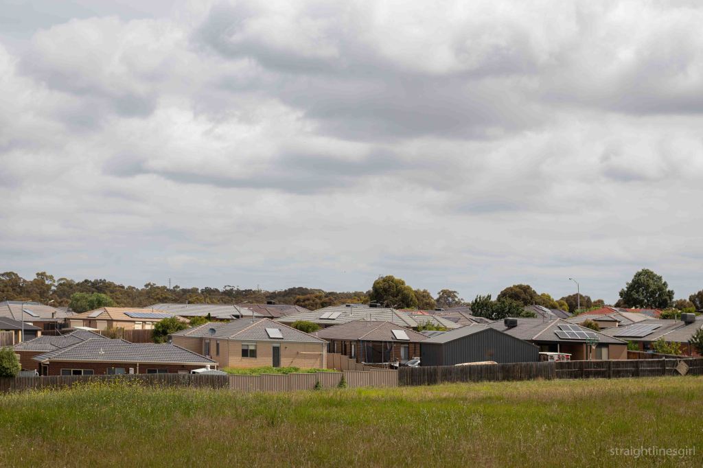
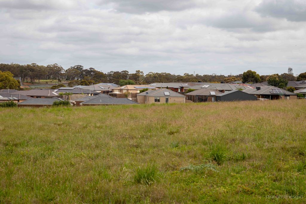
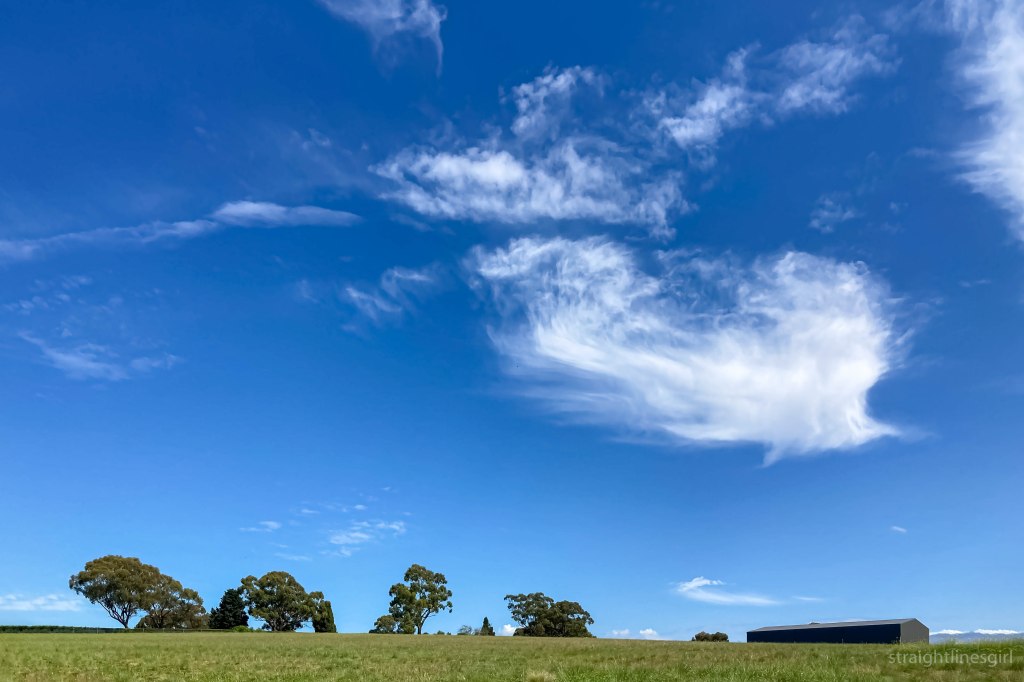
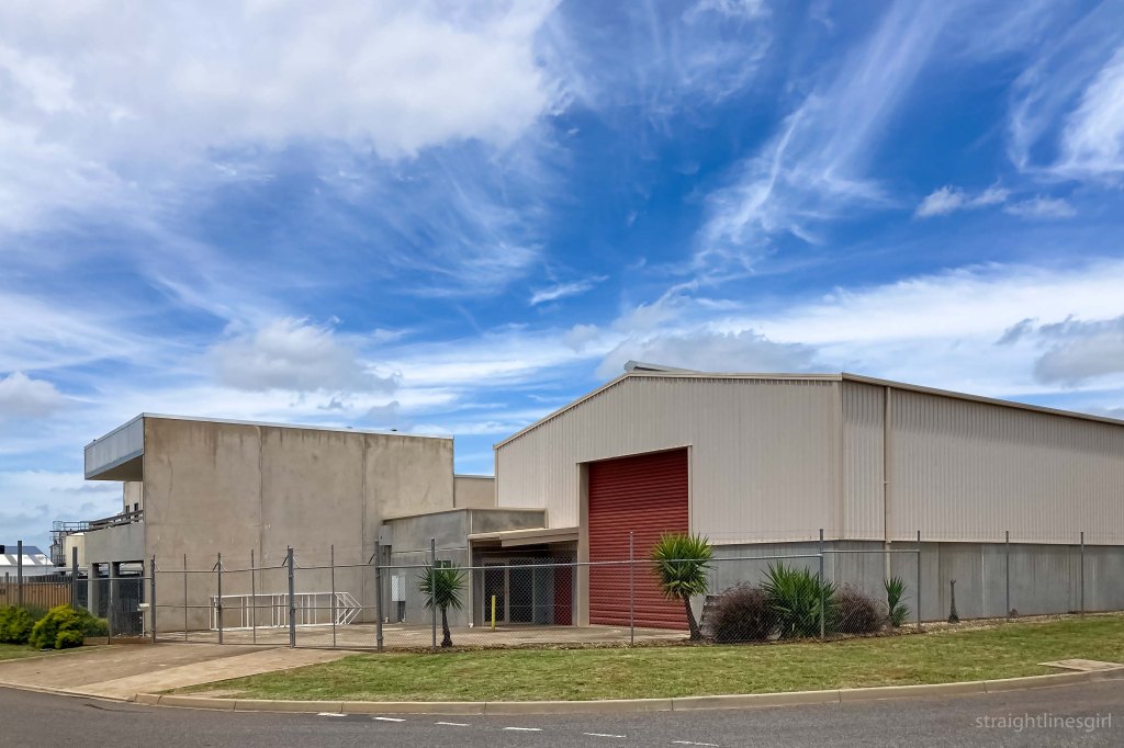
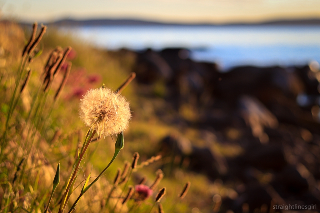
the suburb and the sky
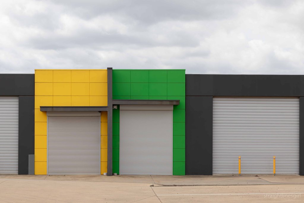
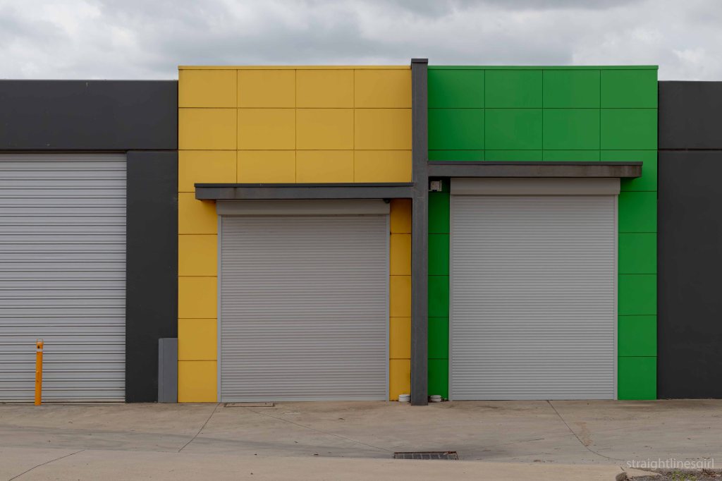
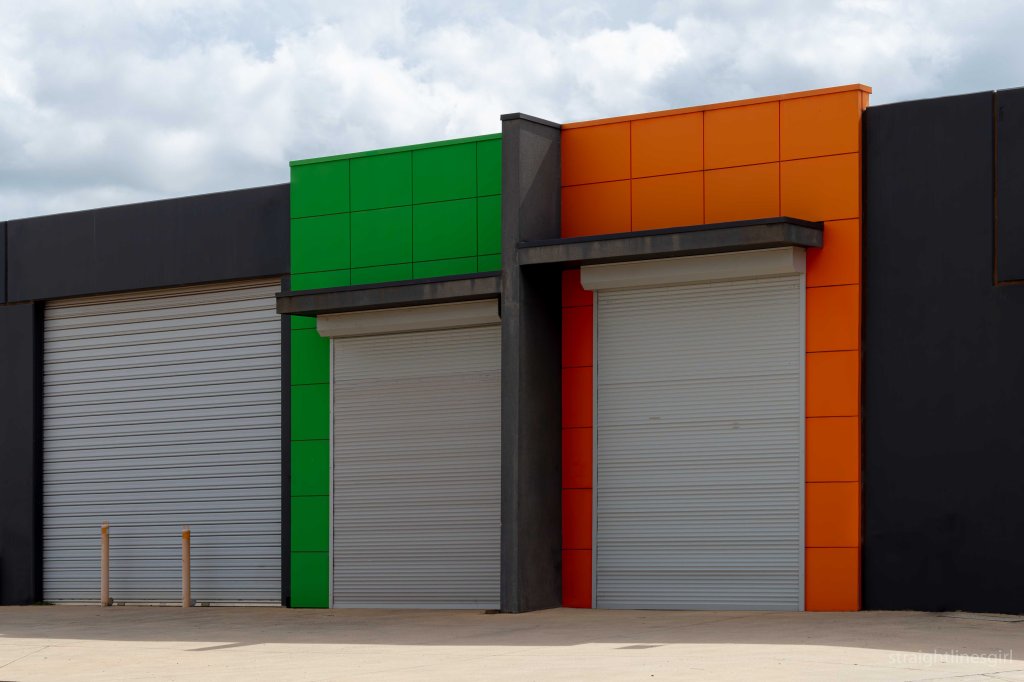
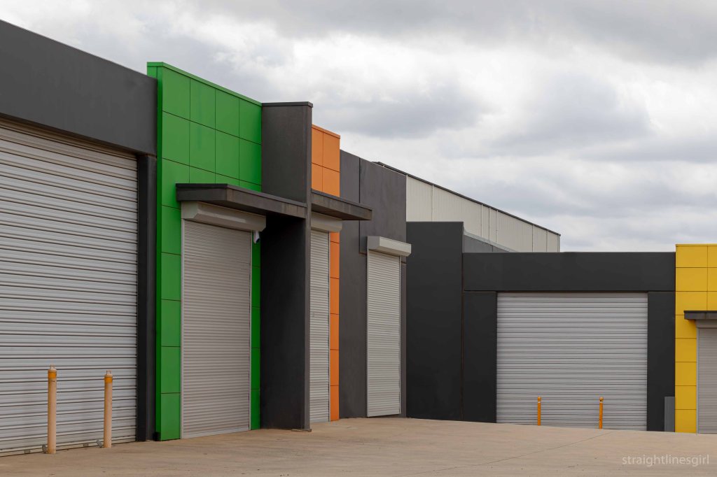
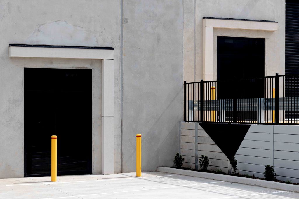
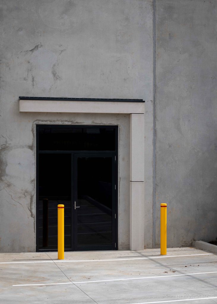
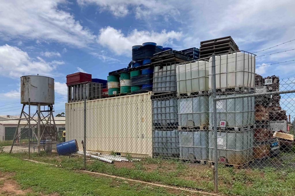
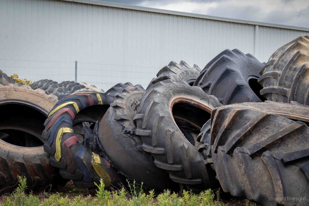
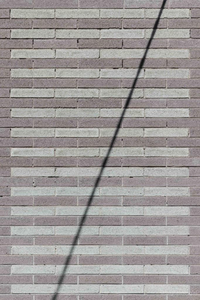
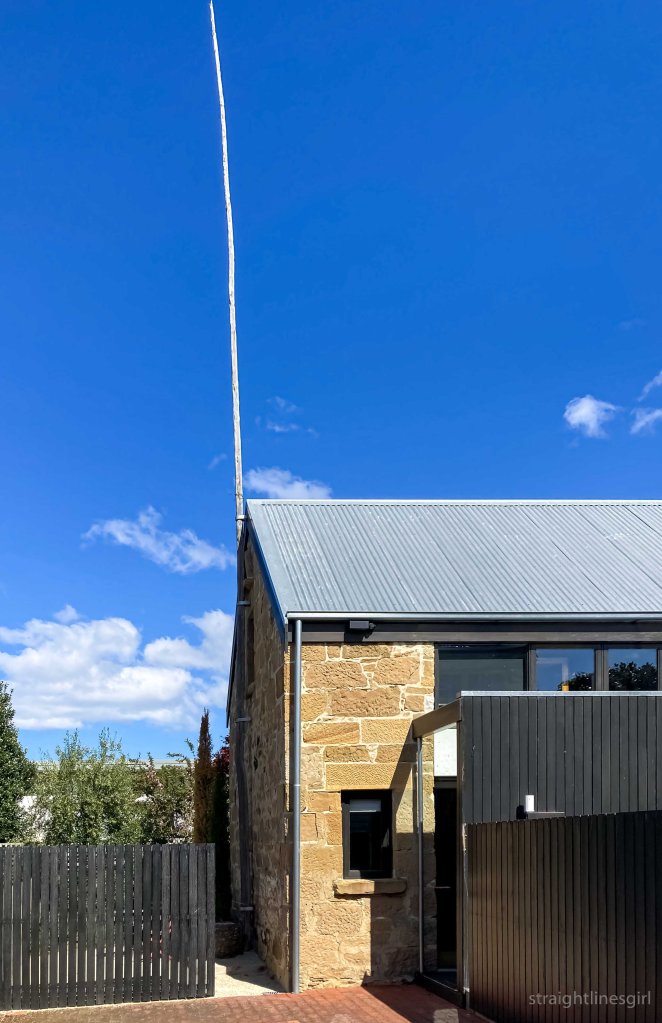
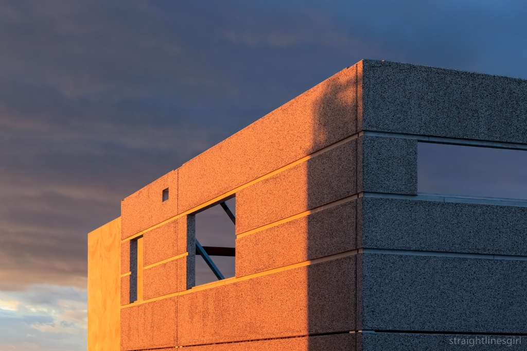
industrial colours
black and white
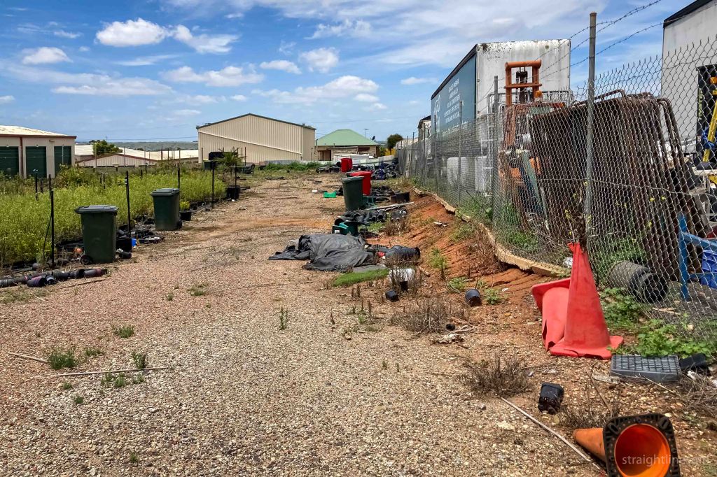
scenes from the street

It’s mandatory on Open House weekend to visit at least one building desigined by Esmond Dorney. Don’t ask me why. It just is.
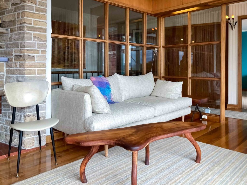
Lil Sis and I had been to the house at Fort Nelson commonly referred to as The Dorney House a couple of weeks earlier when we attended Paddy Dorney’s launch of his book about his father’s work. (You can read about it in the second part of this post.) We didn’t have time this weekend to fit it in, but we were very keen to see one of Esmond’s houses (which hadn’t been open before) in Woolton Place, Sandy Bay.
It was built in 1958 and has had some sympathetic changes to the kitchen and bathroom in 2014.
It is, as you’d expect, beautiful, with so much natural light and beautiful curved features.

The owners said that they’d so far been unable to find plans for this house and they believed they might have been among the many papers that were lost when Esmond’s office was burned down. As a result, it isn’t in Paddy’s book and we don’t know much about it.
The entire street is full of gems like this and I need to come back and be one of those people who walks around and photographs other people’s houses.
This is a tiny apartment in Lenah Valley, designed by Ray Heffernan in 1964.
Open House tells us the apartment is only 37 square metres. It’s north-facing and it “showcases the principles of good design that can improve human experience, including floor-to-ceiling glass windows that keep the apartment warm in winter and cool in summer”.
Al-Na-Craig is on Augusta Road.
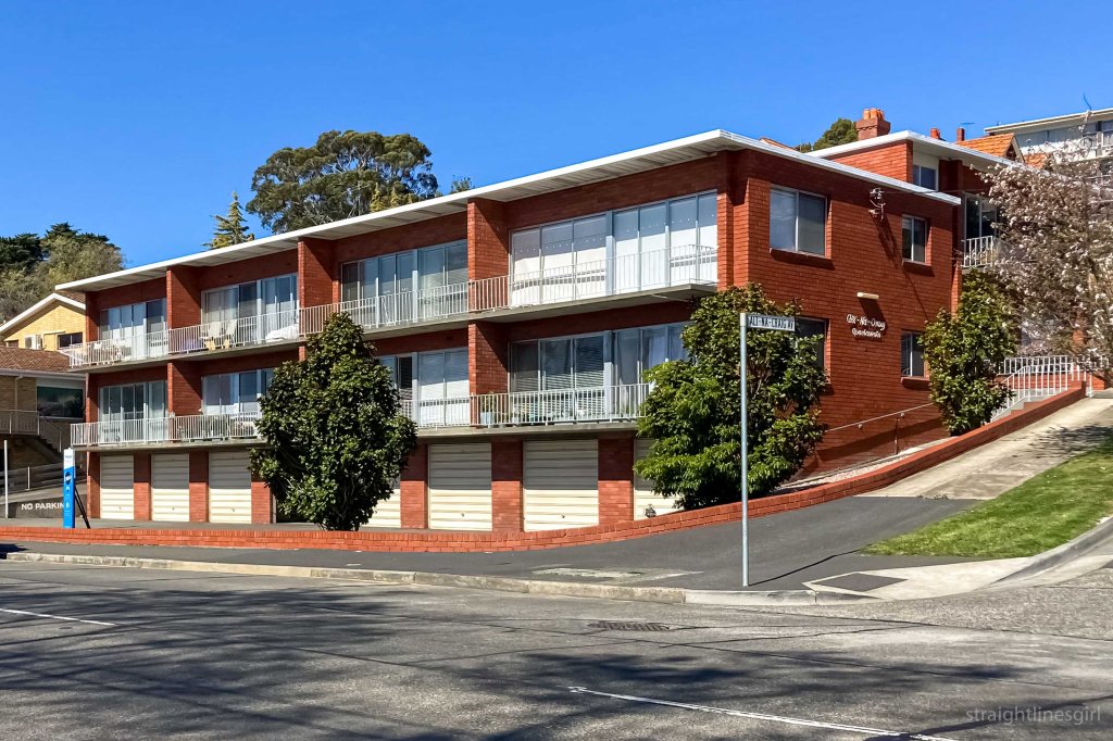
That’s not 6 Alt-Na-Craig Avenue.
But it says Alt-Na-Craig on the side of it.
But it’s not 6 Alt-Na-Craig Avenue . . .
Ohhhh . . . we have to walk up this hill . . .
Indeed we do, and we get to a gorgeous block of units overlooking Lenah Valley. Here, we meet Helen, the owner of the tiny apartment.
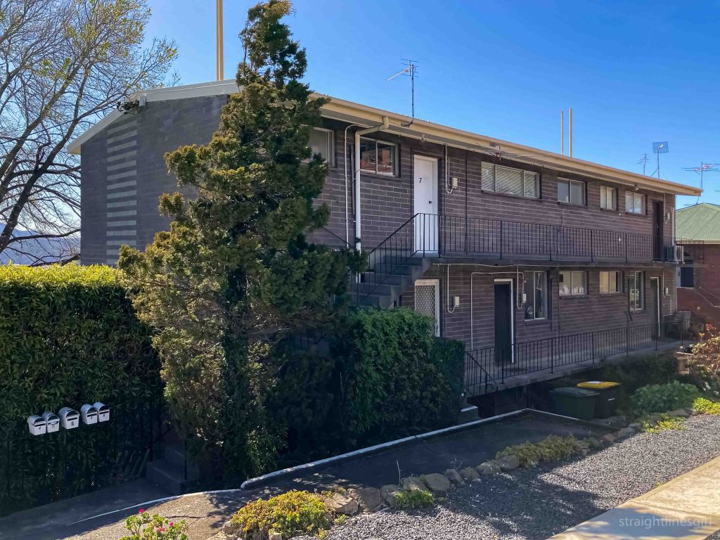
Really.
Tiny.
It has a tiny kitchen (imagine Mr Tall in there, says Lil Sis), and a slightly bigger bathroom, which begs the question why is the bathroom bigger than the kitchen?.
Helen has cleverly moved the hot water cylinder out of the bathroom into the kitchen so she can fit a washing machine in there. I meant to ask where the washing machine would have been in 1964. Maybe they went to the laundromat.
The rest of the apartment is one room, with the bedroom section (with built-ins) separated from the living area with a floating glass screen wall, which allows enough blockage for the bedroom to be its own space but also lets light in and keeps the place light and airy, which you really need in such a tiny space. Helen says of all the apartments, hers is the only one to have retained this feature.
The living and bedroom area is slightly off-north facing and the windows are designed so that in winter, when the sun is lower, light (and warmth) comes a good distance into the space to keep it warmer; and in summer, it comes in just far enough for light but it doesn’t overheat. It’s very clever use of space.
Of course, I couldn’t live there because there are no book cases. I’d need to buy the apartment next door too, just to house my books.
I don’t think Helen’s selling though!
This renovated barn in West Hobart was our last stop on Saturday.
The owners say the dilapidated old barn behind the main house was the main reason they decided to buy the property.
It took over seven years to create the project, from exploring the possibilities, to engaging an architect and working through council and heritage issues and finally construction.
They say they reused as much timber as possible in the design, with the table being built out of left over timbers. All of the original stone has been retained.

It’s a lovely space.
By the time we’d finished the modernism walking tour on Sunday afternoon, we were running our of time to get back to Sandy Bay to see the last house on our itinerary.
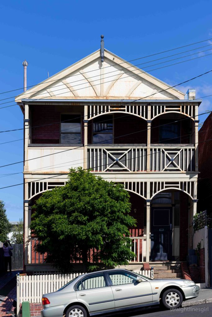
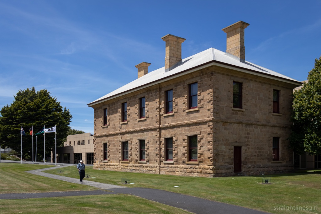
540 Churchill Avenue was designed in 1957 by Barry Fisher. It is a stunning home!
We pulled up outside at 3.49 pm, just as the volunteers were packing up the signs. Please can we have a look? we asked, and Helen (who we’d met at Al-Na-Craig on Saturday) said okay but we had to be quick. And quick we were!
We got a very fast but thorough tour of this gorgeous house, a couple of doors down from Esmond Dorney’s Butterfly House that we’d seen in 2021.
This house was designed for Mr H H (Bert) Smart, Master Warden of the Marine Board from 1957 to 1983.
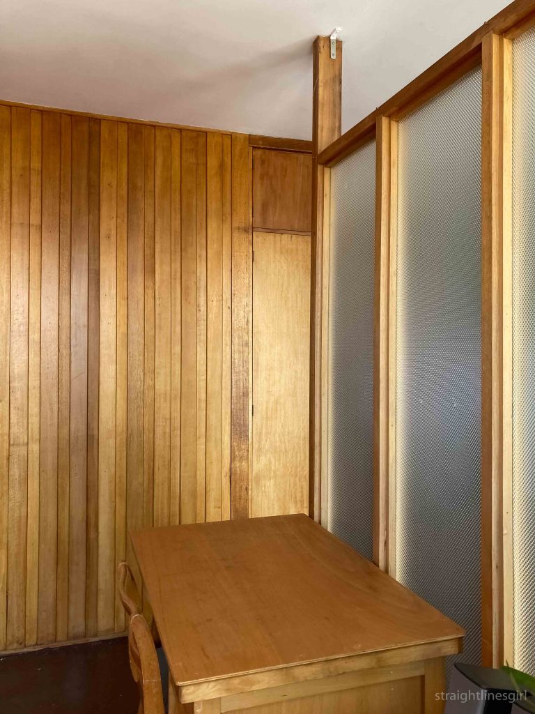
There is exquisite attention to detail everywhere, down to the horizontal banister on the entrance stairs. It’s another of those beautifully light homes that take in the views of timtumili minanya/River Derwent, with timber fittings throughout.
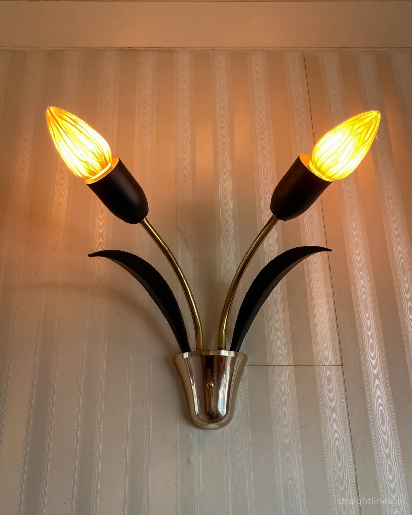
And this light fitting.
The kitchen is gorgeous.
There have been some recent renovations and extensions, especially downstairs, which are sympathetic to the original design. It is an absolutely beautiful home and I’m so glad we were able to see it.
And that was the end of our Open House Weekend. I still have one more post to slot in somewhere though!

It was a short stroll from the Railway Roundabout Fountain to the site of the former railway station that gave the fountain its name.
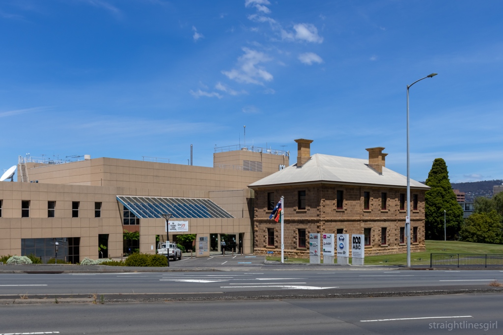
The site, originally built in the 1870s for the Tasmanian Main Line Railway Company, is now home to the ABC HQ, and was open for tours during Open House.
Here’s what the site looked like before the roundabout was built. What is now the ABC Building is in the centre of the photo, with the car park out the front.
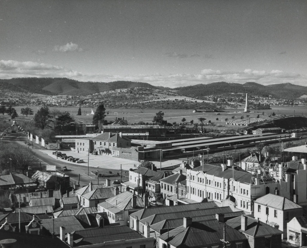
If you look very closely at the far left of the photo, you can see the street arch with the crown on top that was made for the 1954 Royal visit and is now at the Riverfront Motel at Berriedale.
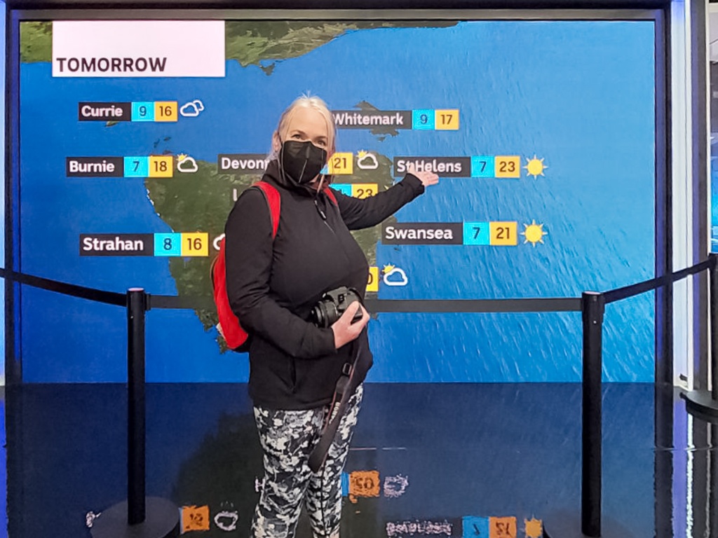
This was a self-guided tour of the studio so there was a lot of people lining up to get in, and the focus was on the ABC’s activities rather than on the architecture so I can’t tell you much about that.
The older building at the front of the site is the original railway station building from the 1870s. According to Col Dennison, the line opened in 1875 and the station closed in 1974.
A picture from Col’s book Yesterday’s Hobart Today shows a signal clock above a wrought iron porch at the front of the building.
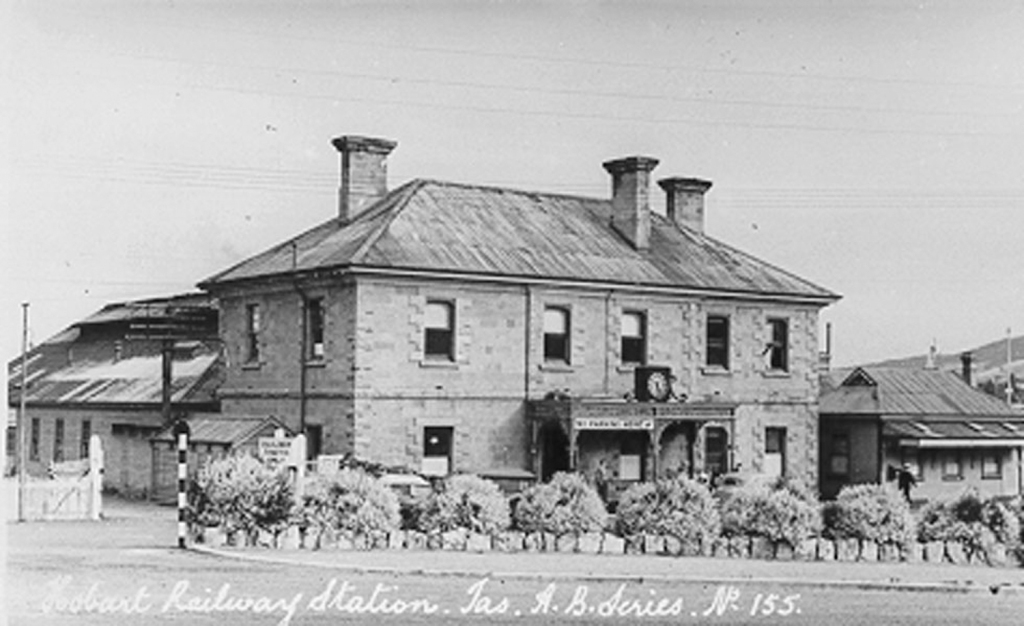
I’ve seen some more recent photos of the site and it looks to have been a Datsun car parts office at one point.
If the ABC purchased the site in 1985, we can assume the large building dates back to around that time. It brings to my mind the CSIRO building on the waterfront, which was opened in 1982, so that sounds about right.

The tour led us through the radio and TV studios, as well as a glimpse into the tech world.

A tiny studio, called the Tardis, captured my attention and as I was looking through the window, one the producers, Jo Spargo, told me this was where they do off-air interviews. She asked if I’d like to come in and talk about my story and my memories of the ABC.
Why not?
Jo’s questions led me into talking about my Hobart Street Corners project.
She asked what my memories of the ABC were, and I said when I was a kid, ABC was the only channel we watched. We’d watch Doctor Who and The Goodies, my Dad would watch the 7.00 News and then the TV would go off. That changed a bit when we got older but that was my childhood.
Jo said that was a lot of people’s childhoods!
Presenter Sabra Lane talked us through her day on the radio and explained how she works in the studio.
We saw the TV news and weather sets, where people were able to have a go presenting and reading from the teleprompter.
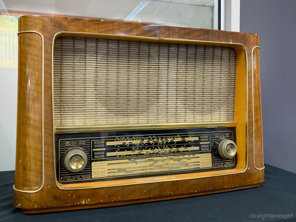
We saw a lot of historical relics from the ABC, including the gong used to announced the beginning and end of radio programs, and the ABC plaque.
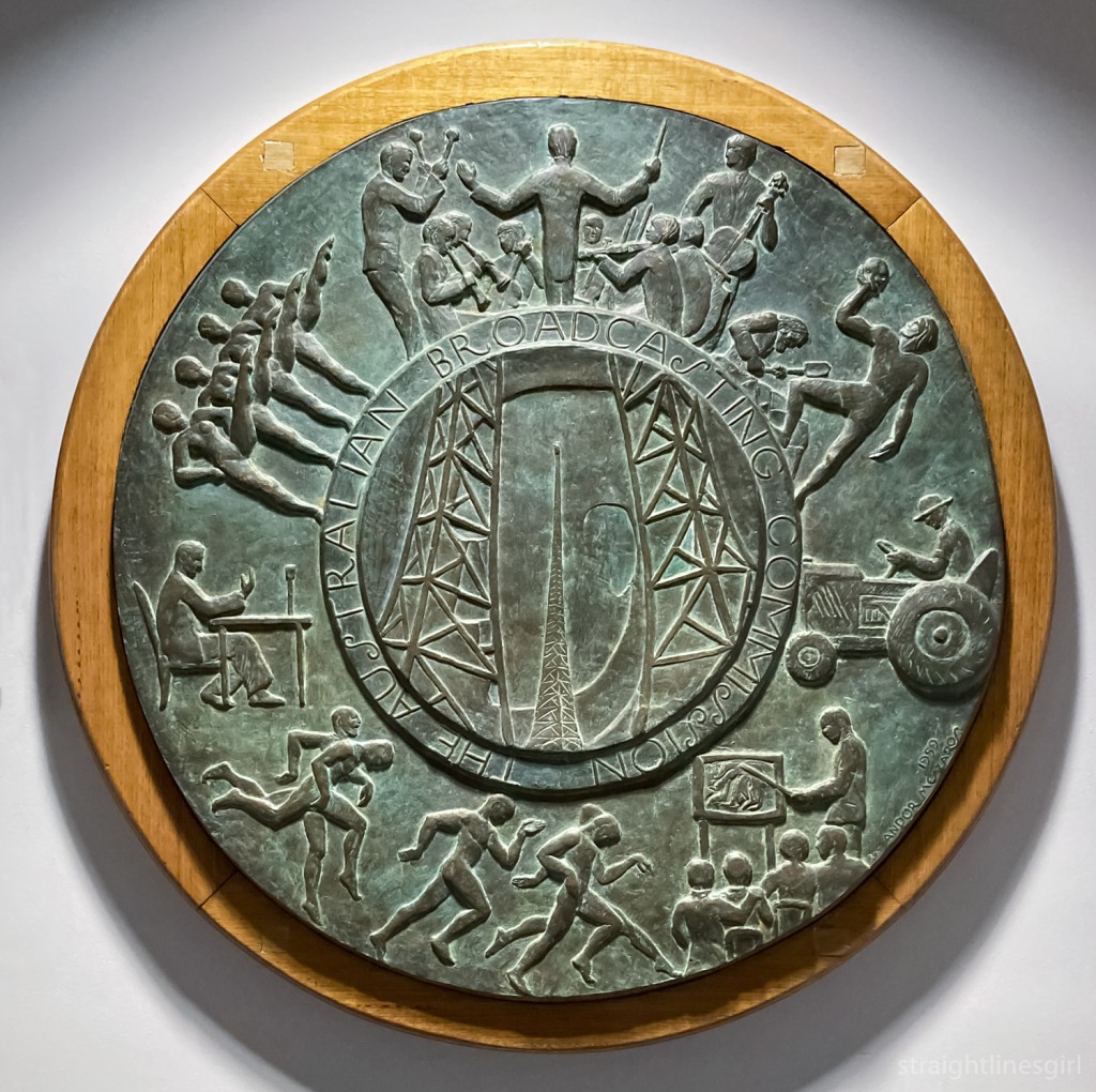
According to the blurb next to the display, the ABC commissioned a plaque to put into its buildings after television was introduced into Australia. This was designed by Melbourne sculptor Andor Meszaros, who had designed the commemoration medallion for the Melbourne Olympics in 1956.
The description of the plaque says it shows surround figures depicting seven program departments, with the centre motif revealing a man’s head superimposed on a transmitter tower. This symbolises the mind at work and thoughts being transmitted.
Speaking of childhood memories, we were also encouraged to take photos of ourselves with Big Ted and Jemima.

Even though we didn’t learn much about the buildings, it was an interesting morning. I’d had no idea what it was like inside so appreciated the chance to walk through and find out.
Thanks to the ABC and Open House for putting the day together.
I didn’t realise until after I’d got back home from the Sydney trip that there was a companion to the Randwick Art Deco walk for the neighbouring suburb of Coogee.
That’s cool. I have somewhere new to explore next time I’m in the area.
I spent only a couple of hours in Coogee this time. It involved a walk down Coogee Bay Road, fish and chips on the beach, and the return walk up a back road that ended up in St Pauls Street in Randwick.
I was going to explore more the next day but the rain put an end to that idea.


I’m taking part in Susannah Conway’s August Break photo challenge on Instagram in August. Day 14’s prompt was “Love is . . . “
I wasn’t sure what would most represent this for me, but I spent most of the day sorting out my archive and backlog of photos in my Hobart Street Corners photo project from the past four years, and starting to put them on my website so they have a life beyond Instagram.

I guess spending over four years on a project must mean I love it, right?
I mean, I do. I love the idea of documenting these places and how they change over time, and keeping a long-term record of this.
I can’t say I loved looking at some of the terrible editing I did back in 2018 and 2019 though, and I like to think I’ve improved a bit there. And I do sometimes feel I’ve set myself up to fail with an unnecessarily excessive volume of photos that maybe I don’t love as much as I want to.

I’ve been thinking about this for a while. Where to with the project? What do I want it to be? How can I maintain the love?
I’ve recently looked at collections of photos by Stephen Shore and read his reflections on structuring his images, some of which are street corners. Not that I’m comparing my work to Stephen Shore’s, but his comments rang true for me.
In the 1970s and 1980s Stephen photographed, among other things, city intersections. He talks about how content and structure would guide him to where he would photograph and exactly where to place the camera, but that there was a bigger question: Why this particular intersection on this day, in this light, at this moment? He says thinking about this gave him the experience of deep connection with the content of the picture. (Modern Instances, page 61.)
It would be easy for me to say that the answer to that question is that I simply wanted to record the street corner that I happened to be walking past at this moment in time. It’s the reason for the very first photo from the project in February 2018. I don’t think this is a bad thing. And it’s very easy to do when you’re using an iPhone rather than a view camera like Stephen Shore ended up using for many of photographs. (Have you seen the size of those things?)
(Random aside, I think I read somewhere that Stephen uses an iPhone for some of his images now.)

But even with this reason, I feel like I can only sustain this for so long, before it starts to get same-y and uninspiring. It starts to feel like a chore and I start to seek more from the pictures.
I’m not sure what this might be. I’m not about to run out and get an 8×10 camera to force myself to slow down. This is an iPhone project, and it comes with the many limitations of using that as a camera.
But even just becoming aware, as Stephen started to be when he started shooting with the view camera, of the “continual shifting” of the visual relationships between the elements while walking down a street. “The telephone pole bears an ever changing relationship to a building next to it or behind it, this mailbox changes its relationship to the telephone pole.” These changes we can pay conscious attention to as we walk. (Uncommon Places, page 201.)
As he worked, Stephen would ask, “Where do I stand so that the camera makes sense of the space I can see?” (Modern Instances, page 59.)
The intersection he saw as a three-dimensional problem. Where am I going to stand? Where am I going to cut it off? How much am I going to show? Am I going to wait for a person to stand in or a car to stop? (Uncommon Places, page 201.)
These are things I can pay closer attention to when I’m at an intersection, even if my phone can’t capture all of the detail that a large format camera would.

Bringing more awareness to what I’m including in the image, and why I’m making it at that time (apart from it being on the way to work) might make me slow down and think a bit more. I might make fewer photos but perhaps they’ll be more interesting or insightful.
By slowing down it will take longer for me to make a photograph, which I’ll then post on Instagram to be viewed briefly in someone’s feed. It’s a curious mix. The image maker and the image viewer experience very different things.
As Stephen says of his prints, “I can pay attention to small details, I can see relationships in space that may not reveal themselves immediately, and have all of this inform a picture which is then taken in very quickly by the viewer. So there is a compression of time in the picture: to be there and see everything could take minutes, but it all can be grasped at once on this piece of paper.” (Uncommon Places, page 201.)
But I don’t think this means I shouldn’t slow down, observe elements in place and be more deliberate in my framing. That creates the meaning for me, and that’s what I want to play around with for a while, and see where it takes the project.


Open House Hobart 2021, Day 2: Aotea House
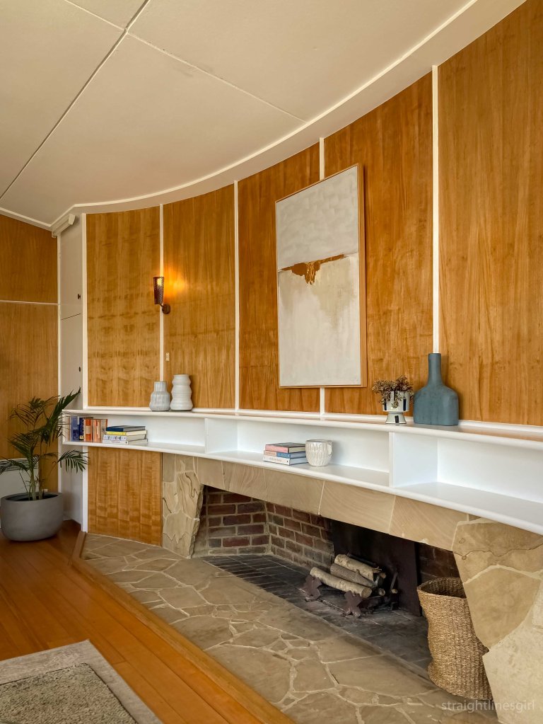
After our visit to Esmond Dorney’s 1958 Butterfly House, we ventured deeper into Sandy Bay to find a house that was a complete contrast, at least on the surface.

This was Aotea House, designed by Britten Pace in 2020. This house was only open for two tours so we were very fortunate to be able to see it. It’s a three level concrete building on a super steep site at the top end of Sandy Bay.
Open House Hobart tells us
A faceted monolithic concrete form punctuated by panel joints and openings, Aotea House faced challenging site conditions and the design muse of a commanding white gum.
Rather than provide a continuous panorama allied to a homogeneous kitchen/living/dining, the vertical program presented an opportunity to create smaller distinct spaces within a larger volume. These intimate spaces were designed as an escape for family members with foreground relief from the panoramic views of the living room.
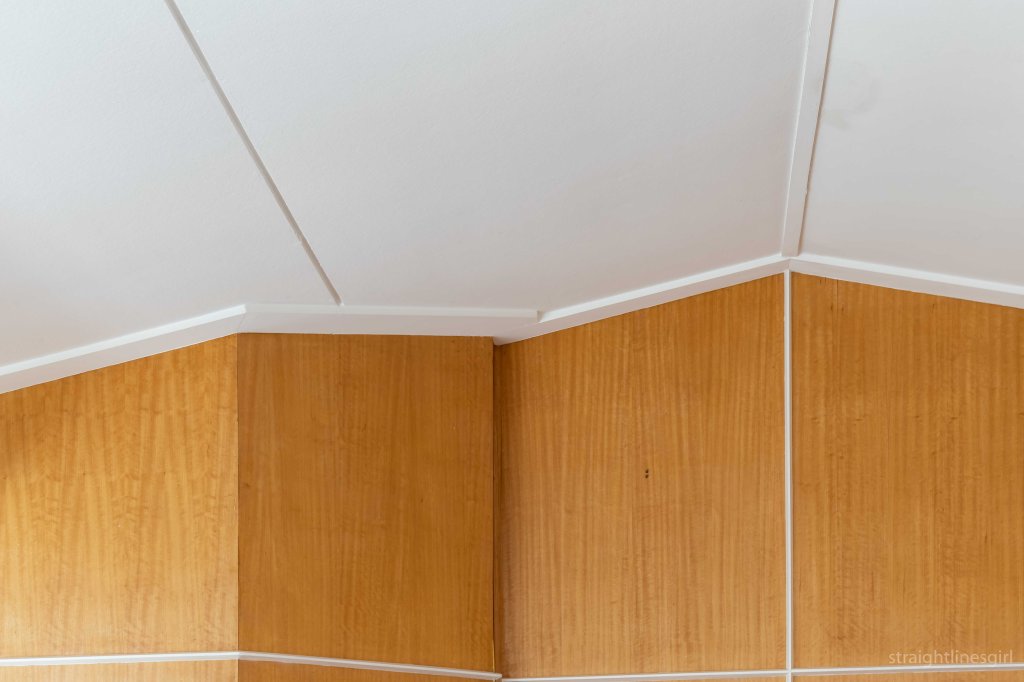
The plan is an irregular pentagon stacked over three modest floor plates, with each narrowing and framing views of foliage and close bushland or opening to sweeping views of the Derwent and Southern Midlands. And there are only two right angles in the entire house!
The white gum creates a contiguous thread, cohabiting occupants with rosellas feeding in its leafy canopy, then descending past the striking white trunk of the understory to the forest floor below.
Open House Hobart Website
It’s a fascinating residence.

Although it’s more than 60 years older than the Dorney House, I think the concept of making the garden part of the house that Esmond described is a feature here too, with the huge white gum being incorporated into the views from every level of the house.

The owners told us that they didn’t want to live in a concrete box and went to great trouble to make sure the house didn’t become one. There are only two right angles in the house so, as you might imagine, finding furniture to fit has been challenging.

It has huge windows that had to be commercial grade because of the size, and the logistics of installing them sounds incredibly complex. There’s a massive curved external wall that made me think of the Gordon Dam, but is actually based on a mould from an industrial water tank.

The owners explained that they wanted open plan areas where the whole family could be together, as well as little nooks where people could escape by themselves. The result is a very open space, where the vertical elements dominate, with cleverly placed hiding places that I’m sure the kids (and the adults!) would love.
It’s a beautiful structure, with the combination of concrete and timber working really well together.

And the views are fabulous.

Open House Hobart weekend was held on 13-14 November, with a fascinating range of buildings open for tours and drop-ins.
After our Taroona Esmond Dorney buildings, we were supposed to take part in the Modern Hobart City walking tour, which I was super excited about, but unforeseen circumstances meant it had been cancelled earlier in the week, so we had some free time before our next Dorney house. We decided to wander along Macquarie Street and see what we could find
The National Mutual Life Building at 119 Macquarie Street was open, we think for the first time

Open House tells us this about it.
This six-storey neo-Gothic sandstone building in the centre of Hobart has been a prominent part of the Hobart city landscape since its construction in 1906. The National Mutual Life Association (founded in Melbourne in 1869) commissioned prominent Hobart-born architect, Alan Cameron Walker, to design their Hobart offices. Walker was born in 1865 and apprenticed under the well-known Tasmanian architect, Henry Hunter. The stone facade and carved bas-reliefs of the building are of particular note, and feature a lion and unicorn flanking the company logo above the entrance on Macquarie Street. The building now houses a number of commercial tenancies, with the third and fourth floors being occupied as a residence.
I’ve always been intrigued by this building, especially the turret on the roof, and it sits nicely next to one of my favourite buildings, the Reserve Bank.
It was raining when we got to the roof top and my first impression was of the brilliant view it had of the two beautiful modernist buildings on the corner of Murray and Collins Street, Jaffa and the T&G Building. Who cares about the rain here?

I was so excited by the view I almost forgot about the turret (I don’t know if that’s the actual term, I’m sure it’s not).
It also sits nicely against the Reserve Bank so you can reach out and touch it.
Should you wish to do so.

There was once a rooftop cafe up here, complete with deck chairs, which looks like it would have been a fabulous use of the space. We need more rooftop cafes!
The top floor of the building had recently been vacated and was empty, ready for refurbishment.

It was such a wonderful space and very hard not to notice all the lead lighting throughout, which is thought to have been an 1970s addition.

I wasn’t the only person expressing a wish to live here.


On the other side of the Reserve Bank were two apartments at 105 Macquarie Street, “Polly” and “Henry”, which are recent transformations of former office spaces into short stay accommodation.

They were both very different in look and feel, and Polly had super views of the other side of the Reserve Bank.

These spaces were designed by Preston Lane, who had done the Tate House restoration, and one of the things we noticed was how a huge artwork had been incorporated into one of Polly’s walls. Apparently this had inspired Erik at Tate House to do the same thing in his bedroom in Taroona. It looked really cool. And I wasn’t able to get any photos of it, but this post will give you the idea.
We didn’t get much time here as we had an appointment with another Dorney house further out of the city. Onward!


When I got the idea for the 50 in 50 project, I thought it would be interesting to challenge myself to take a photo every day with the same lens, and to restrict myself to using only that lens for a whole month to see what new perspectives I could get by limiting my choices. I had initially thought I’d use my 24mm prime lens because, well, because I love it and I could see myself using just that lens forever and never using anything else.
But loving that lens so much, I didn’t think that it would be a huge challenge to not use it. The 50mm, on the other hand, well, that was something different. I wasn’t exactly sure why I’d bought it and I’d rarely used it. I think I’d heard it was a good lens for portraits but, as portraits aren’t a genre I’m very interested in at all, I’m not sure what I thought getting a portrait lens would achieve.
Nonetheless, I had it and it was sitting there in my lens bag unused. Everytime I went to use it, everything would be SO CLOSE and I’d hastily swap it for my 10-22 where I was a lot more comfortable.
I’d set myself the goal of completing a 30-day project with one lens in 2020 as part of my 20 in 2020 list that I write about on my other blog. I realised at the end of October that time was running out if I wanted to get this done. I was on a short break in the middle of a very frantic time at work when I decided, in that way you make crazy decisions when you’re relaxed and on holidays, that I was going to start the project the very next day with the 50mm lens and it was going to be a 50-day project, not a 30-day one. Because 50/50/50 was just so much tidier than 30/50/30.
The challenge was set and the rules were made. I locked all my other lenses away in my camera bag and began. The main rule was that I needed to make at least one photo every day and post it. I didn’t actually have to edit or post it the day I took the photo, as long as I’d actually captured a photo every day. I was a little bit flexible with the challenge and I did allow myself to continue to use my phone for thing I’d normally have used my phone for anyway like casual daily photos and Hobart Street Corners.
So what did I learn?
Not allowing myself to crop the images, other than what was needed to straighten them, meant that I had to be a lot more careful in my framing in-camera. In some photos that were very tight, I found it difficult to make the adjustments I needed to compensate for the viewfinder showing me a slightly different view than what appeared in the image. More than once, an image that I thought I’d framed perfectly ended up with something I thought I had excluded sneaking in on the right hand side, or the image wasn’t framed exactly the way I had thought it was.
It was also difficult to step back as far as I needed to get what I wanted into the frame, so in a lot of photos I ended up getting closer and including less in the image than I had intended. This is why there are a lot of photos from the challenge of the tops of buildings or details, because the 50mm perspective just didn’t allow everything to be included. There are limits to how far you can step back sometimes, because there are things like brick walls or roads with heavy traffic that stop you. Getting run over in the pursuit of my art is not really the way I want to end my life!
Doing this challenge forced me to look at things in a different way to how I would have if I was using the 10-22 lens and trying to get everything in. It helped me to isolate details that I found interesting and to really think about what was interesting about a scene. It often felt like it was a lot more of a personal way to make photos, to find the element that spoke to me within what was usually quite a cluttered space, and to focus on that and to show it from my perspective.
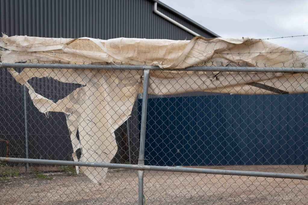
I’d go out with one idea in mind and then, after being in the space for a while and taking the photos I thought I’d wanted, I’d look around some more and see something completely different. I’d then go and explore the things that had caught my eye and end up with a totally different image to what I’d imagined. Light playing on a surface, a creeping shadow, a small feature that I’d never have noticed if I’d been looking at the big picture. Something on the ground. Something sitting on a fence. I’d capture these things as I saw them, and I’m glad I did because, more often than not, I’d come back the next day and they’d be gone.
Of course, not everything worked out as I’d wanted it to, and some days I ended up just taking a photo of something, anything, just to complete the challenge for that day. These were not some of my best moments.
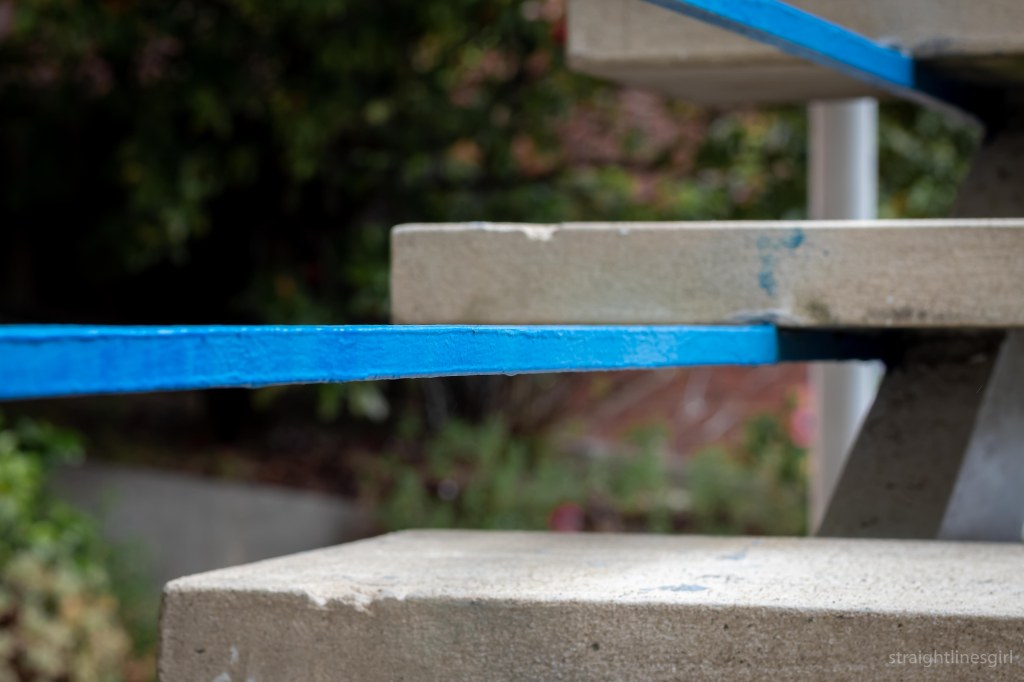
I found I really enjoyed getting up close to a feature and making it the focal point of the image, with a very shallow depth of field to blur the background.
Some of these types of photos worked well; others not so much. I had a couple of days where I’d get a photo I really liked only to find I hadn’t quite nailed the focus, whereas similar shots with less pleasing composition were tack sharp. What to do there?! My choice was to go with composition over sharpness and to remind myself it’s okay to take more than one photo of exactly the same thing if I think it’s going to be a good one. Maybe one day I’ll remember this.

16 December was the last day of the challenge and I’d already picked out my subject a couple of days earlier on my morning walk, when there was great light. I’d taken a few test shots and thought I could make it work on the last day. All I needed was the same light and the same lack of traffic on the highway. Sadly, the light didn’t come and I woke up feeling very unwell. Not unwell enough to not go for a walk but not exactly raring to go either. So I didn’t get the photo I wanted to round the project off. I took a couple of photos while I was out but nothing really worked and all I wanted to do was go back to bed. Which I did.
It was a disappointing end to what had been a fantastic project that, for the most part, I enjoyed doing. Overall, I’m pleased with the photos I made for the project, and there are a couple that are up there with my favourite images of the year.
I’m not in any great rush to stop using the lens and, now I know some of its possibilities, I’m keen to use it more often.
It’s been a great experience for me. I would say if you feel like your photography is getting stuck or same-y or you want to mix it up a bit, set yourself a challenge like this where you restrict yourself to one element. Go out for a couple of weeks, a month, however long feels right to you, and make photographs every day within that restriction. Maybe you could restrict the lens, or the aperture you use (or even both!). You could restrict yourself to making a photo at a particular time of day or within a particular location. One challenge I have always been interested in is the “one block” challenge, where you can only make photographs of things that are within one block of your town for whatever period you choose. Maybe a back and white challenge is more your thing (I did that for a year in 2018), or you photograph only yellow things every day for a month. Or birds. Or cups of coffee. Or sandstone (nah, just kidding, don’t do that). Anything where you limit your options, I think, will help you to focus on one thing and to get more creative as you can’t get distracted by the many other variables that could distract you.
Now I have to plan myself a new challenge for 2021.
Have you thought about undertaking a photo challenge like this? Or done one? Let me know in the comments.
