open house richmond 2024

Open House Richmond was a one-off Open House event held in February 2024 as part of the Richmond Bicentenary.

Located on the land of the Mumirimina people of the Oyster Bay Nation, Richmond hosted a number of events between December 2023 and February 2024 to commemorate the history of the town.

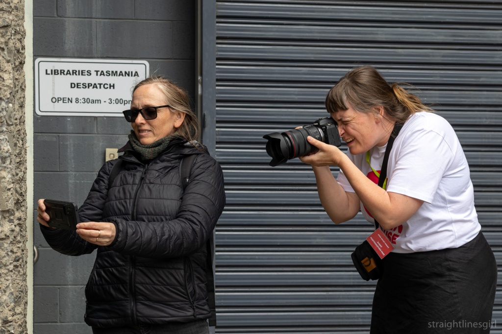
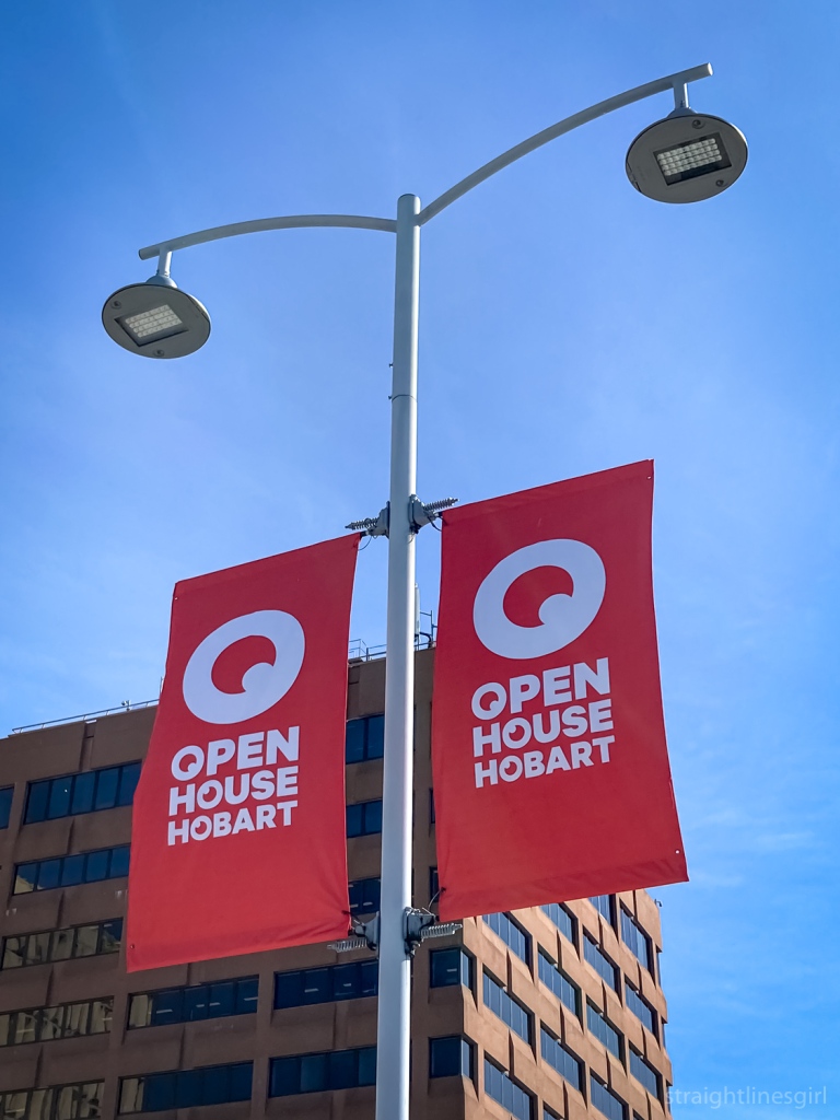
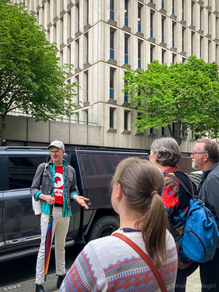
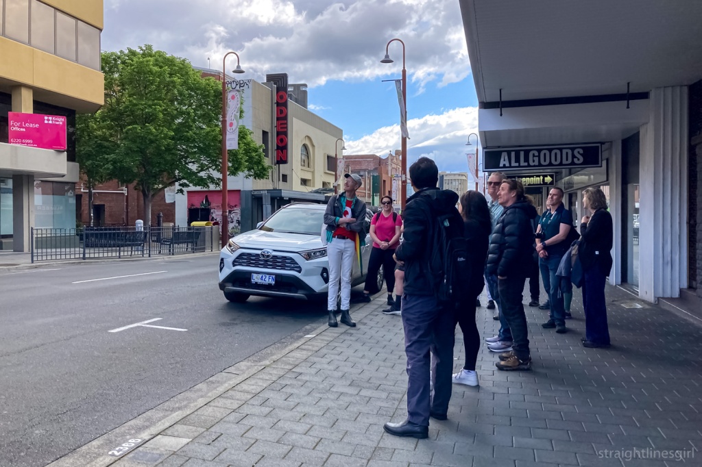
Having attended many Open House Hobart events in the past, my sister and I decided it was well past time that we volunteered at one of these weekends, so we put our hands up to help out on the Saturday morning.

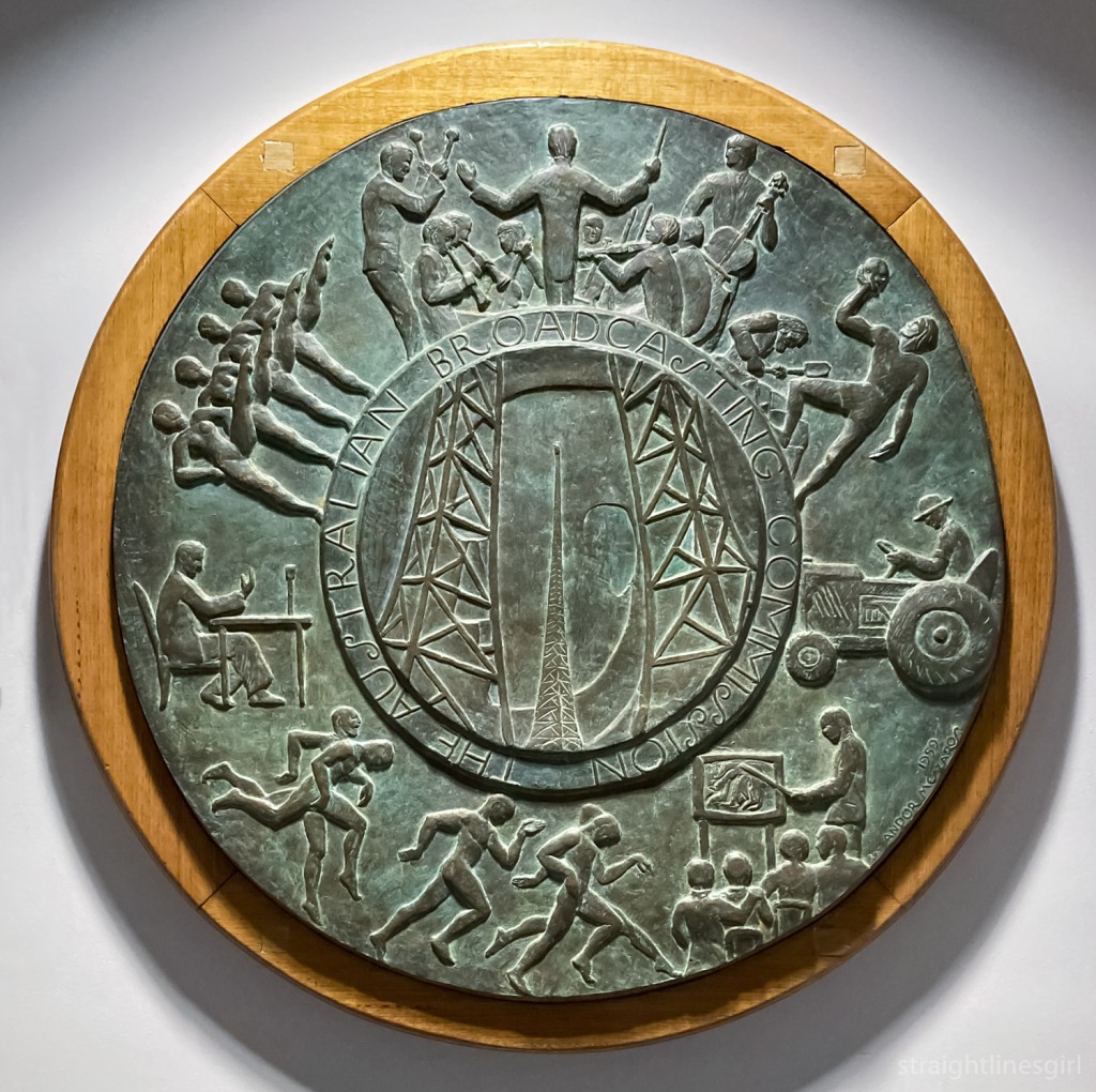
You can read about what we did here.

Barb is wearing a red Open House t-shirt holding a clipboard standing outside of a white weatherboard building with a red Open House Richmond sign in the window. She is wearing a black cap and a demin mini skirt.
I finally got to hold a clipboard! (NB not the building I was volunteering at) Photo by Carryl M.

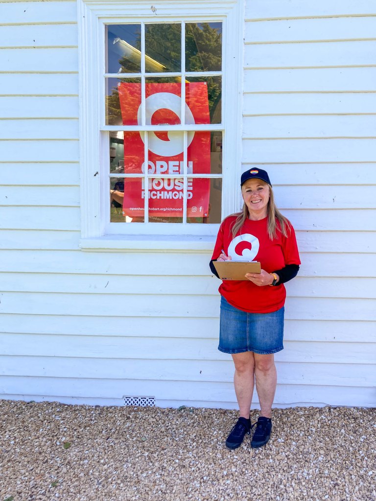
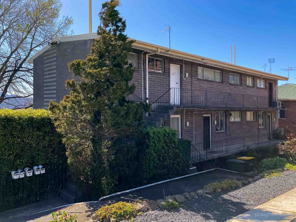
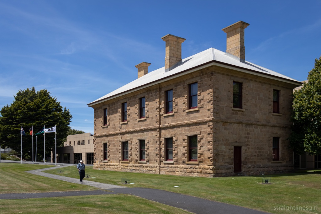
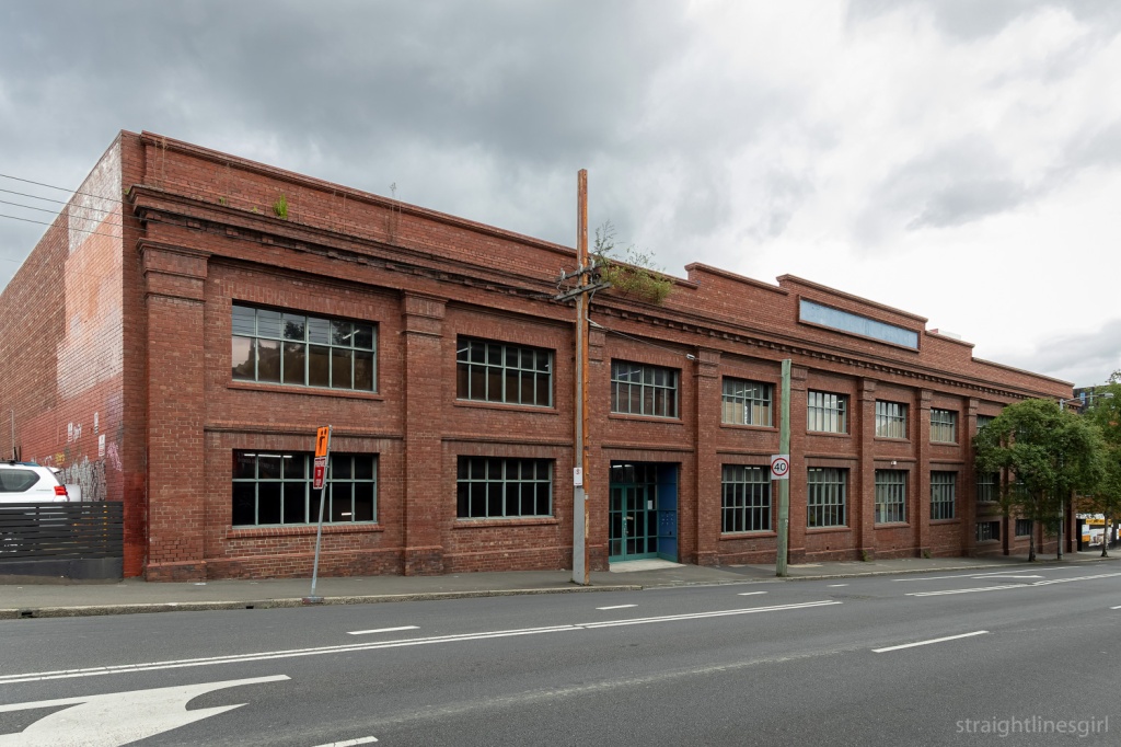
We were allocated to the St John the Evangelist Church precinct for three hours on Saturday. Our job was to tally the number of visitors and ask them for their postcodes. If you’ve been to Open House events before, you’ll know this drill.

St John the Evangelist Church

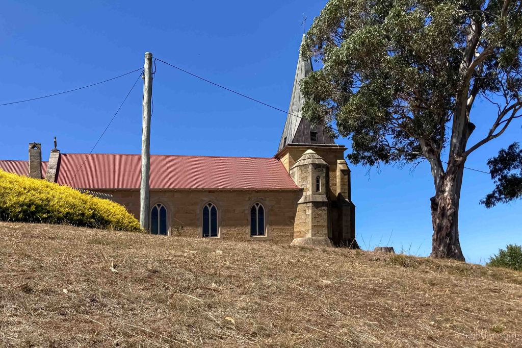
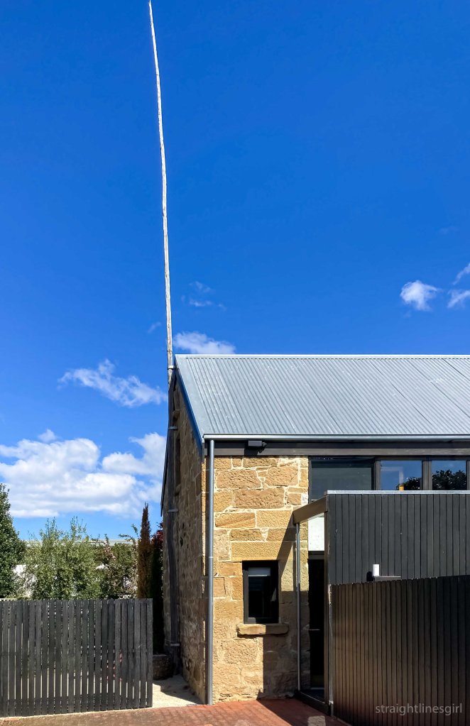
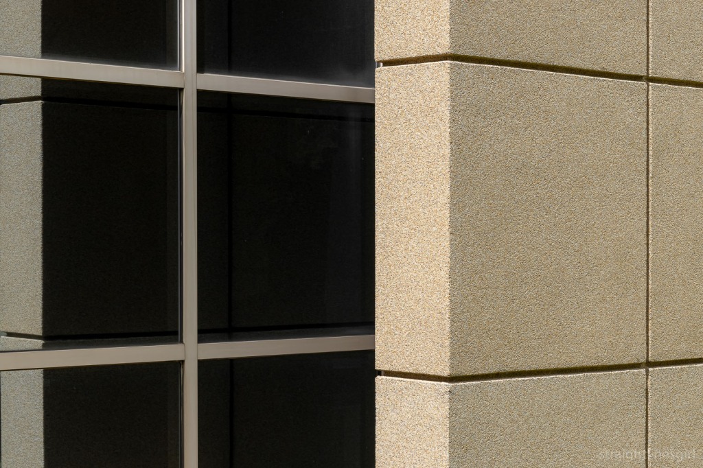
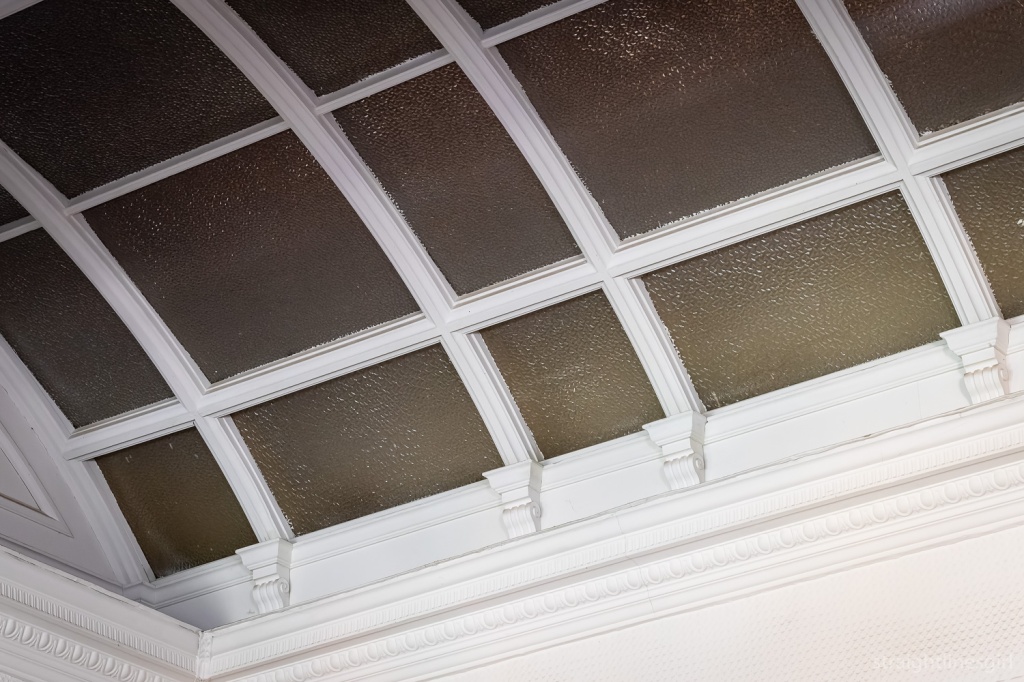
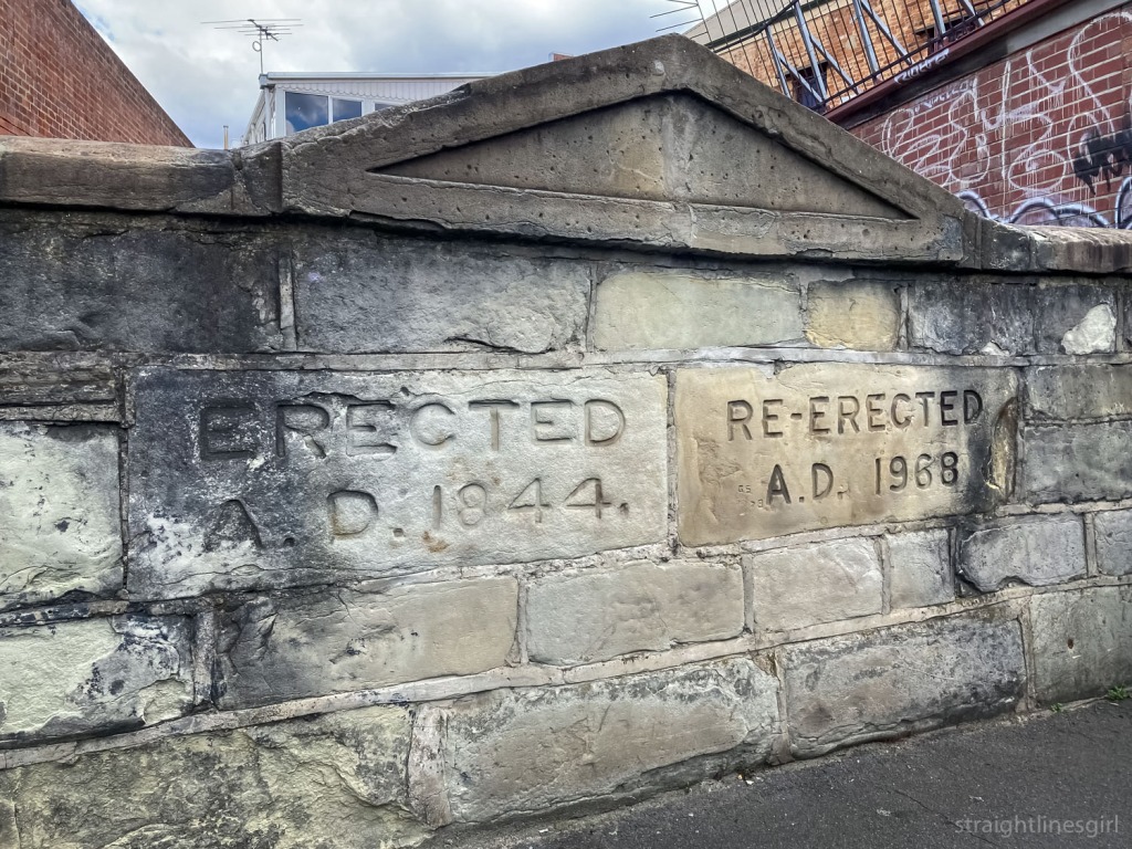
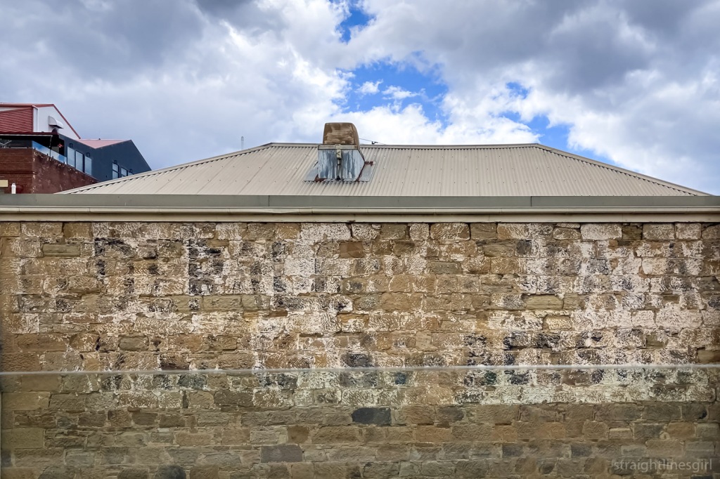
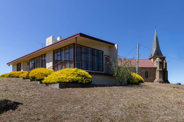
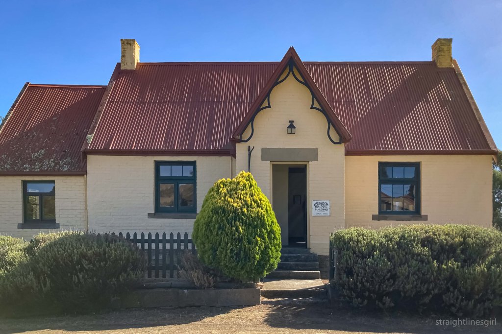
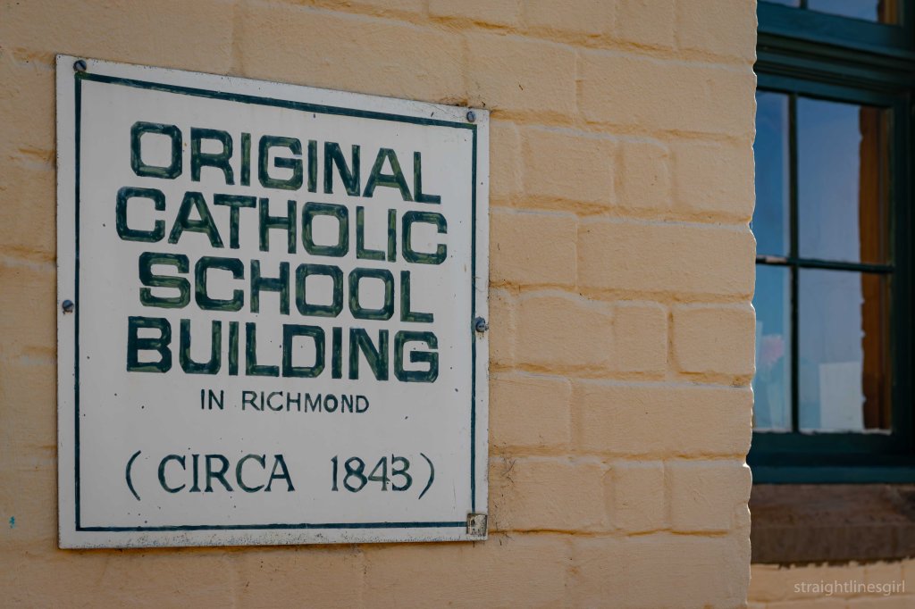
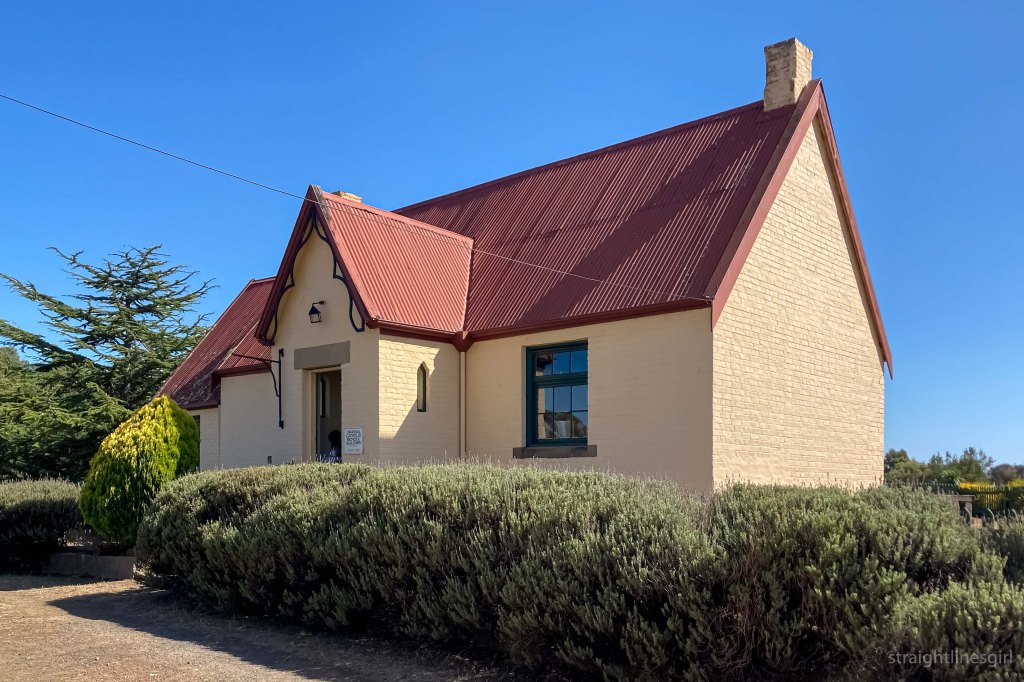
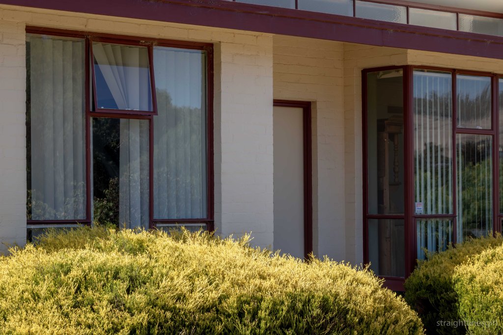
The church (dating back to 1835) and the old school house (1843) were open to the public. The 1959 presbytery wasn’t open, but visitors were invited to walk around and admire its modernist excellence.

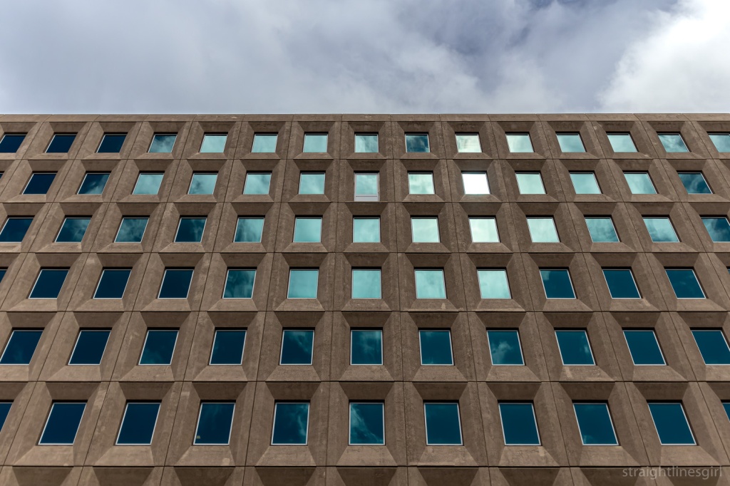
Wesley Stacey Exhibition

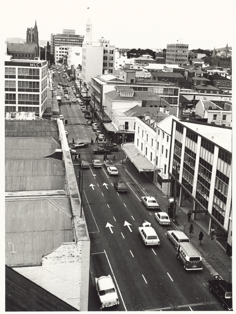
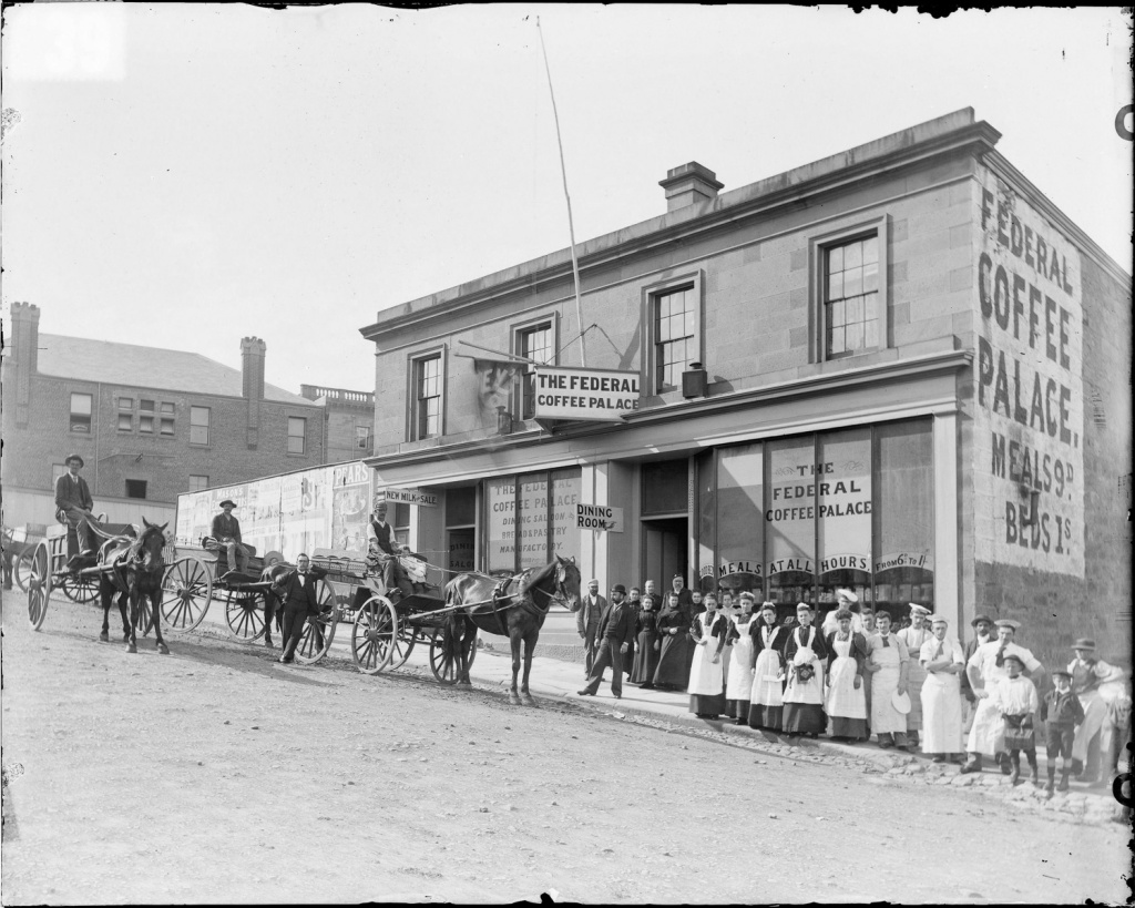
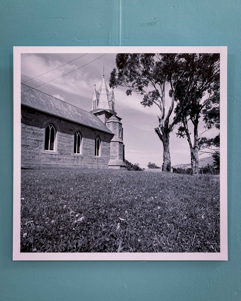
Before we headed off to the church, we took a look at the Wesley Stacey photo exhibition of Richmond in the 1960s. Wes Stacey (1941-2023) was an Australian architectural and documentary photographer who came to Richmond in 1968 to document the town.

Wesley Stacey 1968 Richmond

The exhibition notes tell us

Wes was in Richmond for a few days in 1968 during which he brought an artist’s eye to the town just prior to its emergence from a century in the doldrums. Bypassed by roads, rail and causeways, Richmond settled into a period of reduced relevance and quietude, which saved it from unsympathetic development. Wes’ photographs record a very locally-focussed Richmond and present a perspective on the village just prior to its reinvention as a heritage tourism hot spot.

It was cool to see this photo of the church we were about to visit.

Wesley Stacey’s 1968 photo of St John the Evangelist Church

The exhibition was curated by Richmond Bicentenary Creative Director, Noel Frankham. The photographs form part of the “Wes Stacey archive of architectural photographs, 1968-1972”, held by the National Library of Australia.

It’s an amazing collection of almost 3,000 photos.

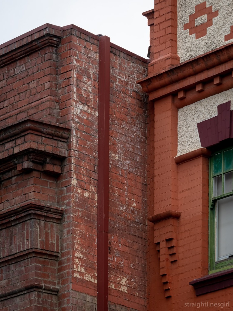
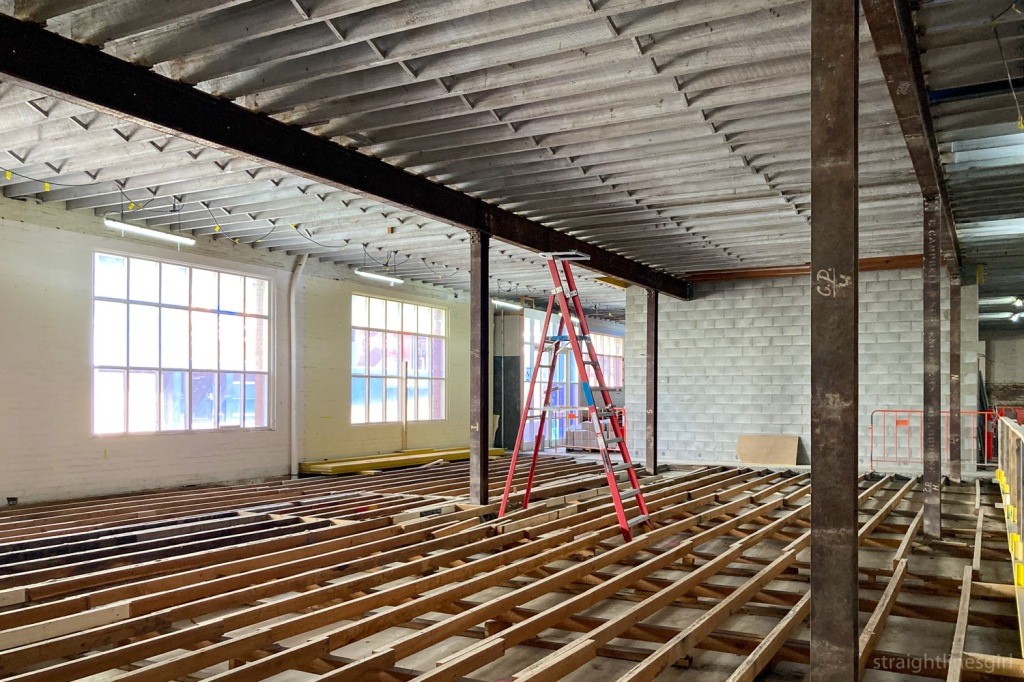
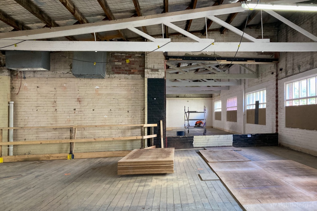
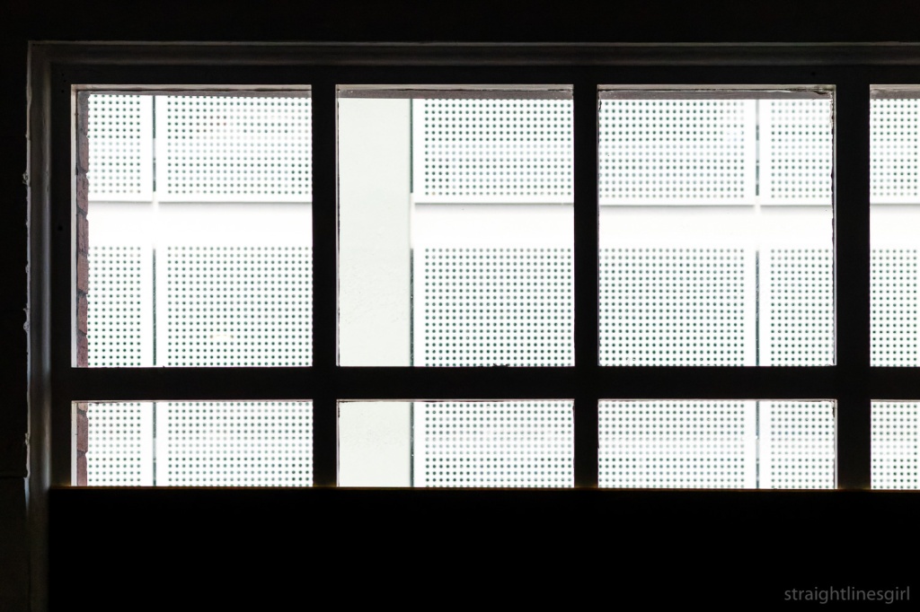
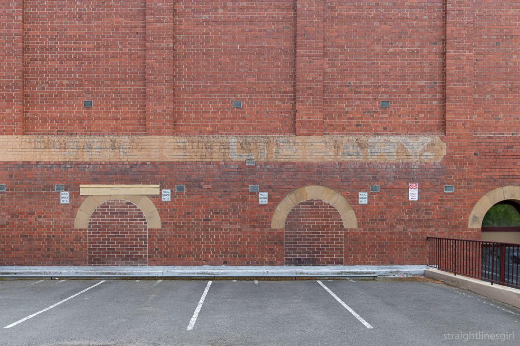
St John the Evangelist Precinct

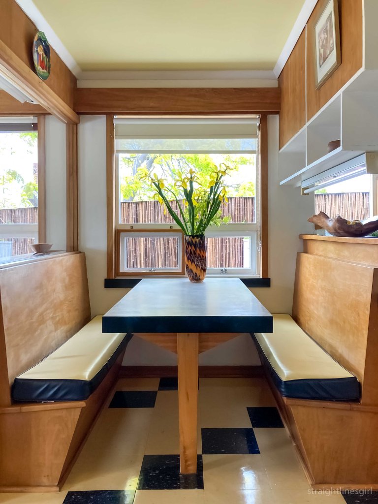
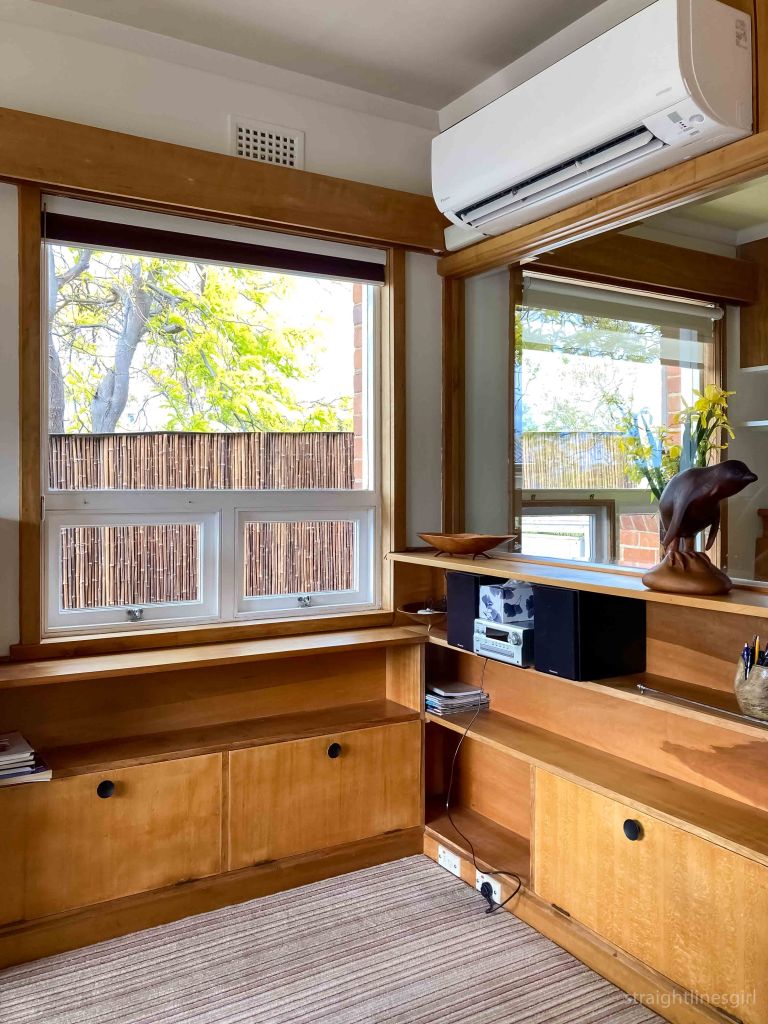
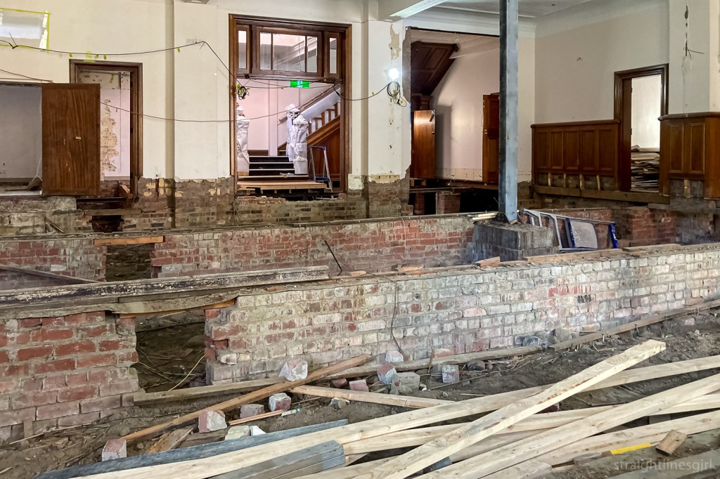
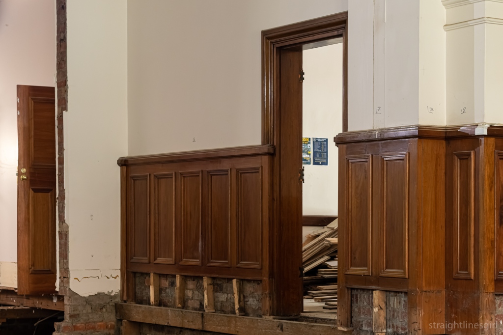
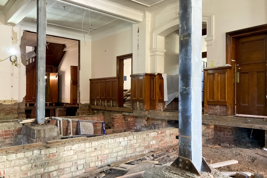
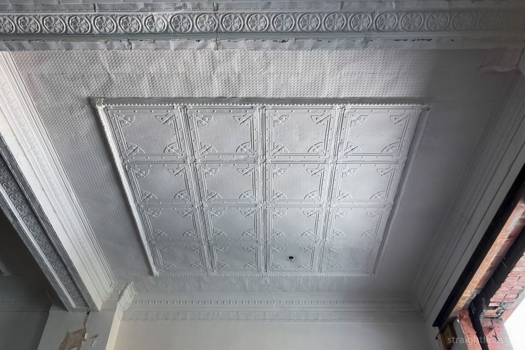
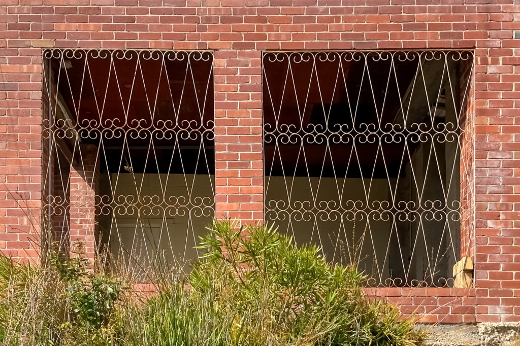
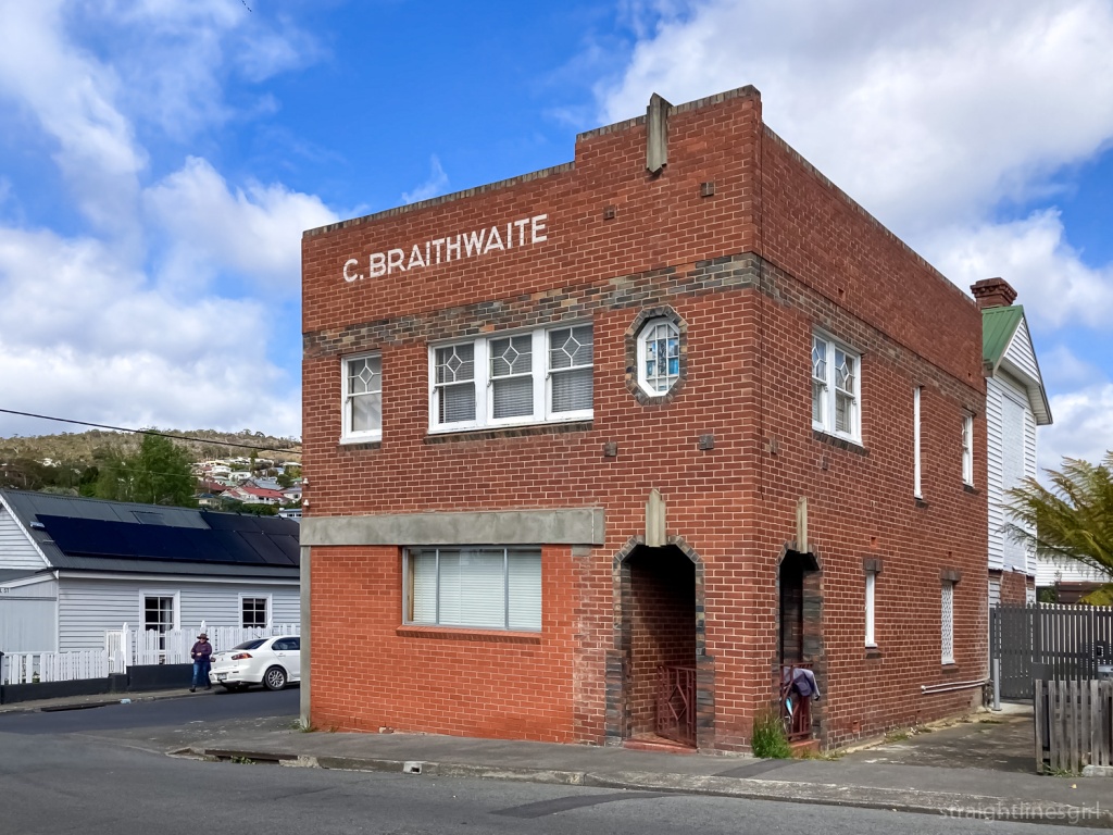
Three hours was a lot of time to explore the area in between visitors. Here’s some photos.

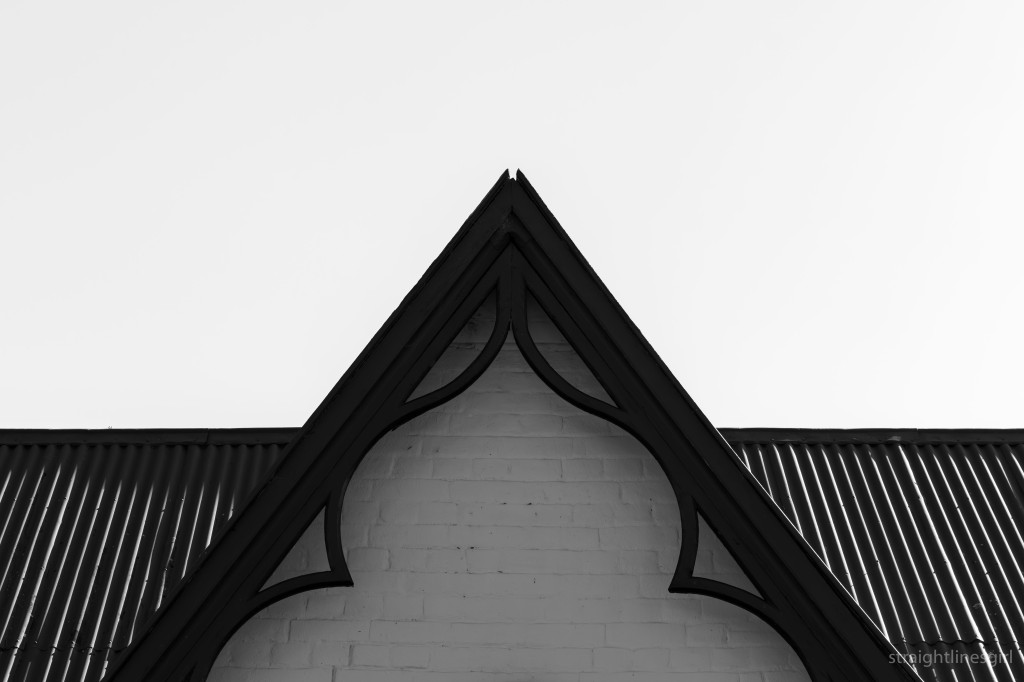
Old Catholic School House (1843)

Old School House
Old School House
Old School House
Old School House

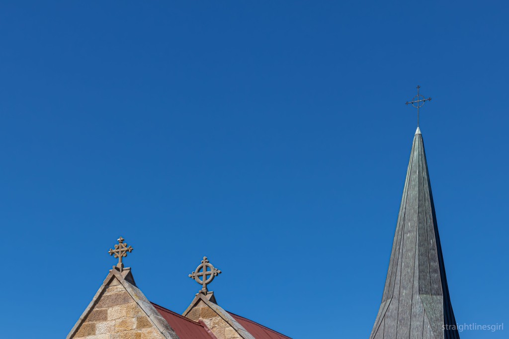
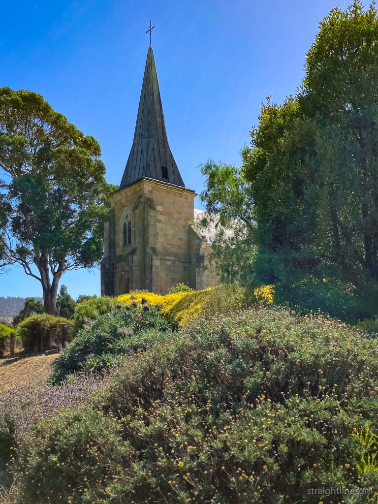
St John the Evangelist Church (1835)
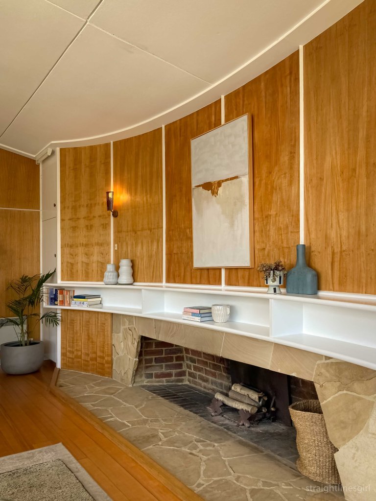
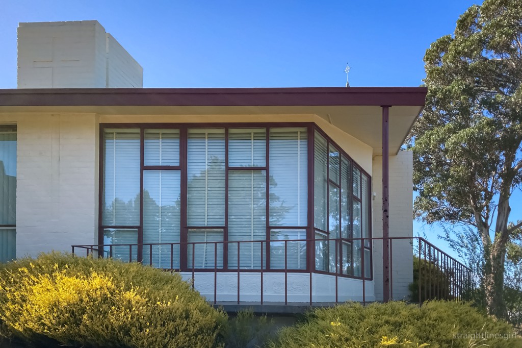
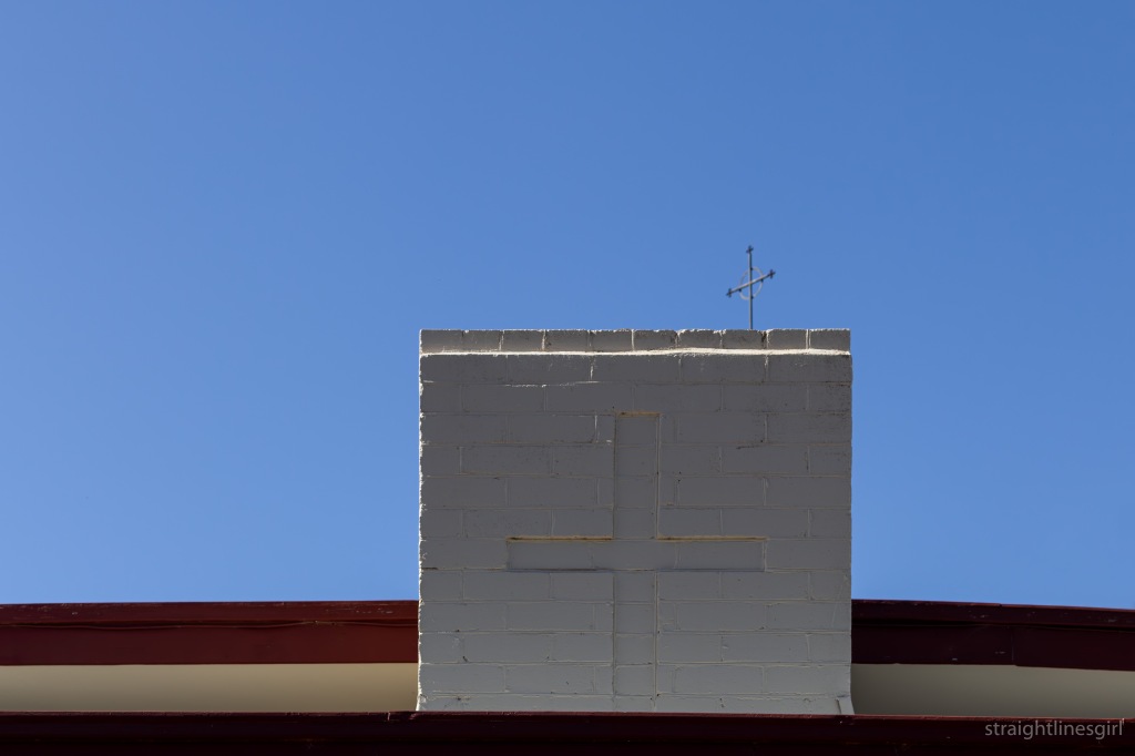
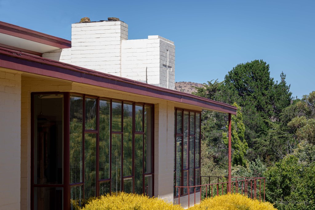
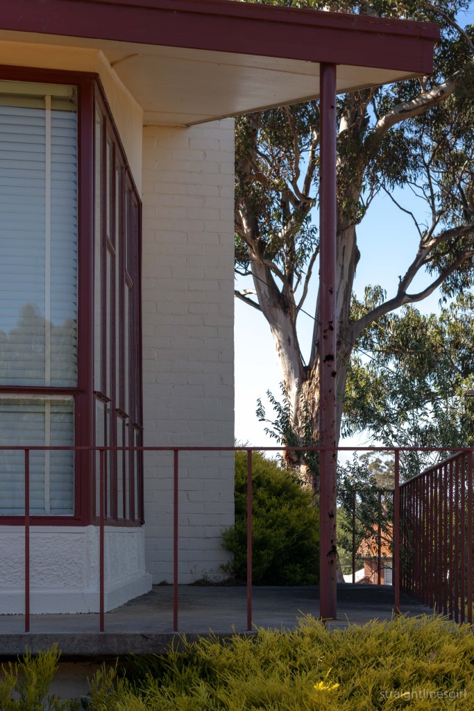
Church toppers
Church seen from the road
The church and the presbytery

The Presbytery

The original church presbytery (date unknown) eventually become a convent and was subsequently replaced by in the 1930s by a new catholic school and convent. In 1929, the old school house was converted into a presbytery, presumably temporarily.

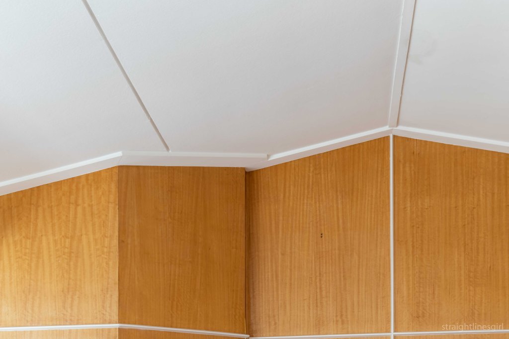
The current presbytery was designed by Paul Fox in 1957. The newly appointed parish priest, Rev Fr JB Reed had the design approved by the Archbishop Most Rev G Young DD, and it was completed in 1959 by the builder Mr E H Hewitt of Lindisfarne.

Presbytery front door

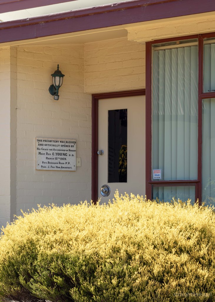
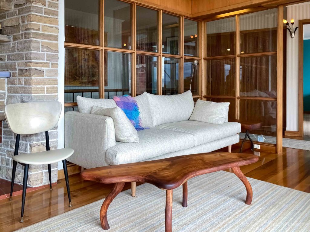
It’s a two-bedroom house with, we were told, an ensuite bathroom, which was apparently very uncommon in the 1950s.

Presbytery seen from the old school house

At the building’s blessing and opening on 15 March 1959, The Mercury observed that, ‘although modern in design, the presbytery has been built so that it in no way interferes with the antiquity of the church’.

A pair of crosses
Windows
The end
Detail
Lines
Strong verticals
More strong verticals

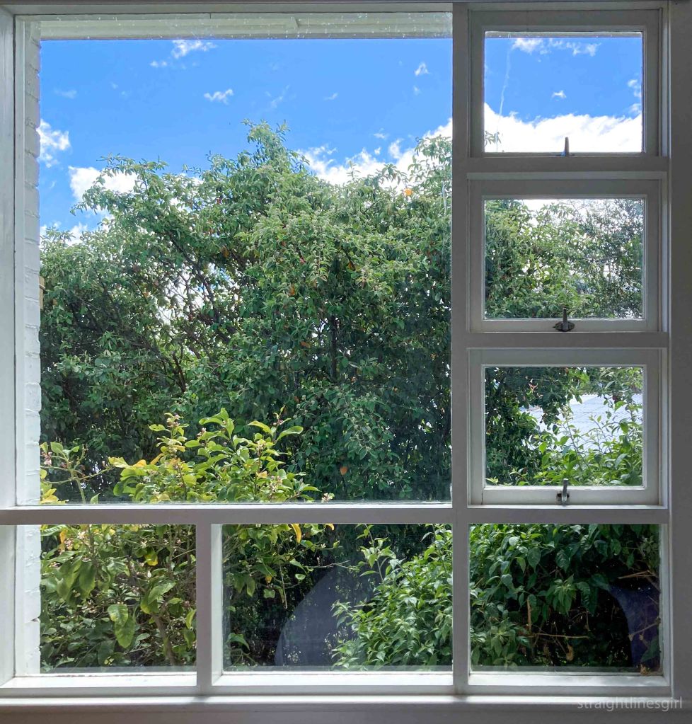
I had a lovely morning exploring what I could of this wonderful building and meeting and greeting visitors to the school house. It was interesting to hear some of the stories people shared.

I think part of the fun of Open House is to meet people with common interests (or even uncommon interests!) and to learn interesting things about our built heritage.

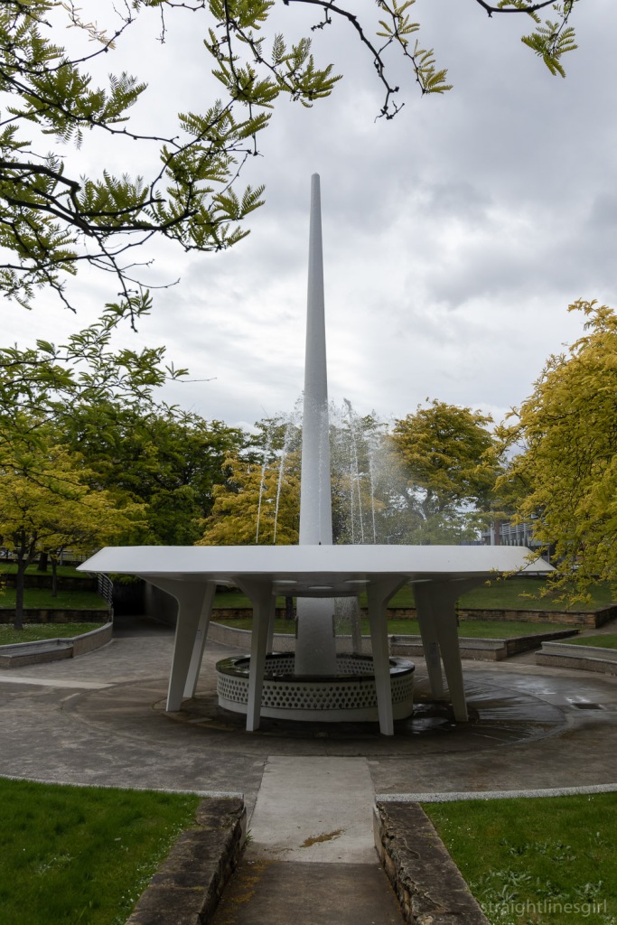
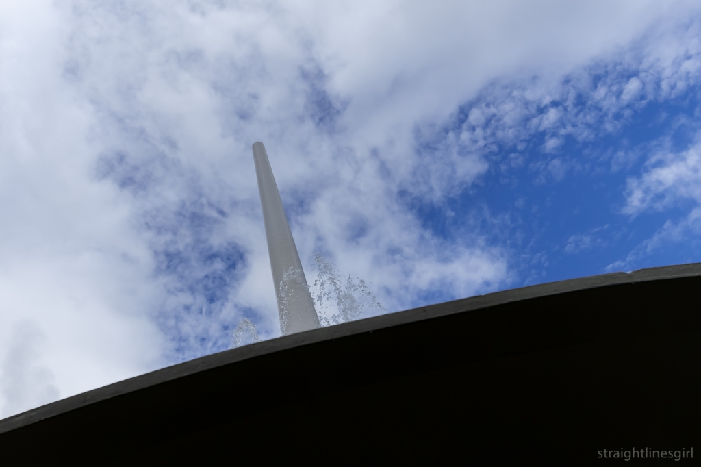
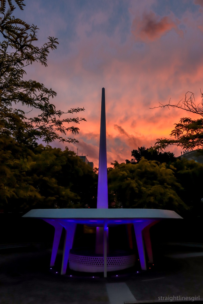
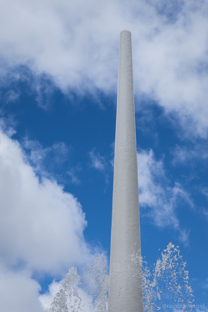
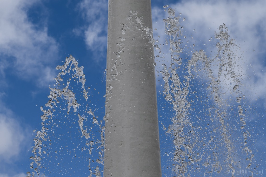
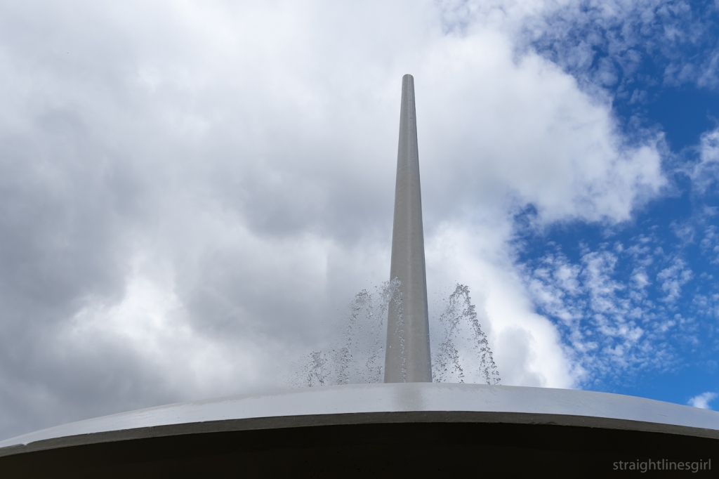
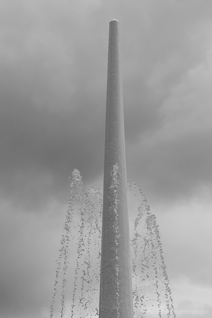
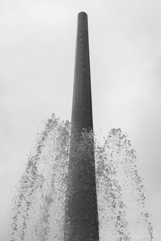
And the day wouldn’t be complete without . . .

The Richmond Tourist Amenities

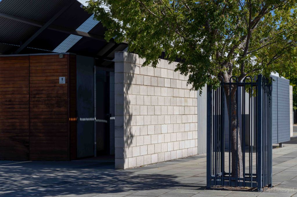
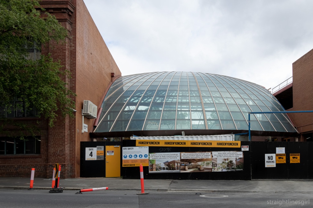
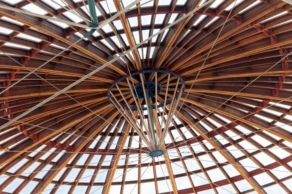
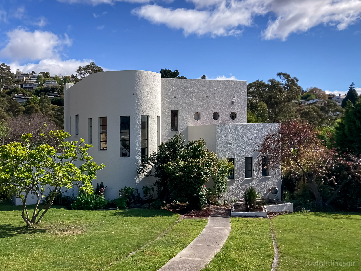
This was presented as an example of ‘contemporary architecture within a historic setting’. 

 The complex was commended in the 2004 and 2005 Tasmanian architecture awards:

“This building deserves recognition because it seeks to contextualise, within an historic setting. Through means other than imitation of historic forms. It is a well-considered approach, which reworks components of the familiar without pastiche. It also provides an innovative plan for an often maligned building type.”

From 1+2 Architecture

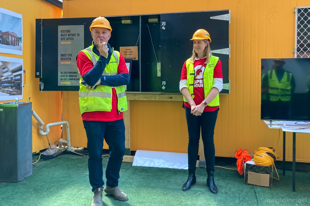
Thanks to everyone who made this weekend possible, especially Katie and Jen from Open House HQ, who do an amazing job of putting the program together.

open house hobart 2023—some houses

2023 Open House Hobart posts

Some amazing homes

Featured buildings – Woolton Place, Alt-Na-Craig, The Barn, 540 Churchill Avenue.

Woolton Place

It’s mandatory on Open House weekend to visit at least one building desigined by Esmond Dorney. Don’t ask me why. It just is.

Lil Sis and I had been to the house at Fort Nelson commonly referred to as The Dorney House a couple of weeks earlier when we attended Paddy Dorney’s launch of his book about his father’s work. (You can read about it in the second part of this post.) We didn’t have time this weekend to fit it in, but we were very keen to see one of Esmond’s houses (which hadn’t been open before) in Woolton Place, Sandy Bay.

It was built in 1958 and has had some sympathetic changes to the kitchen and bathroom in 2014.

The stone open fireplace in Esmond Dorney’s Woolton Place house

It is, as you’d expect, beautiful, with so much natural light and beautiful curved features.

Exit to the deck

The owners said that they’d so far been unable to find plans for this house and they believed they might have been among the many papers that were lost when Esmond’s office was burned down. As a result, it isn’t in Paddy’s book and we don’t know much about it.

Windows for everyone!

The entire street is full of gems like this and I need to come back and be one of those people who walks around and photographs other people’s houses.

Wall and ceiling collide

Alt-Na-Craig

This is a tiny apartment in Lenah Valley, designed by Ray Heffernan in 1964.

Open House tells us the apartment is only 37 square metres. It’s north-facing and it “showcases the principles of good design that can improve human experience, including floor-to-ceiling glass windows that keep the apartment warm in winter and cool in summer”.

Al-Na-Craig is on Augusta Road.

Al-Na-Craig Apartments on August Road

That’s not 6 Alt-Na-Craig Avenue.

But it says Alt-Na-Craig on the side of it.

But it’s not 6 Alt-Na-Craig Avenue . . .

Ohhhh . . . we have to walk up this hill . . .

Indeed we do, and we get to a gorgeous block of units overlooking Lenah Valley. Here, we meet Helen, the owner of the tiny apartment.

The apartments we came to see

Really.

Tiny.

It has a tiny kitchen (imagine Mr Tall in there, says Lil Sis), and a slightly bigger bathroom, which begs the question why is the bathroom bigger than the kitchen?.

Helen has cleverly moved the hot water cylinder out of the bathroom into the kitchen so she can fit a washing machine in there. I meant to ask where the washing machine would have been in 1964. Maybe they went to the laundromat.

The cool brickwork on the side

The rest of the apartment is one room, with the bedroom section (with built-ins) separated from the living area with a floating glass screen wall, which allows enough blockage for the bedroom to be its own space but also lets light in and keeps the place light and airy, which you really need in such a tiny space. Helen says of all the apartments, hers is the only one to have retained this feature.

The living room side of the floating glass wall. Look at all that timber!

The living and bedroom area is slightly off-north facing and the windows are designed so that in winter, when the sun is lower, light (and warmth) comes a good distance into the space to keep it warmer; and in summer, it comes in just far enough for light but it doesn’t overheat. It’s very clever use of space.

Of course, I couldn’t live there because there are no book cases. I’d need to buy the apartment next door too, just to house my books.

I don’t think Helen’s selling though!

Stone Flower/The Barn

This renovated barn in West Hobart was our last stop on Saturday.

20 Forest Road and a car

The owners say the dilapidated old barn behind the main house was the main reason they decided to buy the property.

The Barn behind the house . . . and what is that giant pole for?

It took over seven years to create the project, from exploring the possibilities, to engaging an architect and working through council and heritage issues and finally construction.

They say they reused as much timber as possible in the design, with the table being built out of left over timbers. All of the original stone has been retained.

Retaining stone and timber

It’s a lovely space.

The wall hanging in the bedroom

540 Churchill Avenue

By the time we’d finished the modernism walking tour on Sunday afternoon, we were running our of time to get back to Sandy Bay to see the last house on our itinerary.

540 Churchill Avenue was designed in 1957 by Barry Fisher. It is a stunning home!

Stair detail, 540 Churchill Avenue

We pulled up outside at 3.49 pm, just as the volunteers were packing up the signs. Please can we have a look? we asked, and Helen (who we’d met at Al-Na-Craig on Saturday) said okay but we had to be quick. And quick we were!

We got a very fast but thorough tour of this gorgeous house, a couple of doors down from Esmond Dorney’s Butterfly House that we’d seen in 2021.

The living room . . . and the amazing light fitting in the background

This house was designed for Mr H H (Bert) Smart, Master Warden of the Marine Board from 1957 to 1983.

There is exquisite attention to detail everywhere, down to the horizontal banister on the entrance stairs. It’s another of those beautifully light homes that take in the views of timtumili minanya/River Derwent, with timber fittings throughout.

And this light fitting.

Amazing light fitting

The kitchen is gorgeous.

There have been some recent renovations and extensions, especially downstairs, which are sympathetic to the original design. It is an absolutely beautiful home and I’m so glad we were able to see it.

Timber, amazing windows and a stripy mat

And that was the end of our Open House Weekend. I still have one more post to slot in somewhere though!

open house hobart 2023— the new spirit of modernism (part 2)

2023 Open House Hobart posts

The New Spirit of Modernism (Part 2)

Featured buildings – Former M.L.C Building, Lands Building, and former AMP Building.

Former MLC Building

Leaving the State Library behind, our wonderful guide, Bronwen, led us down Murray Street past “Murray House”, to the corner of Liverpool Street, where we found the former MLC Building.

A ten-story class curtain wall building situated on a street corner
Former MLC Building 65 Murray Street

It was designed by Philp Lighton Floyd and Beattie for MLC. I had to google ‘MLC’ as I’m not sure what it stands for (other than knowing it’s easily confused with CLM, whose building on the corner of Macquarie and Elizabeth Street was where we saw a ghost sign on Saturday). I suspected the words “mutual” and “life” might make an appearance and, indeed, MLC was once known as Mutual Life & Citizens Assurance Company Limited.

The building was constructed in two stages, with the first five storeys built (according to my records) in 1958, which means it pre-dates the library. The remaining floors were added in about 1977.

A black and white image looking down on a stret
Looking down Murray Street, early 1970s (Tasmanian Archives PH30-1-9754)

I found the above photo in the library, which shows what the MLC building looked like before the top floors were added. (It looks like it might have been taken from the library.) There are a few other buildings in Hobart where this approach was taken. What is now Construction House in Bathurst Street and former 34 Davey Street are two that come to mind.

The top of a multi-story glass curtain wall building
Looking up

I was lucky to have had a tour of this building through Open House in 2018, which took in the view of the city from the roof.

A view of a street with a prominant dark concrete building int he foreground.
Looking back up Murray Street at the State Library and the Stack (November 2018)

The building also has this interesting extension on the first floor, which I think Bronwen said was part of the original design. And of course, the obligatory relief sculpture to show MLC’s care for their customers.

First floor of the MLC Building, currently home to the Bett Gallery

Jaffa House

Further along Murray Street is Jaffa House, which wasn’t on our official list of stops but we stopped there anyway.

It was designed by Jim Moon of Bush Parkes Shugg and Moon, and built in 1971-72. It was originally the Savings Bank of Tasmania headquarters, and is known as Jaffa because of its colour.

A reflection of an art deco style building in an orange glass curtain wall
Reflections of the T&G Building in the windows of Jaffa

AMP Building

Our next stop was AMP House on the corner of Collins and Elizabeth Street. It will always be AMP to me, never NAB, despite what the sign on the side says.

It was designed by Richard Crawford of Crawford Shurman Wegman Architects and competed in 1968.

A large tall brutalist tower building
AMP Building tower

This is a delightful building that can almost be seen in two parts: the tower and the podium on which it sits. I’ve often thought that the podium by itself would make a lovely small brutalist building.

You can see the relationships between the tower and the podium more clearly from higher up, like in this photo I made from the roof on the neighbouring CML Building during Open House 2018. (I did a lot of rooftops that year!)

A black and white photo of a large concrete building sitting on a podium, with the edge of another buildin gint he foreground
AMP Building from the top of the CML Building

AMP is the Australian Mutual Provident Society, and it had a small office building on this site prior to 1881, when its new building was constructed.

AMP’s 1881 Premises on the corner of Elizabeth and Collins Street (Tasmanian Archives)

This building was extended and had another floor added in 1913. Bronwen said that in the 1960s, AMP decided it wanted to own the tallest building in Hobart, so it had the 1881 building demolished and replaced with the current one. One of the archways from the old building is now located in the Botanical Gardens.

The facade features the Tom Bass relief sculpture “Amicus certus in re incerta – A sure friend in an uncertain event”, which is similar to the one on the side of Sydney’s AMP building. This one has a stylised map of Tasmania in the centre of arms encircling the Goddess of Plenty watching over the father, mother and child.

A concrete tower block atop a smaller podium
Looking up at the AMP Building

Reserve Bank

Just around the corner on Macquarie Street, is the Reserve Bank Building, which we learned about on a 2020 Open House walking tour.

The Reserve Bank Building, Macquarie Street

This building was completed in 1978, and Bronwen noted its recessed corners. (She loves recessed corners and pointed them out everywhere we went). What I remember about this building is that they wanted to keep it simple and inexpensive because money was tight at the time, and it wouldn’t have been a good look for the government to go splashing cash around for a fancy new bank building.

It was awarded the ‘Enduring Architecture Award’ at the 2012 Tasmanian Architecture Awards.

The void

Bronwen pointed out the recessed area to the left of the building that was kept aside for the public artwork, which in this case is Stephen Walker’s wonderful Antarctic Tableau.

A close up of a bronze sculpture of a bird's head
Antarctic Tableau (detail) by Stephen Walker

Lands Building

Our final stop was the fabulous Lands Building in the next block.

It’s a very neat symmetrical design with some kind of escape hatch on the second to top floor that no one has ever been able to explain. (Look closely!)

A concrete building facade with several rows of even windows
The Lands Building, Macquarie Street

Another example from the 1970s (1976, I believe), it is, like other brutalist structures, grounded and earthy, which, Bronwen observed, seems appropriate for something called the Lands Building.

I think it could be taller.

Two rows of four windows in a concrete building facade
The Lands Building, Macquarie Street

And that was the end of the tour.

It was great to meet someone who loves these buildings so much, and I agree with Bronwen that we need to find out more about them. I’m certainly enjoying uncovering their history from random places, but often all I can find is little snippets, as there isn’t a lot of readily available information about many of these buildings. It’s fun to search though! There are many rabbit holes . . .

Before we left, Bronwen asked if there was any interest in more tours of other modernist buildings and the answer was a very enthusiastic ‘yes’, so hopefully next year we’ll see her again.

open house hobart 2023— the new spirit of modernism (part 1)

2023 Open House Hobart posts

The New Spirit of Modernism (Part 1)

Featured buildings – State Library of Tasmania and The Stack.

If you can’t already tell from the majority of my photos, I’m rather fond of modernist buildings. So I was very excited when I saw there was a modernism walking tour on Open House weekend.

I’d told Lil Sis when we were negotiating the booking system that I didn’t care about anything else as long as I got onto this tour. We had booked onto a modernism tour a couple of years ago and it had been cancelled at the last minute because the architect had broken their toe and couldn’t manage the walk.

But no such disaster this time, and we met architect Bronwen Jones outside the State Library on Sunday afternoon.

A tall, brutalist building. View is looking up to the sky.
The State Library Stack

Bronwen describes herself as a flâneuse, a female flâneur, the person who walks around the streets, observing urban life. I’ve often felt connected to this term but the one I use more often to describe myself is ‘urban bushwalker’. To my mind, it’s the same thing. Though maybe the original flâneurs walked with a sketchbook and I walk with my camera.

Bronwen is passionate about modernism and observed that, unlike the old sandstone buildings that dominate Tasmania’s landscape, there has been very little research done into these mid-20th century structures. As a result we don’t know a lot about them and there’s a real risk of them being demolished with their stories untold. It’s happened to far too many of these buildings already.

A view looking up at some modernist buildings
Behind the State Library

We began our tour at the Stack, the wonderful 1970s brutalist addition to the State Library (which you might recall was originally housed in the Carnegie Building we saw on the Signs of Hobart tour). It’s a most distinctive building, and there’s a video floating round in the archives that shows it being built.

Close up of ragged concrete lines on the side of a building
Stack detail

It took me many years to work out that when an item’s location in the library catalogue said “Stack” it actually meant the item was in this building not, as I’d imagined, that it was sitting in a stack of other books on the floor . . . That only happens in my house. The library would not do this.

Light and shadow on different textured concrete
Textures and shadows of the Stack

Now that we have that cleared up, we were accompanied on the first part of the tour by Nina, one of Open House’s official photographers, who I’d met at the drawing workshop on Friday.

And at last, finally, several years after she had photographed me photographing a building completely unaware, I got my chance to return the favour. You have to be quick to do this though. She knows exactly what you’re doing most of the time!

A woman in a white t-shirt is photographing a woman in a black jacket who is photographing the side of a building
Nina in action. Lil Sis is possibly aware this is happening

So, back to the Stack.

This building is raw, honest and, as Bronwen pointed out, designed with minimal windows to keep all the precious archival records away from the sunlight. She said it was always the intention for this section to be added when the library building was designed in the late 1950s, but it wasn’t completed until around 1971.

Looking up at a concrete building
Minimal windows

The State Library building itself was designed by the Melbourne architect John Scarborough, who also designed the Morris Miller Library at the University. It was opened in 1962.

As we admired this fabulous building, Bronwen spoke about the context within which the modernist buildings came to be. There is much written on this. It was a time following post-war austerity, when architects (and everyone else) were able to travel internationally and bring back new ideas, and new immigration waves of people bringing ideas from their homelands with them. This included new design concepts, new materials like glass, steel and concrete, and new technology, including pre-fabrication.

A woman wearing a red top standing in front of the State Library building, a glass curtain wall with blue panels
Bronwen talking about the design of the State Library

And standardisation. There’s a lot of that. Fin. Glaze. Panel Repeat.

Bronwen said there is a lot of horizontal lines and regularity in these designs, but not necessarily with the axial symmetry you’d see in a Georgian design. The idea is that these buildings are stripped back to the essentials so the form comes through without any ridiculous (my word, not hers) fancy ephemera to distract you.

It fits the concept of “tabular rasa”: sweeping everything clean and starting over (I had to google that because I spelled it wrong). And it’s a very minimalist aesthetic: To achieve the most practically and aesthetically with the least possible means.

The other concept big in modernism was “form follows function” which in its simplest sense means the building should be designed so it can do what it’s meant to do. The Stack is an obvious example of this, I suppose, with its design that excludes the light so the archival artefacts aren’t damaged.

I tried to take notes but it’s impossible to do that and make photos at the same time AND listen to the person talking. (Can anyone tell me what “Groused Harvey” is supposed to mean? I wrote that in my notes and I have no idea!)

Closeup of blue glass curtain wall panels
State Library glass curtain wall

Bronwen spoke about glass curtain walls, of which this is Tasmania’s first example. She noted that this type of wall is non-structural; it is ‘pinned’ to the slabs, which themselves are built on columns which give the structural support. This is unlike older architecture, which is built brick-on-brick, put in a window and keep building. (Reminds me of my Lego days.)

A problem with these structures today is that this is very thin, light glass that was intended to deliver natural light and warmth into the building, accompanied by flexible “shape-shifting interiors” that could easily be altered to the required layouts.

But open plan offices suck (again, my words), and the glass isn’t exactly thermal glass, so it’s not super efficient.

The building, like many others of this era, is elevated, and with so much glass it appears light and weightless, almost like it’s floating, in direct contrast to its grounded heavy neighbour, the Stack. I can’t say I’d ever paid attention but Bronwen pointed out how the building is set back from the street front and it sits at a slightly different angle to the street.

An ols black & white street view of the state library of Tasmania building, a four-story glass curtain facaed
View of the library from the 1960s (Tasmanian Archives PH30-1-2205)

With the building sitting above the ground there is potentially a great public space at street level. It’s a car park, which is not great use of the space, but, as Bronwen said, in this era everything was being designed around the “car is king” principle. (I don’t think much has progressed there . . . though there are shifts that are upsetting car drivers, so there is hope for us urban walkers.)

State Library Bathurst Street facade

After stopping to admire the buildings from Murray Street, we headed down the road for the next stop on the tour.

Looking up at a complex of concrete and glass curtain wall builsings
State Library and the Stack from Murray Street

To be continued . . .

open house hobart 2023—the ABC building

2023 Open House posts

The ABC Building

It was a short stroll from the Railway Roundabout Fountain to the site of the former railway station that gave the fountain its name.

The site, originally built in the 1870s for the Tasmanian Main Line Railway Company, is now home to the ABC HQ, and was open for tours during Open House.

Here’s what the site looked like before the roundabout was built. What is now the ABC Building is in the centre of the photo, with the car park out the front.

Photograph - Hobart - Railway Terminal, Cenotaph - shows end of Liverpool Street buildings and area where Railway Roundabout and fountain were later built - also street decoration for the 1954 Royal visit (street arch with crown on top)
Hobart Railway Station before 1961 (Source Tasmanian Archives & Heritage Office AA375-1-216)

If you look very closely at the far left of the photo, you can see the street arch with the crown on top that was made for the 1954 Royal visit and is now at the Riverfront Motel at Berriedale.

This was a self-guided tour of the studio so there was a lot of people lining up to get in, and the focus was on the ABC’s activities rather than on the architecture so I can’t tell you much about that.

The older building at the front of the site is the original railway station building from the 1870s. According to Col Dennison, the line opened in 1875 and the station closed in 1974.

A long, low modern builidng behind an older, two-storey Georgian sandstone Building.There are flagpoles and signs out the front and a road runs past the complex
The ABC site as it is today

A picture from Col’s book Yesterday’s Hobart Today shows a signal clock above a wrought iron porch at the front of the building.

Photograph - Front view of Hobart Railway Station - a Georgian style sandstone building with low shrubs at the front and a station clock above the portico
Hobart Railway Station c 1940 (Source Tasmanian Archives & Heritage Office PH30-1-517)

I’ve seen some more recent photos of the site and it looks to have been a Datsun car parts office at one point.

If the ABC purchased the site in 1985, we can assume the large building dates back to around that time. It brings to my mind the CSIRO building on the waterfront, which was opened in 1982, so that sounds about right.

THE ABC Sign, black text on a white background: Australian Broadcasting Corporation
The ABC sign and some witches hats

The tour led us through the radio and TV studios, as well as a glimpse into the tech world.

A satellite dish atop a wall
Outside the ABC

A tiny studio, called the Tardis, captured my attention and as I was looking through the window, one the producers, Jo Spargo, told me this was where they do off-air interviews. She asked if I’d like to come in and talk about my story and my memories of the ABC.

Why not?

Jo’s questions led me into talking about my Hobart Street Corners project.

She asked what my memories of the ABC were, and I said when I was a kid, ABC was the only channel we watched. We’d watch Doctor Who and The Goodies, my Dad would watch the 7.00 News and then the TV would go off. That changed a bit when we got older but that was my childhood.

A page of newspaper clippings from May 1972 about ABC TV programs including "Doctor Who fights rival"
My Doctor Who memories don’t go back quite as far as 1972

Jo said that was a lot of people’s childhoods!

Presenter Sabra Lane talked us through her day on the radio and explained how she works in the studio.

We saw the TV news and weather sets, where people were able to have a go presenting and reading from the teleprompter.

Barb is standing in front oe a map of Tasmania's weather holding out her arm to St Helens. She is wearing floral leggings, a black jacket and a black face mask. She has a camera in her other hand.
I’m not planning on changing careers any time soon (photo: Lil Sis)

We saw a lot of historical relics from the ABC, including the gong used to announced the beginning and end of radio programs, and the ABC plaque.

A round plaque depicting the seven stream of ABC activity with a transmission tower in the centre
The ABC plaque

According to the blurb next to the display, the ABC commissioned a plaque to put into its buildings after television was introduced into Australia. This was designed by Melbourne sculptor Andor Meszaros, who had designed the commemoration medallion for the Melbourne Olympics in 1956.

The description of the plaque says it shows surround figures depicting seven program departments, with the centre motif revealing a man’s head superimposed on a transmitter tower. This symbolises the mind at work and thoughts being transmitted.

An old radio
A very old radio

Speaking of childhood memories, we were also encouraged to take photos of ourselves with Big Ted and Jemima.

Barb is standing in front of the ABC Radio sign next to Jemima and Big TEd from PLay Schoool.
Childhood memories

Even though we didn’t learn much about the buildings, it was an interesting morning. I’d had no idea what it was like inside so appreciated the chance to walk through and find out.

Close up of a pebble-textured wall reflecting in some black windows
Taking a close look at the outside

Thanks to the ABC and Open House for putting the day together.

An old two-storey sandstone building with a human walking past
The old railway office, now part of the ABC complex

open house hobart 2023—railway roundabout fountain

2023 Open House posts

The Railway Roundabout Fountain

My first Open House Hobart stop on Sunday morning was the Railway Roundabout Fountain, which is located at the roundabout formerly known as the Railway Roundabout. I still call it that, even though the railway station is long gone (and is now the site of my next tour, the ABC Building).

Here’s a video of the roundabout from 1961 before the fountain was built.

A space-age looking water fountain surrounded by trees
Railway Roundabout Fountain

The Open House people had left a great history of the fountain on the site, which gave some of the context for the time in which it was built—including the Space Race—and the story behind its design.

The roundabout itself was designed to smooth the traffic flow that the intersection of Brooker Avenue and Liverpool Street. This was more difficult because of the large numbers of pedestrians in the area, travelling to and from the railway station on one side and, the swimming pool and the university campus on the Domain side.

To deal with this, they built four tunnels underneath the roads, which met in a sunken garden in the middle. We are told,

At this focal point, something bold and dramatic is needed – a monument, a structure, a statement – something that reflects the mood of change in the world, the optimism and excitement that is gathering momentum.

Looking up at a cloudy blue sky from the underside of the fountain. The spire of the fountain soars into the sky
The view from underneath the fountain

Hobart Council ran a competition to design a fountain for the space. The winning design was from three workers from the Cadbury chocolate factory: graphic designer Geoff Parr, engineer Rod Cuthbert, and advertising administrator Vere Cooper.

Chris Viney, writing the blurb for Open House describes it as follows

A slender white 12-metre needle springs upward from its base in a circular bowl at ground level, passing through a wide, shallow dish, supported by slim pillars. Jets of water shoot skyward to play on the needle, then cascade down through holes into the lower bowl, which is tiled in a mosaic design.

Sunlight forms patterns through the holes—at night, floodlights illuminate the needle and the falling water. It’s a fountain for the Space Age, an exciting, forward-looking, upward-thrusting design for the decade of change that has just begun.

A space needle design fountain lit up at night with the sunset sky in the background)
The fountain at night (Photo from 2019)

Another thing I didn’t know was how they’d designed the anemometer to stop the water spraying over passing cars and pedestrians. The original design hadn’t worked, and Rod Cuthbert said he developed his own based on one of his son’s toys.

“A weight suspended on a stainless steel wire ran through a small hole in a brass disk. When the wind moved the weight, the wire touched the disk and closed an electrical circuit, lowering the water jets.”

A close up on a fountain spire with water jets against a cloudy blue sky backgrouond
Closeup of the spire

The fountain was refurbished in 2013, with new computerised LED lighting providing 17 million colours instead of the original four. Totally appropriate for such a space-age design.

Close up image of water jets against a fountain spire, with blue sky and clouds in the background
Watching the water

I had fun exploring the different angles and moods of the fountain.

A wall of water across a blurred background of vegetation, with the rim of a fountain in the top left of the image
Underneath the fountain

Depending on where I was standing, it looked like two different days.

View looking up at the fountain with a half-cloudy, half blue sky
When you can’t make up your mind which sky to use as a background, use them both
Black and white image of a fountain sire with tall water jets against a cloudy sky
Cloud cover
A closeup of the water jets against the spire of the fountain
More of those water jets
Black and white image of water jets below a tall fountain spire
Water chaos

Thank you, Open House, for the history lesson. I’ll be paying more attention to the fountain (and the Tom Samek mosaic on the walls) next time I’m passing through.

Mural of small grey tiles alternating with lighter grey, darker grey and one red tile
The mural at the fountain

And, a random piece of trivia. The UK’s Roundabout Appreciation Society called the railway roundabout the World’s Best Roundabout in 2015.

open house hobart 2023—crisp & gunn

2023 Open House posts

Crisp & Gunn

AKA The Forestry Dome

A large glass dome sandwiched betweem two red brick buildings, with construction hoarding along the front and yellow signs bearing the words Hansen Yuncken
Robert Morris-Nunn’s Forestry Dome

Our second major tour of Open House Hobart weekend was the former Forestry Tasmania headquarters in Melville Street. The site is now owned by the University of Tasmania and is currently being redeveloped as a university building. This development spans from Melville Street to what was Freedom furniture in Brisbane Street.

It’s the focus of much controversy at the moment, due to the university’s proposed move from its Sandy Bay campus into the city.

A long, two-storey red brick buildingbuilt in a 1930s modernist style
Murray Street side of the Crisp & Gunn complex

The Melville Street frontage includes two older buildings connected by what is known as the “Forestry Dome”, designed by Robert Morris-Nunn in 1997, to enclose a courtyard on the site. The two buildings it linked were heritage listed but the dome itself, which housed an internal forest, was not.

It received a RAIA Tasmania award for recycled buildings, and the Colourbond Steel in Architecture Award in 1998, and was a finalist in the National Architecture Awards.

A faded sign on a red brick wall which can just be made out to read "Crisp & Gunn"
Crisp & Gunn ghost sign on the Elizabeth Street side of the complex

Hobart Council approved an application from Tasmania Police in 2018 to demolish the dome for their new headquarters. It was reported that many councillors didn’t support that development and only approved it because there were no grounds in the planning scheme to reject it. Fortunately for the dome, the work didn’t proceed and somewhere along the line, Utas ended up buying the site.

It’s also now listed on the Heritage Register along with the Crisp and Gunn offices and workshop at 79-83 Melville Street.

So the Dome is secure.

Wooden struts that form the shell of a large dome
The dome in redevelopment

The site was constructed in the 1920s, replacing an older Crisp and Gunn facility from the early 1900s that burned down in 1922.

Ernest and Frederick Crisp went into partnership with John and Thomas Gunn’s southern interests in 1908. This was just one of their sites, the partnership having many building interests around Hobart, including seven timber stores, a timber yard in Derwent Park, and brickworks at Knocklofty (the Gunns originally having been bricklayers by trade).

Over this site, which extended through to Brisbane Street, there was an office building, joinery factory, ironmongery, paint and glass stores and a timber mill. The complex was built by William Cooper and Sons, one of Hobart’s best-known building and architecture families. (See here for more information, and also THR12028 Provisional entry – Datasheet and CPR – Crisp & Gunn offices and workshop, and Forestry Tasmania dome at Heritage Tasmania.

The mill and store on Brisbane Street were demolished in the 1990s. Most recently, that side of the site had been occupied by Freedom Furniture.

Two people dressed in black pants, red t0shirt, green hi vis vests and yellow construction hard hats standing in front of a yellow wall giving a talk
Alex and Phoebe introducing us to the sire

We were shown around the site by Pheobe from Woods Bagot, designers of the redevelopment, and Alex, Hunsen Yuncken’s project manager.

Alex observed that one of the main challenges of the site is the eight level difference between the Brisbane Street side, where there was a two-storey underground car park connected to Freedom Furniture, and the structures on Melville Street. So there is a lot of earth moving to do, and this has to take place without removing the structures that they’re retaining.

A stripped out building with brick foundation pillars
Inside the office building

We looked through the deconstruction of the office building first. This is the smaller of the two Melville Street buildings, on the Elizabeth Street end.

We heard about the work they’re doing to retain a lot of the lovely timber in there, including a beautiful blackwood staircase. I think they said this will be the main office area for academic staff and others.

Close up of timber panelling and an open doorway in a construction site of a stripped building
Some of the timber panels
A stripped building showing timber panelling and brick foundations
Zooming out on the office building
A white pressed tin roof
Part of the pressed tin roof
A rounded ceiling structure with white painted beams and panes of foested glass
Ceiling detail

The warehouse side of the site, closest to Murray Street, will be the main teaching and learning space, and at this stage it’s hard to envisage what it will look like after it’s all completed. Phoebe said the focus will be away from lecture theatres and more on smaller learning spaces for collaborative group work and face to face learning.

A large stripped room revealing wooden floor supports
The top floor of the warehouse looking out on Melville Street
A large empty room with wooden floors and ceiling beams. A white painted brick wall extends half was across the room
The other side of the warehouse
A view through a window to a white metal mesh wall
Looking out the window to the Melville Street car park

Making our way to the Brisbane Street side of the site, we got a different perspective on the dome.

A view across a car park at a partially deconstructed glass and timber dome
Looking back at the dome from the Brisbane Street side of the site
Close up of the top of the dome with a blue cloudy sky
Zooming in on the dome
Shadows of a round lattice structure on the ground
Shadows on the ground

The work on the Brisbane Street side of the site is also incorporating stormwater upgrades. Alex explained the existing convict-built infrastructure can’t cope with more frequent storms of increased intensity so a lot of the disruption to this street has been because they’ve had to do this work at the same time as the redevelopment.

A blocked off street with road and construction works taking place
Brisbane Street side of the site in September

It was an interesting visit and an opportunity to see a site that won’t be fully open for another two years. And no matter what else happens, it’s a big win that the dome is going to be restored and re-forested.

Thank you Alex, Phoebe and Open House for giving us the opportunity to see this work up close. I’ve often passed by and wondered what it all looked like inside so it’s great to finally know.

Crisp & Gunn building

And I can’t be the only one who’s noticed this ghost sign on the site, hinting at the building’s former use as an SES headquarters between 1971 and 1994, before Forestry Tasmania took it over in 1995.

open house hobart 2023—signs of hobart

I love November because it’s Open House Hobart time!

This year, Lil Sis and I had a whole weekend of events planned. And to kick things off, on Friday I went to the architectural drawing class, which I wrote about on my other blog.

Open House is go!

Our first tour was the Signs of Hobart tour, hosted by Brady Michaels. Brady has undertaken a massive trip around Australia to document signs, both well-known and obscure, before they disappear.

His book Signs of Australia was included in our tour registration.

The tour promised to “reveal the hidden and not-so-hidden secrets of Hobart’s built environment, viewed through the lens of vintage signage, advertising and design”.

A man in a red t-shirt and denim jacket, wearing a white cap addresses a group of people in the street
Start of the Signs of Hobart walking tour

It was a one-hour (and a bit because these tours always run over time) walk around Hobart looking at some of the well known and lesser-known signs that adorn our streets, starting with the Gibson Flour Mill in Morrison Street.

A statue of two huskies on sleds in front of wall with a faded sign on the top reading "Bushells Tea"
Bushells Tea, Argyle Street

Continuing around to Argyle Street, we stopped to look at the Bushells Tea ghost sign, near the replica Mawson Huts. I think this is a fairly well-known ghost sign in Hobart but I didn’t know that these signs dated back to the 1950s, when tea’s mantle as the most popular drink in Australia was being challenged by coffee. Brady said where you find a Bushells sign like this, you are (or would have been) quite likely to find a Robur sign nearby, as it was the other popular brand of tea at the time.

Close up of a wall with the text Bushells Tea in blue text
Bushells Tea sign

If you look very closely at this sign, there’s another sign underneath the white background, which looks like it might say something like “Wards Customs Ale” but it’s very hard to make out.

It was a treat to learn that one of our fellow walkers was the son of the sign writer who had made the Bushells sign! So we got an extra tour guide who had personal connections to many of the signs we stopped to look at, including the Colonial Mutual sign in Macquarie Street, which he had done himself.

A white painted wall with a stylised intertwineed C and M and the words Colonial mutual pained on the side
Colonial Mutual, Macquarie Street

One of the cool signs we stopped by was a ghost sign I discovered a couple of years ago that marks the site of Hobart’s first public library in the Carnegie Building on the corner of Argyle and Davey Street. (This links nicely to one of Sunday’s tours.)

A red brick wall in a car park bearing a faded sign with the words PUBLIC LIBRARY faintly visible
Hobart Public Library

We made our way through the Elizabeth Street Mall stopping to look at some more signs along the way.

A sign made of five vertically placed yellow squares with red letters spellng K O D A K
One of Hobart’s most-loved old signs, Kodak in the Elizabeth Street Mall
Green block letters sitting on to of a blue beam, the letter McK
Part of the McKeans sign in the Elizabeth Street Mall

The beauty of tours like this is gaining a new appreciation of signs I already knew about, as well as seeing ones I must have passed by hundreds of times and never noticed, like this “Blazzers” sign. Brady thinks it was a coffee shop but no one remembers it.

A painted brown brick wall with the work "Blazzers" in white loppy text
Anyone remember Blazzers?

Brady noted that a some of the signs have been tagged, which is unfortunate. He said in other places, graffiti artists will leave old signs alone, but that doesn’t seem to be the case in Hobart.

I guess it adds another layer of history to them.

A street sign with a prominent old building with a ghost sign stating "Mran and Cato Self Serve"
Looking up Elizabeth Street to Bathurst Street, past the Moran & Cato ghost sign

I’d always wondered about “Moran & Cato” from this sign further up Elizabeth Street

It turns out Moran and Cato was a chain of grocery stores established in the late 19th century, with stores across Tasmania in the 20th century competing with Colesworths. It converted most of its stores to self-service in the late 1950s and early 1960s, which gives a clue to the vintage of this sign.

A sign painted on a red brick wall with the words Moran & Cato Self Service
Moran & Cato Self Service

Just down the street from this building is this older ghost sign most likely from the Tasmanian Tribune, which appears to have been the local newspaper from 1872 to 1879.

Two windows from  Georgian building with very faint painted worsd Tribute oFfice
Tribune Office

There’s some very cool signs along Liverpool Street, including the old Mona Lisa restaurant, which I’ve heard a lot of people in history groups reminisce about.

A bkack and whit vertical for the Mona Lisa Loicensed Restaurant
Mona Lisa, Liverpool Street
An old neon sign for the Mona Lisa Licensed restaurant, with the words WINE AND DINE in black text on a yellow background
Mona Lisa, Liverpool Street

Liverpool Street is also home to the Odeon Theatre, formerly the Strand Picture Theatre, built in 1916.

A red neon sign with the vertial lettering ODEON
Odeon Theatre, Liverpol Street

There are some other interesting signs on Liverpool Street and we stopped here to talk about some of them.

A group of people outside the Allgoods store looking at something across the street
Checking out the signs on Liverpool Street

Our signwriter companion knew about this one, which I think he said was for a restaurant.

Yin Yang, Liverpool Street

In the next block is the Zebra Stove Polish sign on sandstone, which isn’t a common surface for painted signs like this one. Brady said it was one of his early discoveries. He said he’d been having a meal in the Shamrock Hotel over the road, looked out the window and there it was.

Apparently, it looks better when it’s raining as the water brings more contrast out.

A faded sign painted on a sandstone wall with a picture of a zebra and the words Zebra Stove Polish
Zebra Stove Polish

Zebra Stove Polish is, as you might imagine, polish for cast iron stoves

We need to start a campaign to get rid of the metal sign the current business has stuck right in the middle of it!

Our final stop was back on Macquarie Street, walking past the former public toilet block near the former Redline Coaches depot in Harrington Street, which someone accurately described as having been “a dump”.

An old stone wall with the words Erected AD 1844; re-erected AD 1968
The ghost wall that was erected and re-erected and used to front a rather unpleasant toilet block

In this area of Macquarie Street, just up from Harrington Street, we had a minor medical precinct. Near the intersection is the Kevin Corby Pharmacy and its fancy neon light, and further up the street is another former pharmacy that used to (from memory) have a huge green and red neon sign that alternated NOW OPEN/24 HOUR or some such. It’s now the Australian Nursing and Midwifery Foundation office.

This one alternated between ‘Corby’ and ‘Chemist’.

An old neon sign with the word KEVIN in yellow, horizontal above the word CORBY on blue vertical. It is in front of a brick building
Former Kevin Corby Chemist, Macquarie Street

Brady recalled that the Kevin Corby sign was the first neon sign he’d ever seen, coming in to Hobart on evening from the Huon Valley as a kid.

A neon sign of the word KEVIN In yellow text
Kevin

I can remember staying in the Travelodge across the road on a school trip once, so it’s most likely I saw this sign as a young person too, but I don’t have any memories of it from that far back!.

A street scene with a large orange brick building on the right and a crane working onsite, and a row of low brick buildings on the left
Macquarie Street with Kevin Corby and the Travelodge in the foreground. The ANMF building in the far background was also once a pharmacy

This was the end of the tour but we didn’t quite end there because some of us had to go back with Brady to OHH Central, to pick up our copies of the book.

So we had a chance to take in a couple more signs on the way, including more sandstone on the side of the Royal Tennis Courts, and the former Federal Coffee Palace in Murray Street, which is now Daci and Daci.

A sandstone wall with a faded signe reading Federal Coffee Palace
Former Federal Coffee Palace, Murray Street (now Daci & Daci)

It was fitting to end the tour here, since we’d started the morning talking about the competition between tea and coffee in the 1950s.

An old black and white photo of the Federal Coffee Palace, a two-storey sandstone building, with a line of people and some horses and carts outside
Federal Coffee Palace, Murray Street (photo from Tasmanian Archives and Heritage Office NS1013-1-365)

Coffee palaces were introduced by the Temperance movement, as a no-alcohol alternative to pubs, in the late 19th century. But from what I can tell, in Australia, no one drank coffee at that time; they all drank tea, so these establishments actually served tea. It doesn’t sound like they were wildly popular venues, so they didn’t last long and some of them actually ended up becoming hotels.

It was an interesting tour. I hadn’t really thought about it before, but these signs really do tell stories of our past. As the Signs of Australia website says, “They tell us who we are and how we got here, and they preserve a history of commercial sign writing and typography too.”

Thank you, Brady, for sharing your passion for this fascinating part of our history.

south hobart & dynnyrne

In my other life, I’m preparing for the Point to Pinnacle walk to the summit of kunanyi/Mt wellington.

It’s a 21 km walk, which means I need to go out and walk a lot. Preferably up hills.

Last Saturday, I found myself in South Hobart so I took the opportunity to explore and climb hills. Well, one hill.

I only had my phone camera with me but I got some photo ideas as I made my way to Sandy Bay via Dynnyrne.

20231007 Deco house on Macquarie St 2

Macquarie Street

20231007 Sign in second hand store Macquarie St

Macquarie Street

20231007 Samco on Macquarie St 3

Macquarie Street

I’m walking up that mountain in 6 weeks time
Waterworks Quarry
Something that’s been in the news recently
This is cool
Hiding away
I love the typeface of the HEC substations
This caught my eye walking past
Former Braithwaite’s Bakery (c. 1940) messed up a bit with more modern brickwork