I’ve probably walked past Coles Sandy Bay more than a hundred times without ever paying any attention to the mural on the wall alongside Sandy Bay Road.
An abstract montage of lines and shapes in the signature Coles’ red.
I enjoyed photographing the building but it was the red-covered windows along the Russell Crescent side that always had my attention.
Until one day, I stopped to read the plaque on the wall.
It reads
Coles Old World
John Vella
2004
Acrylic paint on board and stainless steel
Wait! This is an actual art work!
I had no idea.
I imagined the title to be a play on the “Coles New World” branding that the supermarkets used to have. It is, and if you do a google search you may come across John Vella’s commentary on how the work got its name. *no spoilers*
The plaque continues:
As a supermarket situated on the edge of a commercial and domestic precinct, this site embodies ideas and experiences related to shopping and home.
The abstracted designs of shopping trolleys reference the diverse actual, natural and virtual networks that define our lives. Divided by the stainless steel columns and distorted by the weather, light and your point of view, the painted lines become immersive, organic and elusive entities.
I couldn’t believe this work shows shopping trolleys and I’d never noticed!
It’s pretty obvious once you look though . . .
The sign states the work was commissioned by Coles and it had the support of Hobart City Council so I wondered if there was any more information about it, or the artist John Vella.
It turns out there is.
An old Tasmania Arts guide tells me that it was part of an Arts Tasmania public art program, and that John Vella’s “artistic landmark” “enlivens and improves what was a very drab space”.
John Vella, I learned from his own website, was born in Sydney and moved to Tasmania in 1996.
He’s currently a senior lecturer at University of Tasmania’s School of Creative Arts and Media. His website describes him as “committing acts of physical and conceptual frottage on communities, objects and systems; ‘rubbings’ that recycle the act and artefact of lived experience”.
I dug a little further and discovered John intended for the stainless steel columns that divide the piece to “reflect and so activate the work for the obliquely passing traffic”.
As you might imagine, the work also attracted vandals over the years, and people would sometimes park a shopping trolley in each bay. John says while the vandalism had started to break the work down, it was also “recreating the streetscape in an intuitive way that [he] came to enjoy”.
It seems that at one point Coles management initially attempted to patch up the damage and some time after this, in 2008 or 2009, they completely obliterated it.
John reports that he followed this up with the Council and Arts Tasmania, and there must have been some resolution as the art work is quite obviously back. (If you look at Google street view, the work isn’t there in 2009 but is back in 2015.)
In reflecting on the work and these events, John has made some thoughtful commentary on this series of events and perspectives of ‘do not touch’ versus art that is ‘alive’; permanence or evolution.
It reminds me of photos I’ve made of temporary spaces, temporary views, and the fact that the urban environment is in constant change. That’s one of the reasons I love photography: to capture those moments frozen in time because tomorrow the space might be different.
I didn’t realise until after I’d got back home from the Sydney trip that there was a companion to the Randwick Art Deco walk for the neighbouring suburb of Coogee.
That’s cool. I have somewhere new to explore next time I’m in the area.
I spent only a couple of hours in Coogee this time. It involved a walk down Coogee Bay Road, fish and chips on the beach, and the return walk up a back road that ended up in St Pauls Street in Randwick.
I was going to explore more the next day but the rain put an end to that idea.
Sunburst Music on Coogee Bay RoadSunburst Music on Coogee Bay Road173 Coogee Bay RoadThis shop + flats on Coogee Bay Road is in the Coogee Walk. Constructed c. 1933.Coogee Beach Rainbow Walkway (opened February 2021)John LeMarseny Boatshed, Coogee BeachCoogee Beach The wall supporting the walkway
After I’d spent more than an hour with Town Hall House, I wandered around briefly before deciding to call it a day.
First was the entrance to this building in Druitt Street, which was once, according to the real estate website, Australia Post’s central agency warehouse and also a gym operated by Madonna.
48-58 Druitt Street
And I couldn’t help this photo of the Western Distributor coming off the Sydney Harbour Bridge.
I did come back into the city later in the week, to visit the Art Gallery of NSW.
While I was making my way back to the city, I saw this building from Hyde Park, which I later found out was 201 Elizabeth Street, a 38-storey building that is about to be redeveloped.
201 Elizabeth Street (Kann Finch & Partners, 1979)
In the 1880s, this site was occupied by a five-story tobacco factory, which was demolished in the 1928 for a T&G Building designed by A&K Henderson. At 68 metres, it was the tallest building in Sydney at the time. That building was in turn demolished in 1975, with the current building completed in 1979. (Urbis, 2016)
201 Elizabeth Street
Walking though the city I was surprised at how many of the older buildings were scaffolded and being redeveloped. I wondered how many of them were featured in the Sydney Modern and Sydney Inter-War walking tours and how many I wouldn’t have been able to see if I had gone looking for them.
One that wasn’t was the Commonwealth Bank building in Pitt Street and Martin Place. This is the building that the Commonwealth Bank used on its money boxes.
It was built in 1916 and was the first fully steel-framed structure in Sydney.
Commonwealth Bank Building (John Kirkpatrick, 1916)
According to Sydney Inter-War, the building had a major addition from 1929-1933 along Pitt Street (not pictured) and again in 1965 along Martin Place, which can be seen at the back of the photo.
That was the end of my Sydney city adventures. I’m happy with what I saw on my two trips into the city, even if some of it was shrouded.
I’m never sure if Sydney actually is a more complicated city than Melbourne, but it seemed to be a lot harder to find buildings in the Sydney books than it had been in Melbourne. It might be that I’m geographically challenged. It’s been more than once I’ve headed off in the opposite direction to where I’m supposed to be going in Sydney, and I would have ended up on the tram back to Circular Quay if I hadn’t looked at the signs on the platform as the tram was arriving.
Sydney racetracks run backwards so maybe everything else there does too!
After my visit to Circular Quay and The Rocks, where I found some interesting places, but not what I’d set out to see, it was time to look for the one building that was on my if-I-don’t-see-this-the-whole-trip-will-be ruined list.
This was Town Hall House, which was designed in the 1970s to accommodate City of Sydney council staff that had outgrown the Town Hall and were spread around the CBD.
Town Hall House (Ancher Mortock annd Wooley, 1977)
The first time I saw a photo of this building, it reminded me of another building that was very close to my heart.
In fact, an information sheet from the Australian Institute of Architects states of 10 Murray Street that Dirk Bolt’s “architectural language of cantilevered deep beams to support levels above was to be adopted for . . .Sydney Town Hall House”.
So it’s like 10 Murray Street’s cousin.
Town Hall House (Ancher Mortock annd Wooley, 1977)
I was excited to finally see this place in person!
Town Hall House and a weird ghost of a jetstream
In hindsight, maybe the middle of a hot weekday wasn’t the best time to try and make photographs of a CBD building. But I did what I could and managed not to bump into anyone or get run over in traffic. So all up, it was a successful trip.
Town Hall House, Druitt StreetTown Hall HouseTown Hall HouseTown Hall House, Kent StreetDetailsPart of the public space behind the street frontStairs off Kent Street to the plazaKent Street sideDruitt Street sideDruitt Street sideDruitt Street sideDruitt Street entranceDruitt Street facade
When I left off last time, I was walking off the Sydney Harbour Bridge, hoping the scaffolded building I could see (far left of the photo) wasn’t the AMP Building.
Sydney skyline from the Harbour Bridge
The little sandstone-looking building is the Fours Seasons Hotel, which I thought might have appeared in the Sydney Modern book. It doesn’t.
Four Seasons Hotel
I couldn’t find out much about this building other than it was built in 1982.
Once you get off the bridge, there are a zillion lanes of traffic, and you can take the Cahill Walk back to Circular Quay through The Rocks.
Coming off the Harbour Bridge
Signs along the way tell about how the expressway was built and how much the area has changed.
Construction on the Cahill Expressway started in 1954, and it was built to divert through traffic away from the CBD. This road doesn’t sound like it has many fans. This article says it’s been described as “doggedly symmetrical, profoundly deadpan, severing the city from the water on a permanent basis, as well as “an eyesore, an unnecessary barrier between the city centre and the harbour foreshore and an inappropriate structure to have at the city’s point of entry”.
It says it is “extremely functional though rather ugly, and in a more environmentally and aesthetically conscious era would never have been allowed to be built”.
Ouch!
According to the signs, the construction took place across much of the “historic heart” of the city and resulted in many houses in The Rocks being demolished.
As you come off the walk, you can stand in the spot that was once Little Essex Street (and before that, Brown Bear Lane), which was demolished in 1954, and see what it would have looked like in 1902.
Old viewpoints
I made it back to Circular Quay and commenced my search for the AMP Building.
It was built in 1962, designed by Peddle Thorp and Walker. When it was completed, at 115 metres, it because Australia’s tallest building, breaking the height limit restrictions set in 1912. Sydney Modern says it used the precedent of Melbourne’s ICI House to do this. I’m not sure how that went down. Maybe it was “Melbourne broke their height limits so why can’t we, and we can make ours taller so we’ll win at tall buildings”.
I believe (at least in Melbourne’s case) it had something to do with the percentage of the area of the site the building was actually going to cover. So maybe that’s the precedent. For this building, a significant proportion of the site was to be public open space. It’s now a public transport space, which makes it congested and tricky to get around, but open space was the original intention.
I like my answer better.
According to the Cahill Expressway signs, the expressway “modernised the Circular Quay skyline, encouraging the construction of new skyscrapers”, and AMP house was obviously one of them.
As I had reluctantly suspected, it was indeed the scaffolded building.
This is what I saw when I got to 33 Alfred Street.
AMP Building (Peddle Thorp and Walker, 1962)AMP Building (Peddle Thorp and Walker, 1962)
There’s boards underneath that provide some history of the building and explain what’s happening in the redevelopment (or, as they call it, re-sculpting).
AMP Building history board
Fortunately, the Tom Bass sculpture is still visible.
Amicus certus in re incerta (Tom Bass)
This sculpture depicts the goddess of Peace and Plenty, the male figure of Labour and a woman with a child. The AMP’s motto Amicus certus in re uncerta means “a certain friend in uncertain times”. This basic idea is a feature of other AMP buildings, including the one in Hobart.
According to Sydney Modern, the AMP Building is distinct because of its curved facade, “a feature which, along with its height, caused a surprising amount of controversy”.
It also had a roof-top observation deck that was closed when taller buildings came along.
Here’s what it used to look like, and what I’d been hoping to see.
Photo: Gareth Evans. Licensed under the Creative Commons Attribution-Share Alike 3.0.
Two out of two misses wasn’t a good start to the day!
I wandered around Circular Quay a bit longer and made the obligatory bridge photo.
Sydney Harbour Bridge (1932)
I noticed markers on the ground denoting the line of the foreshore prior to settlement and development of the area, reminding me that in the context of this place and its original inhabitants, the Gadigal people of the Eora Nation, what I was looking at was a minuscule faction of its history.
1788 foreshore markers, Circular Quay
I could try and visualise what the AMP building might have looked like. It seems so small now. It’s hard to imagine it was once the tallest building here.
Circular Quay looking back at the AMP Building
As I was deciding what to do next, I came across another Tom Bass sculpture on the side of a building, best seen from the adjacent set of steps.
Research (Tom Bass, 1959)
Sydney Modern tells me this was originally on the side of the ICI building that was previously on the site.
Smaller than Melbourne’s ICI building, this was a glass curtain wall building designed by Bates Smart & McCutcheon (who also designed the one in Melbourne), constructed in 1957 and demolished in 1996.
Here’s a picture of the statue in situ. Information on Sydney’s ICI house seems to be a bit lacking because almost every search comes up with the Melbourne building. But here’s an archive photo of it being built.
By now I’d seen enough of Circular Quay and wondered if I wanted to find some more of the buildings in Sydney Modern and its partner, Sydney Inter-War 1915-1940. While I’d covered the Melbourne Mid-Century Modern tour in two days, these two tours were more logistically difficult.
For a start, I don’t know Sydney as well as I know Melbourne and have been known more than once to head off in the opposite direction to where I’m supposed to be. I’m not sure why, but Sydney has this disorienting affect on me. It’s probably something to do with how their horse races run the wrong way.
And there are two tours that overlap in a lot of places and Sydney’s big and I can never find anything . . . and I only went into the CBD for one thing, and I hadn’t seen it yet.
On my recent Sydney trip, along with the Randwick Art Deco Walk brochure and the Brutalist Sydney Map, I had with me the Footpath Guides Sydney Architectural Walking Guides. I have their Melbourne Mid Century 1950-1970 book and on one of my Melbourne trips I followed the route suggested in that book and photographed all 25 buildings. This had involved a couple of early morning starts staying in Melbourne CBD.
I decided I wasn’t going to do the full walks set out in either the Sydney Inter-war (1915-1940) or Sydney Modern (1950-1990) books but would pick out places that interested me. There was only one building that was on my “I must see this or the whole trip is ruined” list. I was going to find the others if I got the chance because I’d planned to spend most of the week in and around Randwick rather than in the CBD.
The Sydney Modern book mentioned the Sirius apartment building and the AMP building, both of which were around the Circular Quay area. I’d heard of both of them, so I made that my first stop on my CBD day. Circular Quay is a convenient light rail ride from either Randwick or Kensington so I had no trouble getting there.
The first structure that caught my eye (apart from the gargantuan cruise ship) was the Museum of Contemporary Art.
Museum of Contemporary Art, Circular Quay (W.H. Withers & W.D.H. Baxter, 1952)
It was previously the Maritime Services Board building and replaced a much older building. It was planned in 1939 but was delayed because of shortages of labour and materials during the war. Work restarted in 1946 but further delays meant it wasn’t completed until 1952, by which time its design as considered somewhat dated.
Museum of Contemporary Art
The entrances are framed with pink Rob Roy granite, which came from quarries in Sodwalls, near Lithgow. The carved sandstone decorations under the clock tower (you can’t see them here) include a ship’s propeller, wheel and anchor signifying respectively the “driving force, guiding force and stability” of the Maritime Services Board.
Also, what visit to Circular Quay would be complete without a photo of the Sydney Opera House?
Sydney Opera House (Jorn Utzon, 1973)
I wasn’t there to see either of those structures! Circular Quay was packed with unmasked people and I didn’t want to stay there, so my search for Sirius began. It’s on Cumberland Street, which would be easy for anyone who isn’t as geographically challenged as I am to get to from Circular Quay.
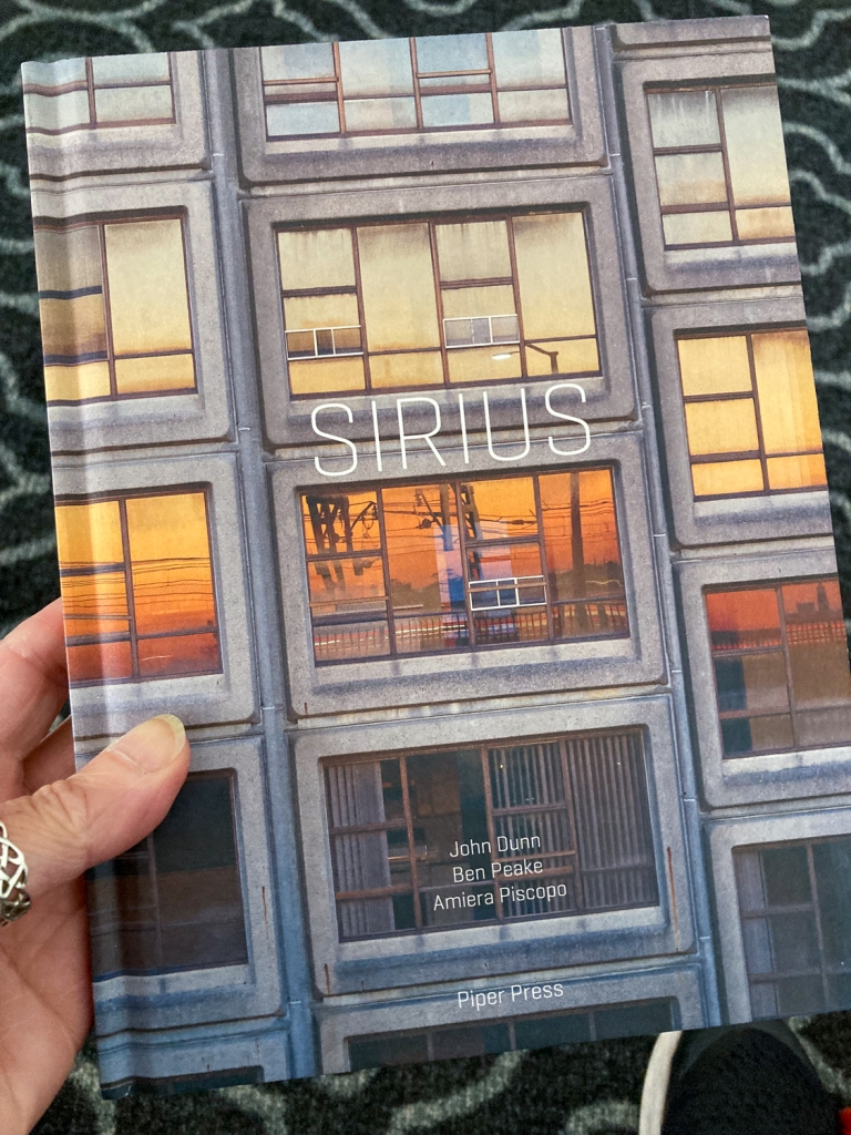
According to Sydney Modern, the NSW Housing Commission built the Sirius apartment complex over the period 1975-1980 to re-house public tenants who were displaced during redevelopment of The Rocks. It included a total of 79 apartments of various sizes, and catered for 250 aged and family residents.
Its architect was Tao Gofers, who was a Housing Commission architect at the time. He originally wanted to paint it white, but they ran out of money so (I think, thankfully) that never happened.
A “rare and fine example” of Brutalist architecture (according to the NSW Heritage Council), Sirius looked like this:
Sirius (image by Katherine Lu. Licensed under the Creative Commons Attribution-Share Alike 4.0 International license.)
I knew it was in danger.
If I hadn’t already known, the bomb symbol next to the words “UNDER THREAT Demolition is imminent” in Sydney Modern (published in 2017) was difficult to miss.
The NSW government had announced in 2014 it would be selling the site to be redeveloped into luxury apartments. I hadn’t followed the story very closely but this was obviously very distressing for the residents of the complex, along with the broader community. They formed the Save Our Sirius Foundation to fight to save the complex.
In 2016 the NSW Heritage Minister refused to have Sirius listed as a heritage site, apparently because its heritage value was outweighed by its financial value to the government. The NSW Land & Environment Court didn’t agree.
By the end of 2017, however, Myra Demetriou was the only resident left at Sirius, and she moved out in February 2018 after the government finally put the complex up for sale. Myra passed away in 2021.
I’d heard there were plans to redevelop it into fancy boutique apartments rather than demolishing it but I hadn’t realised the work was actually underway until I (eventually) got there.
Sirius reimagined
That was disappointing, and I’m sad I never got to see it as it was.
Because I’d taken the long way round, by the time I found Sirius, I’d walked under the Sydney Harbour Bridge. Continuing along Cumberland Street, past the bridge climb office, I found a random lift that went up to the bridge itself. I didn’t know you could walk on the bridge, so I went up to have a look.
Sydney Harbour Bridge (1932)
The bridge construction started in 1924 and was completed in 1932. I found the bridge plaque, which mentions the firm Dorman Long and Company, who were the contractors for design and construction. My great grandfather worked for that company in the 1920s and my mother says he was involved in the bridge design. I have no reason to disbelieve this. He was a structural engineer who specialised in bridges. He moved to Tasmania in 1925, so his involvement must have been only at the very early stages. (Or he wasn’t involved at all and it’s just a family urban legend!)
Sydney Harbour Bridge plaque
I decided not to take the lift to the top of the pylon. The view was pretty good from where I was.
Sydney Opera House from the Harbour Bridge
I didn’t want to go all the way across the bridge because I had other things to see. I’d been able to see a scaffold-clad building from the bridge and desperately hoped it wasn’t the AMP building which was also on my list to see . . .
I found this cool building on the way back. I have no idea what it is.
Sydney Harbour Bridge
Coming off the bridge back down to The Rocks is the Cahill Walk, which accompanies the Cahill Expressway. I wondered if I was going to find myself in this Jeffrey Smart painting, but that’s further around the expressway.
I could see just one part of Siruis that hadn’t been covered over by the redevelopment work.
Sirius reimagined
The lone block made me think of Myra’s story, and what it might have been like for her to be the last person living in the complex.
There was a cool view of the skyline.
Sydney from the Harbour Bridge
Postscript for Sirius: I was at the Art Gallery of NSW later in the week and found a book about the struggle to save Sirius in the bookshop. It tells the history of the complex, from the Green Bans placed on The Rocks in the 1970s until the 2017 court ruling.
Some final images to wrap up my week wandering around University of NSW.
Blockhouse (c. 1966)BlockhouseBlockhouseBlockhouseLibraryMorven Brown Car ParkSchool of Electrical Engineering & TelecommunicationsUNSW Hall (under demolition? redevelopment?)
My first afternoon wander around UNSW led me to this magnificent structure.
UNSW Squarehouse
It was all (painted) concrete and brick and my phone wasn’t wide enough to make any photos of the whole building. So I wandered round trying to find out what it was.
UNSW Squarehouse
Turns out it’s the home of the School of the Built Environment. I couldn’t find out exactly when it was constructed but the UNSW Archives refer to the “Architecture Building” as having been built in the period 1965-1969, so I’m going to guess this is the same building.
UNSW Squarehouse
Obviously, I had to go back when I had the camera.
The Roundhouse was built in 1961 and was Sydney’s first circular building. It was refurbished in 2015-17.
The Roundhouse
I couldn’t help wondering as I wandered around whether I was going to stumble on the Archhouse to complete the series. If it’s there, I didn’t find it.
When I planned the Sydney trip, knowing I’d be based in Randwick rather than in the city, I started looking around for places to explore. University of NSW stood out on the map as being (a) very close to where I’d be staying and (b) very big. It was an obvious candidate.
On our first day, when everyone else wanted to stay back at the hotel to rest after the flight and stay out of the heat, I decided to go out and have a look around. I headed up the road towards High Street.
High Street stretches from the junction of Avoca Street and Belmore Road in Randwick to Anzac Parade in Kensington. The first third of the block, until Botany Street, is taken up by the Prince of Wales Hospital. The rest of it is UNSW territory on one side and Randwock Racecourse on the other.
The first part of that block is filled with the medical faculty buildings, after which is a large open space where the Sir John Clancy Auditorium sits. And the building that first caught my eye as I was walking past.
The Chancellery.
UNSW Chancellery
Instant love!
UNSW Chancellery
Also, very difficult to photograph.
It was the first place I came back to the next morning with my camera to try . . .
UNSW Chancellery
I couldn’t find much about the Chancellery on UNSW’s website, other than it appears to have been built over 1965-66.
They have some great images of it from Max Dupain, who was UNSW’s main photographer over the period 1959-1970, in their archive. Many of these, along with photographs by historian Isadore Brodsky, document this building’s construction.
UNSW Chancellery
I found some cool steps around the side with some unpainted concrete.
Chancellery steps
It was a great start to my exploration of the campus.


